You Might Also Like
Learn Coding Visually
Learn to code with interactive, live-preview playgrounds — HTML, CSS, JavaScript, React & more.
 HTML Playground42 lessons · Click-based · Live preview
 CSS PlaygroundLearn CSS with a live editor
 JavaScript Playground60 lessons · DOM · Async · Canvas
 React PlaygroundLearn React with a live code editor
 GSAP PlaygroundLearn GSAP animation interactively
 SVG Playground44 lessons · shapes · paths · animation
 SCSS Playground45 lessons · Sass modules · tokens
 Tailwind PlaygroundLearn Tailwind CSS with a live editor
 Bootstrap 5 Playground50 lessons · live preview
AI Confidence Score Badge — Free HTML CSS JS Snippet
AI Confidence Score Badge · Cards · Plain HTML, CSS & JS · Live preview
What's included
Features
About this UI Snippet
AI Confidence Score Badge — Color-Coded Certainty Ring, Click-to-Explain Panel & Transparent AI Output
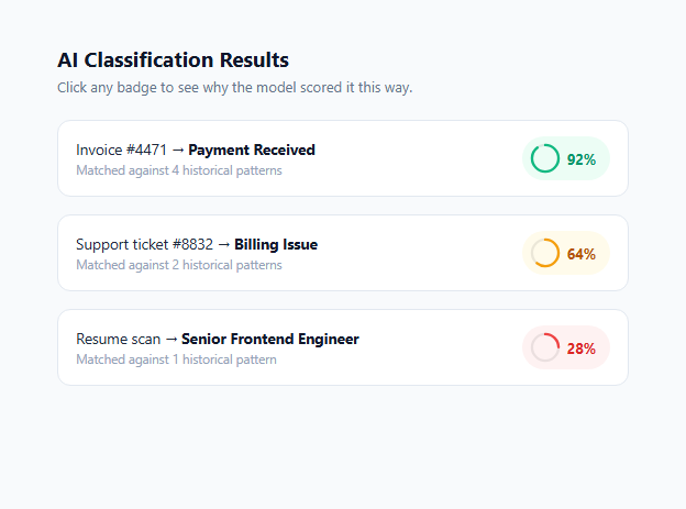
AI systems increasingly make judgments that humans act on without reviewing the underlying evidence: a classification, a match score, a routing decision. The single biggest failure mode in these interfaces is not that the model is wrong sometimes — every model is wrong sometimes — it is that the interface presents every output with the same visual authority whether the model is 98% certain or 31% certain. This snippet builds a confidence badge component that makes uncertainty a first-class, visible part of the UI: a color-coded ring (green for high confidence, amber for medium, red for low), a percentage readout, and a click-to-reveal panel that explains *why* the score is what it is in plain language.
Why confidence transparency matters in 2026
As AI-generated and AI-assisted output becomes the default in dashboards, support tools, and document processing pipelines, the products that earn user trust are the ones that never let a machine judgment masquerade as a verified fact. This is the core "AI transparency" pattern that is replacing the black-box output style of early AI features: instead of a single confident-looking label, the interface exposes the model's own certainty and gives the user a reason, not just a result. A 92% match and a 28% match should never look the same weight on screen — and critically, the user should never have to guess which one needs a second look. Designing for this explicitly reduces automation bias, the well-documented tendency for people to over-trust anything presented by a system, regardless of its actual accuracy.
How the ring and badge are built
Each badge is an SVG ring built from two overlapping <circle> elements: a faint background track (.ring-bg) and a colored foreground arc (.ring-fg) whose stroke-dasharray is fixed at the circle's circumference (94, matching r="15.5") while its stroke-dashoffset is set per-badge to represent the percentage — a smaller offset draws more of the arc. The arc is rotated -90deg via transform-origin: 50% 50% so it starts filling from the top rather than the default 3 o'clock position, which reads more naturally as a progress indicator. The three confidence tiers are driven entirely by CSS classes — .conf-high, .conf-med, .conf-low — each setting a distinct background tint, ring stroke color, and percentage text color using a semantic green/amber/red palette that is consistent with how developers already read status colors elsewhere in a product.
The click-to-explain interaction
Clicking a badge toggles a sibling .result-explain panel open using a max-height transition (0 to 120px) combined with opacity, which is a lightweight way to animate a block whose content height is unknown at author time without relying on JavaScript height measurement. The panel text is written in plain, specific language rather than a generic "confidence: 92%" restatement — it names the actual signals behind the score, such as "exact amount match, known vendor ID, matching PO number" for the high-confidence example, and explicitly recommends manual verification for the medium and low examples. The JavaScript closes any other open panel before opening a new one, so only one explanation is visible at a time, and toggles aria-expanded on the badge button for screen reader users.
Design and accessibility notes
The badge is a real <button> element, not a styled <div>, so it is keyboard-focusable and operable with Enter/Space by default, and it carries aria-expanded state that assistive technology announces on toggle. The color coding is reinforced by the percentage number and by distinct wording in the explanation ("High confidence" / "Medium confidence" / "Low confidence"), so the signal is never conveyed by color alone, which matters for users with color vision deficiencies. This pattern generalizes far beyond classification results — use it for AI-suggested email replies, fraud risk scores, search relevance rankings, or any place a model attaches a number to a claim and you want users to calibrate their trust accordingly rather than accept it uncritically.
Build with AI
Build, Understand, Optimize, and Extend It With AI
Paste this snippet's HTML, CSS, and JS into an AI coding assistant like Claude and ask it to trace exactly how the stroke-dasharray and stroke-dashoffset values on the .ring-fg circle map to the displayed percentage, so you can confidently wire in your own model's live confidence scores instead of the hard-coded demo values. It's also worth asking the assistant to help you design a calibration check — a small script that compares your model's predicted confidence against actual accuracy on a labeled sample, so your green/amber/red thresholds reflect real calibration rather than a guess. Finally, ask it to extend the component with a fourth "insufficient data" tier for cases where the model has too little evidence to produce a meaningful score at all, which is a common gap in confidence-badge implementations that only plan for high, medium, and low.
Prompt to recreate it
Copy this into your AI assistant of choice to build the effect from scratch, or as a jumping-off point for your own variant:
Build an AI confidence score badge component in plain HTML, CSS, and JavaScript that shows a color-coded circular meter and a click-to-reveal plain-language explanation.

Requirements:
- Render a list of result rows, each with a label and a confidence badge showing an SVG ring meter (percentage filled by stroke-dashoffset) plus a numeric percentage, color-coded into at least three tiers (e.g. green 80%+, amber 50-79%, red below 50%).
- Clicking a badge toggles open a sibling explanation panel with a smooth height/opacity transition (not an instant show/hide), containing 1-2 sentences that name the actual reasons behind the score rather than restating the percentage.
- Only one explanation panel should be open at a time — opening a new one must close any previously open panel.
- The badge must be a real, keyboard-focusable button element with an aria-expanded attribute that toggles between true and false as the panel opens and closes.
- The confidence tier must never be communicated by color alone — reinforce it with text (percentage number and/or a tier label) so the component remains usable for color-blind users.
- Include at least three example rows spanning high, medium, and low confidence so all three visual states are demonstrated at once.
- Keep the component self-contained with no external dependencies, ready to be wired to real model output by swapping the hard-coded percentages and explanation strings for dynamic data.
Want to tighten it up first? Run this prompt through the AI Prompt Studio to score it across 8 quality dimensions, catch anti-patterns, and tune the wording for Claude, ChatGPT, or Gemini before you paste it in.
Step by step
How to Use
- 1Click a badge to see its explanationEach result row has a color-coded ring badge with a percentage. Click it and a .result-explain panel slides open beneath the row with a plain-language reason for the score. Click a different badge and the previous panel closes automatically.
- 2Set the ring fill for a new confidence valueThe ring uses a fixed stroke-dasharray of 94 (the circumference of r=15.5). To show a new percentage, set stroke-dashoffset to 94 - (94 * pct / 100) on the .ring-fg circle, and update the .conf-pct text and the tier class (conf-high, conf-med, conf-low) together.
- 3Choose the right tier thresholds for your dataThis demo treats roughly 80%+ as high (green), 50-79% as medium (amber), and below 50% as low (red). Adjust the thresholds in your own logic to match how your model's scores are actually calibrated — a poorly calibrated model should not be dressed up in confident-looking green.
- 4Write explanations that name real signalsAvoid restating the percentage in the explanation text. Instead name the actual factors: which sources matched, how many historical examples were compared, or what specific data was missing. This is what separates a genuinely transparent AI interface from a decorative confidence meter.
- 5Wire it to live model outputReplace the hard-coded stroke-dashoffset and conf-pct values with data from your model response, e.g. score.confidence and score.reasons. Generate the explanation paragraph server-side from the top contributing features rather than a static string, if your model can produce that.
- 6Export and drop into your results listClick HTML to download a standalone file, or JSX to get a React component. Wrap the badge in a reusable ConfidenceBadge component that accepts a percentage prop and a reasons string, so every AI-driven result across your app renders its uncertainty consistently.
Real-world uses
Common Use Cases
Got questions?
Frequently Asked Questions
There is no universal cutoff — it depends entirely on how your model's scores are calibrated. A well-calibrated model where "90%" genuinely means correct 9 times out of 10 can safely use a higher green threshold (e.g. 85%+) than a poorly calibrated model. Before choosing thresholds, plot your model's predicted confidence against its actual accuracy on a held-out set; if 70% predictions are only correct 50% of the time, your thresholds need to shift down accordingly, or you need to recalibrate the model itself (e.g. with temperature scaling or Platt scaling).
For technical or professional users (support agents, analysts, ops teams) a raw percentage paired with a plain-language explanation works well because it gives them a precise, scannable signal. For general consumer audiences, consider replacing the percentage with a qualitative label ("High confidence" / "Needs review") while keeping the color-coded ring, since raw percentages can be misread as statistical guarantees rather than the model's internal estimate.
Most models or scoring pipelines can expose the top contributing features alongside the score — e.g. which fields matched, which embeddings were closest, or which rules fired. Template the explanation string from those features server-side: "Matched on {factor1}, {factor2}, and {factor3}" for high confidence, and "Only {n} comparable example(s) found" for low confidence. Avoid generic filler text like "the model is fairly sure" that gives the user no actionable information.
Yes. The badge is a real <button> element so it receives focus in tab order and activates on Enter or Space without any extra JavaScript. The aria-expanded attribute is toggled between "true" and "false" so screen readers announce whether the explanation panel is currently open. Because the tier is also conveyed through the percentage text and explanation wording (not color alone), the component remains understandable for users with color vision deficiencies.
Yes — add additional CSS classes (e.g. .conf-verylow) with their own ring color, background tint, and text color, and extend your threshold logic to assign them. Keep in mind that too many tiers dilutes the at-a-glance scannability that makes a three-tier system effective; most products find that green/amber/red, or a four-tier system with a distinct "insufficient data" state, covers the practical range of decisions users need to make.