You Might Also Like
Learn Coding Visually
Learn to code with interactive, live-preview playgrounds — HTML, CSS, JavaScript, React & more.
 HTML Playground42 lessons · Click-based · Live preview
 CSS PlaygroundLearn CSS with a live editor
 JavaScript Playground60 lessons · DOM · Async · Canvas
 React PlaygroundLearn React with a live code editor
 GSAP PlaygroundLearn GSAP animation interactively
 SVG Playground44 lessons · shapes · paths · animation
 SCSS Playground45 lessons · Sass modules · tokens
 Tailwind PlaygroundLearn Tailwind CSS with a live editor
 Bootstrap 5 Playground50 lessons · live preview
AI-Generated Review Summary Card — HTML CSS JS Snippet
AI-Generated Review Summary Card · Cards · Plain HTML, CSS & JS · Live preview
What's included
Features
About this UI Snippet
AI-Generated Review Summary Card — Sentiment Tags, Mini Bar Indicators & Source Excerpt Disclosure
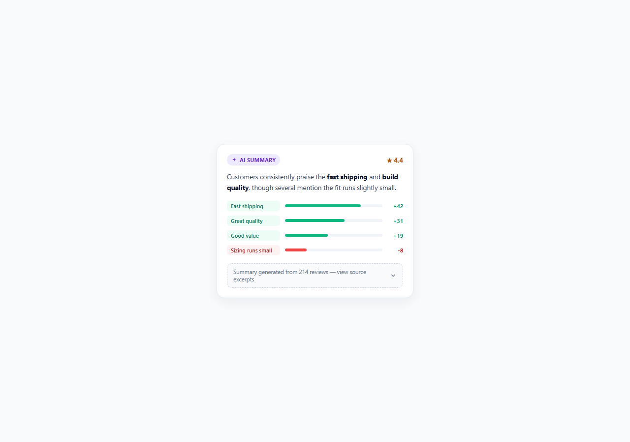
AI-generated review summaries have become a standard ecommerce and marketplace feature: instead of making a shopper scroll through 200 individual reviews, a model condenses them into a short paragraph and a handful of common themes. The convenience is real, but so is the risk — a summary is an interpretation, not a fact, and if a product page presents it with the same unquestionable authority as a spec sheet, users have no way to tell whether the AI accurately represented the underlying reviews or quietly smoothed over a real problem. This snippet builds a review summary card that stays honest about its own nature: an overall sentiment line, tag chips with proportional bar indicators showing how often each theme was mentioned, and — critically — a disclosure control that reveals the actual excerpt quotes the summary was built from.
Why source-verifiable AI summaries matter in 2026
As AI-summarized content spreads across ecommerce, news aggregation, and customer feedback tools, the products that retain user trust are the ones that treat a summary as a starting point for the user's own judgment, not a replacement for it. This is the same AI-transparency principle behind confidence scoring and cited AI answers: never let a generated summary stand alone without a path back to its source material. A shopper reading "customers praise the fast shipping" should be able to click through and see two or three real sentences that back that claim up, in the actual words of real reviewers, not just trust the AI's paraphrase. This habit of designing a verification path into every AI-summarized surface is quickly becoming a baseline expectation rather than a differentiator, especially as synthetic and manipulated reviews make raw review volume alone an unreliable trust signal.
How the sentiment tags and bars communicate proportion, not just presence
Rather than a flat list of theme keywords, each tag in the .tag-list pairs a colored chip (green .tag-pos for favorable themes, red .tag-neg for critical ones) with a horizontal .tag-bar whose fill width is set per-tag to represent how frequently that theme appeared relative to the others — "Fast shipping" at 78% width clearly outweighs "Good value" at 44%, giving the user an at-a-glance sense of theme prominence that a plain list of chips cannot convey. Each tag also carries a raw mention count (+42, -8) so the proportion is anchored to an actual number rather than an abstract percentage. On page load, the bars animate in from 0% width using a double requestAnimationFrame call (needed because the browser must paint the 0% state once before the transition to the target width can be observed), which reinforces the impression that these are computed, live figures rather than static decorative copy.
The disclosure pattern: summary first, evidence on demand
The .disclosure-toggle button sits below the tag list, stating plainly how many reviews the summary was generated from ("Summary generated from 214 reviews") and inviting the user to view source excerpts. Clicking it expands an .excerpts panel — using the same max-height/opacity transition technique as other progressive-disclosure components — containing two to three real, attributed review quotes that directly support the themes named above. This keeps the primary card compact and scannable for users who trust the summary at a glance, while giving skeptical or high-stakes shoppers (someone about to spend real money, or make a decision based on the "sizing runs small" note) a one-click path to the actual evidence. The aria-expanded state on the toggle button and the rotating chevron icon both signal the disclosure's open/closed state clearly to sighted and assistive-technology users alike.
Design notes
The purple .ai-tag badge in the card header is a deliberate, small, consistent marker — it should appear on every AI-generated summary surface in a product so users learn to recognize at a glance which content is machine-generated versus directly authored, which is itself a transparency requirement increasingly expected of AI-assisted product content. The excerpt blockquotes use a left border accent rather than heavy quotation styling, keeping them legible and clearly distinguished from the summary prose above them.
Build with AI
Build, Understand, Optimize, and Extend It With AI
Paste this snippet's HTML, CSS, and JS into an AI coding assistant like Claude and ask it to explain why the tag bars are animated in with a double requestAnimationFrame call instead of just setting the width directly, and whether that technique is necessary in your specific framework (React, for instance, has its own patterns for mount-triggered transitions). It's also worth asking the assistant to help you wire the sentiment line, tag list, and excerpt quotes to a real review aggregation pipeline or API response instead of the hard-coded demo data, and to design a sensible fallback UI for when a product has too few reviews for a meaningful AI summary to be generated at all. Finally, ask it to help extend the disclosure pattern to support pagination if you want to reveal more than 2-3 excerpts on demand.
Prompt to recreate it
Copy this into your AI assistant of choice to build the effect from scratch, or as a jumping-off point for your own variant:
Build an AI-generated review summary card in plain HTML, CSS, and JavaScript that summarizes many customer reviews with a verification path back to real source quotes.

Requirements:
- Show a small, consistent "AI Summary" badge in the card header so the content is clearly marked as machine-generated, plus an overall star rating and a one-sentence AI-generated sentiment summary referencing at least one specific positive and one specific negative theme.
- Show 3-4 theme tag chips (color-coded positive/negative), each paired with a horizontal bar indicator whose fill width represents that theme's relative mention frequency compared to the others, and a raw mention count (e.g. +42 or -8) next to each bar.
- Include a disclosure line stating how many total reviews the summary was generated from, that toggles open a panel of 2-3 real, individually attributed excerpt quotes directly supporting the summarized themes when clicked — using a smooth height/opacity transition, not an instant show/hide.
- The disclosure toggle must be a real button with aria-expanded reflecting open/closed state, and an icon (e.g. a chevron) that visually rotates to match the state.
- Animate the tag bars filling in from zero width shortly after the card first renders, to reinforce that the proportions are computed from real data rather than static.
- Keep the whole component self-contained and ready to be wired to a real review aggregation backend by replacing the hard-coded summary text, tag data, and excerpt quotes with dynamic values.
Want to tighten it up first? Run this prompt through the AI Prompt Studio to score it across 8 quality dimensions, catch anti-patterns, and tune the wording for Claude, ChatGPT, or Gemini before you paste it in.
Step by step
How to Use
- 1Click the disclosure line to see source quotesClick "Summary generated from 214 reviews — view source excerpts" beneath the tag list. The .excerpts panel expands with a smooth max-height transition to reveal 2-3 real, attributed review quotes that back up the themes named above.
- 2Set tag bar widths from real mention frequencyEach .tag-bar-fill has an inline style="width:XX%" representing how often that theme was mentioned relative to the most common one. Compute this server-side as (theme mentions / max theme mentions) * 100 so the bars accurately reflect your real review data, not arbitrary values.
- 3Keep the mention count anchored to a real numberThe .tag-count span (e.g. "+42") should always be the actual count of reviews mentioning that theme, not a derived percentage — this gives users a concrete number to sanity-check the bar proportion against.
- 4Always populate the excerpts panel with real quotesNever leave the .excerpts panel empty or filled with paraphrased text — it exists specifically to let users verify the AI summary against real customer language. Pull 2-3 representative quotes per theme directly from your review database, with attribution.
- 5Keep the AI Summary tag visible and consistentThe .ai-tag badge in the card header should appear identically on every AI-generated summary surface across your product so users learn to recognize AI-summarized content at a glance, distinct from directly authored copy.
- 6Export and wire to your review data pipelineClick HTML to download a standalone file, or JSX for a React component. Generate the sentiment line, tag list, and review count server-side from your actual review aggregation pipeline, and pass the excerpt quotes as props so the disclosure panel always reflects real source data.
Real-world uses
Common Use Cases
Got questions?
Frequently Asked Questions
Two to three quotes per disclosure is usually enough to let a user spot-check the summary's key claims without turning the card into a full review list. Prioritize quotes that directly support the most prominent tags (highest bar width) and, if space allows, include at least one quote representing the negative theme so the disclosure does not read as cherry-picked positive evidence.
Base the bar width on relative mention frequency: count how many reviews mention each theme, then scale each bar relative to the most-mentioned theme (100% width) rather than an absolute scale, so the bars stay visually meaningful even as your total review count grows over time. Keep the raw count visible alongside the bar so users are not left guessing what the percentage is relative to.
Explicit labeling is strongly recommended and increasingly expected by users. Presenting an AI-generated summary without any indication of its origin risks users treating an approximation as verified fact, and can damage trust if the summary is later found to have missed or softened a real issue. A small, consistent badge like the .ai-tag in this snippet costs very little visual space and meaningfully improves transparency.
If your review data updates in near-real-time, re-fetch the summary and tag data on an interval or on page revisit rather than caching it indefinitely, and re-run the bar-fill animation (reset width to 0% then animate to the new target) so returning users notice the numbers have been refreshed rather than assuming stale data is current.
Yes — the same structure (a short AI-generated summary line, a small set of theme tags with proportional indicators, and a disclosure toggle revealing real source snippets) applies directly to summarizing support ticket clusters, meeting transcripts, or survey responses. The core requirement stays the same: whatever the AI condenses, give the user an easy way to check the condensation against the real source material.