You Might Also Like
Learn Coding Visually
Learn to code with interactive, live-preview playgrounds — HTML, CSS, JavaScript, React & more.
 HTML Playground42 lessons · Click-based · Live preview
 CSS PlaygroundLearn CSS with a live editor
 JavaScript Playground60 lessons · DOM · Async · Canvas
 React PlaygroundLearn React with a live code editor
 GSAP PlaygroundLearn GSAP animation interactively
 SVG Playground44 lessons · shapes · paths · animation
 SCSS Playground45 lessons · Sass modules · tokens
 Tailwind PlaygroundLearn Tailwind CSS with a live editor
 Bootstrap 5 Playground50 lessons · live preview
AI Agent Action Approval Card — Free HTML CSS JS Snippet
AI Agent Action Approval Card · Cards · Plain HTML, CSS & JS · Live preview
What's included
Features
About this UI Snippet
AI Agent Action Approval Card — Human-in-the-Loop Confirmation UI for Irreversible AI Actions
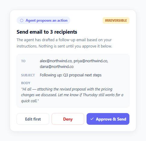
As AI agents move from answering questions to actually taking actions — sending emails, deleting files, making purchases, modifying records — the interface pattern that gates those actions becomes one of the most consequential pieces of UI a product can ship. Get it wrong and users either lose trust because an agent did something unexpected, or they lose the benefit of automation because every action requires a full manual redo. This snippet implements the pattern correctly: a card that shows exactly what the agent is about to do, in concrete and specific terms, and requires an explicit human decision — Approve, Deny, or Edit first — before anything irreversible actually executes.
Specific and previewable, never vague
The single biggest failure mode in agentic-action UI is a confirmation dialog that says something like "AI wants to take an action, continue?" with no detail about what that action actually is. A vague confirmation trains users to click through without reading, which defeats the entire purpose of a human-in-the-loop gate — the approval becomes theater rather than a real checkpoint. This card instead renders a genuine preview: a .preview-list breaking the proposed email down into its actual To, Subject, and Body fields, with the real recipient addresses and real drafted subject line visible before any decision is made. For a file-deletion agent, the equivalent would list the 12 actual filenames rather than saying "delete some files" — the underlying principle is the same regardless of the action type: a user must be able to verify the specific, concrete consequences of approval, not just trust a label.
Two distinct rejection paths, not one
Most approval UIs offer only "confirm" and "cancel," which forces a false binary — either accept the AI's draft exactly as-is, or discard the whole thing and start over. This card separates those into btn-deny ("Deny," which cancels the action entirely) and btn-edit ("Edit first," which signals intent to modify the draft before anything sends). Giving users a middle path between full acceptance and full rejection substantially increases how often people actually engage critically with an agent's proposal, rather than defaulting to whichever button requires the least friction. In this demo both secondary actions currently route to the same denied-state UI for simplicity, but in a real implementation "Edit first" would reopen the draft in an editable view rather than terminating the flow.
The confirmation state closes the loop
Once btn-approve is clicked, the button disables immediately (btnApprove.disabled = true) to prevent a double-send from a second click, the title updates to "Sending email…" as an in-progress signal, and after a brief simulated delay the card transitions to a distinct .result-state.approved view with a checkmark and the explicit text "Action completed — email sent to 3 recipients." This closing confirmation matters as much as the initial preview: a user who approved an action needs unambiguous proof that it actually happened and exactly what happened, not silence or an assumption that everything went fine. The hideActionUI() function removes the now-irrelevant preview and buttons so the card's final state reads cleanly as a completed record rather than a stale form.
Why this matters for 2026 AI-native UX
The core discipline of 2026 AI-native product design is that agentic actions must be transparent, specific, and gated behind explicit human control before anything irreversible happens — never silently auto-executed based on an inferred intent. As agents gain the ability to actually act on a user's behalf rather than just suggest, the interface separating "the agent proposed this" from "this actually happened" is the single most important trust mechanism a product has. A well-built approval card like this one is not friction added on top of AI capability; it is the thing that makes delegating real, consequential actions to an agent something a user can do with confidence rather than anxiety.
Build with AI
Build, Understand, Optimize, and Extend It With AI
Paste this snippet's HTML, CSS, and JS into an AI coding assistant like Claude and ask it to trace exactly how the Approve button's disabled state, the "Sending…" in-progress label, and the final "Action completed" confirmation work together to prevent a duplicate send and give the user unambiguous proof the action ran. It's worth asking the assistant to extend the preview-row pattern to a different action type — for example a file-deletion list with individual per-file checkboxes so a reviewer can approve some files and deny others in one card, rather than only all-or-nothing. You could also ask it to add a countdown-based "auto-deny after 60 seconds of inactivity" safeguard for especially high-stakes actions, or to wire the Edit-first path to actually reopen an editable textarea inline in the card instead of routing to the same denied state the demo currently uses.
Prompt to recreate it
Copy this into your AI assistant of choice to build the effect from scratch, or as a jumping-off point for your own variant:
Build an AI agent action approval card in plain HTML, CSS, and JavaScript that gates an irreversible action (for example sending an email to several recipients) behind explicit human confirmation.

Requirements:
- Display a specific, concrete preview of exactly what will happen if approved — real field values (for example actual recipient addresses, subject line, and message body), never a vague "AI wants to perform an action" message.
- Provide three distinct actions: a primary Approve button that executes the action, a secondary Deny button that cancels it with no side effects, and a third Edit-first option that signals the user wants to modify the draft before anything executes — not just a binary accept/cancel.
- When Approve is clicked, immediately disable the button to prevent a duplicate execution from a second click, show a brief in-progress state (for example "Sending…"), and after a short simulated delay transition to an explicit, visually distinct "Action completed" confirmation state.
- When Deny is clicked, show a clearly different, neutral confirmation state indicating nothing happened, with equal visual prominence to the approved state so declining never feels penalized or harder to find than approving.
- Include a small risk indicator (for example an "Irreversible" tag) near the top of the card that sets expectations about the consequence level of the action before the user reads the detailed preview.
- Structure the code so the preview fields, action title, and approve/deny logic could realistically be swapped for a different action type (file deletion, a purchase, a calendar change) without rewriting the card's core approve/deny/edit flow.
Want to tighten it up first? Run this prompt through the AI Prompt Studio to score it across 8 quality dimensions, catch anti-patterns, and tune the wording for Claude, ChatGPT, or Gemini before you paste it in.
Step by step
How to Use
- 1Review the specific proposed actionThe card shows exactly what the agent drafted — real recipient addresses, subject line, and body text in the .preview-list, not a vague "send an email?" prompt. This concreteness is what lets a reviewer make an informed decision instead of blindly trusting the agent.
- 2Click "Approve & Send" to executeThe Approve button disables itself immediately to prevent a double-click send, the title changes to "Sending email…" as a brief in-progress state, then the card transitions to a green "Action completed" confirmation — closing the loop so you know the action genuinely happened.
- 3Click "Deny" to cancel with no side effectsDenying shows a neutral grey confirmation state ("Action denied — nothing was sent") and no email is sent. This path exists so rejecting a proposal is exactly as easy and unambiguous as approving one, with no dark-pattern friction discouraging refusal.
- 4Click "Edit first" for the middle pathRather than forcing an all-or-nothing choice, "Edit first" signals the reviewer wants to modify the draft before anything executes. Wire btnEdit's click handler in your real implementation to reopen the draft in an editable form instead of the demo's simplified denied-state placeholder.
- 5Inspect the risk tag and badgeThe "Irreversible" risk-tag pill and "Agent proposes an action" badge at the top set expectations before the user even reads the details below. Swap the risk-tag text and colour (for example to "Reversible" with a calmer palette) for lower-stakes actions like draft-saving that do not warrant the same visual weight.
- 6Export and connect to a real agent backendClick HTML or JSX to export. Replace the hard-coded preview values with data returned by your agent's planning step, and wire btnApprove's click handler to actually call your send/delete/execute endpoint instead of the setTimeout() simulation, updating the result state based on the real API response.
Real-world uses
Common Use Cases
Got questions?
Frequently Asked Questions
A vague confirmation gives the reviewer nothing concrete to evaluate, which trains people to click through automatically — the approval step stops functioning as a real safeguard. Showing the actual To, Subject, and Body fields lets a reviewer catch a wrong recipient, an inaccurate claim in the draft, or an unintended attachment before anything sends, which is the entire point of a human-in-the-loop gate for an irreversible action.
A binary choice forces reviewers to either accept a draft exactly as written or discard it entirely and start over, which discourages engaging critically with imperfect-but-close drafts. "Edit first" gives a middle path — reopen the proposal in an editable state, make a small correction, then approve the corrected version — which better matches how people actually want to collaborate with an AI draft rather than purely accepting or rejecting it wholesale.
Network latency between the click and the action actually completing creates a window where an impatient or uncertain user might click Approve a second time, potentially sending a duplicate email or executing a costly action twice. Disabling the button the instant it is clicked (btnApprove.disabled = true) closes that window entirely, and the subsequent "Sending…" and "Action completed" states give the user clear feedback that their single click was received and is being processed.
Reserve strong warning styling like "Irreversible" (amber/red) for actions that genuinely cannot be undone or are costly to undo — sending a message, deleting data, spending money. For safely reversible actions like saving a draft, adding a calendar hold that can be cancelled, or generating a preview, use a calmer tag (or omit it) so the visual weight of the warning stays meaningful and does not become background noise from overuse on low-stakes actions.
No — the right amount of friction scales with the consequence and reversibility of the action. Read-only or trivially reversible actions (searching, summarizing, drafting without sending) generally do not need a gated approval card at all, since requiring confirmation for every AI step would recreate the manual-labor problem automation is meant to solve. Reserve a full approval card like this one for actions that are irreversible, costly, or affect someone other than the user themselves — that is where explicit, specific, human-gated consent genuinely matters.