You Might Also Like
Learn Coding Visually
Learn to code with interactive, live-preview playgrounds — HTML, CSS, JavaScript, React & more.
 HTML Playground42 lessons · Click-based · Live preview
 CSS PlaygroundLearn CSS with a live editor
 JavaScript Playground60 lessons · DOM · Async · Canvas
 React PlaygroundLearn React with a live code editor
 GSAP PlaygroundLearn GSAP animation interactively
 SVG Playground44 lessons · shapes · paths · animation
 SCSS Playground45 lessons · Sass modules · tokens
 Tailwind PlaygroundLearn Tailwind CSS with a live editor
 Bootstrap 5 Playground50 lessons · live preview
Achievement Badge Collection Grid — HTML CSS JS Snippet
Achievement Badge Collection Grid · Cards · Plain HTML, CSS & JS · Live preview
What's included
Features
About this UI Snippet
Achievement Badge Collection Grid — Locked/Unlocked States, Shine Sweep Animation & Confetti-Lite Unlock Celebration
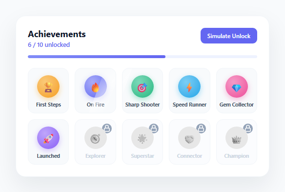
Gamified progress systems — achievement badges, unlockable trophies, skill collections — are one of the most reliable engagement patterns in product design. Duolingo, LinkedIn, Steam, and countless SaaS onboarding flows use a badge grid to visualize accomplishment and create a sense of "one more to go." This snippet builds that pattern as a fully interactive, dependency-free component: a responsive grid of circular icon badges that can be locked (grayscale, dimmed, with a lock overlay) or unlocked (full color, with a subtle looping shine sweep), each clickable to reveal contextual information, plus a "simulate unlock" control that demonstrates the actual unlock animation sequence.
Locked vs. unlocked visual states
Every badge shares the same markup — an icon inside a circular frame plus a name label — and the locked/unlocked distinction is expressed entirely through CSS classes. Locked badges get filter: grayscale(1) on the icon circle, a dimmed neutral background instead of the badge's accent-colored radial gradient, and a small circular lock icon absolutely positioned in the top-right corner via .lock-overlay. Unlocked badges use radial-gradient(circle at 35% 30%, ...) with a CSS custom property --accent set per-badge inline, so each unlocked badge can have its own color (amber for "First Steps," indigo for "On Fire," emerald for "Sharp Shooter") while sharing one shared gradient formula. This custom-property approach means adding a new badge color requires zero new CSS — just a different --accent value on the button element.
The shine-sweep animation on unlocked badges
Unlocked badges include a .badge-shine element: an absolutely positioned, skewed white gradient strip that sweeps across the badge using a left keyframe animation from -60% to 130%, masked by the badge's overflow: hidden. Because it runs on an infinite loop with staggered animation-delay values per badge (using :nth-child selectors), the sweeps ripple across the grid rather than firing in unison, producing a subtle, premium "polished trophy case" feel rather than a distracting flashing effect. The sweep uses transform: skewX(-20deg) so the highlight reads as a light reflection rather than a flat rectangle sliding across.
Interactive tooltips for both states
Clicking any badge — locked or unlocked — opens a small dark popover positioned relative to the badge panel using getBoundingClientRect() math to compute the offset from the panel's own bounding rect. For locked badges, it reads the requirement from a data-requirement attribute ("Complete 10 tasks to unlock"). For unlocked badges, it reads a data-earned attribute and shows "Earned on [date]". This means the demo content is entirely data-driven from HTML attributes — swapping requirement text or earned dates never touches the JavaScript. A document-level click listener closes the popover when clicking outside any badge.
Simulating an unlock: state transition and confetti-lite burst
The "Simulate Unlock" button demonstrates the full unlock sequence on the next locked badge in DOM order. simulateUnlock() finds the first .locked badge, swaps its classes from locked to unlocked, removes the lock overlay element, re-inserts a fresh .badge-shine element (since the shine sweep only exists on unlocked badges), and adds a temporary .celebrating class that triggers a CSS box-shadow pulse ring (@keyframes badge-pulse) and an icon pop-scale animation. Simultaneously, spawnConfetti() procedurally generates 14 small colored <span> elements positioned at the badge's center, each animated outward at a randomized angle and distance using CSS custom properties (--dx, --dy, --rot) consumed by a single shared @keyframes confetti-burst rule, then removes each piece from the DOM on animationend to avoid leaking nodes. This is deliberately "confetti-lite" — a dozen tiny squares rather than a full particle library — keeping the celebration snappy and dependency-free.
Progress summary and grid layout
A header shows a live "N / Total unlocked" count and a linear progress bar, both recalculated by updateProgress() after every unlock. The grid uses CSS Grid with repeat(5, 1fr) columns, collapsing to 3 columns under a mobile media query, so the same markup adapts cleanly from a wide dashboard panel down to a phone-width card.
Build with AI
Build, Understand, Optimize, and Extend It With AI
Paste this snippet's HTML, CSS, and JS into an AI coding assistant like Claude and ask it to explain how the locked and unlocked visual states share the same badge markup but diverge entirely through CSS classes and the --accent custom property, and how spawnConfetti() generates randomized particle trajectories using only CSS custom properties and one shared keyframes rule. It's also a strong candidate for extension — ask the assistant to wire simulateUnlock() to fire automatically when a real achievement condition is met in your app's state, to add a "recently unlocked" sorting mode that moves newly earned badges to the front of the grid, or to add keyboard navigation so badges can be tabbed through and activated with Enter for full accessibility. Because the celebration logic (pulse, shine, confetti) is cleanly separated from the data (locked/unlocked class, data attributes), it's easy to ask for a version driven entirely by an external JSON array of achievements.
Prompt to recreate it
Copy this into your AI assistant of choice to build the effect from scratch, or as a jumping-off point for your own variant:
Build an achievement badge collection grid in plain HTML, CSS, and JavaScript with locked and unlocked states, click-to-reveal details, and an unlock celebration animation — no external libraries.

Requirements:
- Render a responsive grid of at least 8 circular icon badges, each showing an icon and a name label, where each badge can independently be in a locked or unlocked visual state driven by CSS classes rather than duplicated markup.
- Unlocked badges must appear in full color with a subtle continuous shine-sweep animation across the icon; locked badges must appear grayscale/dimmed with a visible lock icon overlay, and the two states must be visually unmistakable at a glance.
- Clicking a locked badge shows a popover or tooltip with a specific unlock requirement string unique to that badge; clicking an unlocked badge shows a popover with the date or context it was earned; clicking outside any badge closes the popover.
- Show a live summary at the top such as "6 / 10 unlocked" plus a proportional progress bar, both recalculating automatically whenever a badge's locked/unlocked state changes.
- Include a "Simulate Unlock" button that transitions the next locked badge (in a well-defined order) to unlocked, playing a celebratory animation — at minimum a brief scale/pulse effect on the badge plus a lightweight procedural confetti burst made of small animated shapes that clean themselves up from the DOM afterward, not a static image or GIF.
- Disable or relabel the simulate button once every badge is unlocked, and handle the edge case where no locked badges remain without throwing an error.
- Keep the grid responsive, collapsing to fewer columns on narrow/mobile viewports while keeping badges legible and tappable.
Want to tighten it up first? Run this prompt through the AI Prompt Studio to score it across 8 quality dimensions, catch anti-patterns, and tune the wording for Claude, ChatGPT, or Gemini before you paste it in.
Step by step
How to Use
- 1Click any badge to see detailsClick an unlocked badge (full color) to see a popover with the date it was earned, read from its data-earned attribute. Click a locked badge (grayscale with a lock icon) to see its unlock requirement, read from data-requirement.
- 2Try the simulate unlock buttonClick "Simulate Unlock" in the header to watch the next locked badge transition to unlocked in real time: the grayscale filter lifts, a shine sweep starts, a pulse ring and icon pop-scale animation fire, and a confetti-lite burst scatters outward from spawnConfetti().
- 3Add a new badgeCopy a .badge button in the HTML panel. For an unlocked badge, add class="badge unlocked", set style="--accent:#COLOR", and a data-earned date. For a locked badge, add class="badge locked", a data-requirement string, and the .lock-overlay SVG markup. The total count and progress bar update automatically since they read badges.length from the DOM.
- 4Change badge icons and colorsReplace the emoji inside .badge-icon with any emoji, SVG, or icon font glyph. Change the --accent custom property inline on each unlocked badge to recolor its radial gradient background and glow — no other CSS edits needed since the gradient formula references var(--accent) directly.
- 5Adjust the shine sweep timingIn the CSS panel, edit the shine-sweep keyframes duration (currently 3.2s) or the per-badge animation-delay values on the :nth-child selectors to make the sweep ripple faster, slower, or in a different stagger pattern across the grid.
- 6Wire real unlock events to spawnConfetti()Call spawnConfetti(badgeElement) and toggle the same locked/unlocked classes whenever your backend confirms a real achievement, for example after an API response inside a fetch().then() callback, so the exact same celebration animation fires for genuine unlocks.
Real-world uses
Common Use Cases
Got questions?
Frequently Asked Questions
Each unlocked badge contains a .badge-shine span — a skewed, semi-transparent white gradient strip positioned absolutely inside the badge, which has overflow: hidden. A CSS @keyframes rule animates its left property from -60% to 130% on an infinite loop, so it continuously sweeps across and off the badge, clipped to the badge boundary. Staggered animation-delay values per badge (via :nth-child selectors) prevent every badge from flashing in unison.
spawnConfetti() runs a small loop that creates 14 absolutely positioned <span> elements at the badge's center, each given randomized CSS custom properties for horizontal distance (--dx), vertical distance (--dy), and rotation (--rot). A single shared @keyframes confetti-burst rule animates transform: translate(var(--dx), var(--dy)) rotate(var(--rot)) with fading opacity. Each piece listens for its own animationend event and removes itself from the DOM, so no elements accumulate after repeated unlocks.
Yes. The simulateUnlock() function is a self-contained example of the state transition — swapping locked/unlocked classes, removing the lock overlay, re-adding a shine element, and calling spawnConfetti(). Call this same sequence of DOM operations from inside your actual achievement-unlocked event handler (a WebSocket message, a fetch response, or a Redux/Zustand state change) instead of the button click listener.
simulateUnlock() finds the first element with the .locked class in DOM order using Array.prototype.find(), so badges unlock in the sequence they appear in the HTML. To unlock a specific badge instead, select it directly by its data-id attribute (for example document.querySelector('[data-id="7"]')) and run the same class-swap and celebration logic on that element rather than the DOM-order search.
The popover position is calculated from getBoundingClientRect() at the moment of the click, relative to the badge panel's own bounding rect, so it is correctly placed for the current layout every time it opens. Because it recalculates fresh on each click rather than persisting a cached position, resizing the window or scrolling the page and then clicking a badge again will always produce accurate placement.