You Might Also Like
Learn Coding Visually
Learn to code with interactive, live-preview playgrounds — HTML, CSS, JavaScript, React & more.
 HTML Playground42 lessons · Click-based · Live preview
 CSS PlaygroundLearn CSS with a live editor
 JavaScript Playground60 lessons · DOM · Async · Canvas
 React PlaygroundLearn React with a live code editor
 GSAP PlaygroundLearn GSAP animation interactively
 SVG Playground44 lessons · shapes · paths · animation
 SCSS Playground45 lessons · Sass modules · tokens
 Tailwind PlaygroundLearn Tailwind CSS with a live editor
 Bootstrap 5 Playground50 lessons · live preview
CSS backdrop-filter Playground — Free HTML CSS JS Snippet
CSS backdrop-filter Playground · Cards · Plain HTML, CSS & JS · Live preview
What's included
Features
About this UI Snippet
CSS backdrop-filter Playground — Real-Time Frosted Glass with blur() and saturate()
The "frosted glass" look — a translucent panel that blurs and enriches whatever sits behind it, like macOS's Control Center or iOS's Control Panel — was, for years, impossible to reproduce faithfully on the web. Developers approximated it with a semi-transparent background: rgba(...) color, which dims what's behind a panel but never actually blurs it, producing a flat, muddy look nothing like real frosted glass. The backdrop-filter CSS property, standardized in the CSS Filter Effects Module Level 2 spec, closes that gap by applying filter functions — the same blur(), saturate(), brightness(), contrast(), and others already available via the regular filter property — directly to whatever content is rendered behind an element, rather than to the element's own contents.
How backdrop-filter differs from filter
The standard filter property (also part of Filter Effects) applies its functions to an element and its own descendants — blur a filter: blur(8px) div and everything drawn inside that div gets blurry, but the page behind it stays crisp. backdrop-filter inverts this: the element itself (and its content) stays perfectly sharp, while the filter is applied to a snapshot of whatever is rendered underneath it, continuously, as that background content scrolls, animates, or changes. This is what makes it possible to have perfectly legible white text sitting on top of a blurred, colorful background simultaneously — something the regular filter property alone could never achieve, because blurring the container would blur the text right along with it.
Why blur() and saturate() are used together
A frosted-glass effect almost always combines two filter functions in the same declaration: blur(Npx) softens the fine detail of whatever is behind the panel into indistinct color fields, while saturate(P%) (values above 100% intensify color vividness) compensates for the perceptual "washing out" that blurring alone tends to cause, keeping the glass panel feeling vibrant rather than murky. Real operating system implementations of this effect (Apple's UIVisualEffectView, Windows' Acrylic material) use this exact blur-plus-saturate combination internally, which is why matching both properties together, rather than blur alone, is what actually reads as "glass" instead of just "blurry."
Technical implementation and browser support
Under the hood, applying backdrop-filter to an element creates a new stacking context and forces the browser to continuously re-composite a filtered copy of the background layer beneath that element on every frame it's visible — a genuinely expensive GPU operation compared to a static rgba() background, which is one reason it's best reserved for a small number of prominent UI surfaces (a nav bar, a modal, a floating card) rather than applied broadly across a page. Support has existed in Safari since version 9 (with the -webkit- prefix still recommended alongside the unprefixed property for maximum compatibility) and in Chrome/Edge since version 76; Firefox shipped unprefixed support in version 103 (2022), meaning as of 2025/2026 it is safe to use in production for any project that doesn't need to support genuinely ancient browser versions, especially when paired with a plain background-color fallback for the rare unsupported client.
What this playground demonstrates
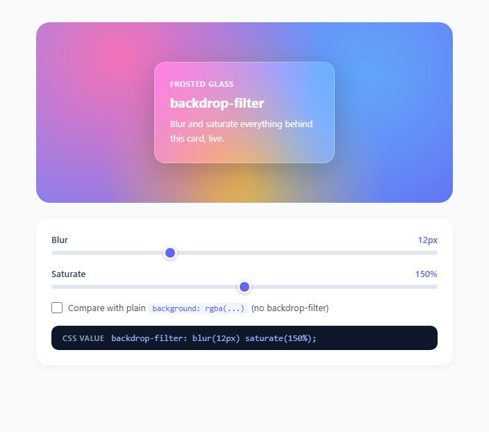
Two sliders build a live backdrop-filter: blur(Npx) saturate(P%) declaration applied directly to a card floating over a deliberately busy, multi-color radial-gradient background, so the blur and saturation effects are immediately obvious against the colorful backdrop. The exact generated CSS string is echoed as literal text so you can copy it straight into a stylesheet. A comparison toggle swaps the card to a "flat" mode using only background: rgba(30,30,46,0.55) with backdrop-filter: none — visually, the flat card simply darkens the busy background uniformly, with all of its color and detail still sharply visible through the translucency, while the frosted card genuinely obscures fine background detail into soft color fields, which is the entire visual and functional difference the two techniques exist to communicate.
Build with AI
Build, Understand, Optimize, and Extend It With AI
Paste this snippet's HTML, CSS, and JS into an AI coding assistant like Claude and ask it to explain precisely why backdrop-filter keeps the card's own text sharp while blurring only the background, and how that differs mechanically from the regular filter property. You could also ask it to add a third slider for brightness() or contrast() and have it explain how chaining additional filter functions changes the generated CSS string in update(). It's also a good candidate for extension: ask the assistant to add a real background photograph instead of the CSS gradient stage, wire up a "copy CSS" button next to the code readout, or add a second glass card so you can compare two different blur/saturate combinations side by side. Treat the demo as a working reference to interrogate and build on, not a finished black box.
Prompt to recreate it
Copy this into your AI assistant of choice to build the effect from scratch, or as a jumping-off point for your own variant:
Build an interactive frosted-glass CSS backdrop-filter playground in plain HTML, CSS, and JavaScript.

Requirements:
- A visually busy, multi-color background (a layered CSS gradient or similar) behind a floating card, chosen specifically so blur and saturation changes are obvious against it.
- Two range sliders controlling a blur radius in pixels (0-40) and a saturation percentage (0-300), each wired with an input event listener that rebuilds a backdrop-filter: blur(Npx) saturate(P%) value and applies it live to the card via both backdropFilter and webkitBackdropFilter inline style properties.
- A text readout that always displays the exact, currently-applied backdrop-filter CSS declaration as copyable code.
- A toggle that swaps the card into a "flat" comparison mode using backdrop-filter: none and a plain semi-transparent rgba() background color instead, disabling the sliders while in that mode since there is nothing left to adjust, so the user can directly compare frosted glass against the older flat-translucency technique on the identical background.
- Live-updating numeric labels next to each slider showing its current value with correct units (px for blur, % for saturate).
- Both the unprefixed backdrop-filter and the -webkit-backdrop-filter properties set together everywhere the effect is applied, for Safari compatibility, with a short code comment explaining why the prefix is still required.
- Custom-styled range slider thumbs with a visible focus state for keyboard accessibility.
Want to tighten it up first? Run this prompt through the AI Prompt Studio to score it across 8 quality dimensions, catch anti-patterns, and tune the wording for Claude, ChatGPT, or Gemini before you paste it in.
Step by step
How to Use
- 1Drag the Blur sliderThe #blur-slider ranges from 0 to 40 and maps directly to the pixel value inside blur() in the generated backdrop-filter declaration. At 0px the card is fully transparent with a sharp background visible through it; as the value increases, background detail smooths into soft color fields.
- 2Drag the Saturate sliderThe #sat-slider ranges from 0 to 300 percent and maps to saturate() in the same declaration. Below 100% the blurred background desaturates toward gray; above 100% (the demo's 150% default) colors intensify, which is what keeps a heavily blurred panel still feeling vivid rather than washed out.
- 3Read the generated CSS stringThe #css-output element mirrors the exact backdrop-filter declaration currently applied to #glass-card, formatted as valid CSS text, ready to copy into your own stylesheet alongside the required -webkit-backdrop-filter duplicate for Safari.
- 4Toggle the flat rgba comparisonCheck "Compare with plain background: rgba(...)" to swap the card into .flat mode, which sets backdrop-filter: none and relies solely on a semi-opaque rgba(30,30,46,0.55) background color. Both sliders disable themselves in this mode since there is no filter left to adjust.
- 5Compare the two techniques directlyToggle back and forth between frosted and flat mode over the same busy multi-color gradient background to see the core difference: the flat rgba card dims the background uniformly while keeping every detail sharp, whereas the frosted glass card genuinely blurs fine detail while staying vibrant, which is the whole reason backdrop-filter exists.
- 6Apply -webkit- prefix and a fallback in productionAlways declare both backdrop-filter and -webkit-backdrop-filter with identical values (Safari still requires the prefix), and set a fallback background-color for browsers with no support at all, so the panel remains legibly translucent even where the blur itself silently does nothing.
Real-world uses
Common Use Cases
Got questions?
Frequently Asked Questions
filter applies its functions (blur, saturate, brightness, etc.) to an element and everything rendered inside it — blurring a filter: blur(8px) container blurs its own text and children too. backdrop-filter applies the same functions only to whatever is rendered behind the element, leaving the element's own content perfectly sharp, which is what allows crisp white text to sit legibly on top of a heavily blurred, colorful background simultaneously.
Yes, still — Safari requires -webkit-backdrop-filter alongside the unprefixed backdrop-filter property even in recent versions, so production CSS should always declare both with identical values: -webkit-backdrop-filter: blur(12px) saturate(150%); backdrop-filter: blur(12px) saturate(150%);. Chrome, Edge, and Firefox have supported the unprefixed property for years and do not need the prefix, but including it is harmless and keeps Safari users fully covered.
The flat card only dims the background uniformly through a semi-transparent color layer — every pixel of detail behind it, sharp edges and all, is still visible, just darkened or tinted. The frosted card actually resamples and blurs the pixels behind it before compositing, destroying fine detail into soft color fields, which is a fundamentally different rendering operation and the entire reason backdrop-filter exists rather than just using a translucent background.
Yes, relatively — because the browser must continuously composite a filtered copy of everything behind the element, including as that background scrolls or animates, backdrop-filter is more GPU-intensive than a static background-color. Best practice is to apply it to a small number of prominent, mostly-static surfaces (a nav bar, a modal, a card) rather than broadly across many elements or large scrolling regions, and to keep blur radii as low as visually necessary.
Yes — backdrop-filter accepts the full CSS filter function list, including brightness(), contrast(), grayscale(), hue-rotate(), and invert(), and you can chain multiple functions in one declaration exactly as this demo chains blur() and saturate(), for example backdrop-filter: blur(10px) brightness(1.1) contrast(0.95) for a slightly brighter, softer glass variant.