You Might Also Like
Learn Coding Visually
Learn to code with interactive, live-preview playgrounds — HTML, CSS, JavaScript, React & more.
 HTML Playground42 lessons · Click-based · Live preview
 CSS PlaygroundLearn CSS with a live editor
 JavaScript Playground60 lessons · DOM · Async · Canvas
 React PlaygroundLearn React with a live code editor
 GSAP PlaygroundLearn GSAP animation interactively
 SVG Playground44 lessons · shapes · paths · animation
 SCSS Playground45 lessons · Sass modules · tokens
 Tailwind PlaygroundLearn Tailwind CSS with a live editor
 Bootstrap 5 Playground50 lessons · live preview
CSS :has() Selector Playground — Free HTML CSS JS Snippet
CSS :has() Selector Playground · Cards · Plain HTML, CSS & JS · Live preview
What's included
Features
About this UI Snippet
CSS :has() Selector Playground — The Native Parent Selector for Conditional Styling
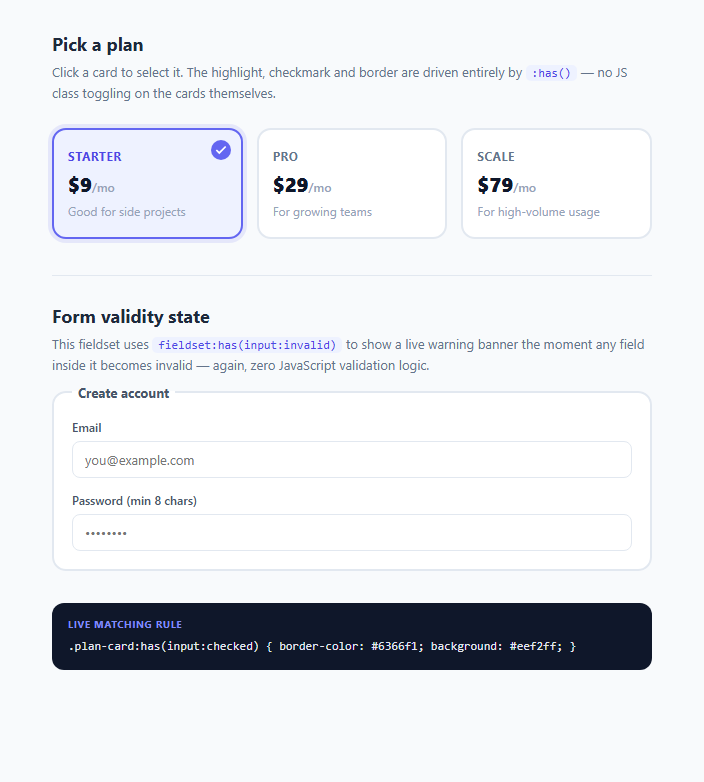
For as long as CSS has existed, selectors could only look downward or sideways — you could style a child based on its parent's class, or a sibling based on the element before it, but you could never style a parent based on what was happening inside it. That gap closed with the :has() relational pseudo-class, sometimes nicknamed the "parent selector," which shipped in all major browsers (Chrome, Edge, Safari, Firefox 121+) through 2023 and is now considered baseline-safe for 2025/2026 production work. This playground demonstrates two real, common UI problems that :has() solves without a single line of JavaScript state management.
How :has() works technically
:has() takes a relative selector argument and matches any element that contains at least one descendant matching that argument. Written as A:has(B), it selects A if A contains B anywhere in its subtree (not just as a direct child, unless you scope it with the child combinator like :has(> B)). Critically, :has() can reference pseudo-classes on the descendant, such as :checked, :invalid, :focus, or :disabled — meaning the parent's appearance can react live to the interactive state of an input buried inside it. This is the mechanism behind both demos above: .plan-card:has(input:checked) matches a card label the instant its internal radio button becomes checked, and fieldset:has(input:invalid:not(:placeholder-shown)) matches the fieldset the instant any field inside it fails HTML validation after the user has typed something.
Why this matters for modern UI development
Before :has(), both of these effects required JavaScript: an event listener on every radio button to add/remove a "selected" class on its parent card, and a submit or input listener to toggle a warning banner's visibility based on aggregated validity across multiple fields. That JavaScript had to stay in sync with the DOM, handle edge cases like programmatic value changes, and re-run on every relevant event. With :has(), the browser's own style engine does this work — the rule re-evaluates automatically whenever the matched state changes, with no listeners, no reflow thrashing from manual class toggles, and no risk of the visual state drifting out of sync with the actual DOM state. This is a meaningful simplification for form-heavy dashboards, pricing pages, and settings panels where "does this container have an active/invalid/checked descendant" is an extremely common question to answer visually.
The card selection pattern
The card grid wraps each <input type="radio"> inside a <label class="plan-card">, which is itself already a common accessibility pattern — clicking anywhere on the label toggles the input. Layering :has(input:checked) on top means the selected-state border, background tint, and checkmark icon are pure CSS side effects of that native radio behavior, keyboard navigation (arrow keys move between radios in a group) included for free.
The form validity pattern
The signup fieldset combines :invalid (from the browser's built-in constraint validation, driven by type="email", required, and minlength="8") with :not(:placeholder-shown) — a trick that suppresses the invalid style until the user has actually typed something, avoiding the jarring experience of a form that looks broken before you've touched it. fieldset:has(...) then promotes that single-field state up to the whole group, showing an aggregate warning banner.
Browser support caveats
:has() has shipped in Chrome/Edge 105+, Safari 15.4+, and Firefox 121+ (December 2023), giving it broad coverage today, but any project supporting older Firefox ESR or legacy Safari should feature-detect with CSS.supports("selector(:has(a))") and provide a JavaScript fallback for critical UI.
Build with AI
Build, Understand, Optimize, and Extend It With AI
Paste this snippet's HTML and CSS into an AI coding assistant like Claude and ask it to trace exactly how .plan-card:has(input:checked) and fieldset:has(input:invalid:not(:placeholder-shown)) get evaluated by the browser — it can walk through the selector matching step by step, including why :not(:placeholder-shown) is needed to avoid showing errors on page load. You could also ask it to extend the demo: add a fourth "Enterprise" card with a :has()-driven "Popular" ribbon, or add a new rule that dims non-selected cards when the grid has any :hover match. It's also a good target for a browser-compatibility question — ask it to write the CSS.supports() feature-detection fallback and an equivalent JS-driven version of both patterns for browsers that don't support :has().
Prompt to recreate it
Copy this into your AI assistant of choice to build the effect from scratch, or as a jumping-off point for your own variant:
Build an interactive HTML/CSS/JS playground that demonstrates the CSS :has() relational selector using two real UI patterns: a selectable pricing card grid and a form fieldset with aggregate validity feedback.

Requirements:
- A grid of 3 plan cards, each an actual <label> wrapping a radio <input>, where the selected card's border color, background tint, and a checkmark icon are controlled purely by a CSS rule like .plan-card:has(input:checked) — no JavaScript class toggling on click.
- A fieldset containing at least two real HTML5-validated inputs (e.g. type="email" required, and a password with minlength), where the fieldset itself gets a red border and a warning banner appears the moment any input inside becomes invalid, using fieldset:has(input:invalid:not(:placeholder-shown)) so the warning does not show before the user has typed anything.
- A small "live CSS rule" text panel that updates via a minimal JS listener purely to display which :has() rule is conceptually active, making clear that this display panel is not what drives the actual styling.
- Keep all state resolution in CSS — JavaScript should only be used for the informational panel text, never to toggle the actual highlight/warning classes.
- Preserve native accessibility: labels wrapping inputs for large click targets, working keyboard radio-group navigation, and HTML5 constraint validation attributes (required, type, minlength) driving the :invalid state.
- Add smooth CSS transitions (200ms range) on border-color, background, and the checkmark's opacity/transform so state changes feel polished rather than instant.
- Use a neutral palette with a single accent color (indigo, #6366f1) for selected/valid states and a red/rose tone for the invalid warning state.
Want to tighten it up first? Run this prompt through the AI Prompt Studio to score it across 8 quality dimensions, catch anti-patterns, and tune the wording for Claude, ChatGPT, or Gemini before you paste it in.
Step by step
How to Use
- 1Select a plan cardClick any of the three plan cards. Watch the border color, background tint, and the checkmark icon appear — all driven by the CSS rule .plan-card:has(input:checked), not a JS class toggle. The "live rule" panel at the bottom updates to show the exact selector conceptually in effect.
- 2Trigger the invalid-form stateType an incomplete email (e.g. "test") or a password under 8 characters into the signup-fieldset fields, then click away. The fieldset border turns red and a warning banner appears — because fieldset:has(input:invalid:not(:placeholder-shown)) now matches.
- 3Fix the fields to clear the warningCorrect the email format and lengthen the password to 8+ characters. As soon as both inputs pass HTML5 constraint validation, the :invalid pseudo-class stops matching, :has() stops matching, and the warning disappears automatically — no JS re-check required.
- 4Inspect the CSS panelThe dark panel at the bottom of the demo shows the current CSS selector as plain text, updated by a small JS listener purely for teaching purposes — it has no effect on the actual styling, which remains 100% CSS-driven.
- 5Extend with your own :has() rulesTry adding a new rule like .card-grid:has(.plan-card:hover) to dim unselected cards on hover, or form:has(input:focus) to highlight the entire form when any field inside it has focus — both are one-line additions to the css panel.
- 6Export and adaptClick HTML to download a standalone file, or JSX/Vue/Angular to get a framework component. In React, the CSS stays identical — :has() needs no JS state at all, so the component can be nearly stateless aside from standard form field values.
Real-world uses
Common Use Cases
Got questions?
Frequently Asked Questions
It selects the parent (or ancestor). Written as A:has(B), the browser finds every element matching A that contains at least one descendant matching B anywhere below it in the DOM tree, and applies the rule's styles to A itself, not B. You can scope it to direct children only with the child combinator, e.g. A:has(> B).
Yes — this is exactly what makes it powerful for interactive UI. :has(input:checked), :has(input:invalid), :has(input:focus), and :has(button:disabled) are all valid and re-evaluate live as the matched descendant's state changes, with no JavaScript required to keep the parent's styling in sync.
Yes for the vast majority of audiences. It has shipped in Chrome/Edge since version 105 (2022), Safari since 15.4, and Firefox since 121 (December 2023) — all evergreen browsers used today support it. Check caniuse.com for your specific audience, and use CSS.supports("selector(:has(a))") to detect support and fall back to a JS-driven class toggle for older or unusual browsers.
Modern browser engines optimize :has() matching, but because it requires the engine to look forward/downward into descendants rather than just backward through ancestors, deeply nested or very broad :has() selectors (like body:has(.some-rare-class)) can be more expensive to re-evaluate on every DOM mutation than a simple class selector. For typical component-scoped use like the card grid and fieldset shown here, the cost is negligible; avoid applying :has() at very high-traffic elements like html or body with wide search scope.
The rule uses :invalid:not(:placeholder-shown) specifically so empty required fields do not look broken before the user interacts with them. :placeholder-shown only matches an input while it is empty and showing its placeholder text, so as soon as the user types and the field is genuinely invalid, :placeholder-shown stops matching, :not(:placeholder-shown) starts matching, and the warning becomes visible.