You Might Also Like
Learn Coding Visually
Learn to code with interactive, live-preview playgrounds — HTML, CSS, JavaScript, React & more.
 HTML Playground42 lessons · Click-based · Live preview
 CSS PlaygroundLearn CSS with a live editor
 JavaScript Playground60 lessons · DOM · Async · Canvas
 React PlaygroundLearn React with a live code editor
 GSAP PlaygroundLearn GSAP animation interactively
 SVG Playground44 lessons · shapes · paths · animation
 SCSS Playground45 lessons · Sass modules · tokens
 Tailwind PlaygroundLearn Tailwind CSS with a live editor
 Bootstrap 5 Playground50 lessons · live preview
Wishlist Heart Button — Free HTML CSS JS Like Snippet
Wishlist Heart Button · Buttons · Plain HTML, CSS & JS · Live preview
What's included
Features
About this UI Snippet
Wishlist Heart Button — Animated Favorite Toggle with Pop and Particle Burst
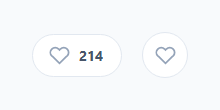
The heart/favourite/wishlist toggle is everywhere — product cards, listings, posts, playlists — and the satisfying ones share two traits: a springy pop when you tap them and a little burst of particles confirming the action. This component delivers both, in two variants (a pill button with a live count and a bare icon button), with an optimistic count update and proper aria-pressed state. It is built in HTML, CSS, and vanilla JavaScript, and the animations are pure CSS keyframes re-triggered from JavaScript.
Toggle state on aria-pressed
Rather than tracking state in a JavaScript variable or an extra class, the button's on/off state lives in its aria-pressed attribute — which is also exactly what a toggle button needs for accessibility. CSS targets [aria-pressed="true"] to fill the heart red, tint the button background pink, and recolour the count, so the visual state is driven directly by the accessibility state. There is one source of truth, and screen readers announce the button as "pressed" when it is favourited.
The spring pop
When you favourite, the heart plays a whbPop keyframe: it dips to scale(0.78), overshoots to scale(1.25), and settles back to scale(1), using a cubic-bezier(0.2, 1.6, 0.4, 1) easing whose value above 1 creates the spring overshoot. This squash-then-stretch is what makes the tap feel physical and rewarding rather than a flat colour change. The pop only plays on toggle-on, not toggle-off, matching the asymmetry users expect (favouriting is celebrated; un-favouriting is quiet).
Re-triggering a CSS animation
A CSS animation only plays once when its class is added; adding the same class again does nothing because the class is already present. To replay the pop on every favourite, the handler removes the animation classes, forces a reflow with void btn.offsetWidth — which flushes the style change so the browser treats the next class add as a fresh animation — then re-adds them. This reflow trick is the standard way to restart a CSS animation from JavaScript, and it is why rapid repeated taps each get their own pop.
The particle burst
Around the heart, a .whb-burst element fires six dots outward on favourite. The trick is doing six particles with no extra DOM: a ::before and ::after pseudo-element each carry three dots via a triple box-shadow, and the keyframes animate those shadows from the centre outward (up-left, up-right, up; and down-left, down-right, down) while fading to transparent. Each dot is a different pink/rose shade. It is a self-contained confetti effect in pure CSS — no canvas, no particle library, no DOM churn — that cleans itself up when the animation ends.
Optimistic count
The pill variant shows a like count. On toggle it updates immediately — plus one on favourite, minus one on un-favourite — parsed from the displayed text and re-formatted with toLocaleString() so large counts keep their thousands separators, and rendered with tabular-nums so the digits do not shift width as the number changes. This is an optimistic update: the UI responds instantly rather than waiting for a server, which is what makes the interaction feel snappy. In production you would reconcile with the real count from your API.
Customisation
Both variants are wired by one wireHeart() function applied to every .whb-btn and .whb-icon, so you can drop the markup anywhere and it just works. Swap the rose palette (#f43f5e and the burst shades) for your brand, adjust the pop easing and the burst distances in the keyframes, and connect the click handler to your favourite/wishlist API. Pre-set aria-pressed="true" to render an already-favourited item on load.
Build with AI
Build, Understand, Optimize, and Extend It With AI
Ask an AI coding assistant like Claude to explain exactly why void btn.offsetWidth appears between removing and re-adding the animation classes in wireHeart() — that forced-reflow trick is the whole reason rapid repeated taps each get a fresh pop and burst instead of the second click doing nothing. It's also worth asking how six particles are drawn from just two pseudo-elements using triple box-shadows, since that's a neat technique worth reusing elsewhere. For extending it, ask for a version that persists the favorited state to localStorage or an API with optimistic-then-reconciled updates, a bookmark-icon variant sharing the same wiring, or a batch "favorite all visible items" action that staggers the pop animation across a grid of cards. Treat the code less like a finished artifact and more like a starting point for a conversation.
Prompt to recreate it
Copy this into your AI assistant of choice to build the effect from scratch, or as a jumping-off point for your own variant:
Build an animated wishlist/favorite heart toggle button in plain HTML, CSS, and JavaScript with a spring pop and a particle burst confetti effect — no canvas, no animation library.

Requirements:
- The button's on/off state must live entirely in its aria-pressed attribute, not in a separate JavaScript variable or CSS-only class — style the filled/unfilled heart and any color changes purely from a [aria-pressed="true"] CSS attribute selector.
- On favoriting (toggling from false to true), play a squash-and-overshoot keyframe animation on the heart icon using a cubic-bezier easing whose value exceeds 1 to create a spring overshoot, and ensure this pop animation does NOT play when un-favoriting.
- Because a CSS animation only plays once per class application, implement the replay correctly: remove the animation classes, force a synchronous layout reflow by reading a layout-triggering property (such as offsetWidth) on the element, then re-add the classes — verify that rapidly clicking the button multiple times in a row replays the full animation every single time with no dead clicks.
- Build a six-dot particle burst using only two pseudo-elements (::before and ::after), each carrying three dots via a triple box-shadow value, animated outward from the button's center via keyframes that change the box-shadow offsets while fading opacity to zero — no additional DOM elements may be created for the particles.
- Include a live count next to the heart that increments on favorite and decrements on un-favorite, formatted with locale-aware thousands separators and rendered with a tabular-number font so the digit width doesn't shift as the count changes.
- Provide both a pill variant (with the visible count) and a bare circular icon-only variant, both wired through the exact same reusable function so adding the markup anywhere just works.
Want to tighten it up first? Run this prompt through the AI Prompt Studio to score it across 8 quality dimensions, catch anti-patterns, and tune the wording for Claude, ChatGPT, or Gemini before you paste it in.
Step by step
How to Use
- 1Paste the HTML, CSS, and JSA pill heart button with a count and a round icon heart button both render in their unfavourited (grey outline) state.
- 2Click a heartThe heart fills red with a springy pop, a burst of pink particles fires outward, and the pill's count increments by one.
- 3Click again to unfavouriteThe heart returns to grey outline quietly (no pop) and the count decrements.
- 4Tap rapidlyEach favourite re-triggers the pop and burst from the start thanks to the reflow restart, so quick taps stay responsive.
- 5Pre-favourite an itemSet aria-pressed="true" on the button in markup to render an already-saved item on load.
- 6Theme and connectSwap the rose palette for your brand and wire the click handler to your wishlist/favourite API.
Real-world uses
Common Use Cases
Got questions?
Frequently Asked Questions
A CSS animation runs once per class application, so re-adding an already-present class does nothing. The fix is to remove the animation class, force a reflow by reading a layout property (void btn.offsetWidth), then re-add the class — the reflow makes the browser treat the re-add as a brand-new animation. This snippet does exactly that for the pop and burst so every favourite tap animates, even rapid ones.
The .whb-burst element's ::before and ::after pseudo-elements each hold three dots using a triple box-shadow. The keyframes animate those box-shadow offsets from the centre outward in six directions while fading opacity to 0. It is purely declarative — no DOM nodes are created or destroyed, nothing to clean up — which makes it cheap and reliable. Adjust the offsets in the whbP1/whbP2 keyframes to change the spread.
aria-pressed is the correct ARIA attribute for a toggle button, so a screen reader announces "pressed" when the item is favourited. By styling [aria-pressed="true"] directly in CSS, the visual state and the accessibility state can never disagree — there is no separate class to keep in sync. It is one attribute doing double duty as state and as accessibility.
It is an optimistic local update for demo purposes — clicking adds or subtracts one immediately so the UI feels instant. In production you would send the favourite to your API and reconcile with the server's authoritative count, ideally rolling back the optimistic change if the request fails. The toLocaleString() formatting and tabular-nums styling are there so real large counts display cleanly.
Hold a favourited boolean (and count) in state and bind aria-pressed to it. On click, flip the boolean and adjust the count. For the pop/burst replay, toggle an animating flag: set it false then true (React needs a key change or a forced reflow in a ref to restart), or simply remount the heart via a key. Bind .whb-pop/.whb-go to that flag and clear it on animationEnd. The CSS keyframes, particle burst, and aria-pressed styling port unchanged.