
Learn Coding Visually
Learn to code with interactive, live-preview playgrounds — HTML, CSS, JavaScript, React & more.
 HTML Playground42 lessons · Click-based · Live preview
 CSS PlaygroundLearn CSS with a live editor
 JavaScript Playground60 lessons · DOM · Async · Canvas
 React PlaygroundLearn React with a live code editor
 GSAP PlaygroundLearn GSAP animation interactively
 SVG Playground44 lessons · shapes · paths · animation
 SCSS Playground45 lessons · Sass modules · tokens
 Tailwind PlaygroundLearn Tailwind CSS with a live editor
 Bootstrap 5 Playground50 lessons · live preview
Thumbnail Gallery — Free HTML CSS JS Image Snippet
Thumbnail Gallery · Cards · Plain HTML, CSS & JS · Live preview
What's included
Features
About this UI Snippet
Thumbnail Gallery — Main Image with Clickable Thumbnail Strip and Cross-Fade
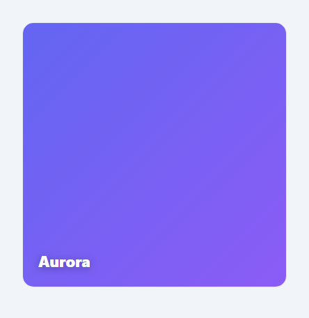
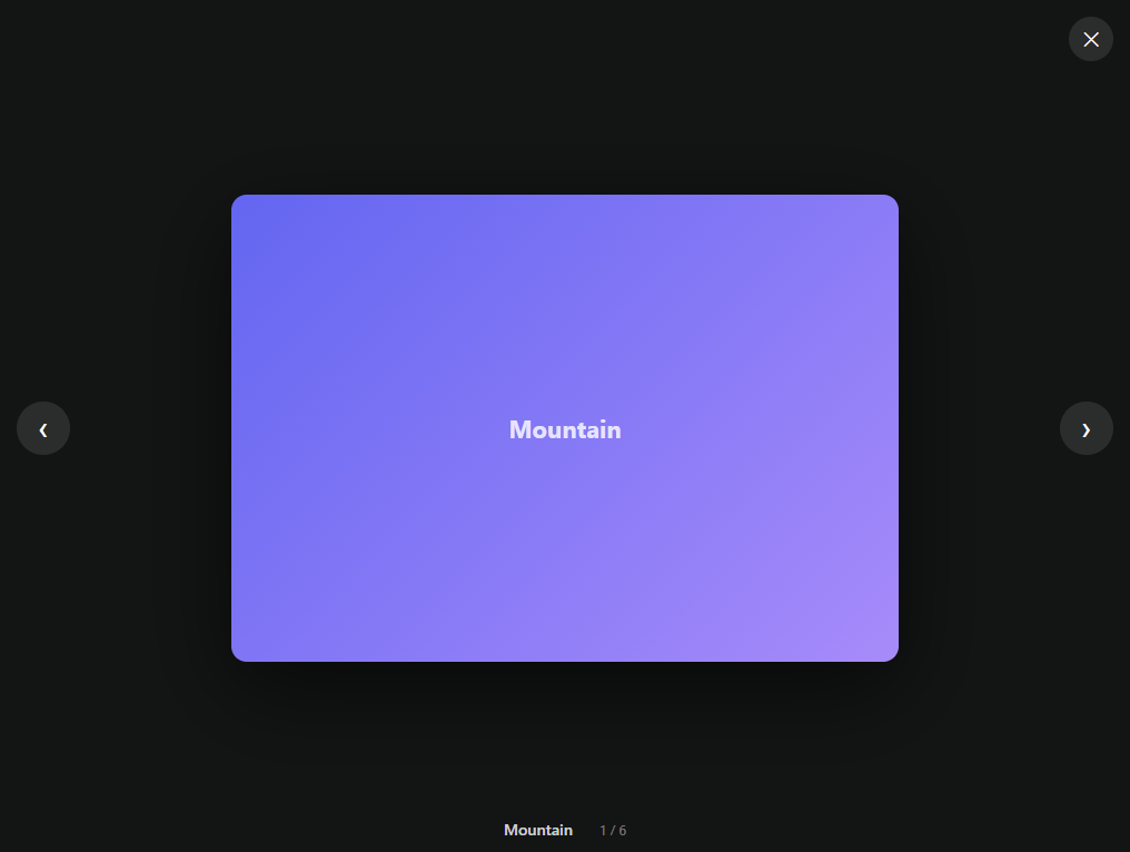
The thumbnail gallery is the standard way e-commerce sites show multiple product photos: one large main image, a row of smaller thumbnails beneath it, and a click on any thumbnail swaps it into the main view. Amazon, Shopify storefronts, and almost every product detail page use this pattern because it lets a shopper see one image clearly while keeping every alternate angle one click away. This component implements it in plain HTML, CSS, and vanilla JavaScript, with a smooth cross-fade between images, an active-thumbnail highlight, and full keyboard navigation. It uses CSS gradients as stand-in images so it runs with no external assets, but swapping in real <img> tags is a one-line change.
Layout: aspect-ratio main stage and a grid of thumbs
The main view uses aspect-ratio: 1 / 1 so it stays perfectly square at any width without a fixed pixel height — the modern replacement for the old padding-top percentage hack. The thumbnail strip is a five-column CSS grid with a consistent gap, and each thumbnail also uses aspect-ratio: 1 / 1 so the row of thumbs is always uniform regardless of the container width. Because both the stage and thumbs are ratio-locked, the whole gallery scales fluidly inside its max-width wrapper.
Data-driven rendering
The gallery is driven by an IMAGES array of { label, bg } objects. On load, the script loops over the array with document.createElement to build each thumbnail <button>, attach its click handler, and apply its background. This data-driven approach means adding or removing an image is a matter of editing the array — no markup changes. Each thumbnail is a real <button> (not a div) so it is focusable and clickable by keyboard out of the box, and it carries role="tab" and aria-selected so assistive technology understands the gallery as a set of selectable views.
The cross-fade transition
Clicking a thumbnail does not snap the main image — it cross-fades. The select() function adds a .fading class that animates the stage's opacity to 0 over 180ms, then in a setTimeout it swaps the background and label and removes the class, fading the new image back in. This fade-out-swap-fade-in sequence hides the hard cut and makes the gallery feel polished. The timeout duration is matched to the CSS transition so the swap happens exactly at the invisible midpoint. A guard at the top of select() returns early if you click the already-active thumbnail, so there is no pointless fade.
Active-state highlighting
The selected thumbnail gets an .active class that shows an indigo border and removes a translucent white overlay. Every thumbnail has a ::after pseudo-element that lays a semi-transparent white veil over it; inactive thumbs are dimmed by this veil, the hovered thumb is partly cleared, and the active thumb is fully cleared and bordered. This is a pure-CSS way to make the current selection pop without changing the image itself, and it gives instant hover feedback with no JavaScript.
Keyboard navigation
The thumbnail strip listens for ArrowRight and ArrowLeft on keydown. Pressing an arrow computes the next index with wrap-around using (active + dir + length) % length — so the selection cycles from the last thumb back to the first and vice versa — calls select(), and moves focus to the newly active thumbnail with .focus(). This makes the gallery fully operable without a mouse, matching the keyboard expectations of a tablist.
Customisation
To use real photos, replace the gradient bg values with image URLs and render an <img src> inside each thumbnail and the stage instead of setting a background. Change grid-template-columns: repeat(5, 1fr) to show more or fewer thumbnails per row, swap the #6366f1 active-border colour for your brand, and adjust the 180ms fade timing (in both the CSS transition and the JS timeout together) to make swaps faster or slower.
Build with AI
Build, Understand, Optimize, and Extend It With AI
Ask an AI coding assistant like Claude to explain why select() swaps the stage's background inside a setTimeout matched to the CSS opacity transition duration rather than swapping it immediately — that 180ms handoff is the entire trick behind the cross-fade feeling seamless instead of jarring. It's also worth asking whether the fixed 180ms timeout could drift out of sync with the CSS transition if someone edits one but forgets the other, and how you'd make them share a single source of truth. For extending the gallery, ask for pinch-to-zoom or a fullscreen lightbox on tapping the main image, a thumbnail strip that scrolls horizontally instead of wrapping into a grid, or an autoplay mode that pauses on hover and resumes on mouse leave. Treat the code less like a finished artifact and more like a starting point for a conversation.
Prompt to recreate it
Copy this into your AI assistant of choice to build the effect from scratch, or as a jumping-off point for your own variant:
Build a product image gallery in plain HTML, CSS, and JavaScript with a large main view and a clickable thumbnail strip beneath it, no library.

Requirements:
- Drive the whole gallery from a single data array of image objects (each with a label and a background/image value), building every thumbnail button dynamically from that array rather than hand-writing markup per image.
- Both the main stage and every thumbnail must use aspect-ratio: 1 / 1 (not a fixed pixel height) so the whole gallery scales fluidly at any container width.
- Clicking a thumbnail must not swap the main image instantly — it must add a class that fades the stage's opacity to 0 over roughly 180 milliseconds, swap the underlying image/background and label while it is invisible, then remove the class so the new image fades back in, with the JavaScript timeout duration matched to the CSS transition duration.
- Guard the select function so clicking the already-active thumbnail does nothing and never triggers a needless fade.
- Every thumbnail must be a real button element with role="tab" and aria-selected reflecting whether it is the current selection, and the currently active thumbnail must show a distinct border plus a cleared hover overlay compared to inactive ones.
- The thumbnail strip must support ArrowLeft/ArrowRight keyboard navigation that moves the selection with wrap-around (so pressing right on the last thumbnail jumps back to the first), calling the same select function used by clicks and also moving DOM focus to the newly active thumbnail.
Want to tighten it up first? Run this prompt through the AI Prompt Studio to score it across 8 quality dimensions, catch anti-patterns, and tune the wording for Claude, ChatGPT, or Gemini before you paste it in.
Source Code
<div class="tg-gallery" id="tgGallery">
  <div class="tg-main">
    <div class="tg-stage" id="tgStage" style="background:linear-gradient(135deg,#6366f1,#8b5cf6)">
      <span class="tg-stage-label" id="tgLabel">Aurora</span>
    </div>
  </div>
  <div class="tg-thumbs" id="tgThumbs" role="tablist" aria-label="Product images"></div>
</div>
* { box-sizing: border-box; margin: 0; padding: 0; }
body { font-family: system-ui, -apple-system, sans-serif; background: #f1f5f9; min-height: 100vh; display: flex; align-items: center; justify-content: center; padding: 32px; }
.tg-gallery { width: 100%; max-width: 380px; }
.tg-main {
position: relative;
width: 100%;
aspect-ratio: 1 / 1;
border-radius: 16px;
overflow: hidden;
background: #fff;
border: 1px solid #e2e8f0;
}
.tg-stage {
position: absolute;
inset: 0;
display: flex;
align-items: flex-end;
padding: 22px;
transition: opacity 0.35s ease;
}
.tg-stage.fading { opacity: 0; }
.tg-stage-label {
color: #fff;
font-size: 22px;
font-weight: 800;
letter-spacing: -0.01em;
text-shadow: 0 2px 12px rgba(0, 0, 0, 0.3);
}
.tg-thumbs {
display: grid;
grid-template-columns: repeat(5, 1fr);
gap: 10px;
margin-top: 12px;
}
.tg-thumb {
position: relative;
aspect-ratio: 1 / 1;
border-radius: 10px;
border: 2px solid transparent;
cursor: pointer;
overflow: hidden;
padding: 0;
background: none;
transition: border-color 0.18s, transform 0.12s;
}
.tg-thumb::after {
content: '';
position: absolute;
inset: 0;
background: rgba(255, 255, 255, 0.5);
opacity: 1;
transition: opacity 0.18s;
}
.tg-thumb:hover { transform: translateY(-2px); }
.tg-thumb:hover::after { opacity: 0.25; }
.tg-thumb.active { border-color: #6366f1; }
.tg-thumb.active::after { opacity: 0; }
.tg-thumb-fill { position: absolute; inset: 0; }const IMAGES = [
{ label: 'Aurora', bg: 'linear-gradient(135deg,#6366f1,#8b5cf6)' },
{ label: 'Sunset', bg: 'linear-gradient(135deg,#f97316,#ec4899)' },
{ label: 'Ocean', bg: 'linear-gradient(135deg,#0ea5e9,#22d3ee)' },
{ label: 'Forest', bg: 'linear-gradient(135deg,#16a34a,#84cc16)' },
{ label: 'Ember', bg: 'linear-gradient(135deg,#ef4444,#f59e0b)' },
];
const stage = document.getElementById('tgStage');
const label = document.getElementById('tgLabel');
const thumbsWrap = document.getElementById('tgThumbs');
let active = 0;
function select(index) {
if (index === active) return;
active = index;
const img = IMAGES[index];
// Cross-fade the main stage
stage.classList.add('fading');
setTimeout(() => {
stage.style.background = img.bg;
label.textContent = img.label;
stage.classList.remove('fading');
}, 180);
[...thumbsWrap.children].forEach((btn, i) => {
btn.classList.toggle('active', i === index);
btn.setAttribute('aria-selected', i === index);
});
}
IMAGES.forEach((img, i) => {
const btn = document.createElement('button');
btn.className = 'tg-thumb' + (i === 0 ? ' active' : '');
btn.type = 'button';
btn.setAttribute('role', 'tab');
btn.setAttribute('aria-label', img.label);
btn.setAttribute('aria-selected', i === 0);
const fill = document.createElement('span');
fill.className = 'tg-thumb-fill';
fill.style.background = img.bg;
btn.appendChild(fill);
btn.addEventListener('click', () => select(i));
thumbsWrap.appendChild(btn);
});
// Arrow-key navigation across thumbnails
thumbsWrap.addEventListener('keydown', (e) => {
if (e.key !== 'ArrowRight' && e.key !== 'ArrowLeft') return;
e.preventDefault();
const dir = e.key === 'ArrowRight' ? 1 : -1;
const next = (active + dir + IMAGES.length) % IMAGES.length;
select(next);
thumbsWrap.children[next].focus();
});Step by step
How to Use
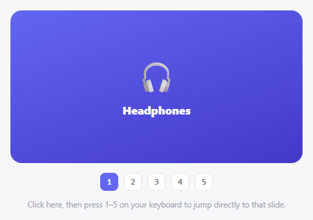
- 1Paste the HTML, CSS, and JSA square main image renders above a row of five thumbnails, with the first thumbnail active.
- 2Click a thumbnailThe main image cross-fades to the selected image and its label updates; the clicked thumbnail gets the indigo active border.
- 3Use arrow keysFocus a thumbnail and press the left/right arrows to move through the images with wrap-around, focus following the selection.
- 4Swap in real imagesReplace the gradient bg values in the IMAGES array with image URLs and render <img> tags in the stage and thumbnails.
- 5Add or remove imagesEdit the IMAGES array — thumbnails and behaviour update automatically since rendering is data-driven.
- 6Tune the lookChange the thumbnail column count, the active border colour, and the fade duration (CSS transition + JS timeout) to taste.
Real-world uses
Common Use Cases
Got questions?
Frequently Asked Questions
Change each IMAGES entry to { label, src: 'photo.jpg' }. In the build loop, append an <img src={img.src}> to the thumbnail instead of setting fill.style.background, and in select() set the stage to show an <img> (or use background-image: url(...)) rather than a gradient. Add object-fit: cover to the images so they fill their square containers without distortion.
Edit grid-template-columns: repeat(5, 1fr) on .tg-thumbs — change 5 to your desired count. For a scrolling strip instead of a wrapping grid, set .tg-thumbs to display: flex; overflow-x: auto and give each thumb a fixed flex-basis. The cross-fade and keyboard logic are independent of the layout, so neither needs changes.
Yes. Add setInterval(() => select((active + 1) % IMAGES.length), 4000) after the setup. Pause it on hover or focus by clearing the interval in a mouseenter/focusin handler and restarting it on mouseleave/focusout, so the user can study an image without it changing under them.
The opacity transition lives in CSS (0.35s on .tg-stage), but the image swap must happen while the stage is invisible — at the midpoint of the fade. The JS setTimeout of 180ms swaps the background at that point, then removes .fading to fade the new image in. If you change the fade speed, update both the CSS transition and the JS timeout together so the swap stays hidden.
Store the active index in state and render the IMAGES array with .map (React), v-for (Vue), or *ngFor (Angular). The main view's background/src binds to IMAGES[active], and each thumbnail's onClick sets the index. For the cross-fade, toggle a "fading" class via state and use a timeout (cleared on unmount) to swap, or simpler, animate opacity with a CSS transition keyed off the active index. The arrow-key handler attaches to the strip's onKeyDown.