

Learn Coding Visually
Learn to code with interactive, live-preview playgrounds — HTML, CSS, JavaScript, React & more.
 HTML Playground42 lessons · Click-based · Live preview
 CSS PlaygroundLearn CSS with a live editor
 JavaScript Playground60 lessons · DOM · Async · Canvas
 React PlaygroundLearn React with a live code editor
 GSAP PlaygroundLearn GSAP animation interactively
 SVG Playground44 lessons · shapes · paths · animation
 SCSS Playground45 lessons · Sass modules · tokens
 Tailwind PlaygroundLearn Tailwind CSS with a live editor
 Bootstrap 5 Playground50 lessons · live preview
Micromodal Accessible Modal (Focus Trap Verified) — Free Snippet
Micromodal Accessible Modal (Focus Trap Verified) · Modals · Plain HTML, CSS & JS · Live preview
What's included
Features
About this UI Snippet
Micromodal Accessible Modal — What "Accessible" Actually Requires
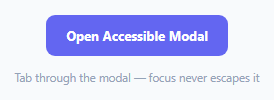
A modal that merely looks like a dialog isn't accessible — real accessibility means keyboard focus is trapped inside it while open (Tab never reaches page content behind the overlay), Escape closes it, and focus returns to whatever triggered it on close. Micromodal implements all three from a handful of data-* attributes, rather than requiring hand-written focus management.
Everything wires up from data attributes, not JavaScript event listeners
data-micromodal-trigger="mm-modal" on the open button and data-micromodal-close on the overlay/close button/cancel button are what MicroModal.init() scans for and wires up automatically — there's no manually-written addEventListener('click', openModal) anywhere in this snippet's JavaScript for the standard open/close interactions.
role="dialog", aria-modal="true", and aria-labelledby aren't decorative
These three attributes on .modal__container are what assistive technology actually uses to understand the element is a modal dialog, that content behind it is inert while open, and which element serves as its accessible title (aria-labelledby="mm-title" pointing at the <h2>) — without them, a screen reader user would have no indication they've entered a modal context at all, regardless of how the focus trap behaves visually.
Focus is genuinely trapped, not just visually contained
While the modal is open, pressing Tab repeatedly cycles only through the modal's own focusable elements (the email input, role select, Send button, Cancel button, close button) — it never reaches the page content behind the dark overlay, even though that content is still technically present in the DOM. This is Micromodal's actual focus-trap implementation, not a CSS effect.
Closing restores focus to where it came from
When the modal closes — by Escape, the × button, Cancel, or a successful invite send — focus moves back to the original "Open Accessible Modal" trigger button, not to the top of the page or nowhere at all. That restoration is what lets a keyboard user continue exactly where they left off.
awaitOpenAnimation/awaitCloseAnimation sync JS state to the CSS animation
Since this modal fades and slides in via CSS @keyframes rather than opening instantly, these two options tell Micromodal to wait for the animation's animationend event before considering the open/close transition complete — without them, rapid interaction during the animation could leave the modal in a visually-mid-transition but logically-already-toggled state.
Reusing it
Swap the invite form for any modal content — the data-micromodal-trigger/data-micromodal-close attributes, the ARIA roles, and the MicroModal.init() call are the entire reusable skeleton; only the content inside .modal__content needs to change.
Build with AI
Build, Understand, Optimize, and Extend It With AI
You don't have to hand-build focus-trap logic to get a genuinely accessible modal. Paste this snippet's HTML, CSS, and JS into an AI coding assistant like Claude and ask it to explain exactly what "focus trapping" means in practice and how Micromodal implements it, plus why the ARIA attributes (role, aria-modal, aria-labelledby) matter independently of the visual and keyboard behavior. The same assistant can help optimize it — ask whether the disableFocus and disableScroll options are configured correctly for this specific use case, and what disableFocus: false actually changes about the modal's default focus behavior on open. It's also useful for extending the effect: ask it to add a second, nested confirmation modal that opens on top of this one (and correctly restores focus through both layers on close), connect the Send Invite button to a real API call with a loading state, or add client-side email validation with an inline error message before allowing the invite to send. Treat the code less like a finished artifact and more like a starting point for a conversation.
Prompt to recreate it
Copy this into your AI assistant of choice to build the effect from scratch, or as a jumping-off point for your own variant:
Build a genuinely accessible modal dialog (with real keyboard focus trapping, not just visual overlay styling) using the Micromodal library (load Micromodal's JS from a CDN, no other library), in plain HTML, CSS, and JavaScript.

Requirements:
- Create a trigger button and a modal dialog, wired together using the library's own data-attribute-based trigger and close mechanisms (not manually written click event listeners for opening or closing) — the modal should open when the trigger is clicked and close via a visible × button, a Cancel button, clicking the dark overlay outside the dialog, and pressing the Escape key.
- Include correct ARIA attributes on the modal so it's identified as a dialog to assistive technology, marks page content behind it as inert while open, and is properly labeled by its own heading text.
- The modal's content should be a small form (for example, an email input and a role dropdown) with at least two footer action buttons (a primary action and a cancel action).
- Verify and ensure that while the modal is open, repeatedly pressing Tab cycles keyboard focus only among the modal's own interactive elements, never escaping to reach page content behind the overlay, and that after the modal closes (through any of its close methods), keyboard focus returns specifically to the original button that opened it.
- Animate the modal's appearance and disappearance with a CSS fade/slide transition, and make sure the library's open/closed state correctly waits for that animation to finish before considering the transition complete.
- Clicking the primary action button should validate that the email field isn't empty, and only then close the modal and log the submitted email elsewhere on the page.
Want to tighten it up first? Run this prompt through the AI Prompt Studio to score it across 8 quality dimensions, catch anti-patterns, and tune the wording for Claude, ChatGPT, or Gemini before you paste it in.
Source Code
<div class="mm-wrap">
<button class="mm-open" data-micromodal-trigger="mm-modal" type="button">Open Accessible Modal</button>
<div class="modal micromodal-slide" id="mm-modal" aria-hidden="true">
<div class="modal__overlay" tabindex="-1" data-micromodal-close>
<div class="modal__container" role="dialog" aria-modal="true" aria-labelledby="mm-title">
<header class="modal__header">
<h2 class="modal__title" id="mm-title">Invite a Teammate</h2>
<button class="modal__close" aria-label="Close modal" data-micromodal-close></button>
</header>
<main class="modal__content">
<label class="mm-field">Email address
<input type="email" id="mm-email" placeholder="teammate@company.com" autofocus>
</label>
<label class="mm-field">Role
<select id="mm-role">
<option>Member</option>
<option>Admin</option>
<option>Viewer</option>
</select>
</label>
</main>
<footer class="modal__footer">
<button class="mm-btn mm-btn-primary" id="mm-send" type="button">Send Invite</button>
<button class="mm-btn" data-micromodal-close type="button">Cancel</button>
</footer>
</div>
</div>
</div>
<div class="mm-log" id="mmLog">Tab through the modal — focus never escapes it</div>
</div>*{box-sizing:border-box;margin:0;padding:0}
body{font-family:system-ui,-apple-system,sans-serif;background:#f8fafc;min-height:100vh;display:flex;align-items:center;justify-content:center;padding:24px}
.mm-wrap{display:flex;flex-direction:column;align-items:center;gap:14px}
.mm-open{padding:12px 20px;border-radius:9px;border:none;background:#6366f1;color:#fff;font:700 13px system-ui;cursor:pointer}
.mm-open:hover{background:#5457e5}
.mm-log{font-size:11.5px;color:#94a3b8;text-align:center;max-width:280px}
.modal{display:none}
.modal.is-open{display:block}
.modal__overlay{position:fixed;inset:0;background:rgba(15,23,42,.55);display:flex;align-items:center;justify-content:center;z-index:100;padding:20px}
.modal__container{background:#fff;border-radius:16px;padding:0;max-width:360px;width:100%;box-shadow:0 20px 50px rgba(0,0,0,.3)}
.modal__header{display:flex;justify-content:space-between;align-items:center;padding:18px 20px 0}
.modal__title{font-size:15px;font-weight:800;color:#0f172a}
.modal__close{width:26px;height:26px;border-radius:50%;border:none;background:#f1f5f9;color:#64748b;font-size:0;position:relative;cursor:pointer}
.modal__close::before,.modal__close::after{content:'';position:absolute;top:50%;left:50%;width:11px;height:2px;background:#64748b;transform-origin:center}
.modal__close::before{transform:translate(-50%,-50%) rotate(45deg)}
.modal__close::after{transform:translate(-50%,-50%) rotate(-45deg)}
.modal__content{padding:16px 20px}
.mm-field{display:flex;flex-direction:column;gap:5px;font-size:11.5px;font-weight:700;color:#64748b;margin-bottom:12px}
.mm-field input,.mm-field select{padding:9px 11px;border:1.5px solid #e2e8f0;border-radius:8px;font-size:13px;color:#0f172a;font-weight:600;outline:none}
.mm-field input:focus,.mm-field select:focus{border-color:#6366f1}
.modal__footer{display:flex;gap:8px;padding:0 20px 20px}
.mm-btn{flex:1;padding:11px;border-radius:9px;border:1.5px solid #e2e8f0;background:#fff;color:#334155;font:700 13px system-ui;cursor:pointer}
.mm-btn-primary{background:#6366f1;border-color:#6366f1;color:#fff}
.mm-btn-primary:hover{background:#5457e5}
.micromodal-slide[aria-hidden='false'] .modal__overlay{animation:mmFadeIn .2s cubic-bezier(0,0,.2,1)}
.micromodal-slide[aria-hidden='false'] .modal__container{animation:mmSlideIn .25s cubic-bezier(0,0,.2,1)}
.micromodal-slide[aria-hidden='true'] .modal__overlay,.micromodal-slide[aria-hidden='true'] .modal__container{animation:mmFadeOut .15s cubic-bezier(0,0,.2,1)}
.micromodal-slide .modal__container{will-change:transform}
@keyframes mmFadeIn{from{opacity:0}to{opacity:1}}
@keyframes mmFadeOut{from{opacity:1}to{opacity:0}}
@keyframes mmSlideIn{from{transform:translateY(-24px)}to{transform:translateY(0)}}var logEl = document.getElementById('mmLog');
// MicroModal.init wires up every element carrying data-micromodal-trigger/
// data-micromodal-close automatically -- no manual open/close click
// handlers are needed for the standard interactions.
MicroModal.init({
disableScroll: true,
disableFocus: false,
awaitOpenAnimation: true,
awaitCloseAnimation: true,
onShow: function () { logEl.textContent = 'Modal open \u2014 try pressing Tab and Shift+Tab'; },
onClose: function () { logEl.textContent = 'Modal closed \u2014 focus returned to the trigger button'; },
});
document.getElementById('mm-send').addEventListener('click', function () {
var email = document.getElementById('mm-email').value;
logEl.textContent = email ? 'Invite sent to ' + email : 'Enter an email first';
if (email) MicroModal.close('mm-modal');
});Step by step
How to Use
- 1Add the Micromodal CDNLoad micromodal.min.js before the snippet's JS runs.
- 2Paste HTML, CSS, and JSAn "Open Accessible Modal" button renders.
- 3Click the buttonThe modal opens with the email field focused.
- 4Press Tab repeatedlyFocus cycles only through the modal, never escaping it.
- 5Press EscapeThe modal closes and focus returns to the trigger button.
- 6Fill in an email and click Send InviteThe modal closes and the log confirms the action.
Real-world uses
Common Use Cases
Got questions?
Frequently Asked Questions
The trigger button carries a data-micromodal-trigger attribute whose value matches the target modal's id (data-micromodal-trigger="mm-modal" pointing at id="mm-modal"). MicroModal.init() scans the page for every element with that attribute and automatically wires up a click handler to open the matching modal — no manual addEventListener code is needed for this standard interaction.
These ARIA attributes communicate the modal's semantics to assistive technology like screen readers: role="dialog" identifies the element as a dialog, aria-modal="true" indicates that content outside it should be treated as inert while it's open, and aria-labelledby="mm-title" tells the screen reader which element serves as the dialog's accessible name (its heading). Without them, a screen reader user has no indication a modal dialog has opened at all, regardless of how it behaves visually or functionally.
While the modal is open, repeatedly pressing Tab cycles focus only through the modal's own focusable elements (its inputs and buttons) — reaching the last focusable element and pressing Tab again wraps back to the first one, rather than moving focus out to page content behind the overlay. This is Micromodal's real implemented behavior, not a purely visual effect of the dark overlay; the page content behind it remains genuinely unreachable by keyboard while the modal is open.
A keyboard user's focus position is their sense of "where am I" on the page. If closing the modal left focus nowhere (or reset to the top of the page), the user would have to re-navigate from scratch to continue where they left off. Restoring focus to the exact button that opened the modal — which Micromodal does automatically on every close path (Escape, the × button, an overlay click, or a close triggered from your own JavaScript) — lets the user continue their keyboard navigation exactly where they were.
Since this modal's overlay and container fade and slide in and out using CSS @keyframes animations rather than appearing instantly, these two options tell Micromodal to wait for the browser's animationend event before considering the open or close action fully complete. Without them, rapidly triggering another action during the animation could leave the modal's internal state and its visual appearance out of sync.