Learn Coding Visually
Learn to code with interactive, live-preview playgrounds — HTML, CSS, JavaScript, React & more.
 HTML Playground42 lessons · Click-based · Live preview
 CSS PlaygroundLearn CSS with a live editor
 JavaScript Playground60 lessons · DOM · Async · Canvas
 React PlaygroundLearn React with a live code editor
 GSAP PlaygroundLearn GSAP animation interactively
 SVG Playground44 lessons · shapes · paths · animation
 SCSS Playground45 lessons · Sass modules · tokens
 Tailwind PlaygroundLearn Tailwind CSS with a live editor
 Bootstrap 5 Playground50 lessons · live preview
Floating UI Anchored Popover in a Scroll Container — Free Snippet
Floating UI Anchored Popover in a Scroll Container · Misc · Plain HTML, CSS & JS · Live preview
What's included
Features
About this UI Snippet
Floating UI Anchored Popover in a Scroll Container — One Popover, Many Anchors
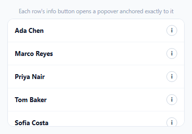
A list where every row has its own "info" button doesn't need a separate popover element per row — it needs one shared popover that gets repositioned and refilled with different content depending on which button was clicked, and that stays correctly pinned to that specific button even while the list scrolls underneath it.
One popover element, reused for every row
Rather than creating six popovers (one per row) and toggling their visibility, there's exactly one #apPop element in the DOM. openFor(btn) reads that row's data-* attributes into the popover's content and repositions the single shared element against whichever button was actually clicked — simpler markup, and no risk of two popovers ever being visible at once by accident.
autoUpdate is re-established on every open, against the new anchor
Each call to openFor first cleans up any previous autoUpdate subscription, then starts a fresh one anchored to the *newly clicked* button. This matters because the previous popover's tracked position was relative to a different button entirely — reusing a stale autoUpdate subscription would keep recalculating position against the wrong anchor.
Scrolling doesn't require re-opening the popover
Because autoUpdate is actively watching the scroll container (it listens for scroll events on all scrollable ancestors of the anchor, not just window scroll), scrolling the list while a popover is open keeps the popover correctly glued to its row's button in real time — a version that computed position once at open time would leave the popover visually detached from its row the moment the list scrolls even slightly.
Toggling and outside-click both route through one close function
Clicking the same info button again, and clicking anywhere outside both the list and the popover, both call the identical closePop() — which hides the popover, clears the currentAnchor tracking variable, and tears down the autoUpdate subscription. There's only one way the popover actually closes, so its cleanup can never be partially applied.
placement: 'left-start' plus flip/shift handles a list near the edge
The popover opens to the left of the info button by default, but the same flip/shift middleware from the auto-flipping tooltip pattern elsewhere in this collection applies here too — a button near the container's top or bottom edge still gets a correctly positioned, fully visible popover.
Reusing it
This one-shared-element-with-live-repositioning pattern applies to any list of per-row popovers, dropdowns, or context menus — a comments list, a table of records, a file browser — swap the row data and popover content for whatever each item actually needs to show.
Build with AI
Build, Understand, Optimize, and Extend It With AI
You don't have to work out how to make one popover serve many anchors correctly. Paste this snippet's HTML, CSS, and JS into an AI coding assistant like Claude and ask it to explain exactly why a single shared popover element repositioned per click is simpler and safer than one popover per row, and why the previous autoUpdate subscription must be torn down before starting a new one when switching which row's popover is open. The same assistant can help optimize it — ask whether reading each row's data from HTML data attributes (as this snippet does) or from a JavaScript array of objects would scale better for a list backed by a real API response. It's also useful for extending the effect: ask it to add a close button inside the popover itself, animate the popover's position change when switching between rows instead of an instant jump, or make the popover keyboard-navigable (opening on Enter/Space when a row is focused, closing on Escape). Treat the code less like a finished artifact and more like a starting point for a conversation.
Prompt to recreate it
Copy this into your AI assistant of choice to build the effect from scratch, or as a jumping-off point for your own variant:
Build a scrollable list where each row has an info button that opens a shared, correctly-anchored popover with that row's details, using the Floating UI positioning library (load its core and DOM packages as separate script tags from a CDN, in that dependency order, no other library), in plain HTML, CSS, and JavaScript.

Requirements:
- Render a scrollable list of at least six rows, each showing a name and an info button, with each row also carrying additional detail data (such as a role and a note) to display when its info button is clicked.
- Use exactly one shared popover element in the page (not one popover per row) that gets repositioned and its content updated depending on which row's info button was most recently clicked.
- When an info button is clicked, position the shared popover anchored to that specific button using the positioning library's collision-detection middleware (an offset, automatic side-flipping when near a boundary, and shift-based correction to stay within the scrollable container's edges).
- While the popover is open, keep it correctly and continuously positioned relative to its anchor button as the list is scrolled, using the positioning library's live-tracking capability — not just computing its position once when it first opens.
- Clicking the same info button again should close the popover; clicking a different row's info button while a popover is already open should move and update the popover to the new row (updating its tracked anchor) rather than requiring the first popover to be closed first; and clicking anywhere outside both the list and the popover should close it.
- Ensure that switching which row's popover is open properly stops tracking the previous anchor's position before starting to track the new one, so there is never more than one active position-tracking subscription running at the same time.
Want to tighten it up first? Run this prompt through the AI Prompt Studio to score it across 8 quality dimensions, catch anti-patterns, and tune the wording for Claude, ChatGPT, or Gemini before you paste it in.
Source Code
<div class="ap-wrap">
  <div class="ap-hint">Each row's info button opens a popover anchored exactly to it</div>
  <div class="ap-scroll" id="apScroll">
    <div class="ap-row" data-name="Ada Chen" data-role="Engineering" data-note="Joined 2023, leads the platform team.">
      <span>Ada Chen</span><button class="ap-info" type="button" aria-label="Info">i</button>
    </div>
    <div class="ap-row" data-name="Marco Reyes" data-role="Design" data-note="Joined 2024, owns the design system.">
      <span>Marco Reyes</span><button class="ap-info" type="button" aria-label="Info">i</button>
    </div>
    <div class="ap-row" data-name="Priya Nair" data-role="Product" data-note="Joined 2022, manages the roadmap.">
      <span>Priya Nair</span><button class="ap-info" type="button" aria-label="Info">i</button>
    </div>
    <div class="ap-row" data-name="Tom Baker" data-role="Support" data-note="Joined 2025, on the support rotation.">
      <span>Tom Baker</span><button class="ap-info" type="button" aria-label="Info">i</button>
    </div>
    <div class="ap-row" data-name="Sofia Costa" data-role="Marketing" data-note="Joined 2021, runs campaigns.">
      <span>Sofia Costa</span><button class="ap-info" type="button" aria-label="Info">i</button>
    </div>
    <div class="ap-row" data-name="Liam Park" data-role="Engineering" data-note="Joined 2024, works on infra.">
      <span>Liam Park</span><button class="ap-info" type="button" aria-label="Info">i</button>
    </div>
  </div>
  <div class="ap-pop" id="apPop">
    <div class="ap-pop-name" id="apPopName"></div>
    <div class="ap-pop-role" id="apPopRole"></div>
    <div class="ap-pop-note" id="apPopNote"></div>
  </div>
</div>*{box-sizing:border-box;margin:0;padding:0}
body{font-family:system-ui,-apple-system,sans-serif;background:#f8fafc;min-height:100vh;display:flex;align-items:center;justify-content:center;padding:24px}
.ap-wrap{width:100%;max-width:360px}
.ap-hint{font-size:11.5px;color:#94a3b8;margin-bottom:8px;text-align:center}
.ap-scroll{max-height:220px;overflow-y:auto;background:#fff;border:1.5px solid #e2e8f0;border-radius:12px}
.ap-row{display:flex;align-items:center;justify-content:space-between;padding:12px 14px;border-bottom:1px solid #f1f5f9;font:700 13px system-ui;color:#0f172a}
.ap-row:last-child{border-bottom:none}
.ap-info{width:22px;height:22px;border-radius:50%;border:1.5px solid #cbd5e1;background:#fff;color:#64748b;font:800 11px system-ui;cursor:pointer;flex-shrink:0}
.ap-info:hover{border-color:#6366f1;color:#6366f1}
.ap-pop{position:absolute;top:0;left:0;width:200px;background:#0f172a;color:#fff;border-radius:10px;padding:12px;display:none;z-index:10}
.ap-pop-name{font-size:13px;font-weight:800}
.ap-pop-role{font-size:11px;color:#a5b4fc;font-weight:700;margin:2px 0 6px}
.ap-pop-note{font-size:11.5px;color:#cbd5e1;line-height:1.4}var scrollEl = document.getElementById('apScroll');
var pop = document.getElementById('apPop');
var popName = document.getElementById('apPopName');
var popRole = document.getElementById('apPopRole');
var popNote = document.getElementById('apPopNote');
var currentAnchor = null;
var cleanup = null;
function position(anchor) {
FloatingUIDOM.computePosition(anchor, pop, {
placement: 'left-start',
middleware: [FloatingUIDOM.offset(8), FloatingUIDOM.flip(), FloatingUIDOM.shift({ padding: 8 })],
}).then(function (r) {
Object.assign(pop.style, { left: r.x + 'px', top: r.y + 'px' });
});
}
function openFor(btn) {
var row = btn.closest('.ap-row');
popName.textContent = row.getAttribute('data-name');
popRole.textContent = row.getAttribute('data-role');
popNote.textContent = row.getAttribute('data-note');
pop.style.display = 'block';
currentAnchor = btn;
if (cleanup) cleanup();
// autoUpdate here is what keeps the popover pinned to ITS row's button
// while the list scrolls -- without it, opening a popover and then
// scrolling the list would leave the popover floating over the wrong row.
cleanup = FloatingUIDOM.autoUpdate(btn, pop, function () { position(btn); });
}
function closePop() {
pop.style.display = 'none';
currentAnchor = null;
if (cleanup) { cleanup(); cleanup = null; }
}
scrollEl.addEventListener('click', function (e) {
var btn = e.target.closest('.ap-info');
if (!btn) return;
if (currentAnchor === btn) { closePop(); return; }
openFor(btn);
});
// Scrolling the list while a popover is open doesn't automatically mean the
// anchor scrolled OUT of view -- autoUpdate keeps repositioning it correctly
// as long as it's visible. This listener only handles dismissing when a
// click happens fully outside both the list and the popover.
document.addEventListener('click', function (e) {
if (currentAnchor && !e.target.closest('.ap-info') && !e.target.closest('#apPop')) closePop();
});Step by step
How to Use
- 1Add the Floating UI CDNLoad @floating-ui/core, then @floating-ui/dom, in that order.
- 2Paste HTML, CSS, and JSA scrollable list of six people renders with info buttons.
- 3Click any info buttonA popover opens anchored exactly to that row.
- 4Scroll the listThe popover stays correctly pinned to its row's button.
- 5Click a different info buttonThe popover moves and updates to that row's info.
- 6Click outside the listThe popover closes.
Real-world uses
Common Use Cases
Got questions?
Frequently Asked Questions
A single shared popover element that gets repositioned and refilled with different content is simpler to manage than six separate popover elements, and it structurally guarantees only one can ever be visible at a time — there's no way for two popovers to accidentally both be open at once, since there's only one popover element in the entire page to show or hide.
Each autoUpdate subscription continuously recalculates the popover's position specifically relative to the anchor element it was created with. If a new row's button is clicked while an old autoUpdate subscription (tracking a different, previous button) is still running, the position would keep being calculated against the wrong anchor. Calling the stored cleanup function before starting a fresh autoUpdate against the newly clicked button ensures only one active position-tracking subscription exists at a time, always matching the currently open popover's real anchor.
autoUpdate doesn't only watch window-level scroll and resize events — it specifically detects and listens to scroll events on all scrollable ancestor elements of the anchor, which includes this snippet's scrollable list container. That's what lets the popover continuously recompute and update its position as the list is scrolled, keeping it visually pinned to its row's button rather than drifting away from it.
Clicking the currently active button again calls closePop(), fully hiding the popover and tearing down its position tracking — a toggle-off. Clicking a different button calls openFor() with the new button, which updates the popover's content, repositions it against the new anchor, and replaces the autoUpdate subscription — the popover doesn't close and reopen visually, it moves and updates in place.
The same single-popover, click-to-open-for-that-row pattern scales to any number of rows without changes, since exactly one popover element and one autoUpdate subscription exist regardless of how many rows are in the list — only the row data (and how you read it, whether from data attributes as here or from a JavaScript data array) needs to scale with your actual dataset.