Learn Coding Visually
Learn to code with interactive, live-preview playgrounds — HTML, CSS, JavaScript, React & more.
 HTML Playground42 lessons · Click-based · Live preview
 CSS PlaygroundLearn CSS with a live editor
 JavaScript Playground60 lessons · DOM · Async · Canvas
 React PlaygroundLearn React with a live code editor
 GSAP PlaygroundLearn GSAP animation interactively
 SVG Playground44 lessons · shapes · paths · animation
 SCSS Playground45 lessons · Sass modules · tokens
 Tailwind PlaygroundLearn Tailwind CSS with a live editor
 Bootstrap 5 Playground50 lessons · live preview
Floating UI Auto-Flipping Tooltip — Free HTML CSS JS Snippet
Floating UI Auto-Flipping Tooltip (Collision Detection) · Misc · Plain HTML, CSS & JS · Live preview
What's included
Features
About this UI Snippet
Floating UI Auto-Flipping Tooltip — Three Middleware, Three Distinct Jobs
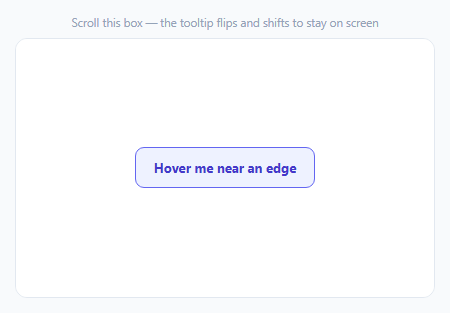
A tooltip anchored "above" its trigger looks fine until that trigger scrolls near the top of its container — then the tooltip either clips off-screen or renders somewhere nonsensical. Floating UI solves this with composable middleware functions, each solving one specific piece of the collision problem, rather than one monolithic "keep it visible" option.
flip() changes which side the tooltip is on
The preferred placement here is 'top', but flip() middleware checks whether that placement would actually overflow the boundary and, if so, swaps to the opposite side ('bottom') automatically. This is a same-axis correction — it changes *which side* the tooltip appears on, nothing else.
shift() corrects the perpendicular axis without changing sides
Even after flip() picks a valid side, the tooltip can still overflow left or right (or up/down, depending on orientation) if the trigger is near a corner. shift({ padding: 8 }) nudges the tooltip along the *other* axis to keep it within bounds — it never changes which side the tooltip is on, only its position along that side, staying 8px clear of the boundary edge.
arrow() needs the real middleware data, not a fixed CSS position
The arrow's position has to move dynamically since shift() can slide the tooltip (and therefore where the arrow needs to point) independently of the tooltip's overall placement. FloatingUIDOM.arrow({ element: arrowEl }) computes the correct offset, returned in result.middlewareData.arrow, and the code reads side/staticSide from the resolved placement to decide which edge of the tooltip box the arrow attaches to.
autoUpdate is what makes this work *during* a scroll, not just at open
Computing position once when the tooltip opens would leave it stuck in place while the container keeps scrolling underneath it. FloatingUIDOM.autoUpdate(btn, tooltip, updatePosition) — started on show, explicitly cleaned up on hide — wires up scroll, resize, and layout-change listeners for exactly as long as the tooltip is visible, recomputing position continuously so the tooltip stays glued to the button in real time.
Floating UI is unopinionated by design — this snippet supplies all the DOM wiring
Unlike Tippy (which wraps this same positioning engine with a full tooltip UI), Floating UI itself only computes coordinates — creating the tooltip element, showing/hiding it, and applying the computed left/top styles are all this snippet's own code, which is the tradeoff for the smaller, positioning-only library.
Reusing it
This exact middleware stack (offset, flip, shift, arrow) plus autoUpdate is the standard recipe for any floating element that needs to survive scrolling and edge cases — dropdowns, popovers, and context menus all build on the identical pattern.
Build with AI
Build, Understand, Optimize, and Extend It With AI
You don't have to work out collision-aware positioning math from scratch. Paste this snippet's HTML, CSS, and JS into an AI coding assistant like Claude and ask it to explain exactly how flip() and shift() solve two different axes of the boundary-collision problem, and why arrow() needs to read live middlewareData on every position update rather than using a fixed CSS position. The same assistant can help optimize it — ask whether computing position on every single scroll event (via autoUpdate) has a noticeable performance cost on a page with many simultaneous tooltips, and what autoUpdate's options offer for throttling that. It's also useful for extending the effect: ask it to constrain the tooltip's flip/shift boundary to a specific container element instead of the whole viewport, add a fade transition when the tooltip flips sides, or build the same middleware stack into a click-triggered dropdown instead of a hover tooltip. Treat the code less like a finished artifact and more like a starting point for a conversation.
Prompt to recreate it
Copy this into your AI assistant of choice to build the effect from scratch, or as a jumping-off point for your own variant:
Build a tooltip that automatically repositions itself to avoid clipping off the edges of a scrollable container, using the Floating UI positioning library (load its core and DOM packages as separate script tags from a CDN, in that dependency order, no other library), in plain HTML, CSS, and JavaScript.

Requirements:
- Create a scrollable container with enough empty space above and below a single button that the button can be scrolled to appear near the top, middle, or bottom of the container's visible area.
- Build a tooltip element (not using any pre-built tooltip library's UI) that appears when the button is hovered or focused, showing a short message and a small arrow/pointer element indicating which element it's attached to.
- Position the tooltip using the positioning library's collision-detection middleware: prefer showing it above the button, but automatically flip it to appear below the button instead when there isn't enough room above; and separately, shift the tooltip's position along its other axis, keeping it fully within the visible bounds without changing which side it appears on.
- Dynamically compute and update the arrow's position on every reposition so it continues to visually point at the button correctly, even when the tooltip has been shifted away from directly centering on the button.
- While the tooltip is visible, continuously keep it correctly positioned as the container is scrolled or the window is resized (not just correctly positioned once at the moment it first appears), and stop that continuous repositioning as soon as the tooltip is hidden to avoid unnecessary ongoing work.
Want to tighten it up first? Run this prompt through the AI Prompt Studio to score it across 8 quality dimensions, catch anti-patterns, and tune the wording for Claude, ChatGPT, or Gemini before you paste it in.
Source Code
<div class="af-wrap">
<div class="af-hint">Scroll this box — the tooltip flips and shifts to stay on screen</div>
<div class="af-scroll" id="afScroll">
<div class="af-spacer"></div>
<button class="af-btn" id="afBtn" type="button">Hover me near an edge</button>
<div class="af-spacer"></div>
</div>
<div class="af-tooltip" id="afTooltip" role="tooltip">
I reposition myself to avoid the edges
<div class="af-arrow" id="afArrow"></div>
</div>
</div>*{box-sizing:border-box;margin:0;padding:0}
body{font-family:system-ui,-apple-system,sans-serif;background:#f8fafc;min-height:100vh;display:flex;align-items:center;justify-content:center;padding:24px}
.af-wrap{width:100%;max-width:420px}
.af-hint{font-size:11.5px;color:#94a3b8;margin-bottom:8px;text-align:center}
.af-scroll{height:260px;overflow:auto;background:#fff;border:1.5px solid #e2e8f0;border-radius:12px;display:flex;flex-direction:column;align-items:center;justify-content:center;gap:0;position:relative}
.af-spacer{height:340px;flex-shrink:0;width:100%}
.af-btn{padding:11px 18px;border-radius:9px;border:1.5px solid #6366f1;background:#eef2ff;color:#4338ca;font:700 13px system-ui;cursor:pointer;flex-shrink:0}
.af-tooltip{position:absolute;top:0;left:0;width:max-content;max-width:200px;background:#0f172a;color:#fff;font-size:12px;font-weight:600;padding:8px 11px;border-radius:8px;line-height:1.4;display:none;z-index:10}
.af-arrow{position:absolute;width:8px;height:8px;background:#0f172a;transform:rotate(45deg)}var btn = document.getElementById('afBtn');
var tooltip = document.getElementById('afTooltip');
var arrowEl = document.getElementById('afArrow');
var scrollEl = document.getElementById('afScroll');
var cleanup = null;
var middleware = [
FloatingUIDOM.offset(10),
// flip() is the middleware that actually solves edge collision -- if the
// preferred placement ('top') would overflow the boundary, it swaps to
// the opposite side automatically rather than letting the tooltip clip.
FloatingUIDOM.flip(),
// shift() handles the perpendicular axis -- even after flip() picks a
// valid side, the tooltip could still overflow left/right; shift() nudges
// it back within bounds without changing which side it's on.
FloatingUIDOM.shift({ padding: 8 }),
FloatingUIDOM.arrow({ element: arrowEl }),
];
function updatePosition() {
FloatingUIDOM.computePosition(btn, tooltip, {
placement: 'top',
middleware: middleware,
// boundary defaults to the viewport -- passing the scroll container
// instead is what makes the tooltip react to THIS box's edges, not the
// whole page's, which matters since the button can scroll near the
// scroll container's edge while still being nowhere near the viewport's.
}).then(function (result) {
Object.assign(tooltip.style, { left: result.x + 'px', top: result.y + 'px' });
var side = result.placement.split('-')[0];
var staticSide = { top: 'bottom', bottom: 'top', left: 'right', right: 'left' }[side];
var arrowData = result.middlewareData.arrow;
Object.assign(arrowEl.style, {
left: arrowData.x != null ? arrowData.x + 'px' : '',
top: arrowData.y != null ? arrowData.y + 'px' : '',
right: '', bottom: '',
});
arrowEl.style[staticSide] = '-4px';
});
}
function show() {
tooltip.style.display = 'block';
// autoUpdate wires scroll, resize, and layout-change listeners for as
// long as the tooltip is visible -- it's what keeps the tooltip glued to
// the button's real position while the container is actively scrolling,
// not just correctly placed once at the moment it opens.
cleanup = FloatingUIDOM.autoUpdate(btn, tooltip, updatePosition);
}
function hide() {
tooltip.style.display = 'none';
if (cleanup) { cleanup(); cleanup = null; }
}
btn.addEventListener('mouseenter', show);
btn.addEventListener('mouseleave', hide);
btn.addEventListener('focus', show);
btn.addEventListener('blur', hide);Step by step
How to Use
- 1Add the Floating UI CDNLoad @floating-ui/core, then @floating-ui/dom, in that order.
- 2Paste HTML, CSS, and JSA scrollable box renders with a button inside it.
- 3Scroll to the top of the boxHover the button — the tooltip flips below it instead of clipping.
- 4Scroll to the middleHover the button — the tooltip shows above it as preferred.
- 5Keep scrolling while hoveringThe tooltip tracks the button's position in real time.
- 6Watch the arrowIt repositions to keep pointing at the button correctly.
Real-world uses
Common Use Cases
Got questions?
Frequently Asked Questions
flip() decides which side of the trigger the tooltip appears on — if the preferred side (like "top") would cause the tooltip to overflow the boundary, flip() swaps to the opposite side entirely. shift() operates on the other, perpendicular axis: once a side has been chosen, shift() slides the tooltip along that side to keep it within bounds, without ever changing which side it's actually on. They solve two different, complementary collision problems.
Because shift() can slide the tooltip along its axis to avoid the boundary, the arrow's correct position (to keep visually pointing at the trigger element) has to move along with that shift — a fixed CSS position (like always centered) would visibly disconnect the arrow from the trigger whenever shift() has adjusted the tooltip's position. The arrow() middleware computes the exact correct offset for the arrow on every position update, which the code reads from middlewareData.arrow.
autoUpdate attaches scroll, resize, and layout-observation listeners to keep recalculating the tooltip's position continuously — useful while the tooltip is visible, but wasteful and unnecessary overhead if left running while it's hidden. Starting it in the show function and calling its returned cleanup function in hide ensures those listeners only exist for as long as they're actually needed.
Floating UI is deliberately a positioning engine only — it calculates where a floating element should go, but doesn't create tooltip DOM, manage show/hide, or apply any styling. Tippy is built on the same kind of positioning logic but wraps it with a complete tooltip implementation. Choosing Floating UI directly trades that convenience for full control over the exact DOM structure, styling, and behavior of the floating element.
The same middleware stack (offset, flip, shift) and the same autoUpdate-on-show/cleanup-on-hide pattern apply directly to a dropdown panel — only the trigger interaction (typically click instead of hover) and the panel's content and styling would need to change. The arrow middleware is optional and often omitted for dropdown menus, which don't always need a pointing indicator.