Learn Coding Visually
Learn to code with interactive, live-preview playgrounds — HTML, CSS, JavaScript, React & more.
 HTML Playground42 lessons · Click-based · Live preview
 CSS PlaygroundLearn CSS with a live editor
 JavaScript Playground60 lessons · DOM · Async · Canvas
 React PlaygroundLearn React with a live code editor
 GSAP PlaygroundLearn GSAP animation interactively
 SVG Playground44 lessons · shapes · paths · animation
 SCSS Playground45 lessons · Sass modules · tokens
 Tailwind PlaygroundLearn Tailwind CSS with a live editor
 Bootstrap 5 Playground50 lessons · live preview
SweetAlert2 Confirmation Dialog Set — Free HTML CSS JS Snippet
SweetAlert2 Confirmation Dialog Set · Modals · Plain HTML, CSS & JS · Live preview
What's included
Features
About this UI Snippet
SweetAlert2 Confirmation Dialog Set — Shared Config, Per-Dialog Overrides
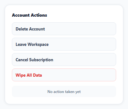
Four different destructive actions need four different confirmation dialogs — but they shouldn't need four completely separately-written configurations. This snippet defines one BASE object with the styling and button behavior every dialog shares, and merges each dialog's specific title, icon, and color on top of it with Object.assign.
A shared base object keeps every dialog visually consistent
BASE sets showCancelButton, both button colors' defaults, and reverseButtons (which puts Cancel on the left, Confirm on the right — a deliberate safety convention so the destructive action isn't the button under a reflexively-clicked default position) once. Every specific dialog call is Object.assign({}, BASE, { ...only what differs... }), which is what keeps four dialogs consistent without four copies of the same boilerplate.
Promise-based results, not callbacks
Swal.fire(...) returns a Promise that resolves with a result object once the dialog closes — result.isConfirmed is true only if the user clicked the actual confirm button, false for cancel, an outside click, or pressing Escape. Branching on that one boolean is all that's needed to know which path the user took.
preConfirm is what makes the "type WIPE to confirm" dialog actually validate
The most destructive action (wipe all data) adds an input: 'text' field and a preConfirm function, which SweetAlert2 calls *before* allowing the dialog to close on confirm. Returning false from preConfirm (after calling Swal.showValidationMessage to explain why) keeps the dialog open with an inline error — the confirm click doesn't close anything until the typed value actually matches, which is meaningfully harder to trigger by accident than a plain confirm button.
icon communicates severity independently of color
Each dialog's icon (warning, question, info, error) is chosen to match how serious that specific action actually is — account deletion warrants warning, a low-stakes plan cancellation only info — giving a second, icon-based severity signal beyond just the confirm button's color.
Reusing it
Add a fifth confirmation by writing only its unique fields and merging them onto BASE, exactly like the existing four — the shared object is what keeps a growing set of confirmation dialogs from drifting into inconsistent styling over time.
Build with AI
Build, Understand, Optimize, and Extend It With AI
You don't have to figure out how to keep several confirmation dialogs visually consistent on your own. Paste this snippet's HTML, CSS, and JS into an AI coding assistant like Claude and ask it to explain exactly how the BASE object and Object.assign pattern let four dialogs share styling while each overrides only its unique fields, and how preConfirm's return value controls whether the dialog is allowed to close. The same assistant can help optimize it — ask whether extracting the four dialog configurations into a data array and generating the buttons and handlers in a loop would be cleaner than writing four separate click handlers, especially if a fifth or sixth dialog is added later. It's also useful for extending the effect: ask it to add a loading spinner state that shows while an async delete request is in flight after confirmation, add a checkbox-based confirmation instead of typed text for a less severe action, or wire the confirmed actions to real API calls with error handling if the request fails. Treat the code less like a finished artifact and more like a starting point for a conversation.
Prompt to recreate it
Copy this into your AI assistant of choice to build the effect from scratch, or as a jumping-off point for your own variant:
Build a set of at least four distinct confirmation dialogs for different destructive account actions using the SweetAlert2 library (load SweetAlert2's all-in-one bundle from a CDN, no other library), in plain HTML, CSS, and JavaScript.

Requirements:
- Define a shared base configuration object containing settings common to all the dialogs (showing a cancel button, a reversed button order so cancel and confirm aren't in a position that invites accidental confirmation, and default button colors), and have each individual dialog's configuration merge its own specific title, message, icon, and confirm button text/color on top of that shared base rather than repeating the shared settings in every dialog.
- Give each of the four dialogs a distinct icon (such as warning, question, info, and error) chosen to match how severe that specific action actually is, and clear message text explaining the consequence of confirming.
- For the most severe/destructive action among the four, require the user to type a specific confirmation word into a text input inside the dialog before the confirm button is allowed to actually close the dialog — validate the typed value inside the dialog's pre-confirm validation hook, showing an inline error message and keeping the dialog open if the typed value doesn't match exactly.
- After each dialog closes, check whether the user actually confirmed (as opposed to cancelling, clicking outside, or pressing Escape) and display a message elsewhere on the page reflecting which action was taken.
Want to tighten it up first? Run this prompt through the AI Prompt Studio to score it across 8 quality dimensions, catch anti-patterns, and tune the wording for Claude, ChatGPT, or Gemini before you paste it in.
Source Code
<div class="cd-wrap">
  <div class="cd-title">Account Actions</div>
  <div class="cd-grid">
    <button class="cd-btn" id="cdDelete" type="button">Delete Account</button>
    <button class="cd-btn" id="cdLeave" type="button">Leave Workspace</button>
    <button class="cd-btn" id="cdCancel" type="button">Cancel Subscription</button>
    <button class="cd-btn cd-danger" id="cdWipe" type="button">Wipe All Data</button>
  </div>
  <div class="cd-log" id="cdLog">No action taken yet</div>
</div>*{box-sizing:border-box;margin:0;padding:0}
body{font-family:system-ui,-apple-system,sans-serif;background:#f8fafc;min-height:100vh;display:flex;align-items:center;justify-content:center;padding:24px}
.cd-wrap{width:100%;max-width:380px;background:#fff;border-radius:16px;padding:22px;box-shadow:0 1px 8px rgba(0,0,0,.07);border:1px solid #e2e8f0}
.cd-title{font-size:14px;font-weight:800;color:#0f172a;margin-bottom:14px}
.cd-grid{display:flex;flex-direction:column;gap:8px}
.cd-btn{padding:11px;border-radius:9px;border:1.5px solid #e2e8f0;background:#f8fafc;color:#334155;font:700 13px system-ui;cursor:pointer;text-align:left}
.cd-btn:hover{border-color:#dc2626;background:#fef2f2;color:#dc2626}
.cd-danger{border-color:#fecaca;color:#dc2626}
.cd-log{margin-top:14px;padding:10px;border-radius:9px;background:#f8fafc;color:#64748b;font-size:12px;font-weight:600;text-align:center}var logEl = document.getElementById('cdLog');
function log(text) { logEl.textContent = text; }
// A shared base config keeps every dialog's button styling and cancel
// behavior consistent -- each specific dialog only overrides what's
// actually different about it (title, text, and how "confirmed" is checked).
var BASE = {
showCancelButton: true,
confirmButtonColor: '#dc2626',
cancelButtonColor: '#94a3b8',
reverseButtons: true,
};
document.getElementById('cdDelete').addEventListener('click', function () {
Swal.fire(Object.assign({}, BASE, {
title: 'Delete your account?',
text: 'This removes your profile and history permanently. This cannot be undone.',
icon: 'warning',
confirmButtonText: 'Delete account',
})).then(function (result) {
log(result.isConfirmed ? 'Account deleted' : 'Cancelled \u2014 account kept');
});
});
document.getElementById('cdLeave').addEventListener('click', function () {
Swal.fire(Object.assign({}, BASE, {
title: 'Leave this workspace?',
text: 'You will lose access until someone invites you back.',
icon: 'question',
confirmButtonText: 'Leave workspace',
confirmButtonColor: '#f59e0b',
})).then(function (result) {
log(result.isConfirmed ? 'Left the workspace' : 'Cancelled \u2014 still a member');
});
});
document.getElementById('cdCancel').addEventListener('click', function () {
Swal.fire(Object.assign({}, BASE, {
title: 'Cancel your subscription?',
text: 'You will keep access until the end of the current billing period.',
icon: 'info',
confirmButtonText: 'Cancel plan',
confirmButtonColor: '#6366f1',
})).then(function (result) {
log(result.isConfirmed ? 'Subscription cancelled' : 'Cancelled \u2014 plan stays active');
});
});
// A destructive-enough action gets a typed-confirmation step, not just a
// button click -- preConfirm can block the dialog from closing until its
// own validation passes, and returning false keeps it open with an error.
document.getElementById('cdWipe').addEventListener('click', function () {
Swal.fire(Object.assign({}, BASE, {
title: 'Wipe all data?',
html: 'This deletes everything permanently. Type <b>WIPE</b> to confirm.',
icon: 'error',
input: 'text',
inputPlaceholder: 'Type WIPE',
confirmButtonText: 'Wipe everything',
preConfirm: function (value) {
if (value !== 'WIPE') {
Swal.showValidationMessage('You must type WIPE exactly to confirm');
return false;
}
return true;
},
})).then(function (result) {
log(result.isConfirmed ? 'All data wiped' : 'Cancelled \u2014 data kept');
});
});Step by step
How to Use
- 1Add the SweetAlert2 CDNLoad sweetalert2.all.min.js before the snippet's JS runs.
- 2Paste HTML, CSS, and JSFour action buttons render in a card.
- 3Click "Delete Account"A warning-icon confirmation dialog opens.
- 4Click "Wipe All Data"A dialog with a text input opens.
- 5Try confirming without typing WIPEIt stays open and shows a validation error.
- 6Type WIPE and confirmThe dialog closes and the action logs below.
Real-world uses
Common Use Cases
Got questions?
Frequently Asked Questions
The four dialogs share several settings — showing a cancel button, a reversed button order, and default colors — that would otherwise be repeated identically in every single Swal.fire call. Using Object.assign({}, BASE, { ...specifics }) applies those shared defaults once while letting each dialog override only the fields that actually differ (title, text, icon, and sometimes color), which keeps the four dialogs visually consistent and makes adding a fifth trivial.
Swal.fire returns a Promise that resolves with a result object once the dialog closes, and result.isConfirmed is true only when the user actually clicked the confirm button — it's false for a cancel click, an outside click, or pressing Escape. Checking that one boolean in the .then() callback is sufficient to branch between the confirmed and cancelled paths.
The dialog is given a preConfirm function, which SweetAlert2 calls automatically when the confirm button is clicked, before actually closing the dialog. If preConfirm returns false, the dialog stays open; calling Swal.showValidationMessage first displays an inline error explaining why. Only when the typed value exactly equals 'WIPE' does preConfirm return true, allowing the dialog to actually close and the .then() callback to run with isConfirmed set to true.
With reverseButtons set, the Cancel button renders on the left and the Confirm button on the right, moving the destructive confirm action away from the position a reflexive click (like repeatedly pressing where a "next" or "OK" button usually sits) would land on. It's a small deliberate friction against accidentally confirming a destructive action out of habit.
Write a new button and click handler following the same pattern as the existing four: call Swal.fire(Object.assign({}, BASE, { title, text or html, icon, confirmButtonText, and optionally a different confirmButtonColor })), then branch on result.isConfirmed in the .then() callback. Because the shared styling and button behavior already live in BASE, the new dialog automatically matches the others without repeating that configuration.