



Learn Coding Visually
Learn to code with interactive, live-preview playgrounds — HTML, CSS, JavaScript, React & more.
 HTML Playground42 lessons · Click-based · Live preview
 CSS PlaygroundLearn CSS with a live editor
 JavaScript Playground60 lessons · DOM · Async · Canvas
 React PlaygroundLearn React with a live code editor
 GSAP PlaygroundLearn GSAP animation interactively
 SVG Playground44 lessons · shapes · paths · animation
 SCSS Playground45 lessons · Sass modules · tokens
 Tailwind PlaygroundLearn Tailwind CSS with a live editor
 Bootstrap 5 Playground50 lessons · live preview
Tippy.js Interactive Popover with Form — Free HTML CSS JS Snippet
Tippy.js Interactive Popover with Form · Forms · Plain HTML, CSS & JS · Live preview
What's included
Features
About this UI Snippet
Tippy.js Interactive Popover with Form — the One Option That Turns a Tooltip Into a UI
A tooltip you can only read and a popover you can actually interact with — type into, click things inside — are built on the same library, but they need one specific, easy-to-miss option set correctly. Get it wrong and the popover closes itself the instant you try to use it.
interactive: true is what keeps the popover open while you use it
By default, Tippy treats its content as decoration: moving the mouse away from the trigger element starts the hide timer immediately, even if the cursor is heading straight for the tooltip's own content. interactive: true changes that — Tippy now also considers the popover's own content area as "still hovering," so a search input and clickable list inside it can actually be used without the whole thing vanishing mid-interaction.
content is a real DOM element, not a string
Rather than passing a content string, content: pfContent hands Tippy a genuine, pre-built DOM node containing a real <input> and <ul>. Tippy moves that exact node into its popover rather than cloning or re-parsing it, which is what makes the search input's event listeners (already attached before Tippy ever sees the element) keep working once it's inside the popover.
The template's inline display:none has to be cleared first
The content markup starts with style="display:none" so it doesn't flash visibly in the page before Tippy adopts it — but that inline style travels *with* the element into the tippy-box, and Tippy's show/hide only toggles the box wrapper, never an inner element's own pre-existing style. pfContent.style.display = '', run once right after capturing the reference and before tippy() is called, is what prevents the popover from reporting itself as fully shown while its actual content stays invisible underneath.
onShow resets and refocuses on every open, not just the first
Each time the popover opens, onShow clears the previous search text and re-renders the full people list — so re-opening after a previous search doesn't show stale filtered results. Focusing the search input is deferred with setTimeout(..., 0): at the exact moment onShow fires, Tippy is still in the process of mounting the popover's content into the DOM, so an immediate .focus() call would target an element not yet attached to the page and silently fail.
Selecting a person closes the popover programmatically
Clicking a person calls instance.hide() directly — the same Tippy instance the whole popover was created from — rather than waiting for an outside click or hover-out to close it. This is what makes selection feel like a completed action instead of leaving an already-answered popover sitting open.
trigger: 'click' plus interactive: true is the standard popover recipe
Combining a click-based trigger (rather than hover) with interactive: true is specifically the pattern for "click to open a small interactive panel" — hover-triggered interactive popovers exist but are unusual UX, since a hover-opened panel with clickable content inside it is easy to accidentally dismiss.
Reusing it
Swap the people list for any searchable option set — tags, projects, reviewers, categories — the interactive: true plus real-DOM-element pattern is what generalizes; only the rendered content and selection handler change.
Build with AI
Build, Understand, Optimize, and Extend It With AI
You don't have to discover the "popover closes before I can use it" problem through trial and error. Paste this snippet's HTML, CSS, and JS into an AI coding assistant like Claude and ask it to explain exactly what the interactive option changes about Tippy's hide-timing behavior, and why passing a real DOM element (rather than an HTML string) as the content preserves the search input's already-attached event listeners. The same assistant can help optimize it — ask whether the setTimeout(fn, 0) used to defer focusing the search input is the most reliable approach across browsers, or whether Tippy's own onMount lifecycle hook (which fires after the content is guaranteed to be in the DOM) would be a cleaner choice. It's also useful for extending the effect: ask it to add keyboard arrow-key navigation through the filtered list, support selecting multiple people instead of just one, or fetch the people list from a real API with a loading state shown while it fetches. Treat the code less like a finished artifact and more like a starting point for a conversation.
Prompt to recreate it
Copy this into your AI assistant of choice to build the effect from scratch, or as a jumping-off point for your own variant:
Build a click-triggered, searchable interactive popover for picking a person from a list, using the Tippy.js library (load Tippy's CSS and its bundled JS — which includes its positioning engine — from a CDN, no other library), in plain HTML, CSS, and JavaScript.

Requirements:
- Build the popover's content (a search text input and a list container) as a real, separate DOM element with its own event listeners already attached, and pass that actual element (not an HTML string) as the tooltip library's content when initializing it on a trigger button.
- Configure the tooltip to open on click (not hover), to have no arrow, and — critically — to remain open and usable while the user moves their mouse into and interacts with the popover's own content, not just while hovering the trigger button itself.
- Populate the list with several sample people, each with a name and a colored initials avatar, filterable live as the user types into the search input (case-insensitive partial match against each name).
- Every time the popover opens, reset the search input to empty and re-render the full unfiltered list (so a previous search doesn't leave stale filtered results visible on the next open), and automatically focus the search input — being careful to focus it only once the popover's content is actually mounted in the page's DOM, not before.
- Clicking a person in the list should update a visible "assigned to" label elsewhere on the page with that person's name and close the popover programmatically, rather than requiring the user to click elsewhere to dismiss it.
Want to tighten it up first? Run this prompt through the AI Prompt Studio to score it across 8 quality dimensions, catch anti-patterns, and tune the wording for Claude, ChatGPT, or Gemini before you paste it in.
Source Code
<div class="pf-wrap">
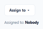
<button class="pf-trigger" id="pfTrigger" type="button">Assign to ▾</button>
<div id="pfContent" style="display:none">
<div class="pf-pop">
<div class="pf-pop-title">Assign task to</div>
<input type="text" class="pf-search" id="pfSearch" placeholder="Search people...">
<ul class="pf-people" id="pfPeople"></ul>
</div>
</div>
<div class="pf-result" id="pfResult">Assigned to: <b>Nobody</b></div>
</div>*{box-sizing:border-box;margin:0;padding:0}
body{font-family:system-ui,-apple-system,sans-serif;background:#f8fafc;min-height:100vh;display:flex;align-items:center;justify-content:center;padding:24px}
.pf-wrap{display:flex;flex-direction:column;align-items:flex-start;gap:14px}
.pf-trigger{padding:10px 16px;border-radius:9px;border:1.5px solid #e2e8f0;background:#fff;color:#334155;font:700 13px system-ui;cursor:pointer}
.pf-trigger:hover{border-color:#6366f1}
.pf-result{font-size:12.5px;color:#64748b}
.pf-result b{color:#0f172a}
.pf-pop{width:220px;background:#fff;border-radius:12px;padding:12px}
.pf-pop-title{font-size:11px;font-weight:800;color:#94a3b8;text-transform:uppercase;letter-spacing:.04em;margin-bottom:8px}
.pf-search{width:100%;padding:8px 10px;border:1.5px solid #e2e8f0;border-radius:8px;font-size:12.5px;outline:none;margin-bottom:8px}
.pf-search:focus{border-color:#6366f1}
.pf-people{list-style:none;max-height:180px;overflow-y:auto}
.pf-person{display:flex;align-items:center;gap:8px;padding:7px 6px;border-radius:7px;cursor:pointer;font-size:12.5px;font-weight:600;color:#334155}
.pf-person:hover{background:#eef2ff}
.pf-avatar{width:24px;height:24px;border-radius:50%;flex-shrink:0;display:flex;align-items:center;justify-content:center;font:800 10px system-ui;color:#fff}
.tippy-box[data-theme~='fwd-pop']{background:#fff;color:#0f172a;box-shadow:0 12px 30px rgba(0,0,0,.18);border:1px solid #e2e8f0}
.tippy-box[data-theme~='fwd-pop'] .tippy-arrow{color:#fff}var PEOPLE = [
{ name: 'Ada Chen', color: '#6366f1' },
{ name: 'Marco Reyes', color: '#f59e0b' },
{ name: 'Priya Nair', color: '#16a34a' },
{ name: 'Tom Baker', color: '#ec4899' },
{ name: 'Sofia Costa', color: '#0ea5e9' },
];
function initials(name) { return name.split(' ').map(function (p) { return p[0]; }).join(''); }
var searchInput = document.getElementById('pfSearch');
var peopleList = document.getElementById('pfPeople');
var resultEl = document.getElementById('pfResult');
var triggerBtn = document.getElementById('pfTrigger');
var instance;
function renderPeople(filter) {
var q = (filter || '').toLowerCase();
peopleList.innerHTML = '';
PEOPLE.filter(function (p) { return p.name.toLowerCase().indexOf(q) !== -1; }).forEach(function (p) {
var li = document.createElement('li');
li.className = 'pf-person';
li.innerHTML = '<span class="pf-avatar" style="background:' + p.color + '">' + initials(p.name) + '</span>' + p.name;
li.addEventListener('click', function () {
resultEl.innerHTML = 'Assigned to: <b>' + p.name + '</b>';
triggerBtn.textContent = p.name + ' \u25be';
instance.hide();
});
peopleList.appendChild(li);
});
}
renderPeople('');
searchInput.addEventListener('input', function () { renderPeople(searchInput.value); });
// pfContent starts with inline display:none so it's invisible sitting in the
// page before Tippy adopts it -- but that inline style travels WITH the
// element into the tippy-box, and Tippy's own show/hide only toggles the box
// wrapper, never this inner style. Left in place, the popover would stay
// collapsed to zero size even while Tippy reports it as shown.
var pfContent = document.getElementById('pfContent');
pfContent.style.display = '';
instance = tippy(triggerBtn, {
content: pfContent,
theme: 'fwd-pop',
// interactive: true is the one option that makes the difference between a
// tooltip you can only look at and a popover you can actually use --
// without it, moving the mouse from the trigger toward the content itself
// would close the popover before the cursor ever reaches it.
interactive: true,
trigger: 'click',
placement: 'bottom-start',
arrow: false,
appendTo: document.body,
onShow: function () {
searchInput.value = '';
renderPeople('');
// Focus has to be deferred a tick past onShow -- the popover's content
// is still being mounted into the DOM at the moment onShow fires, so
// focusing immediately would target an element not yet attached.
setTimeout(function () { searchInput.focus(); }, 0);
},
});Step by step
How to Use
- 1Add the Tippy.js CDNLoad tippy.css and tippy-bundle.umd.min.js before the snippet's JS runs.
- 2Paste HTML, CSS, and JSA single "Assign to" button renders.
- 3Click the buttonA popover opens with a search box, auto-focused.
- 4Type a nameThe list filters live as you type.
- 5Move your mouse into the popoverIt stays open — this is what interactive: true enables.
- 6Click a personThe popover closes and the assignment updates below.
Real-world uses
Common Use Cases
Got questions?
Frequently Asked Questions
By default, Tippy starts hiding its content as soon as the mouse leaves the trigger element, regardless of where the cursor is heading next. Without interactive: true, moving the mouse from the trigger button toward the popover's own content counts as "leaving," so the popover closes before the cursor ever reaches the search input or list — interactive: true tells Tippy to also treat hovering the popover's own content as still active, which is what lets it be used at all.
The search input and list already have their own event listeners attached in JavaScript before Tippy is ever initialized. Passing the actual DOM element (via document.getElementById) means Tippy moves that exact, already-wired-up element into its popover, preserving those listeners. Passing an HTML string instead would have Tippy parse fresh, listener-less DOM from that string, requiring listeners to be re-attached after every popover open.
At the exact moment the onShow callback fires, Tippy is still in the process of mounting the popover's content into the live DOM — calling .focus() on the search input synchronously at that point can target an element that isn't fully attached yet and silently do nothing. Deferring the focus call with setTimeout(fn, 0) pushes it to run just after the current mounting work finishes, by which point the input is reliably present and focusable.
Calling instance.hide() directly on the Tippy instance closes the popover the moment a selection is made, which reads as a completed action — the equivalent of a dropdown closing itself after you pick an option. Leaving it open and waiting for an outside click would leave an already-answered popover sitting on screen, requiring an extra, unnecessary action from the user to dismiss it.
Replace the PEOPLE array and renderPeople function with whatever searchable option set you need (tags, categories, projects), keeping the same shape: a search input filtering a list, and a click handler on each option that updates your result state and calls instance.hide(). The interactive: true configuration, the real-DOM-element content, and the onShow reset logic all carry over unchanged.