Learn Coding Visually
Learn to code with interactive, live-preview playgrounds — HTML, CSS, JavaScript, React & more.
 HTML Playground42 lessons · Click-based · Live preview
 CSS PlaygroundLearn CSS with a live editor
 JavaScript Playground60 lessons · DOM · Async · Canvas
 React PlaygroundLearn React with a live code editor
 GSAP PlaygroundLearn GSAP animation interactively
 SVG Playground44 lessons · shapes · paths · animation
 SCSS Playground45 lessons · Sass modules · tokens
 Tailwind PlaygroundLearn Tailwind CSS with a live editor
 Bootstrap 5 Playground50 lessons · live preview
Tippy.js Tooltip Variants Showcase — Free HTML CSS JS Snippet
Tippy.js Tooltip Variants Showcase · Misc · Plain HTML, CSS & JS · Live preview
What's included
Features
About this UI Snippet
Tippy.js Tooltip Variants Showcase — One Config Object, Eight Real Differences
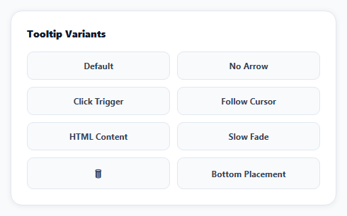
A single tooltip demo tells you almost nothing about a library's range. This snippet initializes eight buttons, each with a genuinely different Tippy.js configuration, so the actual effect of each option — trigger type, cursor-following, HTML content, animation, placement — is directly comparable side by side rather than described in isolation.
Content is plain text by default, on purpose
Tippy's allowHTML option defaults to false, meaning tooltip content is always rendered as plain text unless explicitly opted into HTML rendering per tooltip. That's a deliberate safety default: a tooltip built from user-controlled data (a filename, a comment, a username) can never be accidentally parsed as markup unless a developer specifically sets allowHTML: true for that one tooltip — this snippet's "HTML Content" button is the one place that opts in, and every other button's content is guaranteed to render literally.
trigger controls when the tooltip opens, independent of everything else
The default is 'mouseenter focus' — hover or keyboard focus, which is what makes a tooltip accessible to keyboard users, not just mouse users. Setting trigger: 'click' on the "Click Trigger" button changes that specific tooltip's activation model entirely — it opens on click and stays open until clicked again, appropriate for content someone might want to read without holding a hover state.
followCursor turns off Tippy's own positioning engine for that axis
Normally Tippy (via Popper) calculates a fixed position relative to the reference element. followCursor: true instead tracks the pointer's live position and moves the tooltip continuously — a genuinely different positioning strategy switched on per-instance, not a CSS transition applied on top of the default behavior.
Custom animations require their own CSS file, loaded separately
Tippy ships scale as a built-in default, but other animations like shift-away (used here for the "Slow Fade" button, which also sets a custom duration) require importing that specific animation's CSS file — skip it, and setting animation: 'shift-away' has no visible effect since the CSS driving that animation was never loaded.
A custom theme is CSS-only, applied via the theme option
The dark fwd theme visible on every tooltip here isn't a Tippy configuration option — it's plain CSS targeting .tippy-box[data-theme~='fwd'], activated by passing theme: 'fwd' to each instance. Tippy handles adding that data attribute; the actual visual theme is entirely ordinary CSS.
Reusing it
Each button's configuration comes from its own data-* attributes, read once during initialization — copy any single button's pattern (markup plus its subset of options) in isolation for a real page, without needing the rest of the showcase.
Build with AI
Build, Understand, Optimize, and Extend It With AI
You don't have to read through Tippy's full options list to understand what each one actually changes. Paste this snippet's HTML, CSS, and JS into an AI coding assistant like Claude and ask it to explain exactly how each of the eight buttons' distinct configuration produces a different visible behavior, especially the safety reasoning behind allowHTML defaulting to false and the positioning-strategy difference between normal placement and followCursor. The same assistant can help optimize it — ask whether initializing eight separate Tippy instances individually versus using Tippy's ability to initialize multiple elements from one selector with shared options would be more efficient here, given several buttons share most of their configuration. It's also useful for extending the effect: ask it to add a theme switcher that lets a visitor toggle between light and dark tooltip themes, a tooltip that shows a live-loading state before its real content arrives from an API, or interactive tooltip content with its own buttons inside (which requires the interactive option). Treat the code less like a finished artifact and more like a starting point for a conversation.
Prompt to recreate it
Copy this into your AI assistant of choice to build the effect from scratch, or as a jumping-off point for your own variant:
Build a showcase page demonstrating at least eight visually and functionally distinct tooltip configurations using the Tippy.js library (load Tippy's CSS, at least one additional animation CSS file, and its bundled JS — which includes its positioning engine — from a CDN, no other library), in plain HTML, CSS, and JavaScript.

Requirements:
- Render a grid of buttons, each demonstrating one distinct tooltip behavior: a default tooltip with an arrow, a tooltip with no arrow, a tooltip that opens on click instead of hover and stays open until clicked again, a tooltip that continuously follows the mouse cursor's position instead of staying in a fixed spot, a tooltip containing real HTML markup (bold text and a colored inline element, not just plain text), a tooltip with a distinctly slower custom fade duration and a different animation style than the others, and a tooltip with its placement set to appear below its button instead of above.
- Explicitly enable HTML rendering only for the one tooltip that actually needs it, leaving every other tooltip's content as safe, literal plain text by default (not HTML-interpreted), reflecting the library's own safe-by-default behavior for content that could contain user data.
- Ensure the default (non-click-triggered) tooltips remain accessible via keyboard, opening on keyboard focus in addition to mouse hover, not exclusively on mouse hover.
- Apply one consistent custom dark visual theme across every tooltip (background color, text color, border radius) using the tooltip library's theming mechanism combined with your own custom CSS, rather than the library's unstyled default appearance.
- Drive each button's specific tooltip configuration (its content text, whether it uses an arrow, its trigger type, its placement, etc.) from data attributes on that button's own HTML element, read once during a single initialization pass over all the buttons.
Want to tighten it up first? Run this prompt through the AI Prompt Studio to score it across 8 quality dimensions, catch anti-patterns, and tune the wording for Claude, ChatGPT, or Gemini before you paste it in.
Source Code
<div class="tv-wrap">
<div class="tv-title">Tooltip Variants</div>
<div class="tv-grid">
<button class="tv-btn" data-tip="Default arrow tooltip" data-arrow="true">Default</button>
<button class="tv-btn" data-tip="No arrow, just a clean box" data-arrow="false">No Arrow</button>
<button class="tv-btn" data-tip="Click me again to hide" data-trigger="click">Click Trigger</button>
<button class="tv-btn" data-tip="Follows your cursor exactly" data-follow="true">Follow Cursor</button>
<button class="tv-btn" data-tip="<b>Rich HTML</b> content & a <span style='color:#f59e0b'>colored</span> span" data-html="true">HTML Content</button>
<button class="tv-btn" data-tip="Takes 600ms to appear and disappear" data-duration="600">Slow Fade</button>
<button class="tv-btn tv-icon" data-tip="Delete this item" aria-label="Delete">🗑</button>
<button class="tv-btn" data-tip="Placed below instead of above" data-placement="bottom">Bottom Placement</button>
</div>
</div>*{box-sizing:border-box;margin:0;padding:0}
body{font-family:system-ui,-apple-system,sans-serif;background:#f8fafc;min-height:100vh;display:flex;align-items:center;justify-content:center;padding:24px}
.tv-wrap{width:100%;max-width:460px;background:#fff;border-radius:16px;padding:22px;box-shadow:0 1px 8px rgba(0,0,0,.07);border:1px solid #e2e8f0}
.tv-title{font-size:14px;font-weight:800;color:#0f172a;margin-bottom:16px}
.tv-grid{display:grid;grid-template-columns:repeat(2,1fr);gap:10px}
.tv-btn{padding:11px;border-radius:9px;border:1.5px solid #e2e8f0;background:#f8fafc;color:#334155;font:700 12px system-ui;cursor:pointer}
.tv-btn:hover{border-color:#6366f1;background:#eef2ff;color:#4338ca}
.tv-icon{grid-column:span 1;font-size:16px}
.tippy-box[data-theme~='fwd']{background:#0f172a;color:#fff;font-size:12.5px;font-weight:600;border-radius:8px}
.tippy-box[data-theme~='fwd'] .tippy-arrow{color:#0f172a}document.querySelectorAll('.tv-btn').forEach(function (btn) {
tippy(btn, {
content: btn.getAttribute('data-tip'),
theme: 'fwd',
animation: btn.hasAttribute('data-duration') ? 'shift-away' : 'scale',
arrow: btn.getAttribute('data-arrow') !== 'false',
// allowHTML is a deliberate, explicit opt-in per tooltip -- Tippy treats
// content as plain text by default specifically so a string containing
// real user data can never be accidentally parsed as markup.
allowHTML: btn.getAttribute('data-html') === 'true',
trigger: btn.getAttribute('data-trigger') || 'mouseenter focus',
followCursor: btn.getAttribute('data-follow') === 'true',
duration: btn.hasAttribute('data-duration') ? Number(btn.getAttribute('data-duration')) : undefined,
placement: btn.getAttribute('data-placement') || 'top',
});
});Step by step
How to Use
- 1Add the Tippy.js CDNLoad tippy.css, the animation CSS files, and tippy-bundle.umd.min.js.
- 2Paste HTML, CSS, and JSEight buttons render, each with its own tooltip behavior.
- 3Hover most buttonsA dark themed tooltip appears above them.
- 4Click "Click Trigger"The tooltip opens on click, not hover, and stays until clicked again.
- 5Hover "Follow Cursor"The tooltip tracks your pointer instead of staying fixed.
- 6Hover "HTML Content"Bold text and a colored span render as real markup.
Real-world uses
Common Use Cases
Got questions?
Frequently Asked Questions
Tippy defaults to rendering tooltip content as plain text specifically so that any string — including one built from user-controlled data — can never be accidentally interpreted as HTML markup, which would otherwise be a real security consideration if that data ever contained malicious markup. Turn allowHTML on only for tooltips whose content is fully controlled by your own code, like this snippet's "HTML Content" button, not for tooltips displaying arbitrary user input.
The default trigger, 'mouseenter focus', opens the tooltip on mouse hover or keyboard focus and closes it when either is lost — this is what makes tooltips accessible to keyboard-only users navigating by Tab. Setting trigger: 'click' instead makes that specific tooltip open only on a click and remain open (ignoring hover and focus entirely) until it's clicked again, which suits content a user might want to read without holding a hover state.
By default, Tippy calculates one fixed position for the tooltip relative to its reference element (like "above, centered") and keeps it there. followCursor: true switches to a different positioning strategy entirely: the tooltip continuously repositions itself to track the mouse pointer's live coordinates as it moves within the reference element, rather than staying at one calculated point.
Tippy ships only the 'scale' animation's CSS bundled with its core stylesheet by default. Other built-in animations like 'shift-away' or 'shift-toward' each require importing their own separate CSS file. Setting animation: 'shift-away' in JavaScript without also loading shift-away.css has no visible effect, since the CSS rules that actually define that animation's keyframes were never loaded onto the page.
Pass a theme name string (any name you choose) to the theme option when initializing a tooltip, then write CSS rules targeting .tippy-box[data-theme~='yourThemeName'] (and optionally .tippy-arrow within it for the arrow color) to define that theme's colors, font, and border radius. Tippy handles attaching the matching data-theme attribute to each tooltip's box automatically — the actual visual styling is ordinary CSS you write yourself.