Learn Coding Visually
Learn to code with interactive, live-preview playgrounds — HTML, CSS, JavaScript, React & more.
 HTML Playground42 lessons · Click-based · Live preview
 CSS PlaygroundLearn CSS with a live editor
 JavaScript Playground60 lessons · DOM · Async · Canvas
 React PlaygroundLearn React with a live code editor
 GSAP PlaygroundLearn GSAP animation interactively
 SVG Playground44 lessons · shapes · paths · animation
 SCSS Playground45 lessons · Sass modules · tokens
 Tailwind PlaygroundLearn Tailwind CSS with a live editor
 Bootstrap 5 Playground50 lessons · live preview
Scroll X-Ray Scan Reveal — Free HTML CSS JS Snippet
Scroll X-Ray Scan Reveal · Scroll · Plain HTML, CSS & JS · Live preview
What's included
Features
About this UI Snippet
Scroll X-Ray Scan Reveal — CSS clip-path Wipe, Stacked Layers & Scan-Line Sync
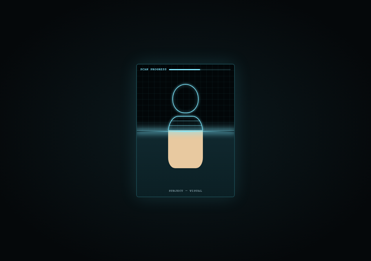
This effect stacks two versions of the same illustration — a normal "visual" layer on top and a stylized "x-ray" layer beneath — and uses a moving clip-path inset to progressively uncover the bottom layer from top to bottom as a glowing scan line sweeps down in sync with scroll, exactly like a medical or security scanner readout.
Two stacked absolutely-positioned layers
.normal and .xray occupy the same .scan-frame box via position: absolute; inset: 0. The x-ray layer starts fully hidden with clip-path: inset(0 0 100% 0) — cut away entirely from the bottom — while the normal layer sits behind it with no clip, always fully visible until covered.
Animating the clip-path inset
GSAP tweens the x-ray layer's clip-path from inset(0 0 100% 0) to inset(0 0 0% 0). The fourth value (bottom inset) is what shrinks toward 0, progressively revealing more of the x-ray layer from the top down as scroll progresses — this is a hardware-accelerated, GPU-friendly alternative to manually resizing an overflow: hidden container.
The synced scan line
A thin glowing .scan-line div is animated with the same scrub timeline, translating its y from 0 to the frame's full height at position 0 alongside the clip-path tween — so the visible glowing edge always tracks exactly where the x-ray reveal boundary currently sits, selling the illusion of an active scanning beam.
X-ray styling technique
The x-ray silhouette reuses the same skull/ribs shapes as the normal layer but restyles them with transparent fills, cyan border outlines, and box-shadow glows plus a repeating-linear-gradient overlay for a scanned-bone texture, layered under a faint grid overlay for a clinical HUD feel.
Fully reversible
Because both the clip-path and scan-line tweens live on one scrub: true timeline, scrolling back up retracts the x-ray reveal and scan line together with no extra logic.
See also Scroll Terrain Contour Lines for another stroke/reveal technique, or Scroll Radar Sweep Reveal for a related scanning-HUD aesthetic.
Build with AI
Build, Understand, Optimize, and Extend It With AI
Hand this snippet's HTML, CSS and JS to an AI coding assistant and ask it to explain precisely why animating clip-path: inset(0 0 X% 0) produces a top-down reveal, and how changing which of the four inset values is animated (top, right, bottom, left) changes the reveal direction — that's the whole mechanism in one property. It's a good one to extend with an assistant's help: ask it to add a horizontal left-to-right variant, to drive the reveal from actual mouse position instead of scroll for a hover-scan interaction, or to swap the CSS silhouette for two real <img> elements with a photographic "before" and a CSS filter: invert(1) contrast(1.4) "x-ray-style" version generated purely in CSS.
Prompt to recreate it
Copy this into your AI assistant of choice to build the effect from scratch, or as a jumping-off point for your own variant:
Build a scroll-driven "x-ray scanner" reveal in HTML, CSS and JavaScript using GSAP and ScrollTrigger — no canvas, no WebGL, no external images required (CSS shapes are fine).

Requirements:
- Stack two full-size layers absolutely inside one framed container: a "normal" layer showing a simple illustrated silhouette, and an "x-ray" layer beneath it showing the same silhouette restyled with glowing outlined/transparent styling to look scanned.
- The x-ray layer must start completely hidden using a CSS clip-path inset() with the bottom value at 100%, and a thin glowing horizontal "scan line" element must sit at the top of the frame.
- Wrap the frame in a tall scroll section and, using one GSAP timeline attached via ScrollTrigger with scrub: true, animate the x-ray layer's clip-path bottom inset down to 0% while simultaneously translating the scan line's y position down the full height of the frame, both on the same timeline position so they move in perfect sync — the glowing line should always appear to sit exactly at the reveal boundary.
- Add a small HUD-style progress bar that fills from 0 to 100% width on the same scrubbed timeline to reinforce the "scanning in progress" feeling.
- Everything must reverse cleanly when the user scrolls back up, since it is driven by scrub rather than a one-shot animation.
- Use a clinical, dark, cyan-glow color palette reminiscent of medical or security scanner UIs.
Want to tighten it up first? Run this prompt through the AI Prompt Studio to score it across 8 quality dimensions, catch anti-patterns, and tune the wording for Claude, ChatGPT, or Gemini before you paste it in.
Source Code
<div class="hint">Scroll ↓ to run the scanner</div>
<div class="scan-wrap">
  <div class="scan-stage">
    <div class="scan-frame">
      <div class="layer normal">
        <div class="silhouette">
          <div class="skull"></div>
          <div class="ribs"></div>
        </div>
        <div class="skin-label">SUBJECT — VISUAL</div>
      </div>
      <div class="layer xray" id="xrayLayer">
        <div class="silhouette xray-sil">
          <div class="skull xray-bone"></div>
          <div class="ribs xray-bone"></div>
        </div>
        <div class="grid-overlay"></div>
        <div class="skin-label">SUBJECT — X-RAY</div>
      </div>
      <div class="scan-line" id="scanLine"></div>
      <div class="hud">
        <span>SCAN PROGRESS</span>
        <div class="hud-bar"><div class="hud-fill" id="hudFill"></div></div>
      </div>
    </div>
  </div>
</div>
* { box-sizing: border-box; }
body { margin: 0; font-family: 'Courier New', monospace; background: #05080a; color: #d7f3ff; }
.hint { text-align: center; padding: 28px 16px; font-size: 13px; letter-spacing: 0.08em; color: #4fd6e8; text-transform: uppercase; }
.scan-wrap { height: 400vh; position: relative; }
.scan-stage { position: sticky; top: 0; height: 100vh; display: flex; align-items: center; justify-content: center; background: radial-gradient(ellipse at 50% 50%, #0c1a1e, #05080a 80%); }
.scan-frame { position: relative; width: min(340px, 82vw); height: 460px; border: 2px solid #1c4a52; border-radius: 8px; overflow: hidden; box-shadow: 0 0 60px rgba(79,214,232,0.15), inset 0 0 30px rgba(0,0,0,0.6); }
.layer { position: absolute; inset: 0; display: flex; align-items: center; justify-content: center; flex-direction: column; }
.normal { background: linear-gradient(180deg, #16323a, #0b1f24); }
.xray { background: #020608; clip-path: inset(0 0 100% 0); }
.silhouette { position: relative; width: 160px; height: 320px; }
.skull { position: absolute; top: 0; left: 50%; transform: translateX(-50%); width: 90px; height: 100px; border-radius: 50% 50% 46% 46%; background: #e8c9a0; }
.ribs { position: absolute; top: 110px; left: 50%; transform: translateX(-50%); width: 120px; height: 180px; background: #e8c9a0; border-radius: 30% 30% 20% 20%; }
.xray-sil .xray-bone { background: transparent; border: 2px solid #7fe9ff; box-shadow: 0 0 8px rgba(127,233,255,0.7), inset 0 0 14px rgba(127,233,255,0.3); }
.xray-sil .ribs.xray-bone { background-image: repeating-linear-gradient(180deg, transparent 0 14px, rgba(127,233,255,0.5) 14px 16px); }
.grid-overlay { position: absolute; inset: 0; background-image: linear-gradient(rgba(79,214,232,0.08) 1px, transparent 1px), linear-gradient(90deg, rgba(79,214,232,0.08) 1px, transparent 1px); background-size: 20px 20px; }
.skin-label { position: absolute; bottom: 14px; font-size: 10px; letter-spacing: 0.12em; color: rgba(215,243,255,0.6); }
.scan-line { position: absolute; left: 0; right: 0; top: 0; height: 3px; background: linear-gradient(90deg, transparent, #7fe9ff, transparent); box-shadow: 0 0 20px 4px rgba(127,233,255,0.8); }
.scan-line::after { content: ''; position: absolute; left: 0; right: 0; top: -40px; height: 40px; background: linear-gradient(180deg, transparent, rgba(127,233,255,0.15)); }
.hud { position: absolute; top: 12px; left: 12px; right: 12px; font-size: 10px; letter-spacing: 0.1em; color: #7fe9ff; display: flex; align-items: center; gap: 8px; }
.hud-bar { flex: 1; height: 4px; background: rgba(127,233,255,0.15); border-radius: 2px; overflow: hidden; }
.hud-fill { height: 100%; width: 0%; background: #7fe9ff; box-shadow: 0 0 8px #7fe9ff; }
@media (max-width: 640px) { .scan-frame { height: 400px; } }gsap.registerPlugin(ScrollTrigger);
const xrayLayer = document.getElementById('xrayLayer');
const scanLine = document.getElementById('scanLine');
const hudFill = document.getElementById('hudFill');
const frameHeight = document.querySelector('.scan-frame').offsetHeight;
gsap.timeline({
scrollTrigger: {
trigger: '.scan-wrap',
start: 'top top',
end: 'bottom bottom',
scrub: true,
},
})
.to(xrayLayer, { clipPath: 'inset(0 0 0% 0)', ease: 'none' }, 0)
.to(scanLine, { y: frameHeight, ease: 'none' }, 0)
.to(hudFill, { width: '100%', ease: 'none' }, 0);
ScrollTrigger.refresh();Step by step
How to Use
- 1Scroll through the previewScroll down slowly and watch the glowing scan line sweep downward, revealing the cyan x-ray silhouette beneath the normal view.
- 2Swap in your own imagesReplace the .silhouette CSS shapes (or the whole .layer content) with real <img> elements for the "before" and "x-ray/after" states.
- 3Adjust scan speed and rangeChange the ScrollTrigger start/end values on .scan-wrap, or the total height set via height: 400vh, to make the scan take more or less scroll distance.
- 4Restyle the x-ray lookEdit .xray-bone border/box-shadow colors and the .grid-overlay background-size to change the scanner's visual language.
- 5Make it horizontalSwap the clip-path inset direction (second value instead of fourth) and animate scan-line's x instead of y for a left-to-right sweep.
- 6Export in your formatClick "HTML" for a standalone file, "JSX" for a React component, or "Tailwind" for a React + Tailwind version.
Real-world uses
Common Use Cases
Got questions?
Frequently Asked Questions
The x-ray layer starts with clip-path: inset(0 0 100% 0), which crops away its entire bottom portion, making it invisible. GSAP animates the bottom inset value down to 0%, progressively un-cropping the layer from the top downward as the user scrolls.
Animating clip-path is composited on the GPU and does not trigger layout reflow the way animating height or clip: rect() on older syntax would, making it smoother especially on mobile.
Both the clip-path tween and the scan-line's y translation are placed at the same timeline position (0) with the same ease (none) and the same scrub-driven progress, so they move in perfect lockstep automatically.
Yes — replace the .silhouette divs with <img> tags sized to fill .scan-frame; keep one normal photo in .normal and a filtered/inverted or illustrated version in .xray.
Yes, the frame uses a min(340px, 82vw) width and a media query height adjustment; clip-path animation performs well on modern mobile browsers.