Learn Coding Visually
Learn to code with interactive, live-preview playgrounds — HTML, CSS, JavaScript, React & more.
 HTML Playground42 lessons · Click-based · Live preview
 CSS PlaygroundLearn CSS with a live editor
 JavaScript Playground60 lessons · DOM · Async · Canvas
 React PlaygroundLearn React with a live code editor
 GSAP PlaygroundLearn GSAP animation interactively
 SVG Playground44 lessons · shapes · paths · animation
 SCSS Playground45 lessons · Sass modules · tokens
 Tailwind PlaygroundLearn Tailwind CSS with a live editor
 Bootstrap 5 Playground50 lessons · live preview
Scroll Radar Sweep Reveal — Free HTML CSS JS Snippet
Scroll Radar Sweep Reveal · Scroll · Plain HTML, CSS & JS · Live preview
What's included
Features
About this UI Snippet
Scroll Radar Sweep Reveal — conic-gradient Sweep, Scroll-Timed Blips & Live Readout
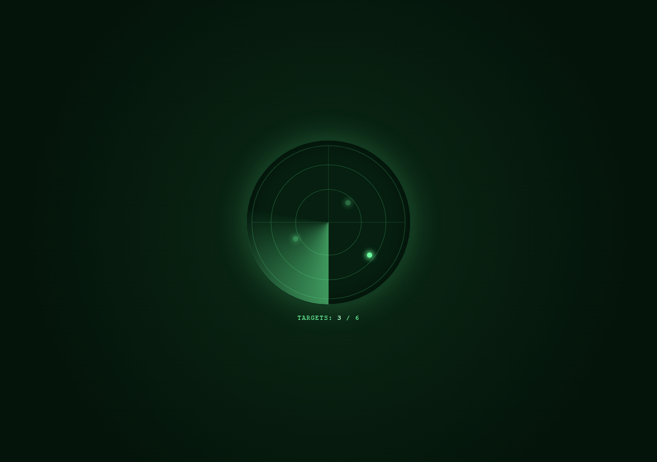
This snippet builds a classic circular radar display — concentric SVG rings, a rotating conic-gradient sweep beam, and glowing "blips" that flash into visibility only once the sweep passes their position — entirely driven by one GSAP ScrollTrigger scrub timeline so the sweep's rotation and every blip's reveal timing are locked to scroll progress.
The sweep beam as a conic-gradient
Rather than drawing a wedge shape manually, .sweep uses background: conic-gradient(from 0deg, rgba(...,0.55), rgba(...,0) 28%, rgba(...,0) 100%) — a bright edge fading to transparent over the first 28% of the circle, then fully transparent the rest of the way. GSAP rotates this element's rotate transform through multiple full turns (360 * totalRotations) across the scroll range, which visually reads as a sweeping radar beam circling the display, its trailing fade behaving like phosphor persistence on a real radar screen.
Blips timed to scroll position, not the sweep's actual angle
Each .blip carries a data-delay attribute (a value between 0 and 1) representing the fraction of the scroll range at which the sweep visually reaches its position. The timeline adds a near-instant opacity flash tween (0 → 1 → 0.35) at that exact timeline position — so as the user scrolls, each blip appears to "light up" the moment the rotating sweep passes over it, then dims to a persistent afterglow rather than disappearing.
Placing blips with CSS custom properties
Each blip's position is set inline via --x and --y custom properties consumed by top: var(--y); left: var(--x), keeping position data colocated with each element in the HTML rather than buried in JS or CSS selectors.
A live progress readout
A second ScrollTrigger.create with onUpdate counts how many blips have passed their data-delay threshold at the current scroll progress and writes that count into a "TARGETS: n / 6" readout — the same raw-progress-driven UI pattern used for non-tween-friendly content like text.
Fully reversible with pin: true
The stage uses position: sticky for the pinned feel while the sweep and blip timeline is entirely scrub-driven, so scrolling back up rotates the sweep backward and blips fade out again in reverse order.
Pair this with Scroll X-Ray Scan Reveal for a related scanning-HUD technique, or Scroll Thermometer Fill for another live-readout gauge pattern.
Build with AI
Build, Understand, Optimize, and Extend It With AI
Paste this snippet's HTML, CSS and JS into an AI assistant and ask it to explain how a conic-gradient combined with a rotate transform produces a radar sweep beam without any SVG wedge or canvas arc drawing, and why the gradient's fade percentage (28%) controls the beam's visual "width." It's a good snippet to extend with an assistant: ask it to compute each blip's data-delay automatically from its --x/--y position using Math.atan2 instead of manually chosen values, to add a trailing blip "ping" ripple animation on reveal, or to add a distance-based label near each blip showing a fake range reading.
Prompt to recreate it
Copy this into your AI assistant of choice to build the effect from scratch, or as a jumping-off point for your own variant:
Build a scroll-driven "radar sweep" display in HTML, CSS and JavaScript using GSAP and ScrollTrigger — no canvas, no WebGL, no SVG wedge shapes.

Requirements:
- Render a circular radar screen containing a few concentric ring outlines (SVG circles or CSS box-shadow rings), a crosshair, and a rotating "sweep" element whose visual is created with a CSS conic-gradient that is bright at its leading edge and fades to fully transparent within about a quarter turn.
- Scatter several small circular "blip" dots inside the radar at different positions (using CSS custom properties for x/y placement), each starting fully transparent.
- Wrap the radar in a tall scroll section and, using one GSAP timeline attached via ScrollTrigger with scrub: true, rotate the sweep element through several full 360-degree rotations across the scroll range.
- Give each blip a data attribute marking a fraction of the scroll range (0 to 1) representing when the sweep should be considered to have passed over it, and add a near-instant opacity tween on the shared timeline at that exact position so the blip flashes to full opacity then settles to a dimmer persistent afterglow, timed to feel like it lit up as the sweep passed.
- Add a live numeric readout (e.g. "TARGETS: 3 / 6") that updates via a ScrollTrigger onUpdate callback counting how many blips have passed their reveal threshold at the current scroll progress.
- Everything must animate forward and reverse cleanly as the user scrolls down and back up.
- Use a dark military-green phosphor-screen color palette with glowing box-shadows on the blips and sweep.
Want to tighten it up first? Run this prompt through the AI Prompt Studio to score it across 8 quality dimensions, catch anti-patterns, and tune the wording for Claude, ChatGPT, or Gemini before you paste it in.
Source Code
<div class="hint">Scroll ↓ to sweep the radar</div>
<div class="radar-wrap">
  <div class="radar-stage">
    <div class="radar-screen">
      <svg viewBox="0 0 300 300" class="rings-svg">
        <circle cx="150" cy="150" r="60" class="ring" />
        <circle cx="150" cy="150" r="105" class="ring" />
        <circle cx="150" cy="150" r="150" class="ring" fill="none" stroke="none" />
        <circle cx="150" cy="150" r="140" class="ring" />
        <line x1="150" y1="10" x2="150" y2="290" class="cross" />
        <line x1="10" y1="150" x2="290" y2="150" class="cross" />
      </svg>
      <div class="sweep" id="sweep"></div>
      <div class="blip" style="--x:62%;--y:38%" data-delay="0.12"></div>
      <div class="blip" style="--x:30%;--y:60%" data-delay="0.3"></div>
      <div class="blip" style="--x:75%;--y:70%" data-delay="0.48"></div>
      <div class="blip" style="--x:45%;--y:25%" data-delay="0.62"></div>
      <div class="blip" style="--x:20%;--y:30%" data-delay="0.78"></div>
      <div class="blip" style="--x:68%;--y:20%" data-delay="0.92"></div>
    </div>
    <div class="readout">TARGETS: <span id="blipCount">0</span> / 6</div>
  </div>
</div>
* { box-sizing: border-box; }
body { margin: 0; font-family: 'Courier New', monospace; background: #04140a; color: #6fffa0; }
.hint { text-align: center; padding: 28px 16px; font-size: 13px; letter-spacing: 0.08em; text-transform: uppercase; color: #3fcf7a; }
.radar-wrap { height: 400vh; position: relative; }
.radar-stage { position: sticky; top: 0; height: 100vh; display: flex; flex-direction: column; align-items: center; justify-content: center; gap: 20px; background: radial-gradient(circle at 50% 50%, #0b2a16, #04140a 75%); }
.radar-screen { position: relative; width: min(320px, 80vw); height: min(320px, 80vw); border-radius: 50%; background: #061f10; box-shadow: 0 0 0 4px #123a20, 0 0 60px rgba(111,255,160,0.25), inset 0 0 40px rgba(0,0,0,0.6); overflow: hidden; }
.rings-svg { position: absolute; inset: 0; width: 100%; height: 100%; }
.ring { fill: none; stroke: rgba(111,255,160,0.25); stroke-width: 1; }
.cross { stroke: rgba(111,255,160,0.15); stroke-width: 1; }
.sweep { position: absolute; top: 0; left: 0; width: 100%; height: 100%; background: conic-gradient(from 0deg, rgba(111,255,160,0.55), rgba(111,255,160,0) 28%, rgba(111,255,160,0) 100%); border-radius: 50%; transform: rotate(0deg); }
.blip { position: absolute; top: var(--y); left: var(--x); width: 10px; height: 10px; margin: -5px; border-radius: 50%; background: #6fffa0; box-shadow: 0 0 10px 3px rgba(111,255,160,0.8); opacity: 0; }
.readout { font-size: 12px; letter-spacing: 0.12em; color: #6fffa0; }
.readout span { color: #b6ffce; font-weight: 700; }
@media (max-width: 640px) { .radar-screen { width: 84vw; height: 84vw; } }gsap.registerPlugin(ScrollTrigger);
const sweep = document.getElementById('sweep');
const blips = gsap.utils.toArray('.blip');
const counter = document.getElementById('blipCount');
const totalRotations = 3;
const tl = gsap.timeline({
scrollTrigger: {
trigger: '.radar-wrap',
start: 'top top',
end: 'bottom bottom',
scrub: true,
},
});
tl.to(sweep, { rotate: 360 * totalRotations, ease: 'none', duration: 1 }, 0);
blips.forEach((blip) => {
const delay = parseFloat(blip.dataset.delay);
tl.to(blip, { opacity: 1, duration: 0.02 }, delay)
.to(blip, { opacity: 0.35, duration: 0.06 }, delay + 0.02);
});
ScrollTrigger.create({
trigger: '.radar-wrap',
start: 'top top',
end: 'bottom bottom',
scrub: true,
onUpdate: (self) => {
const p = self.progress;
let count = 0;
blips.forEach((b) => { if (p >= parseFloat(b.dataset.delay)) count++; });
counter.textContent = count;
},
});
ScrollTrigger.refresh();Step by step
How to Use
- 1Scroll through the previewScroll down slowly — the green sweep beam rotates around the radar and each blip flashes on the moment the beam passes over it, with the target counter updating live.
- 2Add or reposition blipsAdd a .blip div with its own --x/--y percentage position and a data-delay (0 to 1) marking when in the scroll range it should light up.
- 3Change sweep speedAdjust totalRotations in the JS panel — a higher number makes the beam spin more times across the same scroll distance, so blips flash more rapidly in succession.
- 4Restyle the sweep glowEdit the conic-gradient stops in .sweep to change the beam's width, brightness, or trailing fade length.
- 5Adjust the readoutChange the "/ 6" text in the HTML and make sure it matches your total blip count, or remove the readout entirely.
- 6Export in your formatClick "HTML" for a standalone file, "JSX" for a React component, or "Tailwind" for a React + Tailwind version.
Real-world uses
Common Use Cases
Got questions?
Frequently Asked Questions
The .sweep element uses a CSS conic-gradient that is bright near 0 degrees and fades to transparent by 28% of the circle, then stays transparent the rest of the way. GSAP rotates that whole gradient with the rotate transform, which reads visually as a sweeping beam.
Each blip has a data-delay value between 0 and 1 representing scroll progress. The timeline adds a near-instant opacity tween at that exact position, so the blip appears to light up in sync with the sweep passing that point in the rotation.
Yes — compute each blip's angle from its --x/--y position relative to center with Math.atan2, convert to a 0-1 fraction of total rotations, and set data-delay from that instead of a manually chosen value.
onUpdate callbacks are the right tool for reading continuous scroll progress to drive non-animatable content like text, separate from the tween-based timeline that animates opacity and rotation.
Yes, totalRotations (default 3) multiplies 360 degrees so the beam completes several full sweeps across the scroll range, giving more blips room to reveal at readable intervals.