Learn Coding Visually
Learn to code with interactive, live-preview playgrounds — HTML, CSS, JavaScript, React & more.
 HTML Playground42 lessons · Click-based · Live preview
 CSS PlaygroundLearn CSS with a live editor
 JavaScript Playground60 lessons · DOM · Async · Canvas
 React PlaygroundLearn React with a live code editor
 GSAP PlaygroundLearn GSAP animation interactively
 SVG Playground44 lessons · shapes · paths · animation
 SCSS Playground45 lessons · Sass modules · tokens
 Tailwind PlaygroundLearn Tailwind CSS with a live editor
 Bootstrap 5 Playground50 lessons · live preview
Scroll Neon Sign Flicker On — Free HTML CSS JS Snippet
Scroll Neon Sign Flicker On · Scroll · Plain HTML, CSS & JS · Live preview
What's included
Features
About this UI Snippet
Scroll Neon Sign Flicker On — Layered drop-shadow Glow, Per-Letter Flicker & Scroll-Timed Sequencing
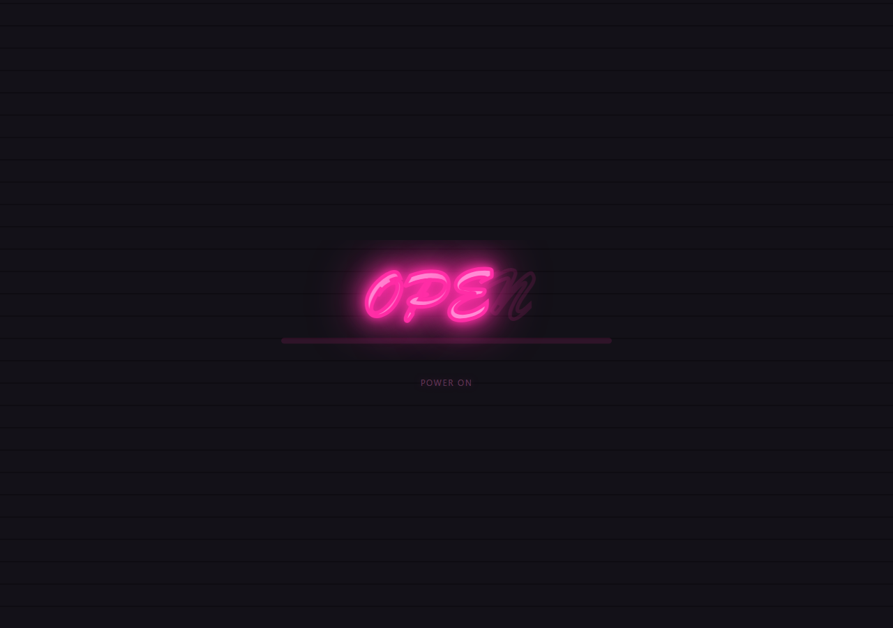
This snippet lights up an SVG neon sign one letter at a time as the user scrolls, combining a scroll-scrubbed opacity/class toggle with a short one-shot CSS @keyframes flicker for each letter, so the sign feels like it's actually powering on unevenly rather than fading in smoothly.
Dim tube outline versus lit glowing fill
Each <tspan class="letter"> starts as a dim, unlit tube: fill: none; stroke: #ff2ea6; stroke-width: 2; opacity: 0.12 — just a faint outline, like an unpowered glass neon tube. The .lit class switches it to a solid glowing fill (fill: #ff8ad4) plus several stacked drop-shadow() filters at increasing blur radii, which is the standard technique for a convincing neon glow: a tight bright shadow plus wider, dimmer shadows around it simulate light bleeding into the surrounding air.
GSAP timeline calls to toggle classes at scroll-mapped positions
Rather than tweening CSS custom properties, this snippet uses tl.call() — GSAP's function-callback timeline method — to add/remove the .lit and .flicker classes at precise fractional timeline positions (t = i / all.length) for each letter. This lets a fast, snappy CSS @keyframes flicker fire once per letter exactly when scroll reaches that letter's turn, rather than trying to scrub a keyframe animation's internal frames directly (which GSAP cannot do for a running animation).
The flicker keyframe itself
@keyframes flicker dips opacity down to 0.3 and 0.5 briefly at two points before settling at 1, using steps(1) timing so each dip is an abrupt jump rather than a smooth fade — mimicking the characteristic stutter of a neon tube's gas discharge stabilizing when power is first applied.
Reversing gracefully
Because tl.call() fires only when the scrubbed playhead crosses that position (forward or backward), scrolling back up removes each letter's .lit class in reverse order, returning it to its dim outline state — GSAP calls in a timeline automatically fire in reverse on scrub-back just like tweens do.
A live power-state label
A separate ScrollTrigger.onUpdate toggles a "POWER OFF"/"POWER ON" text label once scroll passes a small threshold, echoing the pattern used in Scroll Weather Scene Transition for scroll-driven text state.
Pair this with Scroll Text Clip Reveal for another letter-driven scroll technique.
Build with AI
Build, Understand, Optimize, and Extend It With AI
Paste this snippet's HTML, CSS and JS into an AI coding assistant and ask it to explain why tl.call() is the right GSAP tool for firing a one-shot CSS @keyframes flicker at a specific scroll position, as opposed to trying to tween the animation's own internal timing directly — that distinction between scrubbable tweens and discrete triggered effects is the core of the technique. It's worth extending with an assistant's help: ask it to add a subtle buzzing/humming sound effect triggered alongside each letter's flicker (gated behind a user interaction per browser autoplay policy), to make the flicker intensity and duration randomized per letter for more organic variation, or to add a "sign is broken" state where one letter never quite stabilizes and keeps flickering intermittently.
Prompt to recreate it
Copy this into your AI assistant of choice to build the effect from scratch, or as a jumping-off point for your own variant:
Build a scroll-driven neon sign "flicker on" animation in HTML, CSS and JavaScript using GSAP and ScrollTrigger, with SVG text — no canvas, no WebGL.

Requirements:
- Render a word as SVG text split into individual tspan "letter" elements, each starting as a dim, unlit outline (stroke only, no fill, low opacity) representing an unpowered neon tube.
- Define a CSS @keyframes flicker animation using stepped (not smoothed) opacity dips that briefly flash lower before settling at full opacity, mimicking a real neon tube stabilizing when power is first applied.
- Define a "lit" CSS state for each letter with a solid glow fill and several stacked drop-shadow filters at increasing blur radii to simulate realistic neon light bleed.
- Wrap the sign in a tall scroll section and, using one GSAP timeline attached via ScrollTrigger with scrub: true, use the timeline's call() method (not tween-based property animation) to add the lit class and briefly trigger the flicker keyframe animation on each letter in sequence at its own fractional position along the scroll range, then remove the flicker class shortly after so it only plays once per pass.
- Ensure scrolling back up removes each letter's lit state in reverse order, returning the sign to its dim unlit appearance.
- Add a small text readout that toggles between "POWER OFF" and "POWER ON" based on raw scroll progress via a ScrollTrigger onUpdate callback.
- Use a hot-pink neon-on-dark-brick color palette with a subtle brick-pattern background built from CSS gradients, no images.
Want to tighten it up first? Run this prompt through the AI Prompt Studio to score it across 8 quality dimensions, catch anti-patterns, and tune the wording for Claude, ChatGPT, or Gemini before you paste it in.
Source Code
<div class="hint">Scroll ↓ to power on the sign</div>
<div class="neon-wrap">
  <div class="neon-stage">
    <div class="brick-bg"></div>
    <svg viewBox="0 0 520 160" class="neon-svg">
      <text x="260" y="100" text-anchor="middle" class="neon-text">
        <tspan class="letter" data-hue="330">O</tspan><tspan class="letter" data-hue="330">P</tspan><tspan class="letter" data-hue="330">E</tspan><tspan class="letter" data-hue="330">N</tspan>
      </text>
      <rect x="40" y="130" width="440" height="8" rx="4" class="tube-border underline" />
    </svg>
    <div class="power-hint" id="powerHint">POWER OFF</div>
  </div>
</div>
* { box-sizing: border-box; }
body { margin: 0; font-family: system-ui, sans-serif; background: #0a0a0f; }
.hint { text-align: center; padding: 28px 16px; font-size: 13px; letter-spacing: 0.08em; text-transform: uppercase; color: #6a5a7a; }
.neon-wrap { height: 380vh; position: relative; }
.neon-stage { position: sticky; top: 0; height: 100vh; display: flex; flex-direction: column; align-items: center; justify-content: center; gap: 24px; overflow: hidden; background: #0a0a0f; }
.brick-bg { position: absolute; inset: 0; background-image: repeating-linear-gradient(0deg, #17141c 0 30px, #100e14 30px 32px), repeating-linear-gradient(90deg, transparent 0 58px, #100e14 58px 60px); opacity: 0.7; }
.neon-svg { position: relative; width: min(560px, 90vw); height: auto; }
.neon-text { font-family: 'Brush Script MT', cursive, 'Georgia', serif; font-size: 92px; font-weight: 700; fill: none; }
.letter { stroke: #ff2ea6; stroke-width: 2; fill: none; opacity: 0.12; filter: none; }
.letter.lit { fill: #ff8ad4; opacity: 1; filter: drop-shadow(0 0 6px #ff2ea6) drop-shadow(0 0 16px #ff2ea6) drop-shadow(0 0 30px rgba(255,46,166,0.6)); }
.underline { fill: #ff2ea6; opacity: 0.12; }
.underline.lit { opacity: 1; filter: drop-shadow(0 0 6px #ff2ea6) drop-shadow(0 0 18px #ff2ea6); }
@keyframes flicker {
0%, 100% { opacity: 1; }
8% { opacity: 0.3; }
10% { opacity: 1; }
20% { opacity: 0.5; }
22% { opacity: 1; }
}
.flicker { animation: flicker 0.4s steps(1) 1; }
.power-hint { font-size: 12px; letter-spacing: 0.14em; color: #6a5a7a; text-transform: uppercase; }
.power-hint.on { color: #ff8ad4; text-shadow: 0 0 10px rgba(255,46,166,0.6); }
@media (max-width: 640px) { .neon-text { font-size: 60px; } }gsap.registerPlugin(ScrollTrigger);
const letters = gsap.utils.toArray('.letter');
const underline = document.querySelector('.underline');
const powerHint = document.getElementById('powerHint');
const all = [...letters, underline];
const tl = gsap.timeline({
scrollTrigger: {
trigger: '.neon-wrap',
start: 'top top',
end: 'bottom bottom',
scrub: true,
},
});
all.forEach((el, i) => {
const t = i / all.length;
tl.to(el, { opacity: 1, ease: 'none', duration: 0.06 }, t)
.call(() => { el.classList.add('lit', 'flicker'); }, null, t)
.call(() => { el.classList.remove('flicker'); }, null, t + 0.06)
.call(() => { el.classList.remove('lit'); el.style.opacity = ''; }, null, t - 0.001)
.set(el, { opacity: 1 }, t);
});
ScrollTrigger.create({
trigger: '.neon-wrap',
start: 'top top',
end: 'bottom bottom',
scrub: true,
onUpdate: (self) => {
powerHint.textContent = self.progress > 0.05 ? 'POWER ON' : 'POWER OFF';
powerHint.classList.toggle('on', self.progress > 0.05);
},
});
ScrollTrigger.refresh();Step by step
How to Use
- 1Scroll through the previewScroll down slowly — each letter of "OPEN" lights up in turn with a brief flicker, followed by the underline tube, while the power label switches on.
- 2Change the sign textEdit the tspan.letter elements inside the SVG text in the HTML panel — each character needs its own tspan with class="letter" to be individually lit.
- 3Adjust flicker timingEdit the @keyframes flicker percentages/opacity dips in the CSS panel, or change the flicker animation duration (0.4s) for a faster or slower stutter.
- 4Retime the sequenceIn the JS panel, the t = i / all.length spacing controls how much scroll distance passes between each letter lighting up — spread this out further for a slower reveal.
- 5Restyle the glow colorChange the #ff2ea6/#ff8ad4 stroke/fill and drop-shadow colors throughout to switch from hot pink to cyan, green, or any neon hue.
- 6Export in your formatClick "HTML" for a standalone file, "JSX" for a React component, or "Tailwind" for a React + Tailwind version.
Real-world uses
Common Use Cases
Got questions?
Frequently Asked Questions
Multiple drop-shadow() filters are stacked on the .lit class at increasing blur radii and decreasing opacity/color intensity — a tight bright shadow close to the shape plus wider, dimmer shadows farther out — mimicking how real neon light scatters into the surrounding air.
The flicker is a discrete, several-frame CSS @keyframes animation that needs to play through its full sequence once a letter is "reached," not something that can be scrubbed frame-by-frame like a continuous opacity/transform tween. tl.call() lets the scrubbed timeline trigger that one-shot animation at the correct scroll position.
Each call is placed at a specific timeline position and fires once the scrubbed playhead crosses it in either direction, so passing back and forth rapidly across that exact point could retrigger the flicker — for a stricter one-time-only flicker, track a "hasFlickered" flag per letter and check it inside the call.
Add more tspan.letter elements for additional words within the same SVG text (or a second text element), and the JS automatically includes them via gsap.utils.toArray('.letter') without any other changes.
Yes — update the stroke and fill hex values on .letter/.letter.lit and the drop-shadow color values to any neon hue; consider defining them as CSS custom properties for a single-place color swap.