


Learn Coding Visually
Learn to code with interactive, live-preview playgrounds — HTML, CSS, JavaScript, React & more.
 HTML Playground42 lessons · Click-based · Live preview
 CSS PlaygroundLearn CSS with a live editor
 JavaScript Playground60 lessons · DOM · Async · Canvas
 React PlaygroundLearn React with a live code editor
 GSAP PlaygroundLearn GSAP animation interactively
 SVG Playground44 lessons · shapes · paths · animation
 SCSS Playground45 lessons · Sass modules · tokens
 Tailwind PlaygroundLearn Tailwind CSS with a live editor
 Bootstrap 5 Playground50 lessons · live preview
Scroll Paper Fold Brochure — Free HTML CSS JS Snippet
Scroll Paper Fold Brochure · Scroll · Plain HTML, CSS & JS · Live preview
What's included
Features
About this UI Snippet
Scroll Paper Fold Brochure — CSS 3D Hinge Rotation, transform-origin & Sequential Scrub
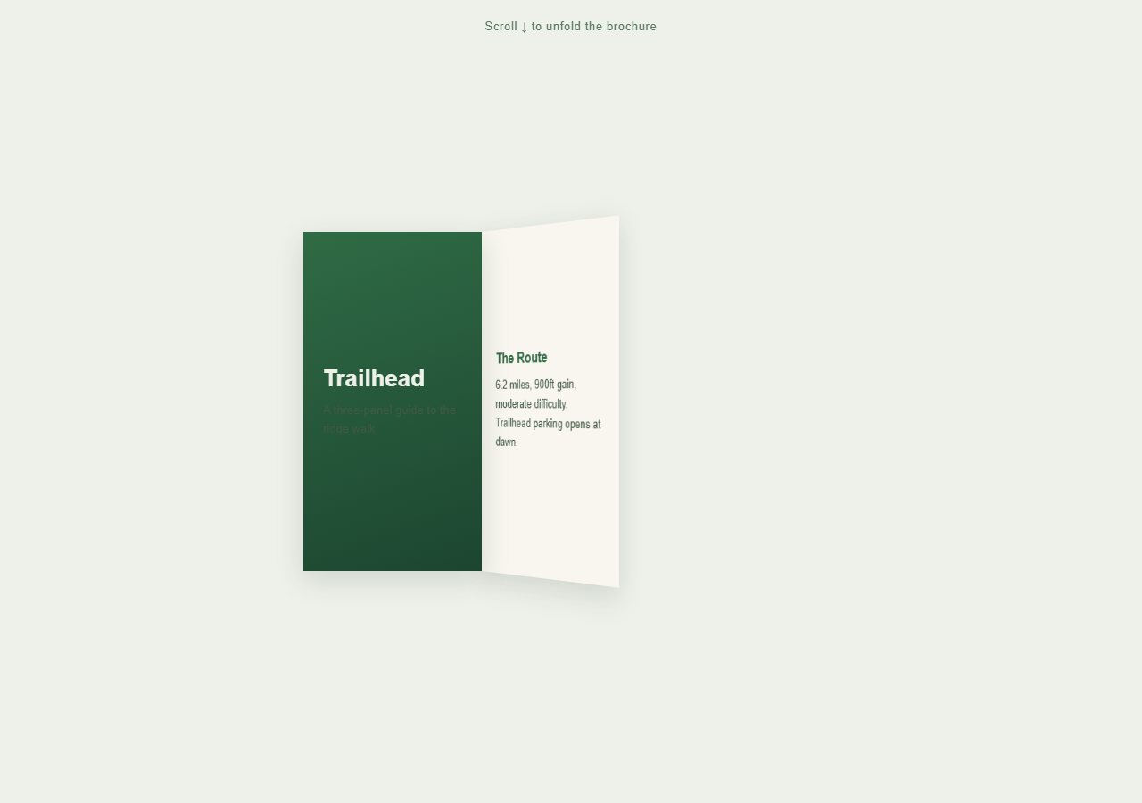
A tri-fold brochure that starts closed and opens one panel at a time as the page scrolls, each panel rotating open on its hinge exactly like unfolding a real paper brochure. Pair with Scroll Sticky Stack for another sticky-staged sequential reveal, or Scroll Parallax Layers for a simpler scrub effect.
A sticky stage inside a tall section, not a hard pin
.fold-section is 280vh tall, defining the scroll distance the unfold takes. .brochure-stage inside it uses position: sticky to hold itself in view for that distance, while the ScrollTrigger driving the animation explicitly sets pin: false — sticky positioning handles the visual staging, letting the brochure unfold across a normal-height scrolling section rather than a hard-pinned one.
Hinge rotation via transform-origin
Both the middle and right panels start at rotateY(-140deg) — folded back behind the cover panel — with transform-origin: left center, so rotation pivots around their left edge exactly like a real paper hinge rather than the panel's own center. The parent .brochure-stage has perspective: 1600px, giving the rotation real depth instead of looking like a flat skew.
Sequential unfolding on one scrubbed timeline
A single GSAP timeline rotates the middle panel from -140deg to 0deg starting at timeline position 0.05, then the right panel through the same rotation starting at 0.45 — staggered so panels open one after another rather than simultaneously, mimicking how a person's hand would unfold a physical brochure fold by fold.
Reversibility
Because both hinge rotations are scrubbed tweens on the same timeline, scrolling back up refolds the panels in reverse order — the right panel closes first, then the middle — exactly retracing the unfolding motion.
Build with AI
Build, Understand, Optimize, and Extend It With AI
Ask an AI assistant to explain why transform-origin: left center paired with a parent's CSS perspective is what makes this rotation read as a paper hinge rather than a flat card flip — and to contrast that with the deliberate choice of position: sticky plus ScrollTrigger's pin: false here, versus pin: true used elsewhere in this library, so you understand when each staging approach is appropriate. It's a good base to extend: ask the assistant to add a subtle drop-shadow that intensifies as each panel opens (to suggest it lifting off the page), to add a fourth panel, or to make the fold direction alternate (mountain/valley fold) between panels. Treat it as a technique reference for CSS 3D hinge rotation, not a finished brochure.
Prompt to recreate it
Copy this into your AI assistant of choice to build the effect from scratch, or as a jumping-off point for your own variant:
Build a scroll-scrubbed "tri-fold brochure unfolding" animation in plain HTML, CSS, and JavaScript using GSAP and ScrollTrigger — CSS 3D transforms only, no 3D library.

Requirements:
- Create a tall wrapping section (e.g. 250-300vh) to define the scroll distance for the whole unfold sequence.
- Inside it, create a stage element positioned with CSS position: sticky and a top offset so it holds its position in the viewport as the user scrolls through the tall section, and give its parent a CSS perspective value (e.g. 1500-1800px) for realistic 3D depth.
- Create a brochure container laid out with display: flex containing 3 panel divs of equal width: a cover panel (visible/flat from the start) and two more panels that each start rotated to roughly -140 degrees on the Y axis with transform-origin set to "left center" so they appear folded behind the cover.
- Create one GSAP timeline whose scrollTrigger is attached to the tall wrapping section with a numeric scrub value and pin explicitly set to false (use the sticky positioning for staging instead of a hard pin).
- In that timeline, tween the second panel's rotateY from its folded angle to 0 degrees using ease: "none", starting near the beginning of the timeline, then tween the third panel's rotateY the same way starting partway through the timeline (staggered after the second panel, not simultaneous), so panels open one after another like a hand unfolding real paper.
- Give each panel distinct brochure-style content (heading and short paragraph) so the unfolding reveals genuinely different information per panel.
- Confirm scrolling back up refolds the panels in reverse order smoothly, since both rotations are tweens on the one shared scrubbed timeline.
- Style with a corporate brochure palette: a solid, deep accent-color cover panel and clean cream/off-white inner panels with simple sans-serif typography.
Want to tighten it up first? Run this prompt through the AI Prompt Studio to score it across 8 quality dimensions, catch anti-patterns, and tune the wording for Claude, ChatGPT, or Gemini before you paste it in.
Source Code
<div class="hint">Scroll ↓ to unfold the brochure</div>
<section class="fold-section">
  <div class="brochure-stage">
    <div class="brochure">
      <div class="panel cover">
        <h2>Trailhead</h2>
        <p>A three-panel guide to the ridge walk</p>
      </div>
      <div class="panel middle" id="panelMiddle">
        <h3>The Route</h3>
        <p>6.2 miles, 900ft gain, moderate difficulty. Trailhead parking opens at dawn.</p>
      </div>
      <div class="panel right" id="panelRight">
        <h3>What to Bring</h3>
        <p>Water, layered clothing, a paper map — signal drops past the ridge line.</p>
      </div>
    </div>
  </div>
</section>
<div class="spacer"></div>
* { box-sizing: border-box; }
body { margin: 0; font-family: 'Helvetica Neue', Arial, sans-serif; background: #eef1ea; color: #223326; }
.hint { position: sticky; top: 12px; text-align: center; font-size: 13px; letter-spacing: 0.05em; color: #5a7a5f; z-index: 5; padding: 10px; }
.fold-section { height: 280vh; }
.spacer { height: 15vh; }
.brochure-stage { position: sticky; top: 14vh; height: 72vh; display: flex; align-items: center; justify-content: center; perspective: 1600px; }
.brochure { display: flex; width: min(90vw, 600px); height: 380px; }
.panel { width: 33.333%; height: 100%; padding: 28px 22px; display: flex; flex-direction: column; justify-content: center; gap: 10px; box-shadow: 0 10px 30px rgba(34,51,38,0.15); }
.cover { background: linear-gradient(160deg, #2f6b45, #1c4530); color: #eef1ea; position: relative; z-index: 3; }
.cover h2 { font-size: 26px; margin: 0; }
.cover p { font-size: 13px; opacity: 0.85; margin: 0; }
.middle { background: #f8f6ee; transform-origin: left center; transform: rotateY(-140deg); position: relative; z-index: 2; }
.right { background: #eef1ea; border-left: 1px solid #d6ddd0; transform-origin: left center; transform: rotateY(-140deg); position: relative; z-index: 1; }
.panel h3 { font-size: 16px; margin: 0; color: #2f6b45; }
.panel p { font-size: 13px; line-height: 1.6; margin: 0; color: #445a48; }gsap.registerPlugin(ScrollTrigger);
var panelMiddle = document.getElementById('panelMiddle');
var panelRight = document.getElementById('panelRight');
gsap.set([panelMiddle, panelRight], { rotateY: -140, transformStyle: 'preserve-3d' });
var tl = gsap.timeline({
scrollTrigger: {
trigger: '.fold-section',
start: 'top top',
end: 'bottom bottom',
scrub: 0.5,
pin: false,
},
});
tl.to(panelMiddle, { rotateY: 0, ease: 'none', duration: 1 }, 0.05)
.to(panelRight, { rotateY: 0, ease: 'none', duration: 1 }, 0.45);Step by step
How to Use
- 1Scroll through the sectionScroll down slowly — the middle panel unfolds open first, then the right panel unfolds, revealing brochure content on each.
- 2Scroll back upThe panels refold in reverse order — right panel first, then middle — confirming full reversibility.
- 3Edit panel contentChange the heading and paragraph text inside .cover, #panelMiddle, and #panelRight in the HTML panel to your own brochure copy.
- 4Adjust fold timingChange the timeline positions (0.05 and 0.45) in the JS panel to make panels unfold closer together or further apart.
- 5Add a fourth panelAdd another .panel div with rotateY(-140deg) and transform-origin: left center, then add a matching tween to the timeline at a later position.
- 6Export in your formatClick "HTML" for a standalone file, "JSX" for React, or "Tailwind" for a React + Tailwind version.
Real-world uses
Common Use Cases
Got questions?
Frequently Asked Questions
The brochure unfolds across a normal-height tall section rather than needing a fixed "stage" the whole time — position: sticky on the wrapping element achieves the same staying-in-view effect without GSAP inserting pin-spacer elements, which better suits content meant to transition while the page continues scrolling.
transform-origin: left center means rotation pivots around the panel's left edge, not its center — exactly where a real paper hinge would be. Combined with perspective set on the parent container, the rotating panel appears to swing through 3D space rather than just skewing flat.
Both panel rotations are tweens on one shared scrubbed timeline, but placed at different timeline start positions (0.05 and 0.45) — this staggers them so the middle panel finishes most of its unfold before the right panel begins, mimicking how a hand would open a real brochure fold by fold.
Yes — add another .panel element with the same starting rotateY(-140deg) and transform-origin: left center, then add a tween for it to the timeline at a later position than the existing panels, and extend the section height proportionally.
Yes — perspective and rotateY are broadly supported. On very narrow viewports you may want to reduce the perspective value or panel widths so panels stay legible; the max-width: 90vw sizing already keeps the brochure responsive.