Learn Coding Visually
Learn to code with interactive, live-preview playgrounds — HTML, CSS, JavaScript, React & more.
 HTML Playground42 lessons · Click-based · Live preview
 CSS PlaygroundLearn CSS with a live editor
 JavaScript Playground60 lessons · DOM · Async · Canvas
 React PlaygroundLearn React with a live code editor
 GSAP PlaygroundLearn GSAP animation interactively
 SVG Playground44 lessons · shapes · paths · animation
 SCSS Playground45 lessons · Sass modules · tokens
 Tailwind PlaygroundLearn Tailwind CSS with a live editor
 Bootstrap 5 Playground50 lessons · live preview
Scroll Holographic Card Tilt Story — Free HTML CSS JS Snippet
Scroll Holographic Card Tilt Story · Scroll · Plain HTML, CSS & JS · Live preview
What's included
Features
About this UI Snippet
Scroll Holographic Card Tilt Story — Scroll-Driven Tilt, mix-blend-mode Sheen & Pinned Story States
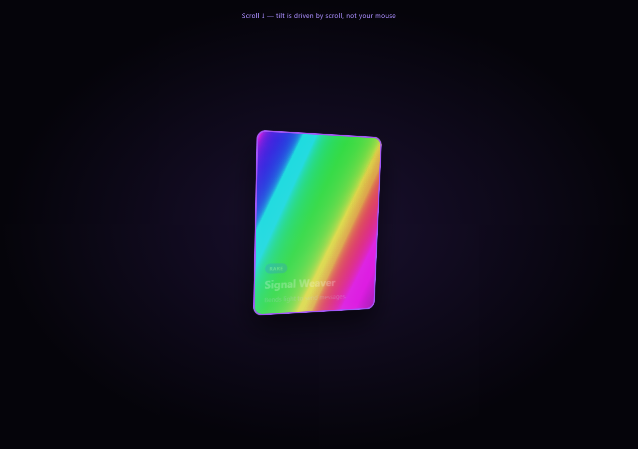
A trading-card effect that looks like the common mouse-tilt holographic card trick, but is driven entirely by scroll progress instead — useful anywhere a mouse isn't available or reliable, like touch devices or a scripted narrative sequence. Pair with Scroll Sticky Stack for another pinned multi-state pattern, or Scroll Parallax Layers for a lighter scrub effect. Compare with mouse-driven tilt cards elsewhere in this library — the mechanism here is fundamentally different: every degree of rotation comes from the scrubbed timeline, never from pointer position.
Scroll-driven 3D tilt, not pointer-driven
The card sits inside a .card-stage with CSS perspective: 1000px, and the .card itself has transform-style: preserve-3d. A scrubbed GSAP timeline tweens rotateX/rotateY through several keyframes (at timeline positions 0, 1, 2, 3) — there is no mousemove listener anywhere. Scroll position is the only input driving the tilt angle at any moment.
The holographic sheen via mix-blend-mode
.sheen is a large gradient layer (background-size: 200% 200%) using mix-blend-mode: color-dodge, a rainbow-striped linear-gradient. As the same scrubbed timeline tweens its background-position from 0% 50% to 100% 50%, the rainbow streak sweeps across the card face. color-dodge brightens the layers beneath it selectively, which is what gives the sheen its glassy, light-catching quality rather than looking like a flat gradient overlay.
Four pinned "story" states
The card is pinned (pin: true) for end: '+=300%' of scroll distance, split into four roughly-equal segments. At each segment boundary, one .content block's opacity crossfades out while the next fades in, and the .rarity-frame border color updates to match a rarity tier (common → rare → epic → legendary) — the same shared timeline coordinates tilt, sheen, content, and frame color together so they always stay in sync regardless of scroll direction or speed.
Full reversibility
Because every visual change is a tween on the one pinned, scrubbed timeline, scrolling back up runs the whole story in reverse: the frame color steps back down the rarity tiers, the content blocks crossfade back, the sheen sweeps backward, and the tilt angle unwinds.
Build with AI
Build, Understand, Optimize, and Extend It With AI
Ask an AI assistant to explain why mix-blend-mode: color-dodge is the right blend mode for a holographic sheen effect (versus, say, overlay or screen) and what visually changes if you swap it — understanding blend modes here transfers to any foil, glass, or light-catching UI effect. It's also worth exploring the deliberate design choice to drive tilt from scroll instead of the mouse: ask the assistant to compare the two approaches and discuss when each is more appropriate (e.g. touch devices, scripted narratives, accessibility). To extend the snippet, ask for a version where the sheen angle itself also rotates with scroll, or where releasing scroll mid-story eases the card to the nearest stage rather than stopping mid-tween. Use it as a technique reference, not a finished card game.
Prompt to recreate it
Copy this into your AI assistant of choice to build the effect from scratch, or as a jumping-off point for your own variant:
Build a scroll-driven holographic trading-card effect in plain HTML, CSS, and JavaScript using GSAP and ScrollTrigger — no 3D library, and critically, no mousemove-based tilt.

Requirements:
- Create a card container inside a parent with CSS perspective set, and give the card itself transform-style: preserve-3d so 3D rotation renders correctly.
- Add a holographic "sheen" layer absolutely positioned over the card with a large linear-gradient background made of several rainbow color stops, background-size set to 200% 200%, and mix-blend-mode: color-dodge so it brightens what's beneath it rather than sitting as a flat overlay.
- Add 4 content blocks stacked absolutely inside the card, each representing a different "rarity" tier (e.g. common, rare, epic, legendary) with its own label, heading, description, and an accent color; only the first should start visible (opacity: 1), the rest start at opacity: 0.
- Add a border/frame element around the card whose border-color you will update via JavaScript to match the current rarity tier's accent color.
- Create one GSAP timeline whose scrollTrigger has pin: true, a numeric scrub value, and enough scroll distance (e.g. end: "+=300%") to comfortably fit 4 sequential stages.
- On that timeline, tween the card's rotateX and rotateY through at least 4 different keyframe angles at increasing timeline positions (e.g. 0, 1, 2, 3) using ease: "none", so tilt is a direct, continuous function of scroll position — never read mouse coordinates anywhere in the JavaScript.
- On the same timeline, tween the sheen layer's background-position from "0% 50%" to "100% 50%" across the full timeline duration, so the rainbow streak sweeps across the card in sync with the tilt and story progression.
- At each of the 3 later stage boundaries, crossfade the current content block's opacity to 0 while the next one fades to 1, and update the frame border-color to the new tier's accent color via a timeline callback.
- Confirm scrolling back up reverses every part of the sequence — tilt, sheen position, content, and frame color — since everything is on the one shared scrubbed timeline.
- Use a dark background with a cohesive holographic-on-navy palette and distinct accent colors per rarity tier (e.g. gray, blue, purple, gold-to-red gradient for the top tier).
Want to tighten it up first? Run this prompt through the AI Prompt Studio to score it across 8 quality dimensions, catch anti-patterns, and tune the wording for Claude, ChatGPT, or Gemini before you paste it in.
Source Code
<div class="hint">Scroll ↓ — tilt is driven by scroll, not your mouse</div>
<section class="card-stage">
  <div class="scene">
    <div class="card" id="card">
      <div class="card-face">
        <div class="rarity-frame" id="frame"></div>
        <div class="sheen" id="sheen"></div>
        <div class="content" id="c1">
          <span class="tag">COMMON</span>
          <h3>Field Scout</h3>
          <p>Base card. Begin the journey.</p>
        </div>
        <div class="content" id="c2">
          <span class="tag rare">RARE</span>
          <h3>Signal Weaver</h3>
          <p>Bends light to send messages.</p>
        </div>
        <div class="content" id="c3">
          <span class="tag epic">EPIC</span>
          <h3>Prism Warden</h3>
          <p>Guardian of the refracted path.</p>
        </div>
        <div class="content" id="c4">
          <span class="tag legendary">LEGENDARY</span>
          <h3>Aurora Sovereign</h3>
          <p>The full spectrum, mastered.</p>
        </div>
      </div>
    </div>
  </div>
</section>
<div class="spacer"></div>
* { box-sizing: border-box; }
body { margin: 0; font-family: system-ui, sans-serif; background: #05040a; color: #fff; }
.hint { position: sticky; top: 12px; text-align: center; font-size: 13px; letter-spacing: 0.05em; color: #a78bfa; z-index: 5; padding: 10px; }
.card-stage { height: 100vh; display: flex; align-items: center; justify-content: center; perspective: 1000px; background: radial-gradient(ellipse at 50% 50%, #1a1030 0%, #05040a 70%); }
.spacer { height: 250vh; }
.scene { transform-style: preserve-3d; }
.card { width: 260px; height: 360px; border-radius: 18px; position: relative; transform-style: preserve-3d; box-shadow: 0 30px 60px rgba(0,0,0,0.6); }
.card-face { position: absolute; inset: 0; border-radius: 18px; background: linear-gradient(160deg, #14102a, #1e1440); overflow: hidden; }
.rarity-frame { position: absolute; inset: 0; border-radius: 18px; border: 3px solid #6b6b8a; transition: border-color 0.3s; pointer-events: none; z-index: 3; box-shadow: inset 0 0 24px rgba(255,255,255,0.05); }
.sheen { position: absolute; inset: -20%; z-index: 2; pointer-events: none; mix-blend-mode: color-dodge; opacity: 0.85;
background: linear-gradient(115deg, transparent 20%, #ff5cf0 32%, #5cf0ff 40%, #a0ff5c 48%, #ffe75c 56%, #ff5cf0 64%, transparent 76%);
background-size: 200% 200%; background-position: 0% 50%; }
.content { position: absolute; inset: 0; display: flex; flex-direction: column; align-items: flex-start; justify-content: flex-end; padding: 22px; opacity: 0; z-index: 4; }
.content h3 { margin: 6px 0; font-size: 22px; }
.content p { margin: 0; font-size: 13px; color: #cfd0e8; line-height: 1.5; }
.tag { font-size: 10px; letter-spacing: 0.1em; padding: 3px 9px; border-radius: 999px; background: #6b6b8a; color: #fff; width: fit-content; }
.tag.rare { background: #3b82f6; }
.tag.epic { background: #a855f7; }
.tag.legendary { background: linear-gradient(90deg, #f59e0b, #ef4444); }gsap.registerPlugin(ScrollTrigger);
var card = document.getElementById('card');
var frame = document.getElementById('frame');
var sheen = document.getElementById('sheen');
var frameColors = ['#6b6b8a', '#3b82f6', '#a855f7', '#f59e0b'];
var contents = ['#c1', '#c2', '#c3', '#c4'].map(function (s) { return document.querySelector(s); });
var tl = gsap.timeline({
scrollTrigger: {
trigger: '.card-stage',
start: 'top top',
end: '+=300%',
scrub: 0.5,
pin: true,
},
});
tl.to(card, { rotateY: -18, rotateX: 10, duration: 1, ease: 'none' }, 0)
.to(card, { rotateY: 18, rotateX: -6, duration: 1, ease: 'none' }, 1)
.to(card, { rotateY: -10, rotateX: 14, duration: 1, ease: 'none' }, 2)
.to(card, { rotateY: 0, rotateX: 0, duration: 1, ease: 'none' }, 3);
tl.to(sheen, { backgroundPosition: '100% 50%', duration: 4, ease: 'none' }, 0);
gsap.set(contents[0], { opacity: 1 });
[1, 2, 3].forEach(function (i) {
tl.to(contents[i - 1], { opacity: 0, duration: 0.3 }, i - 0.15)
.to(contents[i], { opacity: 1, duration: 0.3 }, i)
.add(function () { frame.style.borderColor = frameColors[i]; }, i);
});
tl.add(function () { frame.style.borderColor = frameColors[0]; }, 0.01);Step by step
How to Use
- 1Scroll through the storyScroll down slowly through the pinned section — the card tilts in 3D, the rainbow sheen sweeps across it, and the content and rarity frame color change through four stages.
- 2Scroll back upEvery stage reverses cleanly — tilt, sheen position, content, and frame color all step back in sync.
- 3Add or edit a story stageAdd a new .content block in the HTML panel and a matching crossfade + frame color update in the JS timeline loop to add a fifth rarity tier.
- 4Change the sheen colorsEdit the linear-gradient color stops on .sheen in the CSS panel to shift the holographic palette.
- 5Adjust tilt intensityChange the rotateX/rotateY target values in the JS panel's tween keyframes to make the tilt more subtle or more dramatic.
- 6Export in your formatClick "HTML" for a standalone file, "JSX" for React, or "Tailwind" for a React + Tailwind version.
Real-world uses
Common Use Cases
Got questions?
Frequently Asked Questions
No. Every rotation, sheen position, and content change comes from a single scrubbed GSAP timeline mapped to scroll progress. This is a deliberate contrast to typical mouse-tilt holographic cards, which stop working on touch devices.
A large linear-gradient layer with repeating rainbow color stops sits over the card with mix-blend-mode: color-dodge, which brightens the layers under it selectively rather than just overlaying flat color. Tweening its background-position sweeps the rainbow streak across the card as you scroll.
All of it — tilt keyframes, sheen sweep, content crossfades, and frame color changes — are tweens or callbacks placed on one shared GSAP timeline. Because they share a single scrubbed timeline, scroll position always maps to a consistent combination of all four, in both scroll directions.
Four content states need enough scroll runway to each get a comfortable dwell before crossfading to the next. Pinning keeps the card fixed on screen for that whole distance rather than letting it scroll away mid-story.
Yes — add another .content block with its own tag/heading/text, extend the frameColors array with a new color, and extend the timeline loop's range (currently [1, 2, 3]) to include the new index, plus lengthen the pinned scroll distance proportionally.