Learn Coding Visually
Learn to code with interactive, live-preview playgrounds — HTML, CSS, JavaScript, React & more.
 HTML Playground42 lessons · Click-based · Live preview
 CSS PlaygroundLearn CSS with a live editor
 JavaScript Playground60 lessons · DOM · Async · Canvas
 React PlaygroundLearn React with a live code editor
 GSAP PlaygroundLearn GSAP animation interactively
 SVG Playground44 lessons · shapes · paths · animation
 SCSS Playground45 lessons · Sass modules · tokens
 Tailwind PlaygroundLearn Tailwind CSS with a live editor
 Bootstrap 5 Playground50 lessons · live preview
Notyf Minimal Toast Variants — Free HTML CSS JS Snippet
Notyf Minimal Toast Variants · Misc · Plain HTML, CSS & JS · Live preview
What's included
Features
About this UI Snippet
Notyf Minimal Toast Variants — Registering Types the Library Doesn't Ship With
Notyf is deliberately minimal — it ships with exactly two built-in toast types, success and error. A real app almost always needs more (info, warning, at minimum), and Notyf's answer is a types array passed at construction time, where each custom type gets its own class name, icon, and — critically — its own dismissal behavior.
success and error are the only types that exist without configuration
notyf.success(message) and notyf.error(message) work immediately with zero setup, using Notyf's own default styling and icons. Every other type — including the info and warning variants here — has to be explicitly declared in the types array before notyf.open({ type: '...' }) recognizes it at all.
Each custom type needs its own CSS, not just a config entry
Registering a type gives it a hook (a className and an icon className) but not any actual visual styling — the background color and icon glyph for info and warning are plain CSS rules in this snippet targeting .notyf__toast--info/.notyf__toast--warning and their icon classes. Skipping that CSS would leave a registered type functionally working but visually blank.
duration: 0 plus dismissible: true is what makes a toast type genuinely sticky
Most toasts should auto-dismiss — that's the default duration behavior. But a session-expiring warning is exactly the kind of message a user might miss if it vanishes in 3.5 seconds unread. Setting that specific type's duration to 0 disables its auto-dismiss timer entirely, and dismissible: true is what gives the user a way to close it manually (clicking the toast) since nothing else will.
notyf.open() is the general form; success()/error() are shortcuts
notyf.success('...') is really just a documented convenience wrapper around notyf.open({ type: 'success', message: '...' }) — for any type beyond the two built-ins, open() with an explicit type field is the only way to trigger it, which is why the info and warning buttons use it directly instead of a same-named shortcut method that doesn't exist for custom types.
Reusing it
Register any other type your app needs the same way — a distinct type string, its own className/icon, and whatever duration/dismissible combination fits that type's urgency — the pattern scales to as many toast categories as needed.
Build with AI
Build, Understand, Optimize, and Extend It With AI
You don't have to guess why a toast type isn't showing up correctly. Paste this snippet's HTML, CSS, and JS into an AI coding assistant like Claude and ask it to explain exactly why Notyf's built-in success and error types work immediately while any other type needs to be explicitly registered in the types array, and why registering a type still requires separate CSS to actually give it a visible color and icon. The same assistant can help optimize it — ask whether defining the custom types array inline at construction time versus extracting it as a separate reusable configuration object would matter for a larger app registering many toast types across several files. It's also useful for extending the effect: ask it to add a way to manually dismiss the sticky warning toast programmatically (not just by clicking it) after some condition is met, add a loading-state toast that later updates itself to a success or error toast once an async operation completes, or limit how many toasts can stack on screen simultaneously. Treat the code less like a finished artifact and more like a starting point for a conversation.
Prompt to recreate it
Copy this into your AI assistant of choice to build the effect from scratch, or as a jumping-off point for your own variant:
Build a demo of four different toast notification types (success, error, and two custom types) using the Notyf library (load Notyf's CSS and JS from a CDN, no other library), in plain HTML, CSS, and JavaScript.

Requirements:
- Trigger the library's two built-in toast types (success and error) using their dedicated shortcut methods, with no additional configuration beyond initializing the library.
- Register two additional custom toast types (for example "info" and "warning") that don't exist in the library by default, each with its own distinct background color and icon, defined through the library's type-registration mechanism plus your own CSS targeting the class names you configure for each type.
- Make the "warning" custom type genuinely persistent — it must not automatically disappear after a timeout the way the other toast types do, and must only be dismissible by the user manually clicking on it.
- Trigger the two custom types using the library's general-purpose toast-opening method with an explicit type argument, since custom types don't get their own dedicated shortcut method the way the built-in types do.
- Position all toasts consistently in the same corner of the screen so multiple toasts stack predictably if triggered in quick succession.
Want to tighten it up first? Run this prompt through the AI Prompt Studio to score it across 8 quality dimensions, catch anti-patterns, and tune the wording for Claude, ChatGPT, or Gemini before you paste it in.
Source Code
<div class="nt-wrap">
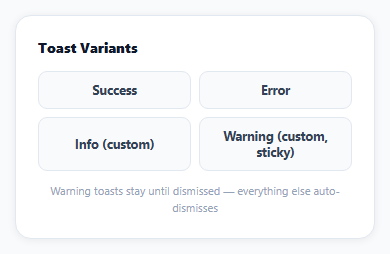
<div class="nt-title">Toast Variants</div>
<div class="nt-grid">
<button class="nt-btn nt-success" id="ntSuccess" type="button">Success</button>
<button class="nt-btn nt-error" id="ntError" type="button">Error</button>
<button class="nt-btn nt-info" id="ntInfo" type="button">Info (custom)</button>
<button class="nt-btn nt-warn" id="ntWarn" type="button">Warning (custom, sticky)</button>
</div>
<p class="nt-hint">Warning toasts stay until dismissed — everything else auto-dismisses</p>
</div>*{box-sizing:border-box;margin:0;padding:0}
body{font-family:system-ui,-apple-system,sans-serif;background:#f8fafc;min-height:100vh;display:flex;align-items:center;justify-content:center;padding:24px}
.nt-wrap{width:100%;max-width:360px;background:#fff;border-radius:16px;padding:22px;box-shadow:0 1px 8px rgba(0,0,0,.07);border:1px solid #e2e8f0}
.nt-title{font-size:14px;font-weight:800;color:#0f172a;margin-bottom:14px}
.nt-grid{display:grid;grid-template-columns:1fr 1fr;gap:8px}
.nt-btn{padding:10px;border-radius:9px;border:1.5px solid #e2e8f0;background:#f8fafc;color:#334155;font:700 12.5px system-ui;cursor:pointer}
.nt-success:hover{border-color:#16a34a;background:#e8f7ee;color:#16a34a}
.nt-error:hover{border-color:#dc2626;background:#fef2f2;color:#dc2626}
.nt-info:hover{border-color:#0ea5e9;background:#eff9ff;color:#0ea5e9}
.nt-warn:hover{border-color:#f59e0b;background:#fef8ec;color:#b45309}
.nt-hint{font-size:11px;color:#94a3b8;margin-top:12px;text-align:center;line-height:1.5}
/* Notyf's built-in types are success/error only -- info and warning are
registered as custom types, so they need their own CSS for background. */
.notyf__toast--info{background:#0ea5e9}
.notyf__toast--warning{background:#f59e0b}
.notyf__icon--info::after{content:'\2139'}
.notyf__icon--warning::after{content:'\26a0'}// Notyf ships only 'success' and 'error' as built-in types -- 'info' and
// 'warning' have to be registered explicitly via the types array, each
// with its own className, icon, and dismissal behavior.
var notyf = new Notyf({
duration: 3500,
position: { x: 'right', y: 'top' },
types: [
{ type: 'info', className: 'notyf__toast--info', icon: { className: 'notyf__icon--info', tagName: 'i' } },
{
type: 'warning',
className: 'notyf__toast--warning',
icon: { className: 'notyf__icon--warning', tagName: 'i' },
// duration: 0 combined with dismissible: true is what makes a toast
// type genuinely sticky -- it never auto-hides, only a manual
// dismiss (clicking it) removes it, appropriate for something the
// user must actually notice rather than glance past.
duration: 0,
dismissible: true,
},
],
});
document.getElementById('ntSuccess').addEventListener('click', function () {
notyf.success('Changes saved successfully');
});
document.getElementById('ntError').addEventListener('click', function () {
notyf.error('Something went wrong \u2014 please try again');
});
document.getElementById('ntInfo').addEventListener('click', function () {
notyf.open({ type: 'info', message: 'A new version is available' });
});
document.getElementById('ntWarn').addEventListener('click', function () {
notyf.open({ type: 'warning', message: 'Your session expires in 2 minutes' });
});Step by step
How to Use
- 1Add the Notyf CDNLoad notyf.min.css and notyf.min.js before the snippet's JS runs.
- 2Paste HTML, CSS, and JSFour toast-trigger buttons render.
- 3Click "Success" or "Error"A toast appears using Notyf's built-in styling.
- 4Click "Info"A custom blue toast appears, auto-dismissing after 3.5 seconds.
- 5Click "Warning"A custom amber toast appears and stays on screen.
- 6Click the warning toast itselfIt dismisses \u2014 the only way it goes away.
Real-world uses
Common Use Cases
Got questions?
Frequently Asked Questions
Notyf ships with exactly two built-in toast types — success and error — with their own default styling and dedicated shortcut methods (notyf.success(), notyf.error()) that work with zero configuration. Any other type, including info and warning, has to be explicitly declared in the types array passed to the Notyf constructor before notyf.open() will recognize and render it at all.
Registering a type in the types array gives it a className hook and an icon className hook, but Notyf doesn't generate any actual colors or icon glyphs for a custom type — those have to be defined as ordinary CSS rules targeting the class names you specified. Without writing that CSS, a registered custom type would technically work (the toast would show and dismiss correctly) but render with no distinguishing background color or icon.
That type's configuration sets duration: 0, which disables Notyf's automatic dismiss timer for toasts of that type entirely — without a duration, nothing tells it to remove itself after a delay. Pairing it with dismissible: true is what gives the user an actual way to close it (clicking the toast), since with auto-dismiss off, nothing else would ever make it go away.
notyf.success() and notyf.error() are convenience methods that exist specifically for Notyf's two built-in types — there's no notyf.info() or notyf.warning() shortcut method, even after those types are registered in the types array. notyf.open({ type: '...', message: '...' }) is the general-purpose method that works for any registered type, built-in or custom, which is why it's used directly for the two custom types here.
Add another entry to the types array with a new type name, its own className and icon configuration, and whatever duration/dismissible combination fits (a loading toast might use duration: 0 since it should stay until you explicitly call notyf.dismiss() once the operation completes), then write the corresponding CSS for its background and icon, and trigger it with notyf.open({ type: 'loading', message: '...' }) exactly like the existing custom types.