



Learn Coding Visually
Learn to code with interactive, live-preview playgrounds — HTML, CSS, JavaScript, React & more.
 HTML Playground42 lessons · Click-based · Live preview
 CSS PlaygroundLearn CSS with a live editor
 JavaScript Playground60 lessons · DOM · Async · Canvas
 React PlaygroundLearn React with a live code editor
 GSAP PlaygroundLearn GSAP animation interactively
 SVG Playground44 lessons · shapes · paths · animation
 SCSS Playground45 lessons · Sass modules · tokens
 Tailwind PlaygroundLearn Tailwind CSS with a live editor
 Bootstrap 5 Playground50 lessons · live preview
Bootstrap Star Rating Input — Free HTML CSS JS Snippet
Bootstrap Star Rating Input · Forms · Plain HTML, CSS & JS · Live preview
What's included
Features
About this UI Snippet
Bootstrap Star Rating Input — HTML, CSS & JavaScript
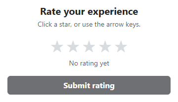
A star rating control has two states people often conflate: the preview you see while hovering, and the committed value that actually gets submitted. This snippet keeps them separate with a single committed variable — hovering any .bsstar span calls paint(value) to temporarily fill stars up to the hovered one via the bsstar-filled class, and mouseleave repaints back to committed rather than leaving the preview stuck. Clicking a star calls commit(value), which is the single source of truth: it updates the hidden #bsstarValue input (so the rating actually travels with a real form submission), updates the live text label through setLabel, repaints the stars, and toggles the disabled state of the Submit button.
Keyboard access doesn't try to make each of the five stars individually tab-stoppable — that would force five tab presses just to reach the widget. Instead the whole #bsstarGroup container carries tabindex="0" and role="radiogroup", and a single keydown listener on the group handles ArrowRight/ArrowUp to increment and ArrowLeft/ArrowDown to decrement the committed rating by one, clamped between 0 and 5 with Math.min/Math.max. Pressing a digit key 1–5 jumps straight to that rating. Each star also gets role="radio" and aria-checked is kept in sync with the committed value inside commit(), so a screen reader announces the current selection the same way a native radio group would.
A non-obvious pitfall this handles: without separating hover-preview from committed value, a user who hovers past their intended rating to reach the Submit button would visually "lose" their selection, because the fill would follow the mouse away from the stars. By repainting to committed on mouseleave rather than clearing to zero, the widget correctly falls back to the last click instead of forgetting it. The Submit button stays disabled until committed is non-zero, preventing a zero-star submission, and clicking Submit writes a confirmation message into #bsstarStatus using the actual committed number rather than a hardcoded string.
Styling is minimal on top of Bootstrap: the .bsstar class sets font-size, a neutral gray default color, and a CSS transition on color and transform so hovering feels responsive; .bsstar-filled swaps in an amber color. The card itself reuses Bootstrap's .card/.card-body structure with only a fixed width and border-radius layered on top, matching the visual weight of the rest of this library's form snippets.
The Submit button is deliberately separate from the act of committing a rating — clicking a star or pressing an arrow key only updates committed and the hidden input; it takes an explicit click on #bsstarSubmit to write a confirmation into #bsstarStatus. That separation matters for a real form: a user should be able to change their mind and click a different star several times before finally submitting, without each click firing a network request. Because commit() is the single function responsible for every side effect of a rating change — the hidden input, the label, the paint, the button's disabled flag, and the ARIA state — adding a new consumer of the rating (for example, sending an analytics event on every change) only requires one new line inside commit() rather than hunting down every place the rating could change and duplicating the same update logic across click handlers, keyboard handlers, and a hypothetical programmatic reset.
Build with AI
Build, Understand, Optimize, and Extend It With AI
Hand this snippet's HTML, CSS, and JS to an AI coding assistant like Claude and ask it to add half-star support by detecting cursor position within each star, or to add a "Clear rating" button that resets the hidden input back to zero. It's also worth asking for a read-only display mode for showing an average rating on a product card.
Prompt to recreate it
Copy this into your AI assistant of choice to build the effect from scratch, or as a jumping-off point for your own variant:
Build a Bootstrap 5.3 five-star rating input, using the real Bootstrap CDN framework (bootstrap.min.css and bootstrap.bundle.min.js) for the surrounding card layout, not custom CSS made to resemble Bootstrap.

Requirements:
- Five clickable star elements laid out in a row inside a Bootstrap card.
- Hovering over a star previews the rating by filling that star and every star to its left, and reverts to the last clicked rating when the mouse leaves, not to zero.
- Clicking a star commits that rating: it should update a hidden <input type="hidden" name="rating"> so the value can be submitted with a real HTML form.
- A live text label below the stars must show the current rating, e.g. "4 out of 5", or "No rating yet" when nothing is selected.
- The whole star row must be keyboard accessible as a single focusable group: ArrowRight/ArrowUp increases the rating, ArrowLeft/ArrowDown decreases it, and digit keys 1-5 jump directly to that value. Use role="radiogroup" and role="radio" with aria-checked kept in sync.
- A Submit button must stay disabled until a non-zero rating is committed.
Want to tighten it up first? Run this prompt through the AI Prompt Studio to score it across 8 quality dimensions, catch anti-patterns, and tune the wording for Claude, ChatGPT, or Gemini before you paste it in.
Source Code
<div class="container py-5 d-flex justify-content-center">
<div class="card bsstar-card">
<div class="card-body p-4 text-center">
<h5 class="fw-bold mb-1">Rate your experience</h5>
<p class="text-muted small mb-3">Click a star, or use the arrow keys.</p>
<div class="d-flex justify-content-center gap-1 mb-2" id="bsstarGroup" role="radiogroup" aria-label="Star rating" tabindex="0">
<span class="bsstar" data-value="1" role="radio" aria-checked="false">★</span>
<span class="bsstar" data-value="2" role="radio" aria-checked="false">★</span>
<span class="bsstar" data-value="3" role="radio" aria-checked="false">★</span>
<span class="bsstar" data-value="4" role="radio" aria-checked="false">★</span>
<span class="bsstar" data-value="5" role="radio" aria-checked="false">★</span>
</div>
<p class="small text-muted mb-3" id="bsstarLabel">No rating yet</p>
<input type="hidden" id="bsstarValue" name="rating" value="0">
<button class="btn btn-dark w-100 fw-bold" id="bsstarSubmit" disabled>Submit rating</button>
<p class="small mt-3 mb-0" id="bsstarStatus"> </p>
</div>
</div>
</div>.bsstar-card { width: 380px; border: 1px solid #eceef1; border-radius: 14px; }
.bsstar { font-size: 34px; line-height: 1; color: #d8dbe0; cursor: pointer; transition: color .1s ease, transform .1s ease; user-select: none; }
.bsstar.bsstar-filled { color: #f5a623; }
.bsstar:hover { transform: scale(1.12); }
#bsstarGroup:focus-visible { outline: 2px solid #0d6efd; outline-offset: 6px; border-radius: 8px; }const stars = Array.from(document.querySelectorAll('.bsstar'));
const group = document.getElementById('bsstarGroup');
const label = document.getElementById('bsstarLabel');
const hiddenInput = document.getElementById('bsstarValue');
const submitBtn = document.getElementById('bsstarSubmit');
const status = document.getElementById('bsstarStatus');
let committed = 0;
function paint(upTo) {
stars.forEach(s => {
s.classList.toggle('bsstar-filled', Number(s.dataset.value) <= upTo);
});
}
function setLabel(value) {
label.textContent = value > 0 ? value + ' out of 5' : 'No rating yet';
}
function commit(value) {
committed = value;
hiddenInput.value = String(value);
setLabel(value);
paint(value);
submitBtn.disabled = value === 0;
stars.forEach(s => s.setAttribute('aria-checked', String(Number(s.dataset.value) === value)));
}
stars.forEach(star => {
star.addEventListener('mouseenter', () => paint(Number(star.dataset.value)));
star.addEventListener('mouseleave', () => paint(committed));
star.addEventListener('click', () => commit(Number(star.dataset.value)));
});
// Keyboard support: the star row itself is focusable (tabindex="0") and acts
// as a single radiogroup, so arrow keys move the committed rating up or down
// by one star without needing to tab through five separate elements.
group.addEventListener('keydown', e => {
if (e.key === 'ArrowRight' || e.key === 'ArrowUp') {
e.preventDefault();
commit(Math.min(5, committed + 1));
} else if (e.key === 'ArrowLeft' || e.key === 'ArrowDown') {
e.preventDefault();
commit(Math.max(0, committed - 1));
} else if (e.key >= '1' && e.key <= '5') {
commit(Number(e.key));
}
});
submitBtn.addEventListener('click', () => {
status.textContent = 'Thanks! You rated ' + committed + ' out of 5.';
status.className = 'small mt-3 mb-0 text-success';
});Step by step
How to Use
- 1Load the snippetFive gray outline stars appear, along with a "No rating yet" label and a disabled Submit button.
- 2Hover over the starsStars fill in amber up to the one under your cursor, previewing the rating without committing it.
- 3Move the mouse awayThe preview reverts — back to empty if nothing was clicked yet, or back to your last click.
- 4Click a starThat star and every star to its left turn solid amber, the label updates to e.g. "4 out of 5", and Submit becomes enabled.
- 5Focus the star row and press an arrow keyThe rating increases or decreases by one star, staying in sync with the label and hidden input.
- 6Click SubmitA green confirmation message appears showing the exact rating that was committed.
Real-world uses
Common Use Cases
Got questions?
Frequently Asked Questions
Yes — the hidden input with id bsstarValue and name="rating" holds the numeric value, so wrapping the markup in a <form> and adding a submit button of type="submit" will include the rating in the request payload like any other form field.
Yes. In React, move the committed state into useState and replace direct DOM class toggling with conditional class names; in Vue, use ref/reactive inside onMounted or a computed class binding; in Angular, track the value in a component property and bind classes with [class.bsstar-filled], calling the equivalent logic from (mouseenter)/(click) bindings instead of addEventListener.
Yes — the star row has tabindex="0" so it is reachable by Tab, role="radiogroup" and role="radio" describe the widget structure, aria-checked is updated on every commit, and arrow keys plus digit keys 1-5 provide full keyboard control without a mouse.
The mouseleave handler repaints to the committed value, not to zero, so your last click is preserved visually — only clicking a different star or using arrow keys changes the committed rating.
Keep the same HTML structure and JS logic untouched, then replace .card/.card-body with Tailwind utility classes like rounded-2xl border p-6, and swap the .bsstar-filled color toggle for a Tailwind class such as text-amber-400 versus text-gray-300.
Not out of the box — this implementation commits whole numbers 1 through 5. Supporting halves would require detecting cursor x-position within each star and rendering a partially clipped star icon, which is a reasonable extension to ask an AI assistant for.