Source Code
<div class="bsadmin-shell">
  <aside class="bsadmin-sidebar" id="bsadminSidebar">
    <div class="bsadmin-brand">
      <span class="bsadmin-dot"></span><span class="bsadmin-brand-text">Northwind</span>
    </div>
    <nav class="bsadmin-nav" id="bsadminNav">
      <a href="javascript:void(0)" class="bsadmin-link active" data-label="Overview">
        <svg width="16" height="16" viewBox="0 0 24 24" fill="none" stroke="currentColor" stroke-width="2" stroke-linecap="round" stroke-linejoin="round"><rect x="3" y="3" width="7" height="9"/><rect x="14" y="3" width="7" height="5"/><rect x="14" y="12" width="7" height="9"/><rect x="3" y="16" width="7" height="5"/></svg>
        <span class="bsadmin-label">Overview</span>
      </a>
      <a href="javascript:void(0)" class="bsadmin-link" data-label="Orders">
        <svg width="16" height="16" viewBox="0 0 24 24" fill="none" stroke="currentColor" stroke-width="2" stroke-linecap="round" stroke-linejoin="round"><path d="M6 2 3 6v14a2 2 0 0 0 2 2h14a2 2 0 0 0 2-2V6l-3-4Z"/><path d="M3 6h18"/><path d="M16 10a4 4 0 0 1-8 0"/></svg>
        <span class="bsadmin-label">Orders</span>
      </a>
      <a href="javascript:void(0)" class="bsadmin-link" data-label="Customers">
        <svg width="16" height="16" viewBox="0 0 24 24" fill="none" stroke="currentColor" stroke-width="2" stroke-linecap="round" stroke-linejoin="round"><path d="M20 21v-2a4 4 0 0 0-4-4H8a4 4 0 0 0-4 4v2"/><circle cx="12" cy="7" r="4"/></svg>
        <span class="bsadmin-label">Customers</span>
      </a>
      <a href="javascript:void(0)" class="bsadmin-link" data-label="Settings">
        <svg width="16" height="16" viewBox="0 0 24 24" fill="none" stroke="currentColor" stroke-width="2" stroke-linecap="round" stroke-linejoin="round"><circle cx="12" cy="12" r="3"/><path d="M19.4 15a1.65 1.65 0 0 0 .33 1.82l.06.06a2 2 0 1 1-2.83 2.83l-.06-.06a1.65 1.65 0 0 0-1.82-.33 1.65 1.65 0 0 0-1 1.51V21a2 2 0 0 1-4 0v-.09A1.65 1.65 0 0 0 9 19.4a1.65 1.65 0 0 0-1.82.33l-.06.06a2 2 0 1 1-2.83-2.83l.06-.06a1.65 1.65 0 0 0 .33-1.82 1.65 1.65 0 0 0-1.51-1H3a2 2 0 0 1 0-4h.09A1.65 1.65 0 0 0 4.6 9a1.65 1.65 0 0 0-.33-1.82l-.06-.06a2 2 0 1 1 2.83-2.83l.06.06a1.65 1.65 0 0 0 1.82.33H9a1.65 1.65 0 0 0 1-1.51V3a2 2 0 0 1 4 0v.09a1.65 1.65 0 0 0 1 1.51 1.65 1.65 0 0 0 1.82-.33l.06-.06a2 2 0 1 1 2.83 2.83l-.06.06a1.65 1.65 0 0 0-.33 1.82V9a1.65 1.65 0 0 0 1.51 1H21a2 2 0 0 1 0 4h-.09a1.65 1.65 0 0 0-1.51 1Z"/></svg>
        <span class="bsadmin-label">Settings</span>
      </a>
    </nav>
    <button class="bsadmin-collapse-btn" id="bsadminCollapseBtn" aria-label="Collapse sidebar">
      <svg width="15" height="15" viewBox="0 0 24 24" fill="none" stroke="currentColor" stroke-width="2.5" stroke-linecap="round" stroke-linejoin="round"><polyline points="15 18 9 12 15 6"/></svg>
    </button>
  </aside>

  <main class="bsadmin-main">
    <header class="bsadmin-topbar">
      <button class="btn btn-sm btn-light d-lg-none" id="bsadminMobileToggle" aria-label="Open menu">
        <svg width="16" height="16" viewBox="0 0 24 24" fill="none" stroke="currentColor" stroke-width="2.5" stroke-linecap="round"><line x1="3" y1="6" x2="21" y2="6"/><line x1="3" y1="12" x2="21" y2="12"/><line x1="3" y1="18" x2="21" y2="18"/></svg>
      </button>
      <h1 class="bsadmin-page-title" id="bsadminPageTitle">Overview</h1>
      <div class="bsadmin-avatar">JL</div>
    </header>

    <div class="bsadmin-stats">
      <div class="bsadmin-stat-card">
        <div class="bsadmin-stat-label">Revenue (30d)</div>
        <div class="bsadmin-stat-value">$48,920</div>
        <div class="bsadmin-stat-delta text-success">▲ 12.4%</div>
      </div>
      <div class="bsadmin-stat-card">
        <div class="bsadmin-stat-label">New orders</div>
        <div class="bsadmin-stat-value">312</div>
        <div class="bsadmin-stat-delta text-success">▲ 6.1%</div>
      </div>
      <div class="bsadmin-stat-card">
        <div class="bsadmin-stat-label">Active customers</div>
        <div class="bsadmin-stat-value">1,204</div>
        <div class="bsadmin-stat-delta text-danger">▼ 2.3%</div>
      </div>
    </div>

    <div class="bsadmin-table-wrap">
      <table class="table table-hover align-middle mb-0">
        <thead><tr><th>Order</th><th>Customer</th><th>Status</th><th class="text-end">Amount</th></tr></thead>
        <tbody>
          <tr><td>#3021</td><td>Ada Lovelace</td><td><span class="badge bg-success-subtle text-success-emphasis">Paid</span></td><td class="text-end">$240.00</td></tr>
          <tr><td>#3022</td><td>Grace Hopper</td><td><span class="badge bg-warning-subtle text-warning-emphasis">Pending</span></td><td class="text-end">$88.50</td></tr>
          <tr><td>#3023</td><td>Alan Turing</td><td><span class="badge bg-success-subtle text-success-emphasis">Paid</span></td><td class="text-end">$512.00</td></tr>
          <tr><td>#3024</td><td>Katherine Johnson</td><td><span class="badge bg-danger-subtle text-danger-emphasis">Refunded</span></td><td class="text-end">$64.00</td></tr>
        </tbody>
      </table>
    </div>
  </main>
</div>
body { margin: 0; background: #f6f7f9; }
.bsadmin-shell { display: flex; min-height: 100vh; }
.bsadmin-sidebar {
width: 220px;
flex-shrink: 0;
background: #111827;
color: #d1d5db;
display: flex;
flex-direction: column;
padding: 18px 12px;
transition: width .2s ease, transform .2s ease;
position: relative;
}
.bsadmin-sidebar.bsadmin-collapsed { width: 66px; }
.bsadmin-sidebar.bsadmin-collapsed .bsadmin-brand-text,
.bsadmin-sidebar.bsadmin-collapsed .bsadmin-label { display: none; }
.bsadmin-brand { display: flex; align-items: center; gap: 9px; padding: 0 8px 18px; font-weight: 800; color: #fff; }
.bsadmin-dot { width: 9px; height: 9px; border-radius: 50%; background: #818cf8; flex-shrink: 0; }
.bsadmin-nav { display: flex; flex-direction: column; gap: 3px; flex-grow: 1; }
.bsadmin-link {
display: flex;
align-items: center;
gap: 11px;
padding: 9px 10px;
border-radius: 8px;
color: #9ca3af;
text-decoration: none;
font-size: 13.5px;
font-weight: 500;
white-space: nowrap;
}
.bsadmin-link:hover { background: #1f2937; color: #e5e7eb; }
.bsadmin-link.active { background: #312e81; color: #fff; }
.bsadmin-collapse-btn {
border: none;
background: #1f2937;
color: #9ca3af;
border-radius: 8px;
width: 100%;
padding: 8px 0;
cursor: pointer;
transition: transform .2s ease;
}
.bsadmin-sidebar.bsadmin-collapsed .bsadmin-collapse-btn svg { transform: rotate(180deg); }
.bsadmin-main { flex: 1; min-width: 0; padding: 22px 26px; }
.bsadmin-topbar { display: flex; align-items: center; gap: 12px; margin-bottom: 22px; }
.bsadmin-page-title { font-size: 20px; font-weight: 800; margin: 0; flex-grow: 1; }
.bsadmin-avatar {
width: 34px; height: 34px; border-radius: 50%;
background: #111827; color: #fff;
display: flex; align-items: center; justify-content: center;
font-size: 12px; font-weight: 700;
}
.bsadmin-stats { display: grid; grid-template-columns: repeat(auto-fit, minmax(160px, 1fr)); gap: 14px; margin-bottom: 20px; }
.bsadmin-stat-card { background: #fff; border: 1px solid #eceef1; border-radius: 12px; padding: 16px 18px; }
.bsadmin-stat-label { font-size: 12px; color: #6b7280; margin-bottom: 6px; }
.bsadmin-stat-value { font-size: 24px; font-weight: 800; margin-bottom: 4px; }
.bsadmin-stat-delta { font-size: 12px; font-weight: 700; }
.bsadmin-table-wrap { background: #fff; border: 1px solid #eceef1; border-radius: 12px; overflow: hidden; }
.bsadmin-table-wrap table { font-size: 13.5px; }
.bsadmin-table-wrap thead th { font-size: 11px; text-transform: uppercase; letter-spacing: .04em; color: #6b7280; border-top: none; }
@media (max-width: 991px) {
.bsadmin-sidebar {
position: fixed;
inset: 0 auto 0 0;
z-index: 20;
transform: translateX(-100%);
}
.bsadmin-sidebar.bsadmin-mobile-open { transform: translateX(0); }
}const sidebar = document.getElementById('bsadminSidebar');
const collapseBtn = document.getElementById('bsadminCollapseBtn');
const mobileToggle = document.getElementById('bsadminMobileToggle');
const nav = document.getElementById('bsadminNav');
const pageTitle = document.getElementById('bsadminPageTitle');
collapseBtn.addEventListener('click', () => {
sidebar.classList.toggle('bsadmin-collapsed');
});
mobileToggle.addEventListener('click', () => {
sidebar.classList.toggle('bsadmin-mobile-open');
});
// Delegated click on the nav — one listener drives both the active-link
// highlight and the page title above the stats, from real clicks.
nav.addEventListener('click', e => {
const link = e.target.closest('.bsadmin-link');
if (!link) return;
nav.querySelectorAll('.bsadmin-link').forEach(l => l.classList.remove('active'));
link.classList.add('active');
pageTitle.textContent = link.dataset.label;
sidebar.classList.remove('bsadmin-mobile-open');
});Learn Coding Visually
Learn to code with interactive, live-preview playgrounds — HTML, CSS, JavaScript, React & more.
 HTML Playground42 lessons · Click-based · Live preview
 CSS PlaygroundLearn CSS with a live editor
 JavaScript Playground60 lessons · DOM · Async · Canvas
 React PlaygroundLearn React with a live code editor
 GSAP PlaygroundLearn GSAP animation interactively
 SVG Playground44 lessons · shapes · paths · animation
 SCSS Playground45 lessons · Sass modules · tokens
 Tailwind PlaygroundLearn Tailwind CSS with a live editor
 Bootstrap 5 Playground50 lessons · live preview
Bootstrap Admin Dashboard with Sidebar Navigation — Free Snippet
Bootstrap Admin Dashboard with Sidebar Navigation · Dashboards · Plain HTML, CSS & JS · Live preview
What's included
Features
About this UI Snippet
Bootstrap Admin Dashboard with Sidebar Navigation — HTML, CSS & JavaScript
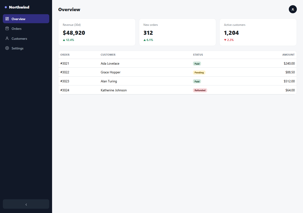
Every admin panel needs the same bones: a persistent side navigation, a page title that reflects the current section, a row of key stats, and a data table. This snippet builds that shell on real Bootstrap 5.3 — Bootstrap's grid, card-style layout, table, and badge components loaded from the actual CDN — around a custom dark sidebar with two genuinely working interaction modes: a desktop icon-only collapse, and a mobile slide-in drawer.
Two different collapse behaviors for two different screens
On desktop, clicking the arrow button at the bottom of the sidebar toggles a .bsadmin-collapsed class that shrinks the sidebar from 220px down to a 66px icon rail, hiding every text label via CSS — a common pattern for reclaiming horizontal space for the main content area without losing navigation entirely. On screens narrower than Bootstrap's lg breakpoint, a completely different mechanism takes over: the sidebar becomes position: fixed and slides in from off-screen (transform: translateX) when a hamburger button in the top bar is tapped, since a persistent 220px column simply doesn't fit a phone-width screen at all.
One delegated nav listener drives two things at once
Clicking any sidebar link does two things through a single delegated click listener on the nav container: it moves the .active highlight to whichever link was clicked, and it updates the page title in the top bar to match that link's data-label. On mobile, the same click also closes the slide-in drawer, so tapping a destination both navigates and dismisses the menu in one action, rather than requiring a separate close tap.
Real Bootstrap components inside the shell
The stat cards use plain CSS grid for their responsive layout, but the orders table below them is Bootstrap's actual .table.table-hover component with real .badge elements for each status — bg-success-subtle, bg-warning-subtle, bg-danger-subtle — Bootstrap 5.3's newer, softer "subtle" badge variants designed specifically for exactly this kind of status-column use case.
Build with AI
Build, Understand, Optimize, and Extend It With AI
Hand this snippet's HTML, CSS, and JS to an AI coding assistant like Claude and ask it to persist the sidebar's collapsed/expanded state to localStorage so it's remembered across page reloads, or to add a dark-mode toggle that switches the main content area's palette while keeping the sidebar dark in both modes. It's also a good exercise to ask the assistant to make the orders table sortable by clicking its column headers, or to replace the static stat numbers with values computed live from the table's own rows.
Prompt to recreate it
Copy this into your AI assistant of choice to build the effect from scratch, or as a jumping-off point for your own variant:
Build a Bootstrap 5.3 admin dashboard shell with sidebar navigation, using the real Bootstrap CDN framework (bootstrap.min.css and bootstrap.bundle.min.js) for its table, badge, and utility classes, not custom CSS made to resemble Bootstrap throughout.

Requirements:
- A dark sidebar (custom CSS, since Bootstrap has no dedicated sidebar component) with a brand/logo area, at least four navigation links with icons, and a collapse button at the bottom that toggles the sidebar between a full labeled width and a narrow icon-only rail via one CSS class and a smooth width transition.
- A main content area with a top bar (page title plus a user avatar), a responsive row of at least three stat cards showing a label, a value, and a percentage change, and a real Bootstrap table below listing sample orders with status badges using Bootstrap's subtle badge color variants (e.g. bg-success-subtle).
- Below Bootstrap's lg breakpoint, the sidebar must switch from being always visible to being hidden off-screen by default, revealed only via a hamburger button in the top bar as a slide-in drawer (position: fixed with a CSS transform transition) — do not keep the same always-visible sidebar behavior on mobile widths.
- Use one delegated click listener on the nav links (not per-link listeners) that updates both which link is visually active and the page title text in the top bar to match the clicked link's label; on mobile, the same click should also close the slide-in drawer.
Want to tighten it up first? Run this prompt through the AI Prompt Studio to score it across 8 quality dimensions, catch anti-patterns, and tune the wording for Claude, ChatGPT, or Gemini before you paste it in.
Step by step
How to Use
- 1Load the snippetClick "Bootstrap Admin Dashboard with Sidebar Navigation" in the sidebar Library tab. The preview loads with a full-width dark sidebar and the Overview page active.
- 2Click a nav linkClick "Orders" or "Customers" in the sidebar — the link highlights and the page title in the top bar updates to match, from a real click event.
- 3Collapse the sidebarClick the arrow button at the bottom of the sidebar — it shrinks to an icon-only rail, and clicking again expands it back.
- 4Shrink the preview widthNarrow the preview below roughly 992px — the sidebar disappears off-screen and a hamburger button appears in the top bar instead.
- 5Open the mobile menuClick the hamburger button — the sidebar slides in from the left. Click any nav link to navigate and automatically close the drawer.
- 6Edit the stats and tableChange the numbers in .bsadmin-stat-card or add rows to the table — both are plain Bootstrap markup, easy to wire to real data.
Real-world uses
Common Use Cases
Got questions?
Frequently Asked Questions
Real Bootstrap 5.3 — the stat table, badges, and underlying utility classes are genuine Bootstrap components loaded from the actual CDN. The sidebar itself is custom (Bootstrap doesn't ship a dedicated admin-sidebar component), built with plain CSS around the rest of the real Bootstrap layout.
Clicking the arrow button toggles a single CSS class on the sidebar that changes its width from 220px to 66px and hides the text labels, leaving only icons — a pure CSS transition handles the smooth resize.
A 220px sidebar taking up permanent space doesn't work on a phone-width screen. Below Bootstrap's lg breakpoint, the sidebar switches to position: fixed and slides in from off-screen only when explicitly opened via the hamburger button, rather than always occupying layout space.
Not to a different page — this is a single-page demo. Clicking a link updates the active highlight and the page title to demonstrate real, working interaction; wire it to your router or page-switching logic for actual navigation.
Yes — copy an existing .bsadmin-link (with a unique data-label) into the nav, or copy a .bsadmin-stat-card into the stats grid. Both layouts (flex column nav, CSS grid stats) accommodate additional items automatically.
They're Bootstrap 5.3's newer subtle badge variants — bg-success-subtle, bg-warning-subtle, bg-danger-subtle — paired with matching -emphasis text color classes, designed for exactly this softer, less visually loud status-badge use case.