More Forms Snippets
Front-End Coding Playgrounds
Learn to code with interactive, live-preview playgrounds — HTML, CSS, JavaScript, React & more.
 HTML Playground42 lessons · Click-based · Live preview
 CSS PlaygroundLearn CSS with a live editor
 JavaScript Playground60 lessons · DOM · Async · Canvas
 React PlaygroundLearn React with a live code editor
 GSAP PlaygroundLearn GSAP animation interactively
 SVG Playground44 lessons · shapes · paths · animation
 SCSS Playground45 lessons · Sass modules · tokens
 Tailwind PlaygroundLearn Tailwind CSS with a live editor
 Bootstrap 5 Playground50 lessons · live preview
Color Swatch Selector — Free HTML CSS JS Snippet
Color Swatch Selector · Forms · Plain HTML, CSS & JS · Live preview
What's included
Features
About this UI Snippet
Color Swatch Selector — CSS Custom Property Colours, Selected Ring, Out-of-Stock & Live Preview
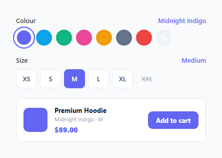
A colour swatch selector is the cornerstone of any e-commerce product page — it lets users choose a product variant by clicking a colour circle rather than selecting from a dropdown. For a free-form colour field, see the color picker input. This snippet provides a complete colour and size variant selector: circular swatches using CSS custom properties for colour, a selected ring that matches the swatch colour, an out-of-stock diagonal slash indicator, size chips with active/disabled states, and a live preview card that updates in real time.
CSS custom properties for swatch colours
Each swatch has a style="--c:#hexvalue" inline attribute. The CSS uses background: var(--c) to apply the colour. This means colours are declared once in HTML and used in both the background and the selected outline — outline: 2px solid var(--c) creates an accent ring that matches the swatch colour exactly, without needing a separate CSS rule per colour.
The selected ring pattern
The selected swatch uses two properties together: border: 3px solid #fff (white gap between swatch and ring) and outline: 2px solid var(--c) (the matching accent ring). This creates the standard e-commerce "selected colour" visual — a coloured ring separated from the swatch by a white gap. Both border and outline are required; one alone looks wrong.
Out-of-stock diagonal slash
The .unavailable swatch has a ::after pseudo-element with background: linear-gradient(45deg, transparent 43%, #fff 43%, #fff 57%, transparent 57%) — a diagonal white line across the circle. This communicates "out of stock" without removing the swatch from the UI (users can still see the colour exists). The swatch also gets opacity: 0.35 and cursor: not-allowed.
Size chips
Size buttons use a similar selected/unavailable pattern but as rectangular chips rather than circles. The .selected chip fills with indigo. The .unavailable chip has text-decoration: line-through and is disabled. The active state is managed by JavaScript removing .selected from all chips and adding it to the clicked one.
The live preview card
A preview card below the selectors shows the selected colour (as a coloured square), product name, the current variant combination as text ("Midnight Indigo · M"), and the price. This gives users an instant confirmation of their selection before adding to cart.
Persisting the selection
Store the selected variant in localStorage or a URL parameter for returning users. On page load: const saved = new URLSearchParams(location.search).get("colour"); if (saved) { const btn = document.querySelector(".swatch[data-name='" + saved + "']"); if (btn) btn.click(); }. On selection: history.replaceState(null, "", "?colour=" + encodeURIComponent(selectedColour)). This preserves the selection across page reloads and allows sharing a specific colour variant via URL.
Build with AI
Build, Understand, Optimize, and Extend It With AI
You don't have to puzzle out why the selected ring looks right just by staring at the CSS. Paste this snippet's HTML, CSS, and JS into an AI coding assistant like Claude and ask it to explain exactly why the selected swatch needs both a solid white border and a separate outline sharing the same --c custom property, and what would go wrong visually if either one were removed. The same assistant can help you optimize it — for instance asking whether reading the color back with getComputedStyle on every click is necessary versus reading the --c value straight from the button's inline style. It is also useful for extending the component: ask it to add keyboard arrow-key navigation between swatches within the radiogroup, support fabric or texture swatches using background-image instead of a flat color, or wire the selected variant into the URL so a specific color/size combination is shareable as a link. Treat the code less like a finished artifact and more like a starting point for a conversation.
Prompt to recreate it
Copy this into your AI assistant of choice to build the effect from scratch, or as a jumping-off point for your own variant:
Build a product color and size variant selector in plain HTML, CSS, and JavaScript — no frameworks, no component libraries.

Requirements:
- A row of circular color swatch buttons inside a role="radiogroup" container, where each swatch's color is set once via an inline CSS custom property (e.g. style="--c:#hex") and referenced by CSS for both its background and, when selected, its outline color — not two separate hardcoded color declarations per swatch.
- The selected swatch must show a solid white border creating a gap plus a separate outline in the swatch's own color, so the ring reads as a distinct halo rather than a plain border, and toggle aria-pressed appropriately on all swatches when selection changes.
- At least one swatch must be marked out of stock: disabled, dimmed with reduced opacity, and visually crossed out using a CSS pseudo-element diagonal gradient line rather than removing the swatch from the layout entirely.
- A separate row of rectangular size chips following the same selected/disabled visual pattern (fill color on selection, strikethrough text and disabled cursor when unavailable), toggled independently from the color swatches.
- A live preview card that updates immediately on any swatch or chip click to show a color swatch, the combined variant text ("ColorName - Size"), and a price, reading the actual applied color back from the DOM via getComputedStyle rather than a hardcoded lookup table.
- An "Add to cart" button that gives temporary visual confirmation (changed text and background color) for about two seconds after being clicked, then reverts.
Step by step
How to Use
- 1Click a colour swatch or size chip to selectThe selected colour gets an accent ring that matches its colour. The selected size chip fills with indigo. The preview card updates instantly to show the chosen combination.
- 2Update swatch colours using data attributesChange the style="--c:#hexvalue" on each .swatch button and update the data-name attribute with the colour name. Add or remove .swatch elements to match your product variants.
- 3Mark out-of-stock variantsAdd class="swatch unavailable" and disabled to any colour or size that is out of stock. The diagonal slash and disabled cursor appear automatically from CSS.
- 4Update the product name and priceEdit the .preview-name and .preview-price text in the HTML. The variant text (colour + size combination) updates automatically from JavaScript. Add logic to onUpdate() to change price based on the selected variant.
- 5Wire Add to Cart to your APIIn the add() function, replace the feedback with a fetch POST: fetch("/api/cart", { method:"POST", body: JSON.stringify({ sku: selectedColour + "-" + selectedSize, qty: 1 }) }). Show success state on resolve.
- 6Export in your formatClick "HTML" for a standalone file, "JSX" for a React component with selectedColour and selectedSize in useState, or "Tailwind" for a React + Tailwind CSS version.
Real-world uses
Common Use Cases
Got questions?
Frequently Asked Questions
Each swatch button has a CSS custom property --c set as an inline style attribute: style="--c:#6366f1". The CSS rule .swatch.selected uses outline: 2px solid var(--c) — this reads the custom property value from the element itself. Since each swatch has its own --c value, the outline colour matches the swatch background automatically. No JavaScript needed to set the ring colour — just add the .selected class and CSS does the rest.
Use getComputedStyle: const hex = getComputedStyle(btn).getPropertyValue("--c").trim(). This returns the CSS custom property value as a string. Note that getComputedStyle reads the computed value (after any CSS inheritance), while element.style.getPropertyValue("--c") reads only inline styles. For inline-set custom properties, both work. The .trim() removes any whitespace the browser adds around the value.
The title attribute on each swatch button provides a native browser tooltip: <button class="swatch" title="Midnight Indigo">. For a styled custom tooltip, use the CSS Tooltip snippet from the Navigation category: add data-tip="Midnight Indigo" to each swatch and apply the tooltip CSS. The tooltip text matches the data-name attribute, so you can generate it: btn.dataset.tip = btn.dataset.name.
Click "JSX" to download. Manage selectedColour and selectedSize with useState. The swatch onClick calls setSelectedColour(btn.dataset.name). Derive the outline colour from the selected swatch: the active ring uses the --c custom property which is set via inline style on each swatch element — this works identically in React. For the preview colour square, store the hex separately: setSelectedHex(btn.style.getPropertyValue("--c")).