More Forms Snippets
Front-End Coding Playgrounds
Learn to code with interactive, live-preview playgrounds — HTML, CSS, JavaScript, React & more.
 HTML Playground42 lessons · Click-based · Live preview
 CSS PlaygroundLearn CSS with a live editor
 JavaScript Playground60 lessons · DOM · Async · Canvas
 React PlaygroundLearn React with a live code editor
 GSAP PlaygroundLearn GSAP animation interactively
 SVG Playground44 lessons · shapes · paths · animation
 SCSS Playground45 lessons · Sass modules · tokens
 Tailwind PlaygroundLearn Tailwind CSS with a live editor
 Bootstrap 5 Playground50 lessons · live preview
Color Picker Input — Free HTML CSS JS Snippet
Color Picker Input · Forms · Plain HTML, CSS & JS · Live preview
What's included
Features
About this UI Snippet
Color Picker Input — Preset Swatches, Hex Input Sync, Opacity Slider & Native Picker
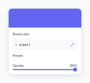
A colour picker input is a specialised form field that lets users select a colour through multiple interaction methods: clicking a preset swatch, typing a hex code directly, or opening the native OS colour picker via an eyedropper button. For a hue wheel instead, see the color wheel picker; for product variants, the color swatch selector. This snippet implements all three methods in a unified card component with a live preview bar, an opacity slider, and full two-way synchronisation between every input method.
The PRESETS swatch array
The PRESETS array contains 10 hex colour values covering the most common brand palette needs: reds, oranges, yellows, greens, blues, indigos, purples, pinks, and neutrals. The swatch rendering loop uses PRESETS.forEach(c => { const s = document.createElement('div'); s.className = 'sw'; s.style.background = c; s.onclick = () => { ... }; row.appendChild(s); }). When a swatch is clicked, it marks itself with the .active class (adding a dark border ring), updates the hex input value, and calls applyColor(hex) to update the preview bar.
The hex input with live validation
The hex input is prefixed by a # hash span (purely decorative, the hash is not part of the input value). The fromHex(v) function validates the input using /^[0-9a-fA-F]{6}$/.test(v) and only calls applyColor() when exactly 6 valid hex characters are present. This prevents the preview from flashing during typing. The input uses text-transform: uppercase in CSS to display hex values in the standard uppercase format.
The hidden native colour picker
A real <input type="color"> element is rendered at 0 width and height with opacity: 0; pointer-events: none so it is invisible but fully functional. The eyedropper button's onclick calls document.getElementById('native').click() to programmatically open the OS colour picker. When the user selects a colour in the OS picker, the oninput="fromNative(this.value)" handler fires, strips the leading hash, and syncs the hex input and preview bar. This technique opens the native picker without any visible input element in the UI.
The opacity slider with gradient track
The opacity range input controls a separate opacity variable. The setOpacity(v) function converts the 0–100 range value to a 0–1 decimal for the rgba() colour in the preview. The slider track is updated dynamically: linear-gradient(to right, #hex opacity%, #e2e8f0 opacity%) creates a visual fill effect showing how much of the track corresponds to the current opacity value.
The applyColor() function
applyColor(hex) is the single function that all three input methods call. It parses the 6-character hex into r, g, b integer values using parseInt(hex.slice(0,2), 16) and constructs an rgba(r,g,b,opacity/100) string applied to the preview bar's background. This single-source-of-truth approach ensures the preview is always consistent regardless of which input method was used.
Build with AI
Build, Understand, Optimize, and Extend It With AI
You don't have to work out how the eyedropper button and the hidden color input actually cooperate just by staring at it. Paste this snippet's HTML, CSS, and JS into an AI coding assistant like Claude and ask it to explain exactly why the native input type color element is rendered at zero size with pointer-events none rather than just hidden, and how document.getElementById('native').click() manages to open the OS picker from a completely different-looking button. The same assistant can help optimize it — for instance asking whether re-querying the range input with document.querySelector on every applyColor call is wasteful compared to caching the reference once. It's also useful for extending the component: ask it to add an eyedropper using the real EyeDropper API where supported, support an alpha-aware hex8 format instead of a separate opacity slider, or persist the last-picked color to localStorage between visits. Treat the code less like a finished artifact and more like a starting point for a conversation.
Prompt to recreate it
Copy this into your AI assistant of choice to build the effect from scratch, or as a jumping-off point for your own variant:
Build a color picker input field in plain HTML, CSS, and JavaScript combining preset swatches, a hex text field, a hidden native color input, and an opacity slider — no color-picker libraries.

Requirements:
- A row of clickable preset swatches generated from a PRESETS array of hex strings (not hardcoded HTML per swatch), where clicking one marks itself active with a visible ring and updates every other control to match.
- A hex text input prefixed with a purely decorative "#" label, validating with a strict six-character hex regex, only applying the color once exactly six valid hex characters are present so the preview never flashes on incomplete input.
- A real input type="color" element rendered at zero width and height with pointer-events disabled so it is invisible, triggered by a separate visible eyedropper-icon button that calls its .click() method to open the OS native color picker without showing the raw input in the layout.
- Two-way sync so picking a color in the native picker updates the hex field and vice versa, both funneling through one single source-of-truth function that applies the current color to a preview bar.
- An opacity range slider (0-100) that combines with the current hex color to produce an rgba() value applied to the preview bar's background, and that also repaints the slider's own track with a linear-gradient so the filled portion visually matches the current opacity percentage.
- Keep a single applyColor function as the only place that writes to the preview bar's background, called by all three input methods (swatch click, hex typing, native picker) so they can never fall out of sync.
Step by step
How to Use
- 1Click preset swatches to select a colourClick any of the 10 preset colour swatches below the hex input. The clicked swatch gets a dark active border ring, the hex input updates with the swatch's hex code, and the preview bar at the top of the card immediately changes to the selected colour.
- 2Type a hex code directly into the inputClick the hex input field and type a 6-character hex code like 3B82F6 (without the # prefix — the # is shown as a prefix label). The preview bar updates as soon as you type a valid 6-character hex value. The input validates with /^[0-9a-fA-F]{6}$/ before applying.
- 3Open the OS native colour picker via the eyedropper buttonClick the eyedropper icon button on the right side of the hex input row. This programmatically triggers a hidden <input type='color'> element, opening your operating system's native colour picker. When you select a colour and close the picker, the hex input and preview bar update to match your selection.
- 4Adjust the opacity sliderDrag the Opacity range slider to change transparency from 0% (fully transparent) to 100% (fully opaque). The preview bar background uses rgba() so it shows the colour at the selected opacity over the white card background. The slider track fills with the current colour to show the full opacity gradient.
- 5Customise the PRESETS array with your brand paletteIn the JS panel, replace the PRESETS array values with your own brand colour hex codes. The swatches are generated dynamically from this array, so adding, removing, or reordering entries automatically updates the rendered swatch row without any HTML changes.
- 6Read the selected colour value for form submission or CSS variable updatesAfter colour selection, read hexInp.value for the hex code (6 characters, no hash). For CSS custom property updates: document.documentElement.style.setProperty('--accent-color', '#' + hexInp.value). For form submission, include it as a hidden input or append it to your FormData object before submitting.
Real-world uses
Common Use Cases
Got questions?
Frequently Asked Questions
A hidden <input type='color' id='native'> element is rendered with opacity: 0; width: 0; height: 0; pointer-events: none so it is invisible but functional. The eyedropper button's onclick handler calls document.getElementById('native').click(), which programmatically opens the OS native colour picker. When the user selects a colour and the picker closes, the oninput='fromNative(this.value)' handler fires. fromNative() strips the leading # from the value, converts it to uppercase, sets hexInp.value to the stripped hex string, sets native.value to synchronise them, then calls applyColor() to update the preview bar and opacity slider track.
The fromHex(v) function checks two conditions before calling applyColor: v.length === 6 ensures the full 6-character code is entered (so the preview doesn't flash during typing of incomplete codes), and /^[0-9a-fA-F]{6}$/.test(v) ensures all characters are valid hexadecimal digits. If either check fails, the function returns early without updating the preview. When both pass, native.value is synchronised to '#' + v and applyColor(v.toUpperCase()) is called to update the preview bar.
The setOpacity(v) function stores the slider value in the opacity variable and calls applyColor(hexInp.value). Inside applyColor(hex), the function parses the hex string into r, g, b integer values using parseInt(hex.slice(0,2), 16) for each channel. It then constructs rgba(r, g, b, opacity/100) and applies it to bar.style.background. The slider track is simultaneously updated using linear-gradient(to right, #hex opacity%, #e2e8f0 opacity%) to create a visual fill effect that shows the current opacity as a proportional fill of the track.
Replace the PRESETS array with objects containing both the hex value and a name: const PRESETS = [{hex:'#ef4444',name:'Red'},{hex:'#6366f1',name:'Indigo'},...]. In the swatch-building loop, set s.style.background = c.hex, s.title = c.name (for native browser tooltip), and pass c.hex to the onclick handler's applyColor call. For a custom styled tooltip instead of the native title, add a tooltip span as a child of the swatch and show/hide it on mouseenter/mouseleave events.