Source Code
<div class="demo">
  <div class="search-wrap">
    <svg class="icon" width="16" height="16" viewBox="0 0 24 24" fill="none" stroke="currentColor" stroke-width="2" stroke-linecap="round">
      <circle cx="11" cy="11" r="8"/><line x1="21" y1="21" x2="16.65" y2="16.65"/>
    </svg>
    <input type="text" class="search" placeholder="Search anything…" oninput="filterList(this.value)" />
    <kbd>⌘K</kbd>
  </div>
  <ul class="results" id="list">
    <li>Dashboard overview</li>
    <li>User settings</li>
    <li>API documentation</li>
    <li>Billing & plans</li>
    <li>Team members</li>
  </ul>
</div>
* { box-sizing: border-box; margin: 0; padding: 0; }
body { font-family: system-ui, sans-serif; background: #f8fafc; display: flex; align-items: center; justify-content: center; min-height: 100vh; padding: 20px; }
.demo { width: 320px; }
.search-wrap {
display: flex;
align-items: center;
gap: 8px;
background: #fff;
border: 1.5px solid #e2e8f0;
border-radius: 10px;
padding: 0 12px;
transition: border-color 0.15s, box-shadow 0.15s;
}
.search-wrap:focus-within {
border-color: #6366f1;
box-shadow: 0 0 0 3px rgba(99,102,241,0.12);
}
.icon { color: #94a3b8; flex-shrink: 0; }
.search {
flex: 1;
padding: 11px 0;
font-size: 14px;
font-family: inherit;
border: none;
outline: none;
background: transparent;
color: #1e293b;
}
.search::placeholder { color: #94a3b8; }
kbd {
font-size: 11px;
color: #94a3b8;
background: #f1f5f9;
border: 1px solid #e2e8f0;
border-radius: 4px;
padding: 2px 5px;
white-space: nowrap;
}
.results {
list-style: none;
margin-top: 8px;
background: #fff;
border: 1px solid #e2e8f0;
border-radius: 10px;
overflow: hidden;
}
.results li {
padding: 10px 14px;
font-size: 13px;
color: #475569;
cursor: pointer;
border-bottom: 1px solid #f8fafc;
transition: background 0.1s;
}
.results li:last-child { border-bottom: none; }
.results li:hover { background: #f1f5f9; color: #1e293b; }
.results li.hidden { display: none; }function filterList(q) {
const items = document.querySelectorAll('#list li');
items.forEach(li => {
li.classList.toggle('hidden', !li.textContent.toLowerCase().includes(q.toLowerCase()));
});
}Learn Coding Visually
Learn to code with interactive, live-preview playgrounds — HTML, CSS, JavaScript, React & more.
 HTML Playground42 lessons · Click-based · Live preview
 CSS PlaygroundLearn CSS with a live editor
 JavaScript Playground60 lessons · DOM · Async · Canvas
 React PlaygroundLearn React with a live code editor
 GSAP PlaygroundLearn GSAP animation interactively
 SVG Playground44 lessons · shapes · paths · animation
 SCSS Playground45 lessons · Sass modules · tokens
 Tailwind PlaygroundLearn Tailwind CSS with a live editor
 Bootstrap 5 Playground50 lessons · live preview
Search Box — Free HTML CSS JS Live Filter Snippet
Search Box · Forms · Plain HTML, CSS & JS · Live preview
What's included
Features
About this UI Snippet
Search Box — Live Filter, :focus-within Ring, and Keyboard Shortcut Badge
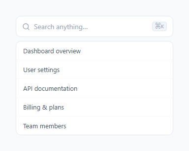
A polished search box is more than a styled text input. It communicates interactivity, responds to focus with a visual ring, filters results instantly as the user types (for suggestions, see the autocomplete input), and ideally shows a keyboard shortcut hint — as in the command palette and keyboard shortcuts panel — for power users. This snippet covers all four in a minimal, clean design.
The :focus-within ring
The search input is visually separated from the container — the <input> has no border, and the .search-wrap div holds the border and focus ring. When any child element (the input) is focused, :focus-within applies to the parent container. This lets you style the outer wrapper on input focus: border-color: #6366f1 and box-shadow: 0 0 0 3px rgba(99,102,241,0.12). This approach is cleaner than styling the input directly because it keeps the icon and input visually unified within a single bordered container.
The keyboard shortcut badge
The <kbd> element in the search box shows a keyboard shortcut hint — typically Cmd+K or Ctrl+K — styled as a small pill with a light background and border. Showing the keyboard shortcut directly in the UI teaches power users the faster path. In production, wire a keydown listener for the shortcut that calls input.focus().
The live filter logic
The filterList(q) function uses querySelectorAll('#list li') to get all list items and classList.toggle('hidden', condition) to show or hide each. The condition is !li.textContent.toLowerCase().includes(q.toLowerCase()) — a case-insensitive substring match. classList.toggle(className, force) adds the class if force is true and removes it if false — a single call that both adds and removes without separate if/else branches.
Connecting to real data
The current list items are static HTML. To filter a real data array, render the list items from JavaScript: items.forEach(item => { const li = document.createElement('li'); li.textContent = item; list.appendChild(li); }). The filterList function then works unchanged on the generated items.
Adding debounce for API search
For a search that calls an API on each keystroke, add a debounce: clear a timeout on each input event and set a new one that fires after 300ms. This prevents an API call on every keystroke and instead fires only when the user pauses.
The :focus-within ring
The search container (not the input) has the focus ring: .search-box:focus-within { box-shadow: 0 0 0 3px rgba(accent, 0.2); border-color: accent; }. :focus-within applies when any descendant has focus. This means the border and ring apply to the container when the input inside is focused — creating a larger, more visually prominent focus indicator than the default browser outline on the input alone.
The live filter pattern
The search input's oninput handler calls filterItems(e.target.value). filterItems iterates all .item elements and toggles .hidden based on whether the item's text content includes the query string (case-insensitive). The filter runs on every keystroke without debounce for lists under 500 items. For larger lists, add a 150ms debounce: clearTimeout(timer); timer = setTimeout(() => filterItems(q), 150).
The clear button
The × clear button appears when the input has content and disappears when it is empty. Clicking it clears the input, triggers a filterItems('') to show all items, and returns focus to the input. Implement the visibility toggle with a CSS class: .search-box.has-value .clear-btn { display: flex; } and add/remove .has-value on every input event based on input.value.length.
Build with AI
Build, Understand, Optimize, and Extend It With AI
You do not need to work out the filtering and focus behavior line by line yourself. Paste this snippet's HTML, CSS, and JS into an AI coding assistant like Claude and ask it to explain exactly why the wrapper div rather than the input itself carries the focus-within ring, or how a single classList.toggle call with a boolean condition replaces a separate add-and-remove branch. The same assistant is useful for optimizing it, for example checking whether the current querySelectorAll-and-loop filter would bog down on a list of thousands of items and whether it needs a debounce or an indexed lookup instead. It is just as handy for extending the feature: ask it to add a clear button that appears only when the input has text, wire the Cmd+K shortcut badge to an actual keydown listener that focuses the input, or highlight the matched substring inside each visible result. Treat the code less like a finished artifact and more like a starting point for a conversation.
Prompt to recreate it
Copy this into your AI assistant of choice to build the effect from scratch, or as a jumping-off point for your own variant:
Build a search box with live list filtering in plain HTML, CSS, and JavaScript, no framework and no libraries.

Requirements:
- An input wrapped in a container div (not the input alone) that shows a search icon on the left and a small kbd-styled keyboard shortcut badge (e.g. Cmd+K) on the right.
- Use the CSS :focus-within pseudo-class on the wrapper div, not a focus style on the input, so the border color and a box-shadow ring both change together when the input is focused, keeping the icon and input visually unified inside one bordered container.
- Below the input, render a list of result items. On every input event, call a filter function that uses querySelectorAll to grab all list items and, for each one, calls classList.toggle("hidden", condition) in a single call where condition is a case-insensitive substring check (item text lowercased, does not include the lowercased query).
- Add a CSS rule that sets display: none on the hidden class so filtered-out items are fully removed from layout, not just faded.
- Do not perform the substring match directly against user input without lowercasing both sides — matching must be case-insensitive.
- As a documented extension point in code comments, show how a 300ms debounce (clearTimeout plus a new setTimeout) would replace the direct call if this were wired to a real API instead of a static in-memory list.
Want to tighten it up first? Run this prompt through the AI Prompt Studio to score it across 8 quality dimensions, catch anti-patterns, and tune the wording for Claude, ChatGPT, or Gemini before you paste it in.
Step by step
How to Use
- 1Type in the search boxType in the preview search box to see the list filter instantly. Items that do not match the query are hidden via classList.toggle.
- 2Update the result itemsIn the HTML panel, replace the li text inside #list with your own items. The filterList function filters them automatically.
- 3Update the keyboard shortcut badgeFind the <kbd> element in the HTML and change Cmd+K to whatever shortcut you use. Wire the keydown listener in your JS to call input.focus().
- 4Change the focus ring colourFind #6366f1 in the CSS and replace with your brand colour. Updates the focused border and the box-shadow ring.
- 5Connect to a real data sourceReplace the static li elements with JavaScript-rendered items from an array or API response. The filterList function works on any li elements inside #list.
- 6Export in your formatClick "HTML" for a standalone file, "JSX" for a React component, or "Tailwind" for a React + Tailwind version.
Real-world uses
Common Use Cases
Got questions?
Frequently Asked Questions
The filterList(q) function calls querySelectorAll("#list li") to get all items, then loops through them with classList.toggle("hidden", condition). The condition is !item.textContent.toLowerCase().includes(q.toLowerCase()) — if true, the hidden class is added; if false, it is removed. A single toggle call handles both showing and hiding.
:focus-within on .search-wrap applies styles when any child element — in this case the input — is focused. This lets the outer wrapper show a border colour change and box-shadow ring when the input is active, keeping the search icon visually inside the focused container without complex event handling.
Add: document.addEventListener("keydown", e => { if ((e.metaKey || e.ctrlKey) && e.key === "k") { e.preventDefault(); document.querySelector(".search").focus(); } }). Update the kbd badge text to match the shortcut you choose.
Add a debounced input handler: let timer; input.addEventListener("input", () => { clearTimeout(timer); timer = setTimeout(() => fetchResults(input.value), 300); }). Render the results by clearing the list and appending new li elements from the API response. The filterList function is then no longer needed.
Add a clear button inside .search-wrap positioned absolutely to the right. Show it when input.value is non-empty (oninput). On click, set input.value = "" and call filterList("") to show all items.
Yes. Click "JSX" to download a React component. Replace filterList with a useState filter: const filtered = items.filter(item => item.toLowerCase().includes(query.toLowerCase())). Bind the input to query state and render only filtered items.