Source Code
<div class="wrap">
  <div class="field">
    <label class="label" for="ac-input">Search country</label>
    <div class="ac-wrap" id="ac-wrap" role="combobox" aria-expanded="false" aria-haspopup="listbox">
      <div class="ac-input-wrap">
        <svg class="ac-icon" width="14" height="14" viewBox="0 0 24 24" fill="none" stroke="currentColor" stroke-width="2.2" stroke-linecap="round"><circle cx="11" cy="11" r="8"/><line x1="21" y1="21" x2="16.65" y2="16.65"/></svg>
        <input
          class="ac-input"
          id="ac-input"
          type="text"
          placeholder="Type to search…"
          autocomplete="off"
          aria-controls="ac-list"
          aria-autocomplete="list"
          oninput="onInput(this.value)"
          onkeydown="onKey(event)"
        >
        <button class="ac-clear" id="ac-clear" onclick="clearInput()" aria-label="Clear" style="display:none">×</button>
      </div>
      <ul class="ac-list" id="ac-list" role="listbox" aria-label="Suggestions"></ul>
    </div>
    <div class="ac-result" id="ac-result"></div>
  </div>
</div>
* { box-sizing: border-box; margin: 0; padding: 0; }
body { font-family: system-ui, sans-serif; background: #f8fafc; min-height: 100vh; display: flex; align-items: center; justify-content: center; padding: 32px; }
.wrap { width: 100%; max-width: 320px; }
.label { display: block; font-size: 13px; font-weight: 600; color: #374151; margin-bottom: 6px; }
.ac-wrap { position: relative; }
.ac-input-wrap { display: flex; align-items: center; background: #fff; border: 1.5px solid #e2e8f0; border-radius: 10px; padding: 0 12px; gap: 8px; transition: border-color 0.15s, box-shadow 0.15s; }
.ac-input-wrap:focus-within { border-color: #6366f1; box-shadow: 0 0 0 3px rgba(99,102,241,0.1); }
.ac-icon { color: #94a3b8; flex-shrink: 0; }
.ac-input { flex: 1; border: none; outline: none; padding: 11px 0; font-size: 14px; color: #0f172a; background: transparent; font-family: inherit; }
.ac-input::placeholder { color: #9ca3af; }
.ac-clear { background: none; border: none; font-size: 16px; color: #94a3b8; cursor: pointer; line-height: 1; padding: 0; transition: color 0.12s; }
.ac-clear:hover { color: #374151; }
.ac-list { position: absolute; top: calc(100% + 5px); left: 0; right: 0; background: #fff; border: 1px solid #e2e8f0; border-radius: 12px; box-shadow: 0 8px 32px rgba(0,0,0,0.1); list-style: none; max-height: 240px; overflow-y: auto; z-index: 100; display: none; }
.ac-list.open { display: block; }
.ac-item { display: flex; align-items: center; gap: 10px; padding: 10px 14px; cursor: pointer; font-size: 13px; color: #374151; transition: background 0.1s; }
.ac-item:hover, .ac-item.active { background: #f8fafc; }
.ac-item.active { background: rgba(99,102,241,0.06); }
.ac-item:first-child { border-radius: 12px 12px 0 0; }
.ac-item:last-child { border-radius: 0 0 12px 12px; }
.ac-flag { font-size: 18px; flex-shrink: 0; }
.ac-name { flex: 1; }
.ac-name mark { background: rgba(99,102,241,0.15); color: #4f46e5; border-radius: 2px; font-style: normal; }
.ac-code { font-size: 11px; color: #94a3b8; font-family: monospace; }
.ac-no-results { padding: 14px; text-align: center; font-size: 13px; color: #94a3b8; font-style: italic; }
.ac-result { margin-top: 8px; font-size: 13px; color: #374151; min-height: 20px; }
.ac-result strong { color: #6366f1; }const COUNTRIES = [
{ name: 'United States', code: 'US', flag: '🇺🇸' },
{ name: 'United Kingdom', code: 'GB', flag: '🇬🇧' },
{ name: 'Canada', code: 'CA', flag: '🇨🇦' },
{ name: 'Australia', code: 'AU', flag: '🇦🇺' },
{ name: 'Germany', code: 'DE', flag: '🇩🇪' },
{ name: 'France', code: 'FR', flag: '🇫🇷' },
{ name: 'India', code: 'IN', flag: '🇮🇳' },
{ name: 'Japan', code: 'JP', flag: '🇯🇵' },
{ name: 'Brazil', code: 'BR', flag: '🇧🇷' },
{ name: 'Netherlands', code: 'NL', flag: '🇳🇱' },
{ name: 'Spain', code: 'ES', flag: '🇪🇸' },
{ name: 'Italy', code: 'IT', flag: '🇮🇹' },
{ name: 'Sweden', code: 'SE', flag: '🇸🇪' },
{ name: 'Norway', code: 'NO', flag: '🇳🇴' },
{ name: 'New Zealand', code: 'NZ', flag: '🇳🇿' },
{ name: 'Singapore', code: 'SG', flag: '🇸🇬' },
{ name: 'South Korea', code: 'KR', flag: '🇰🇷' },
{ name: 'Mexico', code: 'MX', flag: '🇲🇽' },
{ name: 'Argentina', code: 'AR', flag: '🇦🇷' },
{ name: 'Portugal', code: 'PT', flag: '🇵🇹' },
];
const list = document.getElementById('ac-list');
const input = document.getElementById('ac-input');
const wrap = document.getElementById('ac-wrap');
const clear = document.getElementById('ac-clear');
let activeIdx = -1;
let filtered = [];
function highlight(text, q) {
if (!q) return text;
const idx = text.toLowerCase().indexOf(q.toLowerCase());
if (idx === -1) return text;
return text.slice(0, idx) + '<mark>' + text.slice(idx, idx + q.length) + '</mark>' + text.slice(idx + q.length);
}
function onInput(q) {
activeIdx = -1;
clear.style.display = q ? '' : 'none';
filtered = q.length < 1 ? [] : COUNTRIES.filter(c =>
c.name.toLowerCase().includes(q.toLowerCase()) ||
c.code.toLowerCase().includes(q.toLowerCase())
).slice(0, 8);
list.innerHTML = '';
if (q && filtered.length === 0) {
list.innerHTML = '<li class="ac-no-results">No results for "' + q + '"</li>';
openList();
return;
}
if (!filtered.length) { closeList(); return; }
filtered.forEach((c, i) => {
const li = document.createElement('li');
li.className = 'ac-item';
li.setAttribute('role', 'option');
li.id = 'ac-opt-' + i;
li.innerHTML = '<span class="ac-flag">' + c.flag + '</span><span class="ac-name">' + highlight(c.name, q) + '</span><span class="ac-code">' + c.code + '</span>';
li.onmousedown = e => { e.preventDefault(); select(c); };
list.appendChild(li);
});
openList();
}
function openList() { list.classList.add('open'); wrap.setAttribute('aria-expanded','true'); }
function closeList() { list.classList.remove('open'); wrap.setAttribute('aria-expanded','false'); activeIdx = -1; }
function select(c) {
input.value = c.name;
clear.style.display = '';
closeList();
document.getElementById('ac-result').innerHTML = 'Selected: <strong>' + c.flag + ' ' + c.name + ' (' + c.code + ')</strong>';
}
function clearInput() {
input.value = ''; clear.style.display = 'none';
closeList(); list.innerHTML = '';
document.getElementById('ac-result').textContent = '';
input.focus();
}
function onKey(e) {
const items = list.querySelectorAll('.ac-item:not(.ac-no-results)');
if (!items.length) return;
if (e.key === 'ArrowDown') { e.preventDefault(); activeIdx = Math.min(activeIdx + 1, items.length - 1); setActive(items); }
else if (e.key === 'ArrowUp') { e.preventDefault(); activeIdx = Math.max(activeIdx - 1, 0); setActive(items); }
else if (e.key === 'Enter' && activeIdx >= 0) { e.preventDefault(); select(filtered[activeIdx]); }
else if (e.key === 'Escape') { closeList(); }
}
function setActive(items) {
items.forEach((el, i) => el.classList.toggle('active', i === activeIdx));
if (items[activeIdx]) items[activeIdx].scrollIntoView({ block: 'nearest' });
input.setAttribute('aria-activedescendant', 'ac-opt-' + activeIdx);
}
input.addEventListener('blur', () => setTimeout(closeList, 120));Learn Coding Visually
Learn to code with interactive, live-preview playgrounds — HTML, CSS, JavaScript, React & more.
 HTML Playground42 lessons · Click-based · Live preview
 CSS PlaygroundLearn CSS with a live editor
 JavaScript Playground60 lessons · DOM · Async · Canvas
 React PlaygroundLearn React with a live code editor
 GSAP PlaygroundLearn GSAP animation interactively
 SVG Playground44 lessons · shapes · paths · animation
 SCSS Playground45 lessons · Sass modules · tokens
 Tailwind PlaygroundLearn Tailwind CSS with a live editor
 Bootstrap 5 Playground50 lessons · live preview
Autocomplete Input — Free HTML CSS JS Snippet
Autocomplete Input · Forms · Plain HTML, CSS & JS · Live preview
What's included
Features
About this UI Snippet
Autocomplete Input — Typeahead Suggestions, Highlighted Matches, Keyboard Navigation & Clear Button
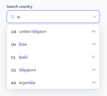
An autocomplete (typeahead) input shows a dropdown of matching suggestions as the user types, allowing them to select from filtered options rather than typing the full value. It combines the freedom of a text input with the precision of a dropdown — one of the most common form patterns in address forms, search bars, country selectors, and command inputs like the command palette. This snippet provides a complete implementation with real-time filtering, match highlighting, full keyboard navigation (arrow keys + Enter + Escape), a clear button, and flag + country code display.
The filter logic
OnInput runs on every keystroke. It filters the COUNTRIES array for entries where name or code includes the query string (case-insensitive). The results are sliced to 8 to keep the dropdown compact. If no results match, a "No results for X" message renders instead of an empty list.
The match highlighting
The highlight() function wraps matching characters with a <mark> tag: text.replace(new RegExp(query, 'gi'), '<mark>$1</mark>'). The <mark> elements get a light indigo background and bold text, making the matching portion immediately visible within the suggestion. The query is escaped for regex safety with a replace on special characters.
Keyboard navigation
ArrowDown/ArrowUp increment/decrement activeIdx, bounded to the list length. setActive() adds .active class to the current item and calls scrollIntoView({ block: 'nearest' }) so items never scroll out of sight in long lists. Enter selects the active item. Escape closes the dropdown and returns to the input. aria-activedescendant tracks the highlighted item for screen readers.
The blur/close timing issue
When a suggestion is clicked, the input fires blur before the click event on the list item. Without handling this, the list closes before the click registers. The solution: use onmousedown on list items (fires before blur) with e.preventDefault() to prevent the input from losing focus. This allows the click to complete before any blur-triggered close logic runs.
Accessible ARIA attributes
The input wrapper has role="combobox" with aria-expanded and aria-haspopup="listbox". The suggestion list has role="listbox". Each item has role="option". The input has aria-controls pointing to the list ID and aria-autocomplete="list". These attributes ensure screen readers announce the suggestions correctly.
Performance with large datasets
For datasets with hundreds of items, the inline includes() filter is fast enough — arrays under 1000 items filter in under 1ms. For thousands of items, consider a trie or sorted binary search instead of linear scan. For truly large datasets (city names, product catalogues, user directories), replace the inline filter with a debounced API call and render suggestions from the server response.
Build with AI
Build, Understand, Optimize, and Extend It With AI
Rather than puzzling out the blur-versus-click race condition on your own, paste this snippet's HTML, CSS, and JS into an AI coding assistant like Claude and ask it to explain exactly why list items use onmousedown with preventDefault instead of a plain onclick, and how that interacts with the setTimeout(closeList, 120) on the input's blur handler. The same assistant can help optimize it — ask whether the linear includes() filter over the COUNTRIES array would still be fast enough at ten thousand entries, or at what point it should be replaced with a debounced server-side search. It's also useful for extending the widget: ask it to add multi-select with removable chips, group suggestions by region with sub-headers, or wire the filter to a real API with request cancellation for stale responses. Treat the code less like a finished artifact and more like a starting point for a conversation.
Prompt to recreate it
Copy this into your AI assistant of choice to build the effect from scratch, or as a jumping-off point for your own variant:
Build a "typeahead autocomplete input" in plain HTML, CSS, and JavaScript — no framework, no external library.

Requirements:
- A text input wrapped in a container with role="combobox", aria-expanded, and aria-haspopup="listbox", plus a clear (×) button that only appears once the input has a value.
- On every input event, filter a local array of objects by case-insensitive substring match against multiple fields (not just one), cap the results to a small number (e.g. 8), and show a distinct "no results for X" message when the query is non-empty but nothing matches.
- Wrap the matched substring of each suggestion's display text in a highlight element (not a color-only style) so the matching characters are visually distinguishable from the rest of the label.
- Full keyboard support: ArrowDown and ArrowUp move a bounded active-index highlight through the visible suggestions (using scrollIntoView with block: "nearest" so the active item is never scrolled out of view), Enter selects the currently active suggestion, and Escape closes the list without selecting.
- Critically, suggestion list items must use onmousedown with event.preventDefault() (not onclick) to handle selection, because the input's blur event fires before a click event would register, and without preventing the default mousedown behavior the list would close before the click could complete.
- Update aria-activedescendant on the input to reference the currently active suggestion's id for screen reader support, and close the list automatically on blur using a short setTimeout delay long enough for a pending mousedown-based selection to finish first.
Want to tighten it up first? Run this prompt through the AI Prompt Studio to score it across 8 quality dimensions, catch anti-patterns, and tune the wording for Claude, ChatGPT, or Gemini before you paste it in.
Step by step
How to Use
- 1Type in the input to see matching suggestionsStart typing a country name or code. Matching suggestions appear immediately with the typed characters highlighted in indigo. Use arrow keys to navigate up and down the list.
- 2Select with mouse or keyboardClick any suggestion to select it. Or use ArrowDown/Up to highlight, then Enter to select. The input fills with the selected name and the result shows below. Press Escape to close without selecting.
- 3Replace the COUNTRIES data with your own optionsUpdate the COUNTRIES array with your own data. Each object needs name (the display and search text) and any additional fields to show (flag, code, icon, subtitle). Update the list item innerHTML in the forEach to show your fields.
- 4Change the number of visible suggestionsUpdate .slice(0, 8) in the filter to show more or fewer suggestions at once. The list has max-height: 240px with overflow-y: auto so it scrolls for longer lists.
- 5Add debouncing for API-backed suggestionsFor remote data, replace the inline filter with a fetch call: clearTimeout(timer); timer = setTimeout(() => fetch("/api/search?q=" + q).then(r=>r.json()).then(renderSuggestions), 200). The 200ms debounce prevents a request on every keystroke.
- 6Export in your formatClick "HTML" for a standalone file, "JSX" for a React component with useState for query and suggestions, or "Tailwind" for a React + Tailwind CSS version.
Real-world uses
Common Use Cases
Got questions?
Frequently Asked Questions
This is the blur-before-click timing issue. When the user clicks a suggestion, the input fires a blur event before the click event on the list item, which triggers closeList() and removes the suggestion before the click registers. The fix: use onmousedown on list items (fires before blur) with e.preventDefault() to prevent the focus from leaving the input. This allows the mousedown to complete before the blur fires. Never use onclick alone on suggestion items in autocompletes.
Replace the inline filter with a debounced fetch: let timer; function onInput(q) { clearTimeout(timer); if (!q) { closeList(); return; } timer = setTimeout(async () => { const res = await fetch("/api/search?q=" + encodeURIComponent(q)); const data = await res.json(); filtered = data.results; renderItems(); openList(); }, 200); }. The 200ms debounce waits for the user to pause typing before fetching, preventing a request on every keypress.
Set input.value to the existing value on page load: input.value = existingValue; clear.style.display = existingValue ? "" : "none". To show the full selected state (flag + code), also set the result display: document.getElementById("ac-result").innerHTML = selectedCountry ? "Selected: <strong>" + selectedCountry.flag + " " + selectedCountry.name + "</strong>" : "". This restores the visual state correctly when editing an existing form record.
Click "JSX" to download. Manage query and filtered (array of suggestions) with useState. Run the filter logic in a useEffect([query]) or inline in the onChange handler. For keyboard navigation, manage activeIndex in useState. Use useRef for the input element for programmatic focus. The blur timing fix becomes: add onMouseDown={e => e.preventDefault()} to each suggestion li element to prevent the input from losing focus on suggestion click.