Learn Coding Visually
Learn to code with interactive, live-preview playgrounds — HTML, CSS, JavaScript, React & more.
 HTML Playground42 lessons · Click-based · Live preview
 CSS PlaygroundLearn CSS with a live editor
 JavaScript Playground60 lessons · DOM · Async · Canvas
 React PlaygroundLearn React with a live code editor
 GSAP PlaygroundLearn GSAP animation interactively
 SVG Playground44 lessons · shapes · paths · animation
 SCSS Playground45 lessons · Sass modules · tokens
 Tailwind PlaygroundLearn Tailwind CSS with a live editor
 Bootstrap 5 Playground50 lessons · live preview
Notion-Style Block Editor — HTML CSS JS Snippet
Notion-Style Block Editor · Forms · Plain HTML, CSS & JS · Live preview
What's included
Features
About this UI Snippet
Notion-Style Block Editor — contenteditable Blocks, Slash Command Menu, Keyboard Block Management & Empty-State Placeholders
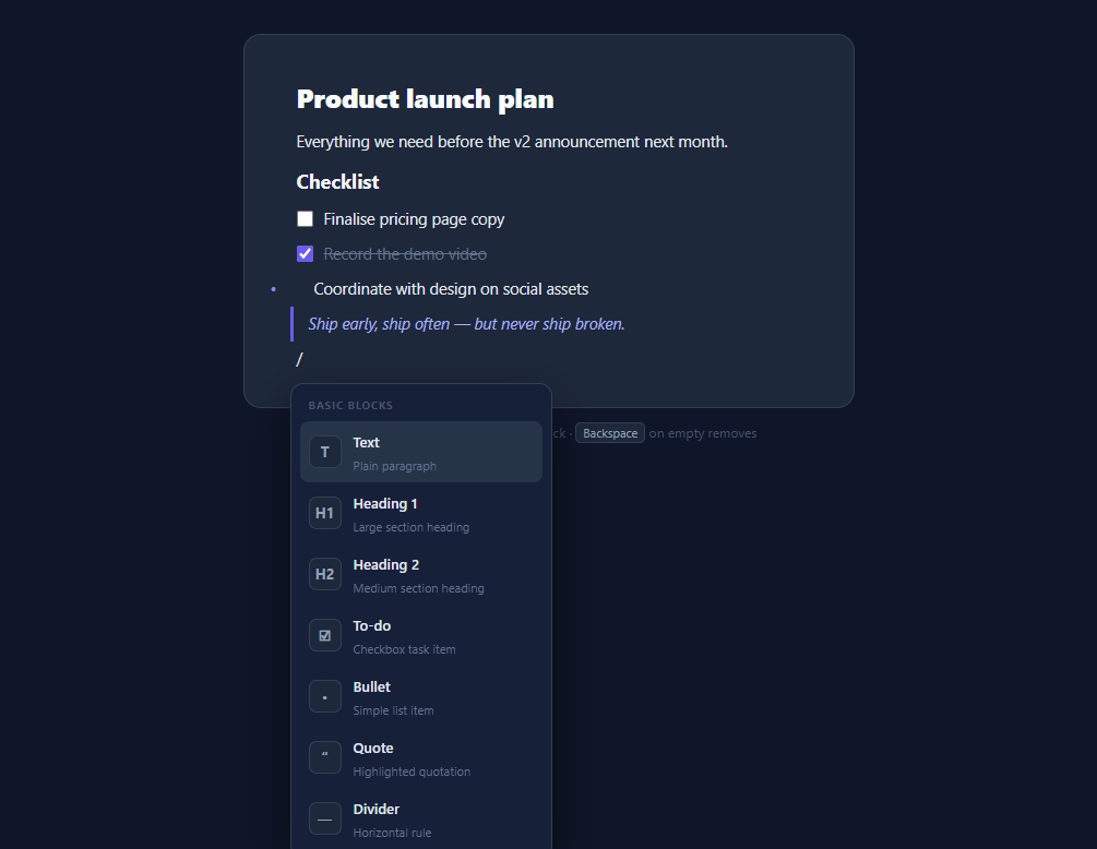
The block editor — pioneered by Notion and now expected in docs tools, CMSs, note apps, and AI writing products — replaces one big rich-text area with a vertical list of independent blocks: paragraphs, headings, to-dos, quotes, each its own editable unit, created and transformed through a slash-command menu. Full implementations (ProseMirror, Lexical, Tiptap, Editor.js) are heavyweight for good reasons, but the core interaction model fits in a few hundred lines of vanilla JavaScript — and building it teaches exactly why those libraries make the choices they do. This snippet implements the recognisable essentials: seven block types, the "/" menu with filtering and keyboard navigation, Enter/Backspace block management, list continuation, and Notion's floating placeholder text.
One block, one contenteditable
The critical architectural decision: instead of a single contenteditable document (the traditional rich-text approach, and the source of most of its legendary pain), *each block owns its own small contenteditable element*. A block is a flex row — hover-revealed drag dots, an optional checkbox for to-dos, and the .block-content editable div — with its type stored in data-type and all type styling driven by [data-type="…"] attribute selectors. Per-block editables mean the browser can never produce the arbitrary nested markup that plagues monolithic contenteditable (a stray bold span swallowing three paragraphs); the document structure lives in the DOM as a clean list of typed blocks, trivially serialisable by mapping over editor.children. This is, in miniature, the same model Editor.js uses.
The slash menu: trigger, filter, place, apply
Typing "/" as the first character of a block opens the command menu — detected in the input event by checking textContent.startsWith('/'), with everything after the slash used as a live filter over the block-type registry (type "/h" and only headings remain). The menu positions itself under the active block via getBoundingClientRect() math relative to the page wrapper, clamped so it never overflows. Navigation follows the roving-index pattern: ArrowUp/Down move a .focused highlight, Enter applies, Escape dismisses, and mousemove syncs the same index so mouse and keyboard never fight. One subtle but load-bearing detail: menu items listen on mousedown with preventDefault() rather than click — a click would first blur the editable and collapse the selection before the handler runs, the classic bug in every toolbar-over-contenteditable UI. Applying a type calls makeBlock() and replaceWith(), swapping the slash-bearing paragraph for a fresh block of the chosen type.
Keyboard block management
Enter never inserts a newline — it creates the next block (preventDefault, build, block.after(nb), focus). The type of that next block encodes the list-continuation rule: a non-empty to-do or bullet spawns another of the same type, anything else spawns a paragraph — press Enter on an *empty* to-do and you drop back to text, exactly Notion's escape-from-list behaviour. Backspace on an empty block removes it and focuses the previous block with the caret moved to its end, done properly with a collapsed Range (selectNodeContents + collapse(false)) since programmatic focus alone puts the caret at the start. Dividers are the special case: non-editable (contentEditable="false"), rendered as an <hr>, and choosing one auto-inserts a focused paragraph after it so the caret always has somewhere to live.
Placeholders without placeholder attributes
Divs have no placeholder attribute, so the hint text uses the CSS trick every block editor relies on: .block-content:empty::before { content: attr(data-ph) } — each block carries its own hint ("Heading 1", "To-do", "Type '/' for commands") in a data attribute, painted as a pseudo-element only while the element is truly empty, with pointer-events: none so it never intercepts the caret. Type-specific styling covers the rest: attribute selectors size headings, draw the quote's indigo left border, inject bullet dots via ::before on the block, and strike through completed to-dos via a .done class toggled by the checkbox.
Build with AI
Build, Understand, Optimize, and Extend It With AI
The two hardest ideas in this snippet — why structure must never be left to contenteditable, and why menu buttons listen on mousedown — are exactly the kind of thing an AI assistant explains well against concrete code: paste the file into Claude and ask it to demonstrate each by describing what a user would observe if you changed the architecture (one big editable) or the event (click instead of mousedown). Then extend it where your product needs: ask for a callout or code block type end-to-end (registry entry, makeBlock branch, CSS, serialisation), drag-to-reorder using the existing handle dots with the nearest-boundary insertBefore algorithm, or Alt+Arrow keyboard reordering if you want the simpler path. For persistence, have it write the debounced autosave that serialises editor.children to your API and the restore path that rebuilds from JSON. And before you scale this up, ask the assistant the honest architectural question: given your feature list — inline bold? collaboration? undo across blocks? — should you extend this or adopt Lexical/Tiptap, and what is the migration cost of each answer. That conversation is worth more than the code.
Prompt to recreate it
Copy this into your AI assistant of choice to build the effect from scratch, or as a jumping-off point for your own variant:
Build a Notion-style block editor in plain HTML, CSS, and JavaScript — typed content blocks with a slash command menu, no editor libraries.

Requirements:
- Architect the document as a vertical list of blocks where EACH block contains its own small contenteditable content element (never one monolithic editable region), with the block type stored in a data attribute and all type styling driven by [data-type] attribute selectors.
- Support seven types from a single registry array (id, label, description, icon, placeholder): paragraph, heading 1, heading 2, to-do with a real checkbox that strikes through the text via a toggled class, bullet with the dot drawn by a ::before pseudo-element, quote with an accent left border, and a non-editable divider rendered as an hr.
- Typing "/" as the first character of a block opens a command menu positioned under that block via getBoundingClientRect: it lists the registry with icon tiles and descriptions, filters live as the user keeps typing after the slash, supports ArrowUp/ArrowDown roving focus synced with mousemove, applies on Enter or click, and dismisses on Escape or outside click; applying replaces the block with a fresh one of the chosen type (a divider must auto-insert a focused paragraph after itself).
- Menu items must listen on mousedown with preventDefault rather than click, so choosing a command never blurs the editable and collapses the caret first — comment why.
- Enter never inserts a newline: it creates the next block, continuing the same type after a non-empty to-do or bullet but escaping to a paragraph after an empty one; Backspace on an empty block removes it and places the caret at the END of the previous block using a collapsed Range (selectNodeContents + collapse(false)).
- Implement per-type placeholder hints with zero JavaScript via .block-content:empty::before { content: attr(data-ph) }, and reveal drag-handle dots on block hover.
- Seed a demo document (heading, paragraph, sub-heading, two to-dos with one checked, a bullet, a quote), and comment how the whole document serialises to JSON by mapping over the editor's children.
Want to tighten it up first? Run this prompt through the AI Prompt Studio to score it across 8 quality dimensions, catch anti-patterns, and tune the wording for Claude, ChatGPT, or Gemini before you paste it in.
Step by step
How to Use
- 1Write with the block modelClick into the seeded document and type. Press Enter to create a new block — inside the to-dos, Enter continues the checklist; on an empty to-do it drops back to a paragraph. Press Backspace on an empty block to remove it, caret landing at the end of the previous block. Tick a to-do checkbox to strike it through. Hover any block to see the drag-handle dots.
- 2Use the slash menuOn an empty block, type "/" — the command menu opens under the block listing all seven types with icons and descriptions. Keep typing to filter ("/h" shows only headings), navigate with ArrowUp/Down, apply with Enter or a click, dismiss with Escape. Choosing Divider inserts the rule plus a fresh focused paragraph after it, since dividers themselves are not editable.
- 3Add your own block typesRegister a type in the TYPES array — { id: "callout", label: "Callout", desc: "Highlighted note", icon: "💡", ph: "Callout" } — then add its CSS as a .block[data-type="callout"] .block-content rule (tinted background, padding, radius). For types needing extra DOM (like the to-do checkbox), add a branch in makeBlock(). The slash menu, filtering, and keyboard flow pick the new type up automatically.
- 4Serialise and restore documentsThe DOM is the document model, so saving is a map: [...editor.children].map(b => ({ type: b.dataset.type, text: b.querySelector(".block-content")?.textContent ?? "", done: b.classList.contains("done") })). Persist the JSON (localStorage or your API), and restore by feeding it through the same seed loop the demo uses. Debounce saves on the editor's input event for autosave — pair with the Form Autosave Indicator.
- 5Add block reorderingThe drag dots are ready for it: set draggable on the handle, store the dragged block on dragstart, and in dragover on the editor compute the nearest block boundary from event.clientY and insertBefore accordingly — the same algorithm as the Drag Sort List snippet. Alternatively, bind Alt+ArrowUp/Down to swap the focused block with its sibling for keyboard-only reordering, which is simpler and equally Notion-authentic.
- 6Know when to graduate to a libraryThis pattern handles typed blocks of plain text superbly and stays understandable. The moment you need inline formatting spans (bold mid-sentence), collaborative cursors, or undo history beyond the browser's per-element default, reach for Lexical, Tiptap, or ProseMirror — they exist precisely for those. Click JSX to export the React version of this one; its per-block model maps naturally onto components with a blocks array in state.
Real-world uses
Common Use Cases
Got questions?
Frequently Asked Questions
A single contenteditable region hands document structure to the browser, and browsers make chaotic editing decisions: pressing Enter might produce a div, a p, or a br depending on engine and context; deleting across a boundary can merge elements into arbitrarily nested spans; pasted content imports foreign markup. Every serious editor spends most of its complexity budget fighting this. Per-block editables sidestep the whole class of problems — the browser only ever edits flat text inside one small div, while all structure (creating, removing, transforming, reordering blocks) goes through your JavaScript, which is exactly the "state-owns-structure" philosophy ProseMirror and Lexical implement with virtual documents. The trade-offs you accept: cross-block text selection doesn't work naturally (Notion itself restricts it, switching to block-level selection), and inline formatting within a block needs either execCommand-style spans or a token model. For typed plain-text blocks — checklists, outlines, structured notes — those trade-offs cost nothing.
Because of focus timing. A click is mousedown + mouseup, and the browser processes focus changes on mousedown: clicking a menu item first blurs the contenteditable block, which collapses the selection and (in a naive implementation) may close the menu via a blur handler — so by the time the click event fires, the context the command needs is gone. Listening on mousedown gets in before any of that, and calling preventDefault() on it suppresses the default focus-transfer entirely, so the editable never blurs and the caret survives. This is the single most common bug in toolbar-over-editor UIs — bold buttons that "lose the selection" — and the fix is always the same pair: mousedown listener, preventDefault, then perform the command against the still-live selection. The demo's applySlash then moves focus deliberately to the newly created block, which is the one intentional focus change in the flow.
Three tiers, in order of effort. Quickest: allow the browser's native shortcuts (Ctrl/Cmd+B and +I work inside contenteditable in all modern browsers, producing <b>/<i> tags) and serialise innerHTML per block instead of textContent — sanitise it on save with an allowlist (b, i, a, code) because contenteditable HTML must never be trusted. Middle: add a floating toolbar that appears on selection (listen for selectionchange, position over getSelection().getRangeAt(0).getBoundingClientRect()) and apply formatting by wrapping the range in elements yourself — reuse the mousedown/preventDefault rule from the slash menu for its buttons. Full: adopt a token-based model where each block stores [{ text, marks: ["bold"] }] segments and renders spans from data — that is the point where you have rebuilt the core of Lexical, and adopting Lexical or Tiptap outright becomes the honest choice. For many products (checklists, outlines, briefs), tier one plus a code-block type covers real usage.
React needs one architectural caution: contenteditable and React's controlled rendering conflict, because re-rendering a block's text from state resets the caret. The working pattern is uncontrolled blocks — keep the blocks array in state for structure (ids, types, order) but let each block's DOM own its text, syncing to state on onInput without echoing state back into the element (suppressContentEditableWarning, and never put the text in JSX). Structural operations (Enter, Backspace, slash-apply) go through setState splices keyed by block id. Angular is analogous: an @for over a signal array of block metadata, [attr.contenteditable] bindings, and text captured on input events without rebinding innerText. Tailwind maps cleanly since all type styling is attribute-driven: data-[type=h1]:text-2xl data-[type=h1]:font-extrabold on the content, data-[type=quote]:border-l-2 data-[type=quote]:border-indigo-500 data-[type=quote]:italic, the placeholder via empty:before:content-[attr(data-ph)] empty:before:text-slate-600, and the menu with the usual popover utilities.