
Learn Coding Visually
Learn to code with interactive, live-preview playgrounds — HTML, CSS, JavaScript, React & more.
 HTML Playground42 lessons · Click-based · Live preview
 CSS PlaygroundLearn CSS with a live editor
 JavaScript Playground60 lessons · DOM · Async · Canvas
 React PlaygroundLearn React with a live code editor
 GSAP PlaygroundLearn GSAP animation interactively
 SVG Playground44 lessons · shapes · paths · animation
 SCSS Playground45 lessons · Sass modules · tokens
 Tailwind PlaygroundLearn Tailwind CSS with a live editor
 Bootstrap 5 Playground50 lessons · live preview
AI Model Selector Dropdown — HTML CSS JS Snippet
AI Model Selector · Forms · Plain HTML, CSS & JS · Live preview
What's included
Features
About this UI Snippet
AI Model Selector — Rich Listbox Dropdown with Context Window, Speed Dots, Pricing Meta & ARIA Keyboard Support
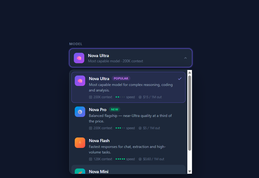
Every AI product that exposes more than one model needs this control: ChatGPT's model menu, Claude's model picker, Cursor's model dropdown, and every API playground all present the same anatomy — a compact trigger showing the current model, opening into a listbox of rich option cards where each model carries a description, capability metadata, and pricing. A native <select> cannot render any of that, so the pattern has to be rebuilt as a custom listbox. This snippet implements it completely in vanilla HTML, CSS, and JavaScript, including the part most custom dropdowns skip: correct ARIA roles and full keyboard navigation.
Data-driven options: one array renders everything
The four demo models live in a MODELS array — id, name, optional badge (new/popular), one-line description, context window, a 1–5 speed rating, price string, emoji icon, and a CSS gradient for the icon tile. The render() function maps this array to option-card markup, so adding a model, changing a price, or reordering the list is a data edit, not a markup edit. This mirrors how a real app would feed the component from a /models API response. Each card is a flex row: gradient icon tile, body (name + badge, description, meta row), and a check icon whose opacity is driven entirely by the aria-selected attribute — state lives in ARIA, and CSS reads it via the [aria-selected="true"] attribute selector, which keeps accessibility and styling permanently in sync.
The metadata row: context, speed dots, price
The meta row encodes the three numbers users actually compare when choosing a model. Context window renders with a frame icon; price renders with a currency glyph; and speed renders as a five-dot meter built by speedDots(n) — five 4px circles where the first *n* get a green .on class. Dots communicate a bounded ordinal scale ("faster vs slower") far better than milliseconds would, since real latency varies per request. Badges use tinted translucent backgrounds (rgba(74,222,128,0.15) green for "new", violet for "popular") — the low-alpha-background/full-saturation-text formula that keeps badges legible on dark surfaces without shouting.
Trigger and dropdown mechanics
The trigger is a real <button> with aria-haspopup="listbox" and a live aria-expanded attribute; its chevron rotates 180° via a transform keyed off [aria-expanded="true"] — again CSS reading ARIA rather than a parallel class. The dropdown is absolutely positioned under the trigger and animates open with the standard popover recipe: opacity: 0; transform: translateY(-6px) scale(0.98); pointer-events: none in the closed state, transitioning to identity when .open is added. pointer-events: none while closed is the detail that prevents invisible dropdowns from eating clicks. An outside-click listener on document closes the menu unless the click landed inside .selector-wrap (checked with closest()).
Keyboard navigation: the roving focusIdx pattern
Focus never leaves the trigger button — instead a focusIdx integer tracks the visually focused option, painted with a .focused class and announced to screen readers through aria-activedescendant pointing at the focused option's id. ArrowDown/ArrowUp clamp the index within bounds, Enter selects, Escape closes, and ArrowDown/Enter/Space on a closed trigger opens the menu with the current selection pre-focused. Mouse and keyboard focus stay unified because mousemove on an option updates the same focusIdx. This is the WAI-ARIA listbox pattern — the same architecture as the Custom Select snippet, extended with rich card content — and it is what separates a production-grade dropdown from a div that only mouse users can operate.
Selecting a model updates the trigger's icon, name, and summary line, plus a note below the control stating the active model and its output-token price — the confirmation affordance that prevents accidental expensive-model usage, which is a real cost concern in AI products.
Build with AI
Build, Understand, Optimize, and Extend It With AI
This snippet rewards interrogation more than admiration: paste it into an AI assistant like Claude and ask it to explain the aria-activedescendant pattern line by line — why focus never leaves the trigger, what a screen reader announces on each ArrowDown, and what breaks if you delete the paintFocus() call. Then put it to work on your integration: ask it to replace the MODELS array with a fetch from your actual provider's model-list endpoint, mapping context windows and per-token prices into the card meta row, and to add a locked state for plan-gated models that opens an upgrade flow instead of selecting. If the picker will live at the bottom of a chat composer, ask for the auto-flip logic that measures viewport space and opens upward. And if you're standardising a design system, ask it to extract the dropdown shell and option card into reusable primitives shared with your other menus — then convert the result to React or Vue with the ARIA behaviour intact, which is precisely the part hand conversions usually drop.
Prompt to recreate it
Copy this into your AI assistant of choice to build the effect from scratch, or as a jumping-off point for your own variant:
Build an AI model selector dropdown in plain HTML, CSS, and JavaScript — a rich custom listbox like the model pickers in ChatGPT or Claude — with full keyboard and screen-reader support.

Requirements:
- Drive everything from a data array of at least four models, each with an id, display name, optional "new" or "popular" badge, one-line description, context-window size, a 1–5 speed rating, an output-token price string, an emoji icon, and a CSS gradient for its icon tile — rendering must be a pure function of this array.
- The closed control is a real button showing the selected model's icon, name, and a short summary line, with aria-haspopup="listbox", a live aria-expanded attribute, and a chevron that rotates 180° via CSS keyed off the aria-expanded attribute rather than a separate class.
- The open dropdown is an absolutely positioned panel of option cards, each showing the icon tile, name plus tinted translucent badge, description, and a meta row with three items: context window with an icon, speed drawn as five small dots where the rating determines how many light up green, and the price.
- Selection state must live in aria-selected on each option, with the highlight ring and check-icon visibility styled purely through the [aria-selected="true"] attribute selector so accessibility state and visual state can never drift apart.
- Implement the WAI-ARIA listbox keyboard pattern with a roving focus index and aria-activedescendant: DOM focus stays on the trigger; ArrowDown/ArrowUp move a visually highlighted option and update aria-activedescendant; Enter selects; Escape closes; ArrowDown, Enter, or Space on the closed trigger opens with the current selection focused; and mousemove over an option syncs the same focus index so mouse and keyboard never fight.
- Animate the dropdown open with an opacity plus small translate/scale transition, and guard the closed state with pointer-events: none; close on outside click using a document listener with closest().
- Below the control, render a confirmation note stating which model requests will use and its output price, updated on every selection — and comment where a real app would persist the choice and notify its API client.
Want to tighten it up first? Run this prompt through the AI Prompt Studio to score it across 8 quality dimensions, catch anti-patterns, and tune the wording for Claude, ChatGPT, or Gemini before you paste it in.
Source Code
<div class="selector-wrap">
  <label class="selector-label" id="selector-label">Model</label>

  <button class="selector-trigger" id="trigger" aria-haspopup="listbox" aria-expanded="false" aria-labelledby="selector-label">
    <span class="trigger-icon" id="trigger-icon"></span>
    <span class="trigger-text">
      <span class="trigger-name" id="trigger-name">Nova Ultra</span>
      <span class="trigger-desc" id="trigger-desc">Most capable · 200K context</span>
    </span>
    <svg class="trigger-chevron" width="14" height="14" viewBox="0 0 24 24" fill="none" stroke="currentColor" stroke-width="2.5"><path d="M6 9l6 6 6-6"/></svg>
  </button>

  <div class="dropdown" id="dropdown" role="listbox" aria-labelledby="selector-label" tabindex="-1"></div>

  <p class="selection-note" id="selection-note">Requests will use <strong>Nova Ultra</strong> at $15 / 1M output tokens.</p>
</div>
* { box-sizing: border-box; margin: 0; padding: 0; }
body { font-family: system-ui, sans-serif; background: #0f172a; min-height: 100vh; display: flex; align-items: center; justify-content: center; padding: 24px; }
.selector-wrap { width: 100%; max-width: 400px; position: relative; }
.selector-label {
display: block; font-size: 11px; font-weight: 700;
letter-spacing: 0.08em; text-transform: uppercase;
color: #64748b; margin-bottom: 8px;
}
/* — Trigger — */
.selector-trigger {
width: 100%; display: flex; align-items: center; gap: 12px;
background: #1e293b; border: 1px solid #334155;
border-radius: 12px; padding: 12px 14px;
cursor: pointer; font-family: inherit; text-align: left;
transition: border-color 0.15s, box-shadow 0.15s;
}
.selector-trigger:hover { border-color: #475569; }
.selector-trigger:focus-visible,
.selector-trigger[aria-expanded="true"] {
outline: none; border-color: #6366f1;
box-shadow: 0 0 0 3px rgba(99,102,241,0.25);
}
.trigger-icon, .opt-icon {
width: 34px; height: 34px; border-radius: 9px; flex-shrink: 0;
display: flex; align-items: center; justify-content: center;
font-size: 15px;
}
.trigger-text { flex: 1; min-width: 0; }
.trigger-name { display: block; font-size: 14px; font-weight: 600; color: #f1f5f9; }
.trigger-desc { display: block; font-size: 11.5px; color: #64748b; margin-top: 1px; }
.trigger-chevron { color: #64748b; transition: transform 0.2s; flex-shrink: 0; }
.selector-trigger[aria-expanded="true"] .trigger-chevron { transform: rotate(180deg); }
/* — Dropdown — */
.dropdown {
position: absolute; top: calc(100% - 24px); left: 0; right: 0;
background: #1e293b; border: 1px solid #334155;
border-radius: 14px; padding: 6px;
box-shadow: 0 20px 50px rgba(0,0,0,0.45);
opacity: 0; transform: translateY(-6px) scale(0.98);
pointer-events: none;
transition: opacity 0.18s, transform 0.18s;
z-index: 50; max-height: 340px; overflow-y: auto;
}
.dropdown.open { opacity: 1; transform: none; pointer-events: all; }
/* — Option cards — */
.opt {
display: flex; align-items: flex-start; gap: 12px;
padding: 11px 10px; border-radius: 10px;
cursor: pointer; transition: background 0.12s;
border: 1px solid transparent;
}
.opt:hover, .opt.focused { background: #273549; }
.opt[aria-selected="true"] { border-color: rgba(99,102,241,0.5); background: rgba(99,102,241,0.1); }
.opt-body { flex: 1; min-width: 0; }
.opt-top { display: flex; align-items: center; gap: 8px; }
.opt-name { font-size: 13.5px; font-weight: 600; color: #f1f5f9; }
.opt-badge {
font-size: 9.5px; font-weight: 700; letter-spacing: 0.05em;
text-transform: uppercase; padding: 2px 7px; border-radius: 20px;
}
.opt-badge.new { background: rgba(74,222,128,0.15); color: #4ade80; }
.opt-badge.popular { background: rgba(168,85,247,0.15); color: #c084fc; }
.opt-desc { font-size: 12px; color: #94a3b8; line-height: 1.5; margin-top: 2px; }
.opt-meta { display: flex; gap: 12px; margin-top: 7px; }
.meta-item { display: flex; align-items: center; gap: 4px; font-size: 10.5px; color: #64748b; }
.meta-item svg { flex-shrink: 0; }
/* Speed dots */
.speed-dots { display: inline-flex; gap: 2.5px; }
.speed-dots i { width: 4px; height: 4px; border-radius: 50%; background: #334155; }
.speed-dots i.on { background: #4ade80; }
.opt-check { color: #818cf8; flex-shrink: 0; opacity: 0; margin-top: 3px; }
.opt[aria-selected="true"] .opt-check { opacity: 1; }
.selection-note { margin-top: 14px; font-size: 12px; color: #64748b; line-height: 1.5; }
.selection-note strong { color: #cbd5e1; }const MODELS = [
{
id: 'nova-ultra', name: 'Nova Ultra', badge: 'popular',
desc: 'Most capable model for complex reasoning, coding and analysis.',
context: '200K', speed: 2, price: '$15 / 1M out',
icon: '\u{1F9E0}', iconBg: 'linear-gradient(135deg,#6366f1,#a855f7)',
},
{
id: 'nova-pro', name: 'Nova Pro', badge: 'new',
desc: 'Balanced flagship — near-Ultra quality at a third of the price.',
context: '200K', speed: 3, price: '$5 / 1M out',
icon: '\u2699\uFE0F', iconBg: 'linear-gradient(135deg,#0ea5e9,#6366f1)',
},
{
id: 'nova-flash', name: 'Nova Flash', badge: null,
desc: 'Fastest responses for chat, extraction and high-volume tasks.',
context: '128K', speed: 5, price: '$0.60 / 1M out',
icon: '\u26A1', iconBg: 'linear-gradient(135deg,#f59e0b,#ef4444)',
},
{
id: 'nova-mini', name: 'Nova Mini', badge: null,
desc: 'Tiny, cheap model for classification and simple lookups.',
context: '32K', speed: 5, price: '$0.15 / 1M out',
icon: '\u{1FAB6}', iconBg: 'linear-gradient(135deg,#10b981,#0ea5e9)',
},
];
const trigger = document.getElementById('trigger');
const dropdown = document.getElementById('dropdown');
const note = document.getElementById('selection-note');
let selected = MODELS[0];
let focusIdx = 0;
function speedDots(n) {
let h = '<span class="speed-dots">';
for (let i = 0; i < 5; i++) h += '<i class="' + (i < n ? 'on' : '') + '"></i>';
return h + '</span>';
}
function render() {
dropdown.innerHTML = MODELS.map((m, i) =>
'<div class="opt' + (i === focusIdx ? ' focused' : '') + '" role="option" id="opt-' + m.id + '"' +
' aria-selected="' + (m.id === selected.id) + '" data-idx="' + i + '">' +
'<span class="opt-icon" style="background:' + m.iconBg + '">' + m.icon + '</span>' +
'<div class="opt-body">' +
'<div class="opt-top"><span class="opt-name">' + m.name + '</span>' +
(m.badge ? '<span class="opt-badge ' + m.badge + '">' + m.badge + '</span>' : '') +
'</div>' +
'<div class="opt-desc">' + m.desc + '</div>' +
'<div class="opt-meta">' +
'<span class="meta-item"><svg width="11" height="11" viewBox="0 0 24 24" fill="none" stroke="currentColor" stroke-width="2"><rect x="3" y="3" width="18" height="18" rx="3"/><path d="M9 9h6v6H9z"/></svg>' + m.context + ' context</span>' +
'<span class="meta-item">' + speedDots(m.speed) + ' speed</span>' +
'<span class="meta-item"><svg width="11" height="11" viewBox="0 0 24 24" fill="none" stroke="currentColor" stroke-width="2"><circle cx="12" cy="12" r="9"/><path d="M12 7v10M9.5 9.5h3.75a1.75 1.75 0 0 1 0 3.5h-2.5a1.75 1.75 0 0 0 0 3.5H14.5"/></svg>' + m.price + '</span>' +
'</div>' +
'</div>' +
'<svg class="opt-check" width="15" height="15" viewBox="0 0 24 24" fill="none" stroke="currentColor" stroke-width="2.5"><path d="M20 6L9 17l-5-5"/></svg>' +
'</div>'
).join('');
dropdown.querySelectorAll('.opt').forEach(el => {
el.addEventListener('click', () => select(+el.dataset.idx));
el.addEventListener('mousemove', () => { focusIdx = +el.dataset.idx; paintFocus(); });
});
}
function paintFocus() {
dropdown.querySelectorAll('.opt').forEach((el, i) => el.classList.toggle('focused', i === focusIdx));
}
function updateTrigger() {
document.getElementById('trigger-icon').style.background = selected.iconBg;
document.getElementById('trigger-icon').textContent = selected.icon;
document.getElementById('trigger-name').textContent = selected.name;
document.getElementById('trigger-desc').textContent = selected.desc.split(' \u2014 ')[0].split(' for ')[0] + ' \u00B7 ' + selected.context + ' context';
note.innerHTML = 'Requests will use <strong>' + selected.name + '</strong> at ' + selected.price + 'put tokens.';
}
function select(i) {
selected = MODELS[i];
focusIdx = i;
updateTrigger();
render();
close();
}
function open() {
focusIdx = MODELS.findIndex(m => m.id === selected.id);
render();
dropdown.classList.add('open');
trigger.setAttribute('aria-expanded', 'true');
trigger.setAttribute('aria-activedescendant', 'opt-' + MODELS[focusIdx].id);
}
function close() {
dropdown.classList.remove('open');
trigger.setAttribute('aria-expanded', 'false');
}
function isOpen() { return dropdown.classList.contains('open'); }
trigger.addEventListener('click', () => isOpen() ? close() : open());
trigger.addEventListener('keydown', e => {
if (!isOpen() && (e.key === 'ArrowDown' || e.key === 'Enter' || e.key === ' ')) {
e.preventDefault(); open(); return;
}
if (!isOpen()) return;
if (e.key === 'ArrowDown') { e.preventDefault(); focusIdx = Math.min(focusIdx + 1, MODELS.length - 1); paintFocus(); }
else if (e.key === 'ArrowUp') { e.preventDefault(); focusIdx = Math.max(focusIdx - 1, 0); paintFocus(); }
else if (e.key === 'Enter') { e.preventDefault(); select(focusIdx); }
else if (e.key === 'Escape') { close(); }
trigger.setAttribute('aria-activedescendant', 'opt-' + MODELS[focusIdx].id);
});
document.addEventListener('click', e => {
if (!e.target.closest('.selector-wrap')) close();
});
// initial paint
updateTrigger();
render();Step by step
How to Use
- 1Open the picker and choose a modelClick the trigger (or focus it and press Enter, Space, or ArrowDown) to open the listbox. Navigate with ArrowUp/ArrowDown — the focused card highlights — and press Enter to select, or click any card. Escape or clicking outside closes the menu. The trigger updates with the selected model's icon, name, and context summary, and the note below confirms the model and price that requests will use.
- 2Edit the model listEverything renders from the MODELS array in the JS panel. Each entry has id, name, badge ("new", "popular", or null), desc, context, speed (1–5, drawn as dots), price, icon (any emoji), and iconBg (a CSS gradient). Add, remove, or reorder entries and the dropdown rebuilds automatically — swap in your provider's real model names and current pricing, or fetch the array from your /models endpoint and call render().
- 3Wire selection into your appThe select(i) function is the single point where a choice commits. Add your side effects there: persist with localStorage.setItem("model", selected.id), update your API client's default model, or dispatch an event — dropdown.dispatchEvent(new CustomEvent("modelchange", { detail: selected, bubbles: true })) — so surrounding code can listen without touching the component.
- 4Add disabled and gated modelsFor plan-gated models (e.g. Ultra requires Pro), add locked: true to the model object, render a small lock icon in place of the check, add aria-disabled="true", and give the card opacity: 0.5 with cursor: not-allowed. In select(), early-return for locked models and instead open your upgrade modal — pair with the Upgrade Banner or Paywall Screen snippets.
- 5Reposition for tight layoutsThe dropdown opens downward from the trigger. In a chat composer where the picker sits at the bottom of the viewport, flip it upward: change top: calc(100% - 24px) to bottom: calc(100% + 8px) and invert the entrance transform to translateY(6px). For automatic flipping, measure trigger.getBoundingClientRect().bottom against window.innerHeight before opening and toggle a .drop-up class.
- 6Export to your frameworkClick JSX for a React version. Hold selected and focusIdx in useState, render options from the array with .map(), and keep aria-activedescendant in sync via props — the CSS transfers unchanged. This control slots directly into the header of the AI Chat Interface, beside the AI Prompt Composer, or into a settings row with the Settings Panel.
Real-world uses
Common Use Cases
Got questions?
Frequently Asked Questions
Two valid ARIA listbox implementations exist: roving tabindex (DOM focus moves to each option) and aria-activedescendant (focus stays on the trigger, which points at the visually focused option by id). This snippet uses activedescendant because it is simpler to keep correct with dynamic content — options can be re-rendered freely without focus jumping or being lost, there is exactly one tab stop, and closing the menu never needs a focus restore. The trigger keeps real keyboard focus the whole time, its keydown handler interprets arrows, and screen readers announce the referenced option as the user navigates. If you later add type-ahead search inside the dropdown, activedescendant also composes cleanly with an input receiving focus.
Fetch your provider's model list on mount, map it into the MODELS shape, and call render(). For example: const res = await fetch("/api/models"); MODELS = (await res.json()).map(m => ({ id: m.id, name: m.display_name, desc: m.description, context: m.context_window >= 1000 ? Math.round(m.context_window/1000) + "K" : m.context_window, speed: m.speed_tier, price: "$" + m.output_price + " / 1M out", badge: m.is_new ? "new" : null, icon: "⚡", iconBg: "linear-gradient(135deg,#6366f1,#a855f7)" })). Keep a loading skeleton in the dropdown while fetching (the Skeleton Loader pattern works), and cache the response — model lists change rarely, so a sessionStorage cache avoids a fetch per page.
Persist in select(): localStorage.setItem("preferred-model", selected.id). On load, read it back and initialise: const saved = localStorage.getItem("preferred-model"); selected = MODELS.find(m => m.id === saved) || MODELS[0] — the find-with-fallback matters because a saved id may reference a model you have since removed. For API calls, either read the stored id at request time or, cleaner, dispatch a CustomEvent from select() and have your API client module keep its own copy. In multi-tab apps, listen for the storage event so a model change in one tab updates the trigger in others.
Tailwind maps directly: the trigger is w-full flex items-center gap-3 bg-slate-800 border border-slate-700 rounded-xl p-3 aria-expanded:border-indigo-500 aria-expanded:ring-4 aria-expanded:ring-indigo-500/25 (Tailwind's aria-* variants read the attribute exactly as this CSS does); option cards are flex gap-3 p-3 rounded-lg aria-selected:bg-indigo-500/10 aria-selected:border-indigo-500/50; badges are text-[10px] uppercase px-2 py-0.5 rounded-full bg-green-400/15 text-green-400. In Angular, make it a component with a signal for selected and focusIdx, @for over the models input, host keydown listener for the arrow logic, and emit a modelChange output from select(); in Vue, the same structure with defineModel() gives you v-model support for free. The ARIA attributes and CSS transfer verbatim in all three.