You Might Also Like
Learn Coding Visually
Learn to code with interactive, live-preview playgrounds — HTML, CSS, JavaScript, React & more.
 HTML Playground42 lessons · Click-based · Live preview
 CSS PlaygroundLearn CSS with a live editor
 JavaScript Playground60 lessons · DOM · Async · Canvas
 React PlaygroundLearn React with a live code editor
 GSAP PlaygroundLearn GSAP animation interactively
 SVG Playground44 lessons · shapes · paths · animation
 SCSS Playground45 lessons · Sass modules · tokens
 Tailwind PlaygroundLearn Tailwind CSS with a live editor
 Bootstrap 5 Playground50 lessons · live preview
Combobox — Searchable Select with Keyboard Nav
Searchable Combobox with Keyboard Navigation · Forms · Plain HTML, CSS & JS · Live preview
What's included
Features
About this UI Snippet
Searchable Combobox — Type-to-Filter Select with Full Keyboard Navigation
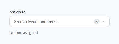
A combobox pairs a text input with a filtered dropdown list, letting a user either type to narrow a long list of options or browse it directly — the pattern behind "assign to a teammate," "choose a country," or "pick a project" fields where a plain <select> becomes unusable past a dozen items. Unlike the autocomplete input, which suggests free-text completions, a combobox constrains the final value to one item from a fixed list.
ARIA combobox pattern
The input carries role="combobox", aria-expanded, aria-controls pointing at the listbox's id, and aria-autocomplete="list". The list itself is role="listbox" with each item as role="option". aria-expanded flips between "true" and "false" as the list opens and closes, which is what tells a screen reader whether the popup is currently visible — this is the official WAI-ARIA combobox pattern, not an invented shortcut.
Filtering and highlighting
On every keystroke, filterList() rebuilds the filtered array with a case-insensitive indexOf check against each person's name, and resets activeIndex to 0 so the first match is always ready to select with Enter. The highlight() function wraps the matched substring in <mark>, built with string slicing around the match index rather than a regex replace — sidestepping the classic bug where special regex characters in a user's search query (like . or () would otherwise need escaping before use in a RegExp.
Keyboard navigation
ArrowDown and ArrowUp move activeIndex and re-render, clamped with Math.min/Math.max so it can't run past either end of the filtered list. Enter selects whichever option is currently active — not necessarily the one under the mouse — which is why activeIndex and mouse :hover are tracked as two separate concerns; a combobox driven purely by hover state breaks the moment a keyboard user moves focus without moving the mouse. Escape closes the list without selecting, leaving the typed text as-is.
Selection and the clear button
Selecting an option sets input.value to the person's full name, stores the full object in selected, and reveals a small circular clear button. Typing again after a selection clears selected immediately — this matters because it is what distinguishes "the user is refining their search" from "the user has committed to a choice," and downstream code should treat selected (not input.value) as the source of truth for what was actually picked.
Outside-click and empty state
A document-level click listener uses e.target.closest('#combo') to close the list on any click outside the component, the same delegation pattern used by dropdown menus and split buttons. When no options match the query, the list renders a single .combo-empty row instead of an empty <ul>, so the absence of results is communicated rather than silently showing nothing.
XSS safety
Every piece of user-influenced text — both the option names and the search query echoed inside <mark> — passes through escapeHtml() before being inserted via innerHTML. This is a small but easy detail to skip when a list is rendered from a template string, and skipping it is exactly how a search box becomes a stored or reflected XSS vector once the option list comes from real user data instead of a hardcoded array.
React integration
In React, keep query, filtered, activeIndex, and selected as four pieces of useState, derive filtered with useMemo off query, and keep the same ARIA attributes on the rendered <input> and <ul> — the accessibility structure translates directly regardless of framework.
See also the multi-select dropdown for choosing several options at once, and the country selector for a domain-specific combobox variant.
Build with AI
Build, Understand, Optimize, and Extend It With AI
Paste this combobox's HTML, CSS, and JS into an AI coding assistant like Claude and ask it to trace exactly how activeIndex, the mouse-hover class, and the actual selected value stay in sync without interfering with each other — that three-way separation is the part most from-scratch comboboxes get wrong first. It's also a strong candidate for an accessibility audit: ask the assistant to check the implementation against the full WAI-ARIA combobox authoring practice, including whether aria-activedescendant should be added to point the input at the currently active option's id rather than relying on visual highlighting alone. Beyond that, ask it to add async loading with a debounced fetch and a loading-state row, or to add multi-select support with removable chips.
Prompt to recreate it
Copy this into your AI assistant of choice to build the effect from scratch, or as a jumping-off point for your own variant:
Build a searchable combobox with keyboard navigation in plain HTML, CSS, and JavaScript, no framework, no libraries.

Requirements:
- A text input styled with role="combobox", aria-expanded, and aria-controls pointing to a dropdown list's id, paired with a dropdown list styled with role="listbox" containing options with role="option".
- Typing in the input must filter a fixed in-memory array of at least eight items by a case-insensitive substring match against each item's name, and the matched substring within each visible option's label must be visually highlighted.
- The dropdown must support full keyboard navigation: ArrowDown and ArrowUp move a highlighted "active" option up or down through the currently filtered list without going out of bounds, Enter selects whichever option is currently active, and Escape closes the dropdown without changing the selection.
- Selecting an option (by click or by Enter) must set the input's displayed text to that option's label, store the full selected object separately from the raw input text, and reveal a small clear button that resets both the input and the stored selection when clicked.
- If the user resumes typing after having made a selection, the previously stored selection must be cleared immediately, since further typing means the user is searching again, not confirming the prior choice.
- Clicking anywhere outside the combobox must close the dropdown. When the current query matches nothing, show a distinct empty-state row inside the dropdown instead of an empty list. All list content built from data must be safely escaped before insertion so no HTML can be injected through the search text or the option labels.
Want to tighten it up first? Run this prompt through the AI Prompt Studio to score it across 8 quality dimensions, catch anti-patterns, and tune the wording for Claude, ChatGPT, or Gemini before you paste it in.
Step by step
How to Use
- 1Copy the input/list markupThe .combo wrapper holds a text input with combobox ARIA roles, a clear button, and a .combo-list <ul> with role="listbox" that starts empty and hidden.
- 2Replace the PEOPLE arraySwap the PEOPLE array for your own options — each item just needs a unique id and the fields your render function displays (name, initials, or any other data).
- 3Add the CSSPaste the CSS once. The .combo.open class controls visibility of the dropdown and the arrow rotation — no per-instance changes needed.
- 4Wire selection to your appRead the selected variable (or its equivalent in your framework state) after selectPerson runs — it holds the full matched object, not just the display text.
- 5Handle empty resultsThe .combo-empty row already covers the no-matches case — customize its message or add a "Create new" action there for tag-style comboboxes.
Real-world uses
Common Use Cases
Got questions?
Frequently Asked Questions
A combobox constrains the final value to one item chosen from a fixed list — free typing only filters, it never becomes the value. An autocomplete input suggests completions but still accepts whatever free text the user types as the final value.
Debounce the input event (e.g. 250ms with setTimeout), fetch matching options from your endpoint inside that debounced handler, replace the filtered array with the response, and re-render — the rest of the keyboard and selection logic is unchanged.
The input value changes on every keystroke while the user searches, but the actual chosen option should only update on an explicit select. Treating input.value as the answer would silently "unselect" the moment someone edits the text to search again.
Keep an array instead of a single selected object, render chosen items as removable chips above or inside the input, and on selectPerson push to that array instead of replacing input.value — see the multi-select dropdown snippet for a full worked example of that pattern.
Open the Export menu on the snippet page. It generates a React component managing query/filtered/activeIndex/selected as hooks, a React + Tailwind version, a Vue 3 SFC using refs and computed filtering, and an Angular standalone component — all preserving the ARIA roles and keyboard handling exactly.