Source Code
<div class="wrap">
  <div class="field">
    <label class="label">Technologies</label>
    <div class="ms-wrap" id="ms-wrap">
      <div class="ms-trigger" id="ms-trigger" role="combobox" aria-expanded="false" aria-haspopup="listbox" tabindex="0">
        <div class="ms-tags" id="ms-tags">
          <span class="placeholder" id="placeholder">Select options…</span>
        </div>
        <svg class="chevron" id="chevron" width="12" height="12" viewBox="0 0 24 24" fill="none" stroke="currentColor" stroke-width="2.5"><polyline points="6 9 12 15 18 9"/></svg>
      </div>

      <div class="ms-dropdown" id="ms-dropdown" role="listbox" aria-multiselectable="true">
        <div class="ms-search-wrap">
          <input class="ms-search" id="ms-search" type="text" placeholder="Search…">
        </div>
        <div class="ms-options" id="ms-options"></div>
        <div class="ms-footer">
          <button class="ms-footer-btn" id="btn-select-all">Select all</button>
          <button class="ms-footer-btn" id="btn-clear-all">Clear all</button>
        </div>
      </div>
    </div>
    <div class="ms-count" id="ms-count"></div>
  </div>
</div>
* { box-sizing: border-box; margin: 0; padding: 0; }
body { font-family: system-ui, sans-serif; background: #f8fafc; min-height: 100vh; display: flex; align-items: center; justify-content: center; padding: 32px; }
.wrap { width: 100%; max-width: 340px; }
.label { display: block; font-size: 13px; font-weight: 600; color: #374151; margin-bottom: 6px; }
.ms-wrap { position: relative; }
.ms-trigger { min-height: 42px; background: #fff; border: 1.5px solid #e2e8f0; border-radius: 10px; padding: 6px 36px 6px 10px; cursor: pointer; display: flex; align-items: flex-start; flex-wrap: wrap; gap: 4px; transition: border-color 0.15s; position: relative; }
.ms-trigger:hover, .ms-trigger.open { border-color: #6366f1; }
.ms-trigger:focus-visible { outline: none; box-shadow: 0 0 0 3px rgba(99,102,241,0.12); }
.ms-tags { display: flex; flex-wrap: wrap; gap: 4px; flex: 1; align-items: center; min-height: 28px; }
.placeholder { font-size: 13px; color: #9ca3af; line-height: 28px; }
.tag { display: flex; align-items: center; gap: 4px; background: rgba(99,102,241,0.1); color: #4f46e5; font-size: 12px; font-weight: 600; padding: 3px 8px; border-radius: 6px; }
.tag-remove { background: none; border: none; cursor: pointer; color: #6366f1; font-size: 14px; line-height: 1; padding: 0; transition: color 0.1s; }
.tag-remove:hover { color: #dc2626; }
.chevron { position: absolute; right: 12px; top: 50%; transform: translateY(-50%); color: #94a3b8; transition: transform 0.2s; flex-shrink: 0; }
.ms-trigger.open .chevron { transform: translateY(-50%) rotate(180deg); }
.ms-dropdown { position: absolute; top: calc(100% + 6px); left: 0; right: 0; background: #fff; border: 1px solid #e2e8f0; border-radius: 12px; box-shadow: 0 8px 32px rgba(0,0,0,0.1); overflow: hidden; z-index: 100; opacity: 0; transform: scale(0.97) translateY(-4px); pointer-events: none; transition: opacity 0.18s, transform 0.18s; }
.ms-dropdown.open { opacity: 1; transform: scale(1) translateY(0); pointer-events: all; }
.ms-search-wrap { padding: 8px 8px 4px; }
.ms-search { width: 100%; border: 1px solid #e2e8f0; border-radius: 8px; padding: 7px 10px; font-size: 13px; outline: none; transition: border-color 0.15s; }
.ms-search:focus { border-color: #6366f1; }
.ms-options { max-height: 200px; overflow-y: auto; padding: 4px; }
.ms-option { display: flex; align-items: center; gap: 9px; padding: 8px 10px; border-radius: 8px; cursor: pointer; font-size: 13px; color: #374151; transition: background 0.1s; }
.ms-option:hover { background: #f8fafc; }
.ms-option.selected { background: rgba(99,102,241,0.06); }
.ms-option.hidden { display: none; }
.ms-checkbox { width: 16px; height: 16px; border-radius: 4px; border: 1.5px solid #cbd5e1; flex-shrink: 0; display: flex; align-items: center; justify-content: center; transition: all 0.12s; }
.ms-option.selected .ms-checkbox { background: #6366f1; border-color: #6366f1; }
.ms-option.selected .ms-checkbox::after { content: ''; width: 8px; height: 5px; border-left: 2px solid #fff; border-bottom: 2px solid #fff; transform: rotate(-45deg) translateY(-1px); display: block; }
.ms-opt-icon { font-size: 14px; width: 20px; text-align: center; flex-shrink: 0; }
.ms-opt-label { flex: 1; }
.ms-opt-count { font-size: 11px; color: #94a3b8; }
.no-results { padding: 12px; text-align: center; font-size: 13px; color: #94a3b8; font-style: italic; }
.ms-footer { display: flex; justify-content: space-between; padding: 6px 10px; border-top: 1px solid #f1f5f9; }
.ms-footer-btn { font-size: 12px; font-weight: 600; background: none; border: none; cursor: pointer; padding: 4px 8px; border-radius: 6px; color: #64748b; transition: background 0.12s, color 0.12s; }
.ms-footer-btn:hover { background: #f1f5f9; color: #374151; }
.ms-count { font-size: 12px; color: #94a3b8; margin-top: 6px; }const OPTIONS = [
{ value: 'react', label: 'React', icon: '⚛️' },
{ value: 'vue', label: 'Vue.js', icon: '💚' },
{ value: 'angular', label: 'Angular', icon: '🔴' },
{ value: 'nextjs', label: 'Next.js', icon: '▲' },
{ value: 'tailwind', label: 'Tailwind CSS',icon: '🌊' },
{ value: 'typescript',label: 'TypeScript', icon: '🔷' },
{ value: 'nodejs', label: 'Node.js', icon: '🟢' },
{ value: 'graphql', label: 'GraphQL', icon: '🔗' },
];
let selected = new Set();
let isOpen = false;
let query = '';
// Build options list
const optContainer = document.getElementById('ms-options');
OPTIONS.forEach(opt => {
const div = document.createElement('div');
div.className = 'ms-option';
div.id = 'opt-' + opt.value;
div.setAttribute('role','option');
div.innerHTML = '<div class="ms-checkbox"></div><span class="ms-opt-icon">' + opt.icon + '</span><span class="ms-opt-label">' + opt.label + '</span>';
div.onclick = e => { e.stopPropagation(); toggle(opt.value); };
optContainer.appendChild(div);
});
function toggle(value) {
if (selected.has(value)) selected.delete(value);
else selected.add(value);
renderTags();
renderOptions();
}
function renderTags() {
const tagsDiv = document.getElementById('ms-tags');
const ph = document.getElementById('placeholder');
tagsDiv.innerHTML = '';
if (selected.size === 0) {
tagsDiv.appendChild(ph);
ph.style.display = '';
} else {
ph.style.display = 'none';
selected.forEach(v => {
const opt = OPTIONS.find(o => o.value === v);
const tag = document.createElement('span');
tag.className = 'tag';
tag.innerHTML = opt.icon + ' ' + opt.label;
const rm = document.createElement('button');
rm.className = 'tag-remove'; rm.setAttribute('aria-label', 'Remove ' + opt.label); rm.textContent = '×';
rm.addEventListener('click', e => { e.stopPropagation(); toggle(v); });
tag.appendChild(rm);
tagsDiv.appendChild(tag);
});
tagsDiv.appendChild(ph);
}
document.getElementById('ms-count').textContent = selected.size > 0 ? selected.size + ' of ' + OPTIONS.length + ' selected' : '';
}
function renderOptions() {
OPTIONS.forEach(opt => {
const el = document.getElementById('opt-' + opt.value);
el.classList.toggle('selected', selected.has(opt.value));
el.classList.toggle('hidden', query && !opt.label.toLowerCase().includes(query.toLowerCase()));
el.setAttribute('aria-selected', selected.has(opt.value));
});
const visible = OPTIONS.filter(o => !query || o.label.toLowerCase().includes(query));
const noRes = optContainer.querySelector('.no-results') || document.createElement('div');
noRes.className = 'no-results'; noRes.textContent = 'No results for "' + query + '"';
if (visible.length === 0) optContainer.appendChild(noRes);
else noRes.remove && noRes.remove();
}
function toggleOpen() {
isOpen = !isOpen;
document.getElementById('ms-dropdown').classList.toggle('open', isOpen);
document.getElementById('ms-trigger').classList.toggle('open', isOpen);
document.getElementById('ms-trigger').setAttribute('aria-expanded', isOpen);
if (isOpen) setTimeout(() => document.getElementById('ms-search').focus(), 100);
}
function filterOptions(q) { query = q; renderOptions(); }
function selectAll() { OPTIONS.forEach(o => selected.add(o.value)); renderTags(); renderOptions(); }
function clearAll() { selected.clear(); renderTags(); renderOptions(); document.getElementById('ms-search').value = ''; query = ''; renderOptions(); }
document.getElementById('ms-trigger').addEventListener('click', toggleOpen);
document.getElementById('ms-search').addEventListener('input', e => filterOptions(e.target.value));
document.getElementById('ms-search').addEventListener('click', e => e.stopPropagation());
document.getElementById('btn-select-all').addEventListener('click', selectAll);
document.getElementById('btn-clear-all').addEventListener('click', clearAll);
document.addEventListener('click', e => {
if (isOpen && !e.target.closest('#ms-wrap')) { isOpen = false; document.getElementById('ms-dropdown').classList.remove('open'); document.getElementById('ms-trigger').classList.remove('open'); }
});
renderTags(); renderOptions();Learn Coding Visually
Learn to code with interactive, live-preview playgrounds — HTML, CSS, JavaScript, React & more.
 HTML Playground42 lessons · Click-based · Live preview
 CSS PlaygroundLearn CSS with a live editor
 JavaScript Playground60 lessons · DOM · Async · Canvas
 React PlaygroundLearn React with a live code editor
 GSAP PlaygroundLearn GSAP animation interactively
 SVG Playground44 lessons · shapes · paths · animation
 SCSS Playground45 lessons · Sass modules · tokens
 Tailwind PlaygroundLearn Tailwind CSS with a live editor
 Bootstrap 5 Playground50 lessons · live preview
Multi-Select Dropdown — Free HTML CSS JS Snippet
Multi-Select Dropdown · Forms · Plain HTML, CSS & JS · Live preview
What's included
Features
About this UI Snippet
Multi-Select Dropdown — Tag Chips, Inline Search, Custom Checkboxes & Select All
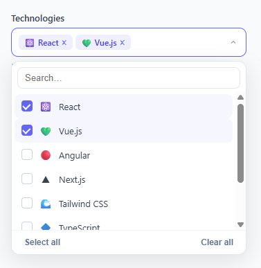
A multi-select dropdown lets users choose multiple items from a list — selected items appear as removable tag chips inside the trigger button. It is the multi-value cousin of the custom select, needed in filter panels, tag management systems, settings pages, and any form where users need to select several options from a larger set. This snippet provides a complete implementation with tag chips, inline search filter, custom CSS checkboxes, select-all, clear-all, and click-outside close — all in plain HTML, CSS, and vanilla JavaScript without any library.
The tag chip display
Selected items render as .tag spans inside the trigger button — the same chips as the tag input. Each chip shows the option icon and label, plus a × remove button that calls toggle(value) with stopPropagation to prevent the dropdown from toggling. As chips are added, the trigger's min-height: 42px expands to fit multiple lines of chips naturally via flex-wrap: wrap.
The custom CSS checkbox
Each option has a .ms-checkbox div that uses a CSS ::after pseudo-element for the checkmark when .selected is applied. The checkmark uses a rotated L-shape: width: 8px, height: 5px, with border-left and border-bottom in white, rotated -45 degrees. No SVG, no icon font — pure CSS.
Inline search filtering
The search input at the top of the dropdown calls filterOptions(query) on every keypress. This adds .hidden to any option whose label does not include the query string (case-insensitive). Filtered options are hidden via display: none but their selected state is preserved — filtering does not deselect items.
Select all and Clear all
The footer buttons iterate the OPTIONS array: selectAll() adds every value to the selected Set; clearAll() calls selected.clear() and resets the search input and query. Both re-render tags and options immediately.
The selected Set
JavaScript's Set data structure is ideal for multi-select state — it prevents duplicates automatically, provides O(1) has() lookup, and supports delete() and clear() operations. The Set is converted to iteration with forEach and filter when building the tags and options display.
Accessibility
The trigger has role="combobox" with aria-expanded and aria-haspopup="listbox". The dropdown has role="listbox" and aria-multiselectable="true". Each option has role="option" and aria-selected toggling. The search input receives focus automatically when the dropdown opens.
Build with AI
Build, Understand, Optimize, and Extend It With AI
Rather than tracing the Set-based state by hand, paste this snippet's HTML, CSS, and JS into an AI coding assistant like Claude and ask it to explain exactly why a JavaScript Set is used for the selected state instead of an array, and how toggle(), renderTags(), and renderOptions() stay consistent with each other across every entry point (option click, tag remove, select all, clear all). The same assistant can help optimize it, for instance asking whether re-running renderOptions() over the full OPTIONS array on every keystroke of the search field would still be fast with a list of several hundred items, or whether the click-outside document listener could interfere with other dropdowns on the same page. It's also useful for extending the component: ask it to add a maximum-selections limit with a friendly inline warning, group options under category headers within the dropdown, or persist the selected Set to the URL or localStorage so the choice survives a refresh. Treat the code less like a finished artifact and more like a starting point for a conversation.
Prompt to recreate it
Copy this into your AI assistant of choice to build the effect from scratch, or as a jumping-off point for your own variant:
Build a "multi-select dropdown" in plain HTML, CSS, and JavaScript using a Set for selection state — no dropdown/select library.

Requirements:
- A trigger element styled like a form field (role="combobox", aria-expanded, aria-haspopup="listbox") that shows a placeholder when nothing is selected, and otherwise shows one removable tag chip per selected option, wrapping onto multiple lines as needed.
- Clicking the trigger opens a dropdown panel (role="listbox", aria-multiselectable="true") positioned below it with a CSS-only open/close transition (opacity plus a small scale/translate), and clicking anywhere outside the whole control must close it.
- Inside the dropdown: a search text input that filters the visible option list by substring match against each option's label as the user types, without deselecting or losing the selected state of any option that scrolls out of view.
- Each option row must show a custom checkbox built from a plain div and a CSS ::after pseudo-element checkmark (no native checkbox, no SVG, no icon font) that fills in only when that option is selected.
- Clicking an option row must toggle its membership in a Set that tracks selected values (not an array), and that Set must be the single source of truth that both the tag-chip row and the checkbox row read from.
- Include "Select all" and "Clear all" footer buttons that operate on the same Set and re-render both the chips and the option list.
- Each tag chip needs its own remove (x) button that removes just that one value from the Set without closing the dropdown or affecting other chips.
- Show a small counter below the control reading like "3 of 8 selected" whenever at least one option is selected.
Want to tighten it up first? Run this prompt through the AI Prompt Studio to score it across 8 quality dimensions, catch anti-patterns, and tune the wording for Claude, ChatGPT, or Gemini before you paste it in.
Step by step
How to Use
- 1Click the trigger to open the dropdownThe dropdown slides open with options. Click any option to select it — a chip appears in the trigger and a filled checkbox marks it in the list. Click again to deselect and remove the chip.
- 2Type in the search box to filter optionsThe inline search filters options as you type. Filtered-out options are hidden but remain selected if they were already chosen. Clear the search to see all options again.
- 3Use Select all and Clear allClick "Select all" in the footer to select every option at once. Click "Clear all" to deselect all options and reset the search input. The chip count below the trigger updates immediately.
- 4Replace the OPTIONS array with your dataUpdate the OPTIONS array at the top of the JS panel. Each object needs value (unique key), label (display text), and optionally icon (emoji or text). The dropdown renders from this array automatically.
- 5Get selected values for form submissionRead the selected Set: const values = [...selected]. For a form, set a hidden input: document.querySelector("[name=tech]").value = [...selected].join(","). On the server, split on comma to get the array of selected values.
- 6Export in your formatClick "HTML" for a standalone file, "JSX" for a React component using useState<Set<string>> for selected state, or "Tailwind" for a React + Tailwind CSS version.
Real-world uses
Common Use Cases
Got questions?
Frequently Asked Questions
Read the selected Set as an array: const values = [...selected]. Add a hidden input: <input type="hidden" name="technologies" id="tech-hidden">. Update it whenever selection changes: document.getElementById("tech-hidden").value = [...selected].join(","). On the server, split the comma-separated string: technologies = request.body.technologies.split(","). For native FormData submission, the hidden input value is included automatically.
Call toggle() for each option you want pre-selected before the initial renderTags() and renderOptions() calls: toggle("react"); toggle("typescript");. Or set selected = new Set(["react","typescript"]) before the initial renders. The tags will appear in the trigger and the checkboxes will be filled on page load.
In the toggle() function, add a max check: if (!selected.has(value) && selected.size >= MAX_SELECTIONS) { showError("Maximum " + MAX_SELECTIONS + " items"); return; }. Show an error message or flash the count display red. Add a visual indicator when the limit is reached: "3/3 selected" in a different colour.
Click "JSX" to download. Manage selected with useState<Set<string>>(new Set()). For toggle: setSelected(prev => { const next = new Set(prev); next.has(v) ? next.delete(v) : next.add(v); return next; }). Derive filteredOptions with useMemo([query]). The tag chips and option list render from the selected Set and OPTIONS array. Pass an onChange prop that receives [...selected] whenever the Set updates.