Custom Select Dropdown — Styled CSS/JS Snippet

Custom Select Dropdown · Forms · Plain HTML, CSS & JS · Live preview

Share & Support

What's included

Features

Fully stylable trigger + floating options panel (native <select> cannot be styled)
Animated open: opacity + translateY fade-and-slide, GPU-friendly
Rotating caret and an open-state focus ring on the trigger
Hover and selected option states with a tinted current choice
Outside-click close via a document-level listener
Keyboard support: Enter/Space toggles, Escape closes
ARIA listbox roles, aria-haspopup, and synced aria-expanded
Scrollable panel with max-height for long lists
Easy to add flags, icons, or grouped options inside each <li>
Export as HTML file, React JSX, or React + Tailwind CSS

About this UI Snippet

Custom Select Dropdown — Styled Trigger, Animated Menu & Outside-Click Close
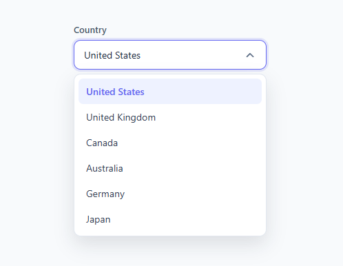
Screenshot of the Custom Select Dropdown snippet rendered live

A custom select dropdown is one of the most-searched UI snippets because the native HTML <select> cannot be styled freely — the same restyling problem as the custom checkbox and custom radio — yet every form needs a dropdown that matches the design. This snippet is a complete, accessible custom select: a styled trigger that shows the current value, an animated dropdown panel, hover and selected option states, a rotating caret, and the three things people always forget — outside-click close, keyboard support, and proper ARIA roles.

The structure: trigger plus options panel

The control has two parts inside a positioned .select wrapper. The .trigger is a real <button type="button"> showing the selected value in a .value span and a caret SVG. Below it, a <ul class="options"> holds the choices as <li role="option"> items. The wrapper has position: relative and the options panel is position: absolute directly beneath it, so the menu floats over the page without pushing content down. This trigger-plus-panel pattern is exactly how design-system selects (and comboboxes like the multi-select dropdown and autocomplete input) are built.

The open/close animation

The options panel is always in the DOM but hidden by default with opacity: 0; transform: translateY(-6px); pointer-events: none. Adding the .open class on the wrapper flips it to opacity: 1; transform: translateY(0); pointer-events: auto, and transition: opacity 0.16s, transform 0.16s animates a quick fade-and-slide-down. Using pointer-events: none while closed means the hidden menu never intercepts clicks even though it is still rendered, which keeps the animation smooth (animating opacity/transform is GPU-friendly) without the layout jump you get from toggling display: none.

The rotating caret and trigger focus ring

The caret SVG rotates 180° when open via .select.open .caret { transform: rotate(180deg) } with a transition: transform 0.2s, the universal signal that a dropdown is expanded. The trigger also gets a focus-style treatment when open: .select.open .trigger gains the brand border color and a soft box-shadow: 0 0 0 3px rgba(99,102,241,0.15) ring, so the active select stands out. Options show a light hover background, and the currently selected <li class="selected"> is tinted and bolded so users can see their current choice when they reopen the menu.

Selecting an option

The pick(li) function does three things: it clears .selected from every option, marks the clicked one, copies its text into the trigger's .value span, and closes the menu. Because the value lives in the trigger, the displayed selection always reflects the last choice. In a real form you would also write the value to a hidden <input> so it submits — that is a one-line addition (hiddenInput.value = li.dataset.value), and the snippet's structure makes it easy to add.

Outside-click and keyboard close — the parts tutorials skip

A dropdown that only closes when you pick an option is frustrating. This snippet adds a document-level click listener that closes any open select when the click lands outside it (if (!sel.contains(e.target))), the behavior users expect from every dropdown. It also wires keyboard handling on the focusable wrapper: Enter or Space opens/closes the menu (mirroring a native select), and Escape closes it. The wrapper has tabindex="0" so it is reachable by keyboard, and the trigger's aria-expanded attribute is kept in sync (true when open, false when closed) so assistive tech announces the state.

ARIA roles for accessibility

The native <select> is fully accessible for free, so when you replace it you must restore those semantics. This snippet uses role="listbox" on the control, role="option" on each item, aria-haspopup="listbox" and aria-expanded on the trigger, and aria-labelledby pointing at the label — the standard ARIA listbox pattern. For a fully production-grade combobox you would add roving tabindex and arrow-key navigation between options and aria-selected on the active item; this snippet gives you the structure and the essential roles to build on. When accessibility is critical and you do not need custom option styling, the native <select> remains the safest choice.

Customizing the select

Re-theme by changing the trigger border, the open-state ring color, and the selected-option tint. Adjust the panel's max-height: 240px and overflow-y: auto to control how many options show before scrolling — useful for long lists like countries. Change the animation by editing the 0.16s durations or the translateY(-6px) start offset. To add icons or flags, put an <img> or SVG inside each <li> and the .value span. Because the options are plain list items, you can group them with headings, add descriptions, or render them from data in a framework.

Step by step

How to Use

  1. 1
    Copy the select blockCopy the .select wrapper with its .trigger button and .options list. Keep the role and aria attributes for accessibility.
  2. 2
    Set your optionsReplace the <li> items with your choices and set which one has the .selected class and shows in the .value span.
  3. 3
    Submit the valueAdd a hidden <input> and, in pick(), set its value to the chosen option (e.g. li.dataset.value) so the form submits the selection.
  4. 4
    Re-theme itChange the trigger border, the .open ring color, and the .selected option tint to match your brand.
  5. 5
    Tune the list heightAdjust max-height on .options to control how many items show before the panel scrolls.
  6. 6
    Export in your formatClick "HTML" for a standalone file, "JSX" for a React component, or "Tailwind" for a React + Tailwind version.

Real-world uses

Common Use Cases

Forms that need a branded dropdown
Country, language, category, and status pickers where the native <select> look clashes with the rest of the form design.
Filters and sort controls
Use the styled select for "Sort by", "Filter", and view options in dashboards and product listings.
Design-system select component
A consistent dropdown with hover, selected, open, and focus states that matches your buttons and inputs exactly.
Learn the dropdown pattern
See how a trigger + absolutely-positioned panel, outside-click close, and aria-expanded combine into a real custom dropdown.
ARIA listbox starting point
Ships with role="listbox"/"option", aria-haspopup, and synced aria-expanded as the foundation for an accessible combobox.
Country / currency selectors
Add flags or symbols inside each option and the value span for rich country, currency, or account pickers.

Got questions?

Frequently Asked Questions

The native <select> cannot be styled freely — you cannot control option padding, hover colors, fonts, the panel background, or animations, and the dropdown looks different in every browser and OS. A custom select gives you full control over appearance while you re-add the behavior (open/close, outside-click, keyboard) and ARIA roles the native element provided for free.

A document-level click listener checks every open .select and removes the .open class if the click target is not inside it (!sel.contains(e.target)). This is the outside-click-to-close behavior users expect from any dropdown.

The wrapper has tabindex="0" and handles Enter/Space to toggle and Escape to close, with aria-expanded kept in sync. It uses role="listbox" and role="option". For a fully production combobox you would add arrow-key navigation between options and aria-selected; this snippet provides the structure and essential roles to build on.

Add a hidden <input name="..."> and, inside pick(), set its value to the chosen option (for example li.dataset.value). The trigger shows the label while the hidden input carries the value to the server.

Put an <img> or inline SVG inside each <li> and inside the .value span. Because options are plain list items, you can add flags, currency symbols, avatars, or two-line descriptions freely.

Yes. Click "JSX" for a React component or "Tailwind" for a React + Tailwind version. In React, hold the open state and selected value in useState, render options from an array, and replicate the outside-click and key handlers in a useEffect.

Custom Select Dropdown — Export as HTML, React, Vue, Angular & Tailwind

HTML
<!DOCTYPE html>
<html lang="en">
<head>
  <meta charset="UTF-8" />
  <meta name="viewport" content="width=device-width, initial-scale=1.0" />
  <title>Custom Select Dropdown</title>
  <style>
    * { box-sizing: border-box; margin: 0; padding: 0; }
    body {
      font-family: system-ui, sans-serif;
      background: #f8fafc;
      min-height: 100vh;
      display: flex; align-items: flex-start; justify-content: center;
      padding-top: 80px;
    }
    
    .field { width: 100%; max-width: 280px; }
    #lbl { display: block; font-size: 13px; font-weight: 600; color: #475569; margin-bottom: 7px; }
    
    .select { position: relative; }
    
    .trigger {
      width: 100%;
      display: flex; align-items: center; justify-content: space-between;
      padding: 11px 14px;
      background: #fff;
      border: 1.5px solid #cbd5e1;
      border-radius: 10px;
      font-size: 14px; color: #1e293b; font-family: inherit;
      cursor: pointer;
      transition: border-color 0.15s, box-shadow 0.15s;
    }
    .trigger:hover { border-color: #94a3b8; }
    .select.open .trigger { border-color: #6366f1; box-shadow: 0 0 0 3px rgba(99,102,241,0.15); }
    
    .caret {
      width: 18px; height: 18px;
      fill: none; stroke: #64748b; stroke-width: 2.5;
      stroke-linecap: round; stroke-linejoin: round;
      transition: transform 0.2s;
    }
    .select.open .caret { transform: rotate(180deg); }
    
    .options {
      list-style: none;
      position: absolute; top: calc(100% + 6px); left: 0; right: 0;
      background: #fff;
      border: 1px solid #e2e8f0;
      border-radius: 10px;
      box-shadow: 0 12px 28px rgba(15,23,42,0.12);
      padding: 6px;
      max-height: 240px; overflow-y: auto;
      z-index: 10;
      opacity: 0; transform: translateY(-6px);
      pointer-events: none;
      transition: opacity 0.16s, transform 0.16s;
    }
    .select.open .options { opacity: 1; transform: translateY(0); pointer-events: auto; }
    
    .options li {
      padding: 9px 11px;
      border-radius: 7px;
      font-size: 14px; color: #334155;
      cursor: pointer;
      transition: background 0.1s;
    }
    .options li:hover { background: #f1f5f9; }
    .options li.selected { background: #eef2ff; color: #6366f1; font-weight: 600; }
  </style>
</head>
<body>
  <div class="field">
    <label id="lbl">Country</label>
    <div class="select" role="listbox" aria-labelledby="lbl" tabindex="0">
      <button class="trigger" type="button" aria-haspopup="listbox" aria-expanded="false" onclick="toggleSelect(this)">
        <span class="value">United States</span>
        <svg class="caret" viewBox="0 0 24 24"><polyline points="6 9 12 15 18 9"/></svg>
      </button>
      <ul class="options" role="presentation">
        <li role="option" class="selected" onclick="pick(this)">United States</li>
        <li role="option" onclick="pick(this)">United Kingdom</li>
        <li role="option" onclick="pick(this)">Canada</li>
        <li role="option" onclick="pick(this)">Australia</li>
        <li role="option" onclick="pick(this)">Germany</li>
        <li role="option" onclick="pick(this)">Japan</li>
      </ul>
    </div>
  </div>
  <script>
    function toggleSelect(btn) {
      const sel = btn.closest('.select');
      const open = sel.classList.toggle('open');
      btn.setAttribute('aria-expanded', open);
    }
    
    function pick(li) {
      const sel = li.closest('.select');
      sel.querySelectorAll('.options li').forEach(o => o.classList.remove('selected'));
      li.classList.add('selected');
      sel.querySelector('.value').textContent = li.textContent;
      sel.classList.remove('open');
      sel.querySelector('.trigger').setAttribute('aria-expanded', 'false');
    }
    
    // Close on outside click
    document.addEventListener('click', e => {
      document.querySelectorAll('.select.open').forEach(sel => {
        if (!sel.contains(e.target)) {
          sel.classList.remove('open');
          sel.querySelector('.trigger').setAttribute('aria-expanded', 'false');
        }
      });
    });
    
    // Keyboard: Enter/Space toggles, Escape closes
    document.querySelector('.select').addEventListener('keydown', e => {
      const sel = e.currentTarget;
      if (e.key === 'Enter' || e.key === ' ') { e.preventDefault(); sel.querySelector('.trigger').click(); }
      if (e.key === 'Escape') { sel.classList.remove('open'); }
    });
  </script>
</body>
</html>
Tailwind
<!DOCTYPE html>
<html lang="en">
<head>
  <meta charset="UTF-8" />
  <meta name="viewport" content="width=device-width, initial-scale=1.0" />
  <title>Custom Select Dropdown</title>
  <!-- Tailwind CSS v3+ — arbitrary value classes (e.g. bg-[#0f172a]) are valid -->
  <script src="https://cdn.tailwindcss.com"></script>
  <style>
    * {
      box-sizing: border-box; margin: 0; padding: 0;
    }

    body {
      font-family: system-ui, sans-serif;
      background: #f8fafc;
      min-height: 100vh;
      display: flex; align-items: flex-start; justify-content: center;
      padding-top: 80px;
    }

    #lbl {
      display: block; font-size: 13px; font-weight: 600; color: #475569; margin-bottom: 7px;
    }

    .select.open .trigger {
      border-color: #6366f1; box-shadow: 0 0 0 3px rgba(99,102,241,0.15);
    }

    .select.open .caret {
      transform: rotate(180deg);
    }

    .select.open .options {
      opacity: 1; transform: translateY(0); pointer-events: auto;
    }

    .options li {
      padding: 9px 11px;
      border-radius: 7px;
      font-size: 14px; color: #334155;
      cursor: pointer;
      transition: background 0.1s;
    }

    .options li:hover {
      background: #f1f5f9;
    }

    .options li.selected {
      background: #eef2ff; color: #6366f1; font-weight: 600;
    }
  </style>
</head>
<body>
  <div class="w-full max-w-[280px]">
    <label id="lbl">Country</label>
    <div class="select relative" role="listbox" aria-labelledby="lbl" tabindex="0">
      <button class="trigger w-full flex items-center justify-between py-[11px] px-3.5 bg-[#fff] border rounded-[10px] text-sm text-[#1e293b] font-[inherit] cursor-pointer [transition:border-color_0.15s,_box-shadow_0.15s] hover:border-[#94a3b8]" type="button" aria-haspopup="listbox" aria-expanded="false" onclick="toggleSelect(this)">
        <span class="value">United States</span>
        <svg class="caret w-[18px] h-[18px] fill-none stroke-[#64748b] [stroke-width:2.5] [stroke-linecap:round] [stroke-linejoin:round] [transition:transform_0.2s]" viewBox="0 0 24 24"><polyline points="6 9 12 15 18 9"/></svg>
      </button>
      <ul class="options [list-style:none] absolute top-[calc(100% + 6px)] left-0 right-0 bg-[#fff] border border-[#e2e8f0] rounded-[10px] shadow-[0_12px_28px_rgba(15,23,42,0.12)] p-1.5 max-h-60 overflow-y-auto z-10 opacity-0 [transform:translateY(-6px)] pointer-events-none [transition:opacity_0.16s,_transform_0.16s]" role="presentation">
        <li role="option" class="selected" onclick="pick(this)">United States</li>
        <li role="option" onclick="pick(this)">United Kingdom</li>
        <li role="option" onclick="pick(this)">Canada</li>
        <li role="option" onclick="pick(this)">Australia</li>
        <li role="option" onclick="pick(this)">Germany</li>
        <li role="option" onclick="pick(this)">Japan</li>
      </ul>
    </div>
  </div>
  <script>
    function toggleSelect(btn) {
      const sel = btn.closest('.select');
      const open = sel.classList.toggle('open');
      btn.setAttribute('aria-expanded', open);
    }
    
    function pick(li) {
      const sel = li.closest('.select');
      sel.querySelectorAll('.options li').forEach(o => o.classList.remove('selected'));
      li.classList.add('selected');
      sel.querySelector('.value').textContent = li.textContent;
      sel.classList.remove('open');
      sel.querySelector('.trigger').setAttribute('aria-expanded', 'false');
    }
    
    // Close on outside click
    document.addEventListener('click', e => {
      document.querySelectorAll('.select.open').forEach(sel => {
        if (!sel.contains(e.target)) {
          sel.classList.remove('open');
          sel.querySelector('.trigger').setAttribute('aria-expanded', 'false');
        }
      });
    });
    
    // Keyboard: Enter/Space toggles, Escape closes
    document.querySelector('.select').addEventListener('keydown', e => {
      const sel = e.currentTarget;
      if (e.key === 'Enter' || e.key === ' ') { e.preventDefault(); sel.querySelector('.trigger').click(); }
      if (e.key === 'Escape') { sel.classList.remove('open'); }
    });
  </script>
</body>
</html>
React
import React, { useEffect } from 'react';

// CSS — optionally move to CustomSelectDropdown.module.css
const css = `
* { box-sizing: border-box; margin: 0; padding: 0; }
body {
  font-family: system-ui, sans-serif;
  background: #f8fafc;
  min-height: 100vh;
  display: flex; align-items: flex-start; justify-content: center;
  padding-top: 80px;
}

.field { width: 100%; max-width: 280px; }
#lbl { display: block; font-size: 13px; font-weight: 600; color: #475569; margin-bottom: 7px; }

.select { position: relative; }

.trigger {
  width: 100%;
  display: flex; align-items: center; justify-content: space-between;
  padding: 11px 14px;
  background: #fff;
  border: 1.5px solid #cbd5e1;
  border-radius: 10px;
  font-size: 14px; color: #1e293b; font-family: inherit;
  cursor: pointer;
  transition: border-color 0.15s, box-shadow 0.15s;
}
.trigger:hover { border-color: #94a3b8; }
.select.open .trigger { border-color: #6366f1; box-shadow: 0 0 0 3px rgba(99,102,241,0.15); }

.caret {
  width: 18px; height: 18px;
  fill: none; stroke: #64748b; stroke-width: 2.5;
  stroke-linecap: round; stroke-linejoin: round;
  transition: transform 0.2s;
}
.select.open .caret { transform: rotate(180deg); }

.options {
  list-style: none;
  position: absolute; top: calc(100% + 6px); left: 0; right: 0;
  background: #fff;
  border: 1px solid #e2e8f0;
  border-radius: 10px;
  box-shadow: 0 12px 28px rgba(15,23,42,0.12);
  padding: 6px;
  max-height: 240px; overflow-y: auto;
  z-index: 10;
  opacity: 0; transform: translateY(-6px);
  pointer-events: none;
  transition: opacity 0.16s, transform 0.16s;
}
.select.open .options { opacity: 1; transform: translateY(0); pointer-events: auto; }

.options li {
  padding: 9px 11px;
  border-radius: 7px;
  font-size: 14px; color: #334155;
  cursor: pointer;
  transition: background 0.1s;
}
.options li:hover { background: #f1f5f9; }
.options li.selected { background: #eef2ff; color: #6366f1; font-weight: 600; }
`;

export default function CustomSelectDropdown() {
  // Auto-generated escape hatch: the original snippet's vanilla JS runs once
  // after mount and queries the rendered DOM. For idiomatic React, lift this
  // into state + handlers.
  useEffect(() => {
    const _listeners = [];
    const _originalAddEventListener = EventTarget.prototype.addEventListener;
    EventTarget.prototype.addEventListener = function(type, listener, options) {
      _listeners.push({ target: this, type, listener, options });
      return _originalAddEventListener.call(this, type, listener, options);
    };
    function toggleSelect(btn) {
      const sel = btn.closest('.select');
      const open = sel.classList.toggle('open');
      btn.setAttribute('aria-expanded', open);
    }
    
    function pick(li) {
      const sel = li.closest('.select');
      sel.querySelectorAll('.options li').forEach(o => o.classList.remove('selected'));
      li.classList.add('selected');
      sel.querySelector('.value').textContent = li.textContent;
      sel.classList.remove('open');
      sel.querySelector('.trigger').setAttribute('aria-expanded', 'false');
    }
    
    // Close on outside click
    document.addEventListener('click', e => {
      document.querySelectorAll('.select.open').forEach(sel => {
        if (!sel.contains(e.target)) {
          sel.classList.remove('open');
          sel.querySelector('.trigger').setAttribute('aria-expanded', 'false');
        }
      });
    });
    
    // Keyboard: Enter/Space toggles, Escape closes
    document.querySelector('.select').addEventListener('keydown', e => {
      const sel = e.currentTarget;
      if (e.key === 'Enter' || e.key === ' ') { e.preventDefault(); sel.querySelector('.trigger').click(); }
      if (e.key === 'Escape') { sel.classList.remove('open'); }
    });
    // Cleanup: restore addEventListener and remove all listeners
    return () => {
      EventTarget.prototype.addEventListener = _originalAddEventListener;
      for (const { target, type, listener, options } of _listeners) {
        target.removeEventListener(type, listener, options);
      }
    };

    // Expose handlers used by inline JSX events to the global scope
    if (typeof toggleSelect === 'function') window.toggleSelect = toggleSelect;
    if (typeof pick === 'function') window.pick = pick;
  }, []);

  return (
    <>
      <style>{css}</style>
      <div className="field">
        <label id="lbl">Country</label>
        <div className="select" role="listbox" aria-labelledby="lbl" tabindex="0">
          <button className="trigger" type="button" aria-haspopup="listbox" aria-expanded="false" onClick={(event) => { toggleSelect(event.currentTarget) }}>
            <span className="value">United States</span>
            <svg className="caret" viewBox="0 0 24 24"><polyline points="6 9 12 15 18 9"/></svg>
          </button>
          <ul className="options" role="presentation">
            <li role="option" className="selected" onClick={(event) => { pick(event.currentTarget) }}>United States</li>
            <li role="option" onClick={(event) => { pick(event.currentTarget) }}>United Kingdom</li>
            <li role="option" onClick={(event) => { pick(event.currentTarget) }}>Canada</li>
            <li role="option" onClick={(event) => { pick(event.currentTarget) }}>Australia</li>
            <li role="option" onClick={(event) => { pick(event.currentTarget) }}>Germany</li>
            <li role="option" onClick={(event) => { pick(event.currentTarget) }}>Japan</li>
          </ul>
        </div>
      </div>
    </>
  );
}
React + Tailwind
import React, { useEffect } from 'react';
// Requires Tailwind CSS v3+ — https://tailwindcss.com/docs/installation
// Arbitrary value classes (e.g. bg-[#0f172a]) are valid Tailwind v3+

export default function CustomSelectDropdown() {
  // Auto-generated escape hatch: the original snippet's vanilla JS runs once
  // after mount and queries the rendered DOM. For idiomatic React, lift this
  // into state + handlers.
  useEffect(() => {
    const _listeners = [];
    const _originalAddEventListener = EventTarget.prototype.addEventListener;
    EventTarget.prototype.addEventListener = function(type, listener, options) {
      _listeners.push({ target: this, type, listener, options });
      return _originalAddEventListener.call(this, type, listener, options);
    };
    function toggleSelect(btn) {
      const sel = btn.closest('.select');
      const open = sel.classList.toggle('open');
      btn.setAttribute('aria-expanded', open);
    }
    
    function pick(li) {
      const sel = li.closest('.select');
      sel.querySelectorAll('.options li').forEach(o => o.classList.remove('selected'));
      li.classList.add('selected');
      sel.querySelector('.value').textContent = li.textContent;
      sel.classList.remove('open');
      sel.querySelector('.trigger').setAttribute('aria-expanded', 'false');
    }
    
    // Close on outside click
    document.addEventListener('click', e => {
      document.querySelectorAll('.select.open').forEach(sel => {
        if (!sel.contains(e.target)) {
          sel.classList.remove('open');
          sel.querySelector('.trigger').setAttribute('aria-expanded', 'false');
        }
      });
    });
    
    // Keyboard: Enter/Space toggles, Escape closes
    document.querySelector('.select').addEventListener('keydown', e => {
      const sel = e.currentTarget;
      if (e.key === 'Enter' || e.key === ' ') { e.preventDefault(); sel.querySelector('.trigger').click(); }
      if (e.key === 'Escape') { sel.classList.remove('open'); }
    });
    // Cleanup: restore addEventListener and remove all listeners
    return () => {
      EventTarget.prototype.addEventListener = _originalAddEventListener;
      for (const { target, type, listener, options } of _listeners) {
        target.removeEventListener(type, listener, options);
      }
    };

    // Expose handlers used by inline JSX events to the global scope
    if (typeof toggleSelect === 'function') window.toggleSelect = toggleSelect;
    if (typeof pick === 'function') window.pick = pick;
  }, []);

  return (
    <>
      <style>{`
* {
  box-sizing: border-box; margin: 0; padding: 0;
}

body {
  font-family: system-ui, sans-serif;
  background: #f8fafc;
  min-height: 100vh;
  display: flex; align-items: flex-start; justify-content: center;
  padding-top: 80px;
}

#lbl {
  display: block; font-size: 13px; font-weight: 600; color: #475569; margin-bottom: 7px;
}

.select.open .trigger {
  border-color: #6366f1; box-shadow: 0 0 0 3px rgba(99,102,241,0.15);
}

.select.open .caret {
  transform: rotate(180deg);
}

.select.open .options {
  opacity: 1; transform: translateY(0); pointer-events: auto;
}

.options li {
  padding: 9px 11px;
  border-radius: 7px;
  font-size: 14px; color: #334155;
  cursor: pointer;
  transition: background 0.1s;
}

.options li:hover {
  background: #f1f5f9;
}

.options li.selected {
  background: #eef2ff; color: #6366f1; font-weight: 600;
}
      `}</style>
      <div className="w-full max-w-[280px]">
        <label id="lbl">Country</label>
        <div className="select relative" role="listbox" aria-labelledby="lbl" tabindex="0">
          <button className="trigger w-full flex items-center justify-between py-[11px] px-3.5 bg-[#fff] border rounded-[10px] text-sm text-[#1e293b] font-[inherit] cursor-pointer [transition:border-color_0.15s,_box-shadow_0.15s] hover:border-[#94a3b8]" type="button" aria-haspopup="listbox" aria-expanded="false" onClick={(event) => { toggleSelect(event.currentTarget) }}>
            <span className="value">United States</span>
            <svg className="caret w-[18px] h-[18px] fill-none stroke-[#64748b] [stroke-width:2.5] [stroke-linecap:round] [stroke-linejoin:round] [transition:transform_0.2s]" viewBox="0 0 24 24"><polyline points="6 9 12 15 18 9"/></svg>
          </button>
          <ul className="options [list-style:none] absolute top-[calc(100% + 6px)] left-0 right-0 bg-[#fff] border border-[#e2e8f0] rounded-[10px] shadow-[0_12px_28px_rgba(15,23,42,0.12)] p-1.5 max-h-60 overflow-y-auto z-10 opacity-0 [transform:translateY(-6px)] pointer-events-none [transition:opacity_0.16s,_transform_0.16s]" role="presentation">
            <li role="option" className="selected" onClick={(event) => { pick(event.currentTarget) }}>United States</li>
            <li role="option" onClick={(event) => { pick(event.currentTarget) }}>United Kingdom</li>
            <li role="option" onClick={(event) => { pick(event.currentTarget) }}>Canada</li>
            <li role="option" onClick={(event) => { pick(event.currentTarget) }}>Australia</li>
            <li role="option" onClick={(event) => { pick(event.currentTarget) }}>Germany</li>
            <li role="option" onClick={(event) => { pick(event.currentTarget) }}>Japan</li>
          </ul>
        </div>
      </div>
    </>
  );
}
Vue
<template>
  <div class="field">
    <label id="lbl">Country</label>
    <div class="select" role="listbox" aria-labelledby="lbl" tabindex="0">
      <button class="trigger" type="button" aria-haspopup="listbox" aria-expanded="false" @click="toggleSelect($event.currentTarget)">
        <span class="value">United States</span>
        <svg class="caret" viewBox="0 0 24 24"><polyline points="6 9 12 15 18 9"/></svg>
      </button>
      <ul class="options" role="presentation">
        <li role="option" class="selected" @click="pick($event.currentTarget)">United States</li>
        <li role="option" @click="pick($event.currentTarget)">United Kingdom</li>
        <li role="option" @click="pick($event.currentTarget)">Canada</li>
        <li role="option" @click="pick($event.currentTarget)">Australia</li>
        <li role="option" @click="pick($event.currentTarget)">Germany</li>
        <li role="option" @click="pick($event.currentTarget)">Japan</li>
      </ul>
    </div>
  </div>
</template>

<script setup>
import { onMounted } from 'vue';

function toggleSelect(btn) {
  const sel = btn.closest('.select');
  const open = sel.classList.toggle('open');
  btn.setAttribute('aria-expanded', open);
}
function pick(li) {
  const sel = li.closest('.select');
  sel.querySelectorAll('.options li').forEach(o => o.classList.remove('selected'));
  li.classList.add('selected');
  sel.querySelector('.value').textContent = li.textContent;
  sel.classList.remove('open');
  sel.querySelector('.trigger').setAttribute('aria-expanded', 'false');
}

onMounted(() => {
  // Close on outside click
  document.addEventListener('click', e => {
    document.querySelectorAll('.select.open').forEach(sel => {
      if (!sel.contains(e.target)) {
        sel.classList.remove('open');
        sel.querySelector('.trigger').setAttribute('aria-expanded', 'false');
      }
    });
  });
  // Keyboard: Enter/Space toggles, Escape closes
  document.querySelector('.select').addEventListener('keydown', e => {
    const sel = e.currentTarget;
    if (e.key === 'Enter' || e.key === ' ') { e.preventDefault(); sel.querySelector('.trigger').click(); }
    if (e.key === 'Escape') { sel.classList.remove('open'); }
  });
});
</script>

<style scoped>
* { box-sizing: border-box; margin: 0; padding: 0; }
body {
  font-family: system-ui, sans-serif;
  background: #f8fafc;
  min-height: 100vh;
  display: flex; align-items: flex-start; justify-content: center;
  padding-top: 80px;
}

.field { width: 100%; max-width: 280px; }
#lbl { display: block; font-size: 13px; font-weight: 600; color: #475569; margin-bottom: 7px; }

.select { position: relative; }

.trigger {
  width: 100%;
  display: flex; align-items: center; justify-content: space-between;
  padding: 11px 14px;
  background: #fff;
  border: 1.5px solid #cbd5e1;
  border-radius: 10px;
  font-size: 14px; color: #1e293b; font-family: inherit;
  cursor: pointer;
  transition: border-color 0.15s, box-shadow 0.15s;
}
.trigger:hover { border-color: #94a3b8; }
.select.open .trigger { border-color: #6366f1; box-shadow: 0 0 0 3px rgba(99,102,241,0.15); }

.caret {
  width: 18px; height: 18px;
  fill: none; stroke: #64748b; stroke-width: 2.5;
  stroke-linecap: round; stroke-linejoin: round;
  transition: transform 0.2s;
}
.select.open .caret { transform: rotate(180deg); }

.options {
  list-style: none;
  position: absolute; top: calc(100% + 6px); left: 0; right: 0;
  background: #fff;
  border: 1px solid #e2e8f0;
  border-radius: 10px;
  box-shadow: 0 12px 28px rgba(15,23,42,0.12);
  padding: 6px;
  max-height: 240px; overflow-y: auto;
  z-index: 10;
  opacity: 0; transform: translateY(-6px);
  pointer-events: none;
  transition: opacity 0.16s, transform 0.16s;
}
.select.open .options { opacity: 1; transform: translateY(0); pointer-events: auto; }

.options li {
  padding: 9px 11px;
  border-radius: 7px;
  font-size: 14px; color: #334155;
  cursor: pointer;
  transition: background 0.1s;
}
.options li:hover { background: #f1f5f9; }
.options li.selected { background: #eef2ff; color: #6366f1; font-weight: 600; }
</style>
Angular
// @ts-nocheck
// Note: vanilla JS DOM manipulation is preserved as-is inside ngAfterViewInit().
// For idiomatic Angular, replace document.getElementById() with @ViewChild() refs
// and move state into component properties with two-way binding.
import { Component, AfterViewInit, ViewEncapsulation } from '@angular/core';
import { CommonModule } from '@angular/common';

@Component({
  selector: 'app-custom-select-dropdown',
  standalone: true,
  imports: [CommonModule],
  encapsulation: ViewEncapsulation.None,
  template: `
    <div class="field">
      <label id="lbl">Country</label>
      <div class="select" role="listbox" aria-labelledby="lbl" tabindex="0">
        <button class="trigger" type="button" aria-haspopup="listbox" aria-expanded="false" (click)="toggleSelect($event.currentTarget)">
          <span class="value">United States</span>
          <svg class="caret" viewBox="0 0 24 24"><polyline points="6 9 12 15 18 9"/></svg>
        </button>
        <ul class="options" role="presentation">
          <li role="option" class="selected" (click)="pick($event.currentTarget)">United States</li>
          <li role="option" (click)="pick($event.currentTarget)">United Kingdom</li>
          <li role="option" (click)="pick($event.currentTarget)">Canada</li>
          <li role="option" (click)="pick($event.currentTarget)">Australia</li>
          <li role="option" (click)="pick($event.currentTarget)">Germany</li>
          <li role="option" (click)="pick($event.currentTarget)">Japan</li>
        </ul>
      </div>
    </div>
  `,
  styles: [`
    * { box-sizing: border-box; margin: 0; padding: 0; }
    body {
      font-family: system-ui, sans-serif;
      background: #f8fafc;
      min-height: 100vh;
      display: flex; align-items: flex-start; justify-content: center;
      padding-top: 80px;
    }
    
    .field { width: 100%; max-width: 280px; }
    #lbl { display: block; font-size: 13px; font-weight: 600; color: #475569; margin-bottom: 7px; }
    
    .select { position: relative; }
    
    .trigger {
      width: 100%;
      display: flex; align-items: center; justify-content: space-between;
      padding: 11px 14px;
      background: #fff;
      border: 1.5px solid #cbd5e1;
      border-radius: 10px;
      font-size: 14px; color: #1e293b; font-family: inherit;
      cursor: pointer;
      transition: border-color 0.15s, box-shadow 0.15s;
    }
    .trigger:hover { border-color: #94a3b8; }
    .select.open .trigger { border-color: #6366f1; box-shadow: 0 0 0 3px rgba(99,102,241,0.15); }
    
    .caret {
      width: 18px; height: 18px;
      fill: none; stroke: #64748b; stroke-width: 2.5;
      stroke-linecap: round; stroke-linejoin: round;
      transition: transform 0.2s;
    }
    .select.open .caret { transform: rotate(180deg); }
    
    .options {
      list-style: none;
      position: absolute; top: calc(100% + 6px); left: 0; right: 0;
      background: #fff;
      border: 1px solid #e2e8f0;
      border-radius: 10px;
      box-shadow: 0 12px 28px rgba(15,23,42,0.12);
      padding: 6px;
      max-height: 240px; overflow-y: auto;
      z-index: 10;
      opacity: 0; transform: translateY(-6px);
      pointer-events: none;
      transition: opacity 0.16s, transform 0.16s;
    }
    .select.open .options { opacity: 1; transform: translateY(0); pointer-events: auto; }
    
    .options li {
      padding: 9px 11px;
      border-radius: 7px;
      font-size: 14px; color: #334155;
      cursor: pointer;
      transition: background 0.1s;
    }
    .options li:hover { background: #f1f5f9; }
    .options li.selected { background: #eef2ff; color: #6366f1; font-weight: 600; }
  `]
})
export class CustomSelectDropdownComponent implements AfterViewInit {
  ngAfterViewInit(): void {
    function toggleSelect(btn) {
      const sel = btn.closest('.select');
      const open = sel.classList.toggle('open');
      btn.setAttribute('aria-expanded', open);
    }
    
    function pick(li) {
      const sel = li.closest('.select');
      sel.querySelectorAll('.options li').forEach(o => o.classList.remove('selected'));
      li.classList.add('selected');
      sel.querySelector('.value').textContent = li.textContent;
      sel.classList.remove('open');
      sel.querySelector('.trigger').setAttribute('aria-expanded', 'false');
    }
    
    // Close on outside click
    document.addEventListener('click', e => {
      document.querySelectorAll('.select.open').forEach(sel => {
        if (!sel.contains(e.target)) {
          sel.classList.remove('open');
          sel.querySelector('.trigger').setAttribute('aria-expanded', 'false');
        }
      });
    });
    
    // Keyboard: Enter/Space toggles, Escape closes
    document.querySelector('.select').addEventListener('keydown', e => {
      const sel = e.currentTarget;
      if (e.key === 'Enter' || e.key === ' ') { e.preventDefault(); sel.querySelector('.trigger').click(); }
      if (e.key === 'Escape') { sel.classList.remove('open'); }
    });

    // Bind inline-handler functions to the component so the template can call them
    Object.assign(this, { toggleSelect, pick });
  }
}