Source Code
<form class="list">
  <label class="cb">
    <input type="checkbox" checked>
    <span class="box">
      <svg viewBox="0 0 24 24"><polyline points="5 12 10 17 19 7"/></svg>
    </span>
    <span class="txt">Email me about product updates</span>
  </label>

  <label class="cb">
    <input type="checkbox">
    <span class="box">
      <svg viewBox="0 0 24 24"><polyline points="5 12 10 17 19 7"/></svg>
    </span>
    <span class="txt">Send me weekly newsletters</span>
  </label>

  <label class="cb">
    <input type="checkbox" checked>
    <span class="box">
      <svg viewBox="0 0 24 24"><polyline points="5 12 10 17 19 7"/></svg>
    </span>
    <span class="txt">Enable two-factor authentication</span>
  </label>

  <label class="cb disabled">
    <input type="checkbox" disabled>
    <span class="box">
      <svg viewBox="0 0 24 24"><polyline points="5 12 10 17 19 7"/></svg>
    </span>
    <span class="txt">Premium feature (upgrade to enable)</span>
  </label>
</form>
* { box-sizing: border-box; margin: 0; padding: 0; }
body {
font-family: system-ui, sans-serif;
background: #f8fafc;
min-height: 100vh;
display: flex; align-items: center; justify-content: center;
}
.list { display: flex; flex-direction: column; gap: 18px; }
.cb {
display: flex; align-items: center; gap: 12px;
cursor: pointer; user-select: none;
}
/* Hide the native checkbox but keep it accessible & focusable */
.cb input {
position: absolute;
opacity: 0;
width: 0; height: 0;
}
.box {
flex-shrink: 0;
width: 22px; height: 22px;
border: 2px solid #cbd5e1;
border-radius: 6px;
background: #fff;
display: grid; place-items: center;
transition: background 0.2s, border-color 0.2s, transform 0.1s;
}
.box svg {
width: 14px; height: 14px;
fill: none; stroke: #fff; stroke-width: 3;
stroke-linecap: round; stroke-linejoin: round;
/* Draw the checkmark on check */
stroke-dasharray: 24;
stroke-dashoffset: 24;
transition: stroke-dashoffset 0.25s ease 0.05s;
}
/* Checked state */
.cb input:checked + .box {
background: #6366f1;
border-color: #6366f1;
}
.cb input:checked + .box svg { stroke-dashoffset: 0; }
/* Press feedback */
.cb input:active + .box { transform: scale(0.9); }
/* Keyboard focus ring */
.cb input:focus-visible + .box {
box-shadow: 0 0 0 3px rgba(99, 102, 241, 0.35);
}
.txt { font-size: 14px; color: #334155; }
/* Disabled */
.cb.disabled { cursor: not-allowed; opacity: 0.5; }
.cb.disabled .txt { color: #94a3b8; }// Pure CSS checkbox — no JavaScript needed.
// Native <input type="checkbox"> drives every state via :checked, :focus-visible, :active.
document.querySelectorAll('.cb input').forEach(cb => {
cb.addEventListener('change', e =>
console.log(e.target.nextElementSibling.nextElementSibling.textContent.trim(), '→', e.target.checked)
);
});Learn Coding Visually
Learn to code with interactive, live-preview playgrounds — HTML, CSS, JavaScript, React & more.
 HTML Playground42 lessons · Click-based · Live preview
 CSS PlaygroundLearn CSS with a live editor
 JavaScript Playground60 lessons · DOM · Async · Canvas
 React PlaygroundLearn React with a live code editor
 GSAP PlaygroundLearn GSAP animation interactively
 SVG Playground44 lessons · shapes · paths · animation
 SCSS Playground45 lessons · Sass modules · tokens
 Tailwind PlaygroundLearn Tailwind CSS with a live editor
 Bootstrap 5 Playground50 lessons · live preview
Custom Checkbox — Animated CSS Checkmark Snippet
Custom Checkbox · Forms · Plain HTML, CSS & JS · Live preview
What's included
Features
About this UI Snippet
Custom Checkbox — Styled Box, Animated SVG Checkmark & Real Accessibility
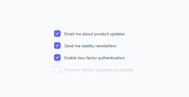
A custom checkbox is one of the most-searched form snippets because the default browser checkbox cannot be styled consistently across browsers — the same is true of the custom radio, custom select, and toggle switch — yet replacing it usually breaks accessibility. This snippet solves both: it keeps a real `<input type="checkbox">` for full keyboard and screen-reader support, hides it visually, and styles a custom box with an animated SVG checkmark that draws itself when checked. It is pure CSS — the native input drives every state, so there is no JavaScript to manage checked values.
The accessible hide-and-replace pattern
The key to a custom checkbox that stays accessible is to never use display: none on the input — that removes it from the tab order and from assistive tech. Instead the input uses position: absolute; opacity: 0; width: 0; height: 0, which makes it invisible but still focusable, checkable, and announced by screen readers. The entire control is wrapped in a <label>, so clicking anywhere — the box or the text — toggles the checkbox natively. This is the correct, battle-tested pattern: the browser handles state, focus, and announcements; CSS only handles appearance.
The CSS sibling selector that powers everything
Because the visible .box comes right after the input in the markup, the adjacent-sibling selector + lets CSS react to the input's state without any script. input:checked + .box fills the box with the accent color. input:focus-visible + .box draws a focus ring. input:active + .box scales the box down for press feedback. input:disabled (via the .disabled label) dims the whole control. This is the heart of every pure-CSS form control: the hidden native input is the single source of truth, and + projects its state onto the styled element.
The animated checkmark draw
The checkmark is an inline SVG <polyline> — not a font glyph or background image, so it stays razor-sharp at any size. The draw animation uses the classic SVG line technique: the path has stroke-dasharray: 24 (roughly the path length) and stroke-dashoffset: 24, which hides the entire stroke by offsetting the dash by its full length. When the box becomes checked, input:checked + .box svg { stroke-dashoffset: 0 } reveals the stroke, and transition: stroke-dashoffset 0.25s ease 0.05s animates the offset from 24 to 0 so the checkmark appears to be drawn from start to finish. The small 0.05s delay lets the box fill in first, so the tick draws on top of the colored background.
The checked, focus, active, and disabled states
A production checkbox needs more than checked/unchecked. This snippet implements all four meaningful states: checked fills the box (background: #6366f1; border-color: #6366f1) and draws the tick; focus-visible adds a 3px translucent ring (box-shadow: 0 0 0 3px rgba(99,102,241,0.35)) so keyboard users can see which box is selected — and using :focus-visible rather than :focus means mouse clicks do not show the ring, only keyboard navigation does; active scales the box to 0.9 for a quick press cue; disabled sets cursor: not-allowed and dims the row so it clearly cannot be toggled. Together these make the control feel polished and behave correctly in a real form.
Why a real input beats a div with a click handler
A common but broken approach is to build a checkbox from a <div> plus a JavaScript click handler. That loses keyboard support (no Space to toggle), loses screen-reader semantics (it is announced as plain text, not "checkbox, checked"), and loses native form submission (the value is not sent with the form). Keeping the native <input type="checkbox"> means the control is automatically focusable, toggles on Space, submits with the form under its name attribute, and is announced correctly — all for free. The custom look is purely cosmetic CSS layered on top.
Customizing color, size, and shape
The accent color appears in three places: the checked background and border-color, and the focus ring rgba(). Change all three to re-theme. To resize, adjust the .box width/height and the SVG width/height together. For a circular checkbox (a "radio-style" toggle), set border-radius: 50% on the box. To make the tick draw faster or slower, change the 0.25s duration; to draw it instantly, remove the transition. Because the markup is a flat label-input-box-text, you can also reorder the text and box to put the checkbox on the right.
Accessibility and forms checklist
Give each <input> a unique name (and value if needed) so it submits correctly. The wrapping <label> already associates the text with the input, so no separate for/id is required, but adding them does no harm and helps some tools. Keep the :focus-visible ring — never remove focus styling without replacing it. Maintain at least a 3:1 contrast between the box border and the background so the unchecked box is visible, and a strong contrast between the checkmark and the filled box. Because the native input remains, voice control, switch access, and screen readers all work without extra ARIA.
Build with AI
Build, Understand, Optimize, and Extend It With AI
You don't have to take it on faith that the checkmark animation is accessible. Paste this snippet's HTML, CSS, and JS into an AI coding assistant like Claude and ask it to explain exactly why the input is hidden with opacity and zero size instead of display none, and how the stroke-dasharray and stroke-dashoffset pair actually draws the checkmark stroke over time. The same assistant can help you optimize it — ask whether the 0.05 second transition delay between the box fill and the checkmark draw is the right value across different box sizes, or whether the SVG polyline could be swapped for a lighter-weight approach on a page with hundreds of checkboxes. It's also useful for extending the control: ask it to add an indeterminate state for parent checkboxes in a tree, a color that shifts per category, or a shake animation when a required checkbox is submitted unchecked. Treat the code less like a finished artifact and more like a starting point for a conversation.
Prompt to recreate it
Copy this into your AI assistant of choice to build the effect from scratch, or as a jumping-off point for your own variant:
Build an accessible custom checkbox in plain HTML, CSS, and a small amount of JavaScript — no library, and the native input must remain the single source of truth for checked state.

Requirements:
- Use a real input type="checkbox" wrapped in a label, hidden visually with position: absolute, opacity: 0, and zero width/height — never display: none, since that removes it from the tab order and from screen readers.
- Style a sibling span as the visible box using the adjacent-sibling CSS selector so the box's background, border color, and checkmark all respond to the hidden input's :checked state with zero JavaScript involved in the visual state.
- Draw the checkmark as an inline SVG polyline (not a background image or icon font) using the stroke-dasharray and stroke-dashoffset technique: set both to the approximate path length so the stroke starts fully hidden, then transition stroke-dashoffset to 0 when the input is checked so the tick appears to draw itself.
- Add a small transition delay to the checkmark's draw animation so the box's background fill visibly completes before the tick starts drawing.
- Add a keyboard-only focus ring using :focus-visible (not :focus) on the box, so mouse clicks never show the ring but keyboard tabbing does.
- Add a pressed-state scale-down transform using :active on the box for physical feedback, and a distinct dimmed, cursor-not-allowed style for a disabled checkbox.
- Confirm the whole control still works correctly with Space-to-toggle, form submission via the input's name and value, and screen reader announcement of "checkbox, checked/unchecked" with no extra ARIA attributes needed.
Want to tighten it up first? Run this prompt through the AI Prompt Studio to score it across 8 quality dimensions, catch anti-patterns, and tune the wording for Claude, ChatGPT, or Gemini before you paste it in.
Step by step
How to Use
- 1Copy a label blockEach checkbox is a <label class="cb"> wrapping a hidden <input>, a styled .box with an SVG checkmark, and a .txt label. Keep all parts.
- 2Change the label textEdit the text inside the .txt span. The whole row is clickable because it is wrapped in a <label>.
- 3Add name attributesGive each <input> a name (and value) so the checkbox submits correctly with your form.
- 4Re-theme the accentChange the checked background, border-color, and the focus-ring rgba() to your brand color in three places.
- 5Resize or round itAdjust .box width/height (and the SVG size) together; set border-radius: 50% for a circular checkbox.
- 6Export in your formatClick "HTML" for a standalone file, "JSX" for a React component, or "Tailwind" for a React + Tailwind version.
Real-world uses
Common Use Cases
Got questions?
Frequently Asked Questions
Keep the real <input type="checkbox"> and hide it with position: absolute; opacity: 0; width/height: 0 (never display: none, which removes it from the tab order). Wrap everything in a <label> and style a sibling .box element using input:checked + .box. The native input still handles keyboard, focus, and screen-reader semantics.
The checkmark is an SVG polyline with stroke-dasharray: 24 and stroke-dashoffset: 24, which hides the stroke. On input:checked the offset animates to 0 via transition: stroke-dashoffset, drawing the tick from start to end. A small delay lets the box fill in first.
Yes. Because the native checkbox is preserved, it submits with the form under its name attribute and value, toggles on Space, and is announced as "checkbox, checked/unchecked" by screen readers — no extra ARIA needed.
Update the accent in three places: the checked background, border-color, and the focus-ring rgba(). To resize, change the .box width/height and the SVG width/height together. Set border-radius: 50% on the box for a circular checkbox.
:focus-visible only shows the ring during keyboard navigation, not on mouse clicks, so keyboard users get a clear indicator while pointer users are not distracted by a ring after every click.
Yes. Click "JSX" for a React component or "Tailwind" for a React + Tailwind version. In React, use a controlled <input type="checkbox"> with checked and onChange, keeping the same label/box/SVG structure so the CSS applies unchanged.