Custom Radio Buttons — CSS Card Group Snippet

Custom Radio Buttons · Forms · Plain HTML, CSS & JS · Live preview

Share & Support

What's included

Features

Real <input type="radio"> kept — single-selection and arrow keys work natively
Accessible hide pattern (opacity + zero size), never display: none
Whole card highlights via the modern: has(input:checked) selector
Springy dot animation with an overshoot cubic-bezier on scale
Focus-visible ring shows for keyboard users but not mouse clicks
Selectable-card layout: dot + bold title + description, fully flexible
No JavaScript — the shared name attribute enforces single selection
Submits natively with the form under name and value
Re-theme the whole group from four color values
Export as HTML file, React JSX, or React + Tailwind CSS

About this UI Snippet

Custom Radio Buttons — Selectable Cards with a Springy Dot & :has() Highlight
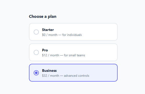
Screenshot of the Custom Radio Buttons snippet rendered live

Custom radio buttons are a top-searched form snippet because the native radio is impossible to restyle reliably, and developers want the modern "selectable card" look used in pricing pages (the plan selector and radio card group), checkout flows, and onboarding. This snippet delivers exactly that: a group of plan cards where choosing one highlights the whole card, animates a dot into place, and — crucially — keeps a real `<input type="radio">` so single-selection, keyboard arrows, and screen-reader semantics all work natively. It is pure CSS, with no JavaScript managing which option is selected.

Why keep the native radio

Radio buttons have behavior you do not want to reimplement: a group sharing the same name allows only one selection, arrow keys move between options, Space/Enter selects, and the chosen value submits with the form. Building this from divs and JavaScript loses all of it and is a common accessibility failure — the same lesson as the custom checkbox. Here every option is a <label class="radio"> wrapping an <input type="radio" name="plan">. The browser enforces single-selection through the shared name, so there is no script to uncheck siblings — the radio group simply works.

The accessible hide pattern

The native radio is hidden with position: absolute; opacity: 0; width: 0; height: 0 rather than display: none. That keeps it focusable, keyboard-operable, and announced by assistive tech while letting CSS draw a custom indicator. The whole card is a label, so clicking anywhere on it selects that option. This is the same reliable pattern used for accessible custom checkboxes, applied to radios.

The animated dot with a springy bounce

The visible indicator is a .dot — a 20px circle with a border — containing an ::after pseudo-element that is the inner fill. By default the inner fill is transform: scale(0) (invisible). When the radio is checked, input:checked + .dot::after { transform: scale(1) } pops it to full size. The transition uses cubic-bezier(0.34, 1.56, 0.64, 1) — an overshoot easing curve whose value above 1 makes the dot scale slightly past 100% and settle back, producing a satisfying springy "bounce" as the option is selected. Animating only transform keeps it smooth on the GPU.

Highlighting the whole card with :has()

The standout feature is the card highlight. The modern CSS :has() relational selector lets a parent style itself based on a descendant's state: .radio:has(input:checked) matches the label only when the radio inside it is checked, applying a colored border and a soft tinted background (border-color: #6366f1; background: #eef2ff). This is the clean, script-free way to build selectable cards — before :has(), you needed JavaScript to add a class to the parent. :has() is supported in all current major browsers; for very old browsers you can fall back to highlighting just the dot and label text via the + sibling selector, which this snippet also uses.

Focus, hover, and selected states

The card responds to every interaction. Hovering or selecting transitions the border-color and background smoothly. Keyboard focus shows a ring via input:focus-visible + .dot { box-shadow: 0 0 0 3px rgba(99,102,241,0.35) } — using :focus-visible so the ring appears only during keyboard navigation, not on mouse clicks. The selected card combines the colored border, tinted background, filled dot, and (on keyboard) focus ring, so the chosen option is unmistakable at a glance.

The card content layout

Each card uses a flex row: the dot on the left, then an .info column with a bold plan name and a small description. This layout scales to any content — add a price badge, an icon, or a "Most popular" tag inside the info column. Because the dot is flex-shrink: 0, it never squashes when the text is long. The cards stack in a flex column with consistent spacing, and the whole group sits under a heading so the question being answered is clear.

Customizing the group

Change the accent color in four places — the checked dot fill (::after background), the checked dot border, the :has card border, and the focus-ring rgba(). To add a fourth option, copy a label and update its value and text; the shared name="plan" automatically includes it in the group. To make the dot bigger, scale the .dot and its ::after together. For a more subtle selection, soften the :has() background tint or remove the bounce by swapping the cubic-bezier for a plain ease. Because the markup is a simple repeating label, the pattern works for 2, 3, or 10 options.

Accessibility checklist

Give every radio in a group the same name so they form one group, and a unique value so the selection submits correctly. The wrapping <label> associates the text with the input, but you can also add for/id pairs for extra robustness. Consider wrapping the group in a <fieldset> with a <legend> ("Choose a plan") so screen readers announce the group's purpose. Keep the :focus-visible ring intact for keyboard users, and ensure the unchecked dot border has enough contrast against the card so empty options are visible. Because the native radios remain, arrow-key navigation, voice control, and screen readers all work without extra ARIA.

Step by step

How to Use

  1. 1
    Copy a label cardEach option is a <label class="radio"> wrapping a hidden <input type="radio">, a .dot indicator, and an .info column. Keep all parts.
  2. 2
    Share one nameGive every radio the same name (e.g. name="plan") so the browser allows only one selection, and a unique value per option.
  3. 3
    Edit the card contentChange the bold title and small description inside .info. Add a price badge or icon if you like — the layout flexes.
  4. 4
    Re-theme the accentUpdate the color in four places: the dot fill, the checked dot border, the .radio:has(input:checked) border/background, and the focus ring.
  5. 5
    Add or remove optionsCopy a label to add an option, or delete one. The shared name keeps them a single group automatically.
  6. 6
    Export in your formatClick "HTML" for a standalone file, "JSX" for a React component, or "Tailwind" for a React + Tailwind version.

Real-world uses

Common Use Cases

Pricing & plan selection
The signature use case — selectable plan cards on pricing pages and checkout where one option must be chosen and clearly highlighted.
Checkout: shipping & payment
Pick a shipping speed or payment method as a card group, with the whole card highlighting the active choice.
Onboarding preference steps
Ask new users to choose a role, use case, or theme with large, tappable cards instead of tiny native radios.
Learn the :has() parent selector
See how :has(input:checked) styles a card based on a descendant input — the modern, script-free way to build selectable cards.
Design-system radio group
Add the card-style radio to your component library with checked, focus, hover, and disabled states ready to go.
Accessible single-choice control
Keeps native radios so arrow-key navigation, form submission, and screen-reader grouping all work without custom ARIA.

Got questions?

Frequently Asked Questions

Keep the real <input type="radio"> and hide it with position: absolute; opacity: 0; width/height: 0 (never display: none). Wrap each in a <label> and give all radios in the group the same name. The browser then handles single-selection, arrow-key navigation, and screen-reader semantics; CSS only draws the custom dot and card.

The CSS :has() relational selector — .radio:has(input:checked) — styles the parent label when the radio inside it is checked, applying a colored border and tinted background. This is the modern, script-free way to build selectable cards; it is supported in all current major browsers.

The dot fill is an ::after with transform: scale(0) by default and scale(1) when checked. The transition uses cubic-bezier(0.34, 1.56, 0.64, 1) — an overshoot curve that scales slightly past 100% and settles back, creating a bounce.

No. Native radios that share the same name attribute allow only one to be checked at a time, automatically unchecking the others. No script is required.

Copy a label, set a unique value and new text — the shared name keeps it in the group. To re-theme, change the accent in four places: the dot fill, the checked dot border, the :has card border/background, and the focus-ring rgba().

Yes. Click "JSX" for a React component or "Tailwind" for a React + Tailwind version. In React, use controlled radios sharing a name with value/checked/onChange; the same label/dot/info structure keeps the CSS working unchanged.

Custom Radio Buttons — Export as HTML, React, Vue, Angular & Tailwind

HTML
<!DOCTYPE html>
<html lang="en">
<head>
  <meta charset="UTF-8" />
  <meta name="viewport" content="width=device-width, initial-scale=1.0" />
  <title>Custom Radio Buttons</title>
  <style>
    * { box-sizing: border-box; margin: 0; padding: 0; }
    body {
      font-family: system-ui, sans-serif;
      background: #f8fafc;
      min-height: 100vh;
      display: flex; align-items: center; justify-content: center;
    }
    
    .plans { width: 100%; max-width: 340px; display: flex; flex-direction: column; gap: 10px; }
    .plans-title { font-size: 16px; color: #1e293b; margin-bottom: 6px; }
    
    .radio {
      display: flex; align-items: center; gap: 12px;
      padding: 14px 16px;
      border: 2px solid #e2e8f0;
      border-radius: 12px;
      cursor: pointer; user-select: none;
      background: #fff;
      transition: border-color 0.2s, background 0.2s;
    }
    
    /* Hide native radio but keep it focusable & accessible */
    .radio input {
      position: absolute; opacity: 0; width: 0; height: 0;
    }
    
    .dot {
      flex-shrink: 0;
      width: 20px; height: 20px;
      border: 2px solid #cbd5e1;
      border-radius: 50%;
      display: grid; place-items: center;
      transition: border-color 0.2s;
    }
    .dot::after {
      content: "";
      width: 10px; height: 10px;
      border-radius: 50%;
      background: #6366f1;
      transform: scale(0);
      transition: transform 0.2s cubic-bezier(0.34, 1.56, 0.64, 1);
    }
    
    /* Selected card */
    .radio input:checked + .dot { border-color: #6366f1; }
    .radio input:checked + .dot::after { transform: scale(1); }
    .radio:has(input:checked) {
      border-color: #6366f1;
      background: #eef2ff;
    }
    
    /* Keyboard focus ring on the card */
    .radio input:focus-visible + .dot {
      box-shadow: 0 0 0 3px rgba(99, 102, 241, 0.35);
    }
    
    .info { display: flex; flex-direction: column; gap: 2px; }
    .info strong { font-size: 14px; color: #1e293b; }
    .info small { font-size: 12px; color: #64748b; }
  </style>
</head>
<body>
  <form class="plans">
    <h3 class="plans-title">Choose a plan</h3>
  
    <label class="radio">
      <input type="radio" name="plan" value="starter">
      <span class="dot"></span>
      <span class="info">
        <strong>Starter</strong>
        <small>$0 / month — for individuals</small>
      </span>
    </label>
  
    <label class="radio">
      <input type="radio" name="plan" value="pro" checked>
      <span class="dot"></span>
      <span class="info">
        <strong>Pro</strong>
        <small>$12 / month — for small teams</small>
      </span>
    </label>
  
    <label class="radio">
      <input type="radio" name="plan" value="business">
      <span class="dot"></span>
      <span class="info">
        <strong>Business</strong>
        <small>$32 / month — advanced controls</small>
      </span>
    </label>
  </form>
  <script>
    // Pure CSS radio group — no JavaScript needed.
    // The native radio's name attribute enforces single-selection automatically.
    document.querySelectorAll('.radio input').forEach(r => {
      r.addEventListener('change', e => console.log('Selected plan:', e.target.value));
    });
  </script>
</body>
</html>
Tailwind
<!DOCTYPE html>
<html lang="en">
<head>
  <meta charset="UTF-8" />
  <meta name="viewport" content="width=device-width, initial-scale=1.0" />
  <title>Custom Radio Buttons</title>
  <!-- Tailwind CSS v3+ — arbitrary value classes (e.g. bg-[#0f172a]) are valid -->
  <script src="https://cdn.tailwindcss.com"></script>
  <style>
    * {
      box-sizing: border-box; margin: 0; padding: 0;
    }

    body {
      font-family: system-ui, sans-serif;
      background: #f8fafc;
      min-height: 100vh;
      display: flex; align-items: center; justify-content: center;
    }

    .radio input {
      position: absolute; opacity: 0; width: 0; height: 0;
    }

    .dot::after {
      content: "";
      width: 10px; height: 10px;
      border-radius: 50%;
      background: #6366f1;
      transform: scale(0);
      transition: transform 0.2s cubic-bezier(0.34, 1.56, 0.64, 1);
    }

    .radio input:checked + .dot {
      border-color: #6366f1;
    }

    .radio input:checked + .dot::after {
      transform: scale(1);
    }

    .radio:has(input:checked) {
      border-color: #6366f1;
      background: #eef2ff;
    }

    .radio input:focus-visible + .dot {
      box-shadow: 0 0 0 3px rgba(99, 102, 241, 0.35);
    }

    .info strong {
      font-size: 14px; color: #1e293b;
    }

    .info small {
      font-size: 12px; color: #64748b;
    }
  </style>
</head>
<body>
  <form class="w-full max-w-[340px] flex flex-col gap-2.5">
    <h3 class="text-base text-[#1e293b] mb-1.5">Choose a plan</h3>
  
    <label class="radio flex items-center gap-3 py-3.5 px-4 border-2 border-[#e2e8f0] rounded-xl cursor-pointer select-none bg-[#fff] [transition:border-color_0.2s,_background_0.2s]">
      <input type="radio" name="plan" value="starter">
      <span class="dot shrink-0 w-5 h-5 border-2 border-[#cbd5e1] rounded-full grid [place-items:center] [transition:border-color_0.2s]"></span>
      <span class="info flex flex-col gap-0.5">
        <strong>Starter</strong>
        <small>$0 / month — for individuals</small>
      </span>
    </label>
  
    <label class="radio flex items-center gap-3 py-3.5 px-4 border-2 border-[#e2e8f0] rounded-xl cursor-pointer select-none bg-[#fff] [transition:border-color_0.2s,_background_0.2s]">
      <input type="radio" name="plan" value="pro" checked>
      <span class="dot shrink-0 w-5 h-5 border-2 border-[#cbd5e1] rounded-full grid [place-items:center] [transition:border-color_0.2s]"></span>
      <span class="info flex flex-col gap-0.5">
        <strong>Pro</strong>
        <small>$12 / month — for small teams</small>
      </span>
    </label>
  
    <label class="radio flex items-center gap-3 py-3.5 px-4 border-2 border-[#e2e8f0] rounded-xl cursor-pointer select-none bg-[#fff] [transition:border-color_0.2s,_background_0.2s]">
      <input type="radio" name="plan" value="business">
      <span class="dot shrink-0 w-5 h-5 border-2 border-[#cbd5e1] rounded-full grid [place-items:center] [transition:border-color_0.2s]"></span>
      <span class="info flex flex-col gap-0.5">
        <strong>Business</strong>
        <small>$32 / month — advanced controls</small>
      </span>
    </label>
  </form>
  <script>
    // Pure CSS radio group — no JavaScript needed.
    // The native radio's name attribute enforces single-selection automatically.
    document.querySelectorAll('.radio input').forEach(r => {
      r.addEventListener('change', e => console.log('Selected plan:', e.target.value));
    });
  </script>
</body>
</html>
React
import React, { useEffect } from 'react';

// CSS — optionally move to CustomRadioButtons.module.css
const css = `
* { box-sizing: border-box; margin: 0; padding: 0; }
body {
  font-family: system-ui, sans-serif;
  background: #f8fafc;
  min-height: 100vh;
  display: flex; align-items: center; justify-content: center;
}

.plans { width: 100%; max-width: 340px; display: flex; flex-direction: column; gap: 10px; }
.plans-title { font-size: 16px; color: #1e293b; margin-bottom: 6px; }

.radio {
  display: flex; align-items: center; gap: 12px;
  padding: 14px 16px;
  border: 2px solid #e2e8f0;
  border-radius: 12px;
  cursor: pointer; user-select: none;
  background: #fff;
  transition: border-color 0.2s, background 0.2s;
}

/* Hide native radio but keep it focusable & accessible */
.radio input {
  position: absolute; opacity: 0; width: 0; height: 0;
}

.dot {
  flex-shrink: 0;
  width: 20px; height: 20px;
  border: 2px solid #cbd5e1;
  border-radius: 50%;
  display: grid; place-items: center;
  transition: border-color 0.2s;
}
.dot::after {
  content: "";
  width: 10px; height: 10px;
  border-radius: 50%;
  background: #6366f1;
  transform: scale(0);
  transition: transform 0.2s cubic-bezier(0.34, 1.56, 0.64, 1);
}

/* Selected card */
.radio input:checked + .dot { border-color: #6366f1; }
.radio input:checked + .dot::after { transform: scale(1); }
.radio:has(input:checked) {
  border-color: #6366f1;
  background: #eef2ff;
}

/* Keyboard focus ring on the card */
.radio input:focus-visible + .dot {
  box-shadow: 0 0 0 3px rgba(99, 102, 241, 0.35);
}

.info { display: flex; flex-direction: column; gap: 2px; }
.info strong { font-size: 14px; color: #1e293b; }
.info small { font-size: 12px; color: #64748b; }
`;

export default function CustomRadioButtons() {
  // Auto-generated escape hatch: the original snippet's vanilla JS runs once
  // after mount and queries the rendered DOM. For idiomatic React, lift this
  // into state + handlers.
  useEffect(() => {
    const _listeners = [];
    const _originalAddEventListener = EventTarget.prototype.addEventListener;
    EventTarget.prototype.addEventListener = function(type, listener, options) {
      _listeners.push({ target: this, type, listener, options });
      return _originalAddEventListener.call(this, type, listener, options);
    };
    // Pure CSS radio group — no JavaScript needed.
    // The native radio's name attribute enforces single-selection automatically.
    document.querySelectorAll('.radio input').forEach(r => {
      r.addEventListener('change', e => console.log('Selected plan:', e.target.value));
    });
    // Cleanup: restore addEventListener and remove all listeners
    return () => {
      EventTarget.prototype.addEventListener = _originalAddEventListener;
      for (const { target, type, listener, options } of _listeners) {
        target.removeEventListener(type, listener, options);
      }
    };
  }, []);

  return (
    <>
      <style>{css}</style>
      <form className="plans">
        <h3 className="plans-title">Choose a plan</h3>
      
        <label className="radio">
          <input type="radio" name="plan" value="starter" />
          <span className="dot"></span>
          <span className="info">
            <strong>Starter</strong>
            <small>$0 / month — for individuals</small>
          </span>
        </label>
      
        <label className="radio">
          <input type="radio" name="plan" value="pro" defaultChecked />
          <span className="dot"></span>
          <span className="info">
            <strong>Pro</strong>
            <small>$12 / month — for small teams</small>
          </span>
        </label>
      
        <label className="radio">
          <input type="radio" name="plan" value="business" />
          <span className="dot"></span>
          <span className="info">
            <strong>Business</strong>
            <small>$32 / month — advanced controls</small>
          </span>
        </label>
      </form>
    </>
  );
}
React + Tailwind
import React, { useEffect } from 'react';
// Requires Tailwind CSS v3+ — https://tailwindcss.com/docs/installation
// Arbitrary value classes (e.g. bg-[#0f172a]) are valid Tailwind v3+

export default function CustomRadioButtons() {
  // Auto-generated escape hatch: the original snippet's vanilla JS runs once
  // after mount and queries the rendered DOM. For idiomatic React, lift this
  // into state + handlers.
  useEffect(() => {
    const _listeners = [];
    const _originalAddEventListener = EventTarget.prototype.addEventListener;
    EventTarget.prototype.addEventListener = function(type, listener, options) {
      _listeners.push({ target: this, type, listener, options });
      return _originalAddEventListener.call(this, type, listener, options);
    };
    // Pure CSS radio group — no JavaScript needed.
    // The native radio's name attribute enforces single-selection automatically.
    document.querySelectorAll('.radio input').forEach(r => {
      r.addEventListener('change', e => console.log('Selected plan:', e.target.value));
    });
    // Cleanup: restore addEventListener and remove all listeners
    return () => {
      EventTarget.prototype.addEventListener = _originalAddEventListener;
      for (const { target, type, listener, options } of _listeners) {
        target.removeEventListener(type, listener, options);
      }
    };
  }, []);

  return (
    <>
      <style>{`
* {
  box-sizing: border-box; margin: 0; padding: 0;
}

body {
  font-family: system-ui, sans-serif;
  background: #f8fafc;
  min-height: 100vh;
  display: flex; align-items: center; justify-content: center;
}

.radio input {
  position: absolute; opacity: 0; width: 0; height: 0;
}

.dot::after {
  content: "";
  width: 10px; height: 10px;
  border-radius: 50%;
  background: #6366f1;
  transform: scale(0);
  transition: transform 0.2s cubic-bezier(0.34, 1.56, 0.64, 1);
}

.radio input:checked + .dot {
  border-color: #6366f1;
}

.radio input:checked + .dot::after {
  transform: scale(1);
}

.radio:has(input:checked) {
  border-color: #6366f1;
  background: #eef2ff;
}

.radio input:focus-visible + .dot {
  box-shadow: 0 0 0 3px rgba(99, 102, 241, 0.35);
}

.info strong {
  font-size: 14px; color: #1e293b;
}

.info small {
  font-size: 12px; color: #64748b;
}
      `}</style>
      <form className="w-full max-w-[340px] flex flex-col gap-2.5">
        <h3 className="text-base text-[#1e293b] mb-1.5">Choose a plan</h3>
      
        <label className="radio flex items-center gap-3 py-3.5 px-4 border-2 border-[#e2e8f0] rounded-xl cursor-pointer select-none bg-[#fff] [transition:border-color_0.2s,_background_0.2s]">
          <input type="radio" name="plan" value="starter" />
          <span className="dot shrink-0 w-5 h-5 border-2 border-[#cbd5e1] rounded-full grid [place-items:center] [transition:border-color_0.2s]"></span>
          <span className="info flex flex-col gap-0.5">
            <strong>Starter</strong>
            <small>$0 / month — for individuals</small>
          </span>
        </label>
      
        <label className="radio flex items-center gap-3 py-3.5 px-4 border-2 border-[#e2e8f0] rounded-xl cursor-pointer select-none bg-[#fff] [transition:border-color_0.2s,_background_0.2s]">
          <input type="radio" name="plan" value="pro" defaultChecked />
          <span className="dot shrink-0 w-5 h-5 border-2 border-[#cbd5e1] rounded-full grid [place-items:center] [transition:border-color_0.2s]"></span>
          <span className="info flex flex-col gap-0.5">
            <strong>Pro</strong>
            <small>$12 / month — for small teams</small>
          </span>
        </label>
      
        <label className="radio flex items-center gap-3 py-3.5 px-4 border-2 border-[#e2e8f0] rounded-xl cursor-pointer select-none bg-[#fff] [transition:border-color_0.2s,_background_0.2s]">
          <input type="radio" name="plan" value="business" />
          <span className="dot shrink-0 w-5 h-5 border-2 border-[#cbd5e1] rounded-full grid [place-items:center] [transition:border-color_0.2s]"></span>
          <span className="info flex flex-col gap-0.5">
            <strong>Business</strong>
            <small>$32 / month — advanced controls</small>
          </span>
        </label>
      </form>
    </>
  );
}
Vue
<template>
  <form class="plans">
    <h3 class="plans-title">Choose a plan</h3>
  
    <label class="radio">
      <input type="radio" name="plan" value="starter">
      <span class="dot"></span>
      <span class="info">
        <strong>Starter</strong>
        <small>$0 / month — for individuals</small>
      </span>
    </label>
  
    <label class="radio">
      <input type="radio" name="plan" value="pro" checked>
      <span class="dot"></span>
      <span class="info">
        <strong>Pro</strong>
        <small>$12 / month — for small teams</small>
      </span>
    </label>
  
    <label class="radio">
      <input type="radio" name="plan" value="business">
      <span class="dot"></span>
      <span class="info">
        <strong>Business</strong>
        <small>$32 / month — advanced controls</small>
      </span>
    </label>
  </form>
</template>

<script setup>
import { onMounted } from 'vue';

onMounted(() => {
  // Pure CSS radio group — no JavaScript needed.
  // The native radio's name attribute enforces single-selection automatically.
  document.querySelectorAll('.radio input').forEach(r => {
    r.addEventListener('change', e => console.log('Selected plan:', e.target.value));
  });
});
</script>

<style scoped>
* { box-sizing: border-box; margin: 0; padding: 0; }
body {
  font-family: system-ui, sans-serif;
  background: #f8fafc;
  min-height: 100vh;
  display: flex; align-items: center; justify-content: center;
}

.plans { width: 100%; max-width: 340px; display: flex; flex-direction: column; gap: 10px; }
.plans-title { font-size: 16px; color: #1e293b; margin-bottom: 6px; }

.radio {
  display: flex; align-items: center; gap: 12px;
  padding: 14px 16px;
  border: 2px solid #e2e8f0;
  border-radius: 12px;
  cursor: pointer; user-select: none;
  background: #fff;
  transition: border-color 0.2s, background 0.2s;
}

/* Hide native radio but keep it focusable & accessible */
.radio input {
  position: absolute; opacity: 0; width: 0; height: 0;
}

.dot {
  flex-shrink: 0;
  width: 20px; height: 20px;
  border: 2px solid #cbd5e1;
  border-radius: 50%;
  display: grid; place-items: center;
  transition: border-color 0.2s;
}
.dot::after {
  content: "";
  width: 10px; height: 10px;
  border-radius: 50%;
  background: #6366f1;
  transform: scale(0);
  transition: transform 0.2s cubic-bezier(0.34, 1.56, 0.64, 1);
}

/* Selected card */
.radio input:checked + .dot { border-color: #6366f1; }
.radio input:checked + .dot::after { transform: scale(1); }
.radio:has(input:checked) {
  border-color: #6366f1;
  background: #eef2ff;
}

/* Keyboard focus ring on the card */
.radio input:focus-visible + .dot {
  box-shadow: 0 0 0 3px rgba(99, 102, 241, 0.35);
}

.info { display: flex; flex-direction: column; gap: 2px; }
.info strong { font-size: 14px; color: #1e293b; }
.info small { font-size: 12px; color: #64748b; }
</style>
Angular
// @ts-nocheck
// Note: vanilla JS DOM manipulation is preserved as-is inside ngAfterViewInit().
// For idiomatic Angular, replace document.getElementById() with @ViewChild() refs
// and move state into component properties with two-way binding.
import { Component, AfterViewInit, ViewEncapsulation } from '@angular/core';
import { CommonModule } from '@angular/common';

@Component({
  selector: 'app-custom-radio-buttons',
  standalone: true,
  imports: [CommonModule],
  encapsulation: ViewEncapsulation.None,
  template: `
    <form class="plans">
      <h3 class="plans-title">Choose a plan</h3>
    
      <label class="radio">
        <input type="radio" name="plan" value="starter">
        <span class="dot"></span>
        <span class="info">
          <strong>Starter</strong>
          <small>$0 / month — for individuals</small>
        </span>
      </label>
    
      <label class="radio">
        <input type="radio" name="plan" value="pro" checked>
        <span class="dot"></span>
        <span class="info">
          <strong>Pro</strong>
          <small>$12 / month — for small teams</small>
        </span>
      </label>
    
      <label class="radio">
        <input type="radio" name="plan" value="business">
        <span class="dot"></span>
        <span class="info">
          <strong>Business</strong>
          <small>$32 / month — advanced controls</small>
        </span>
      </label>
    </form>
  `,
  styles: [`
    * { box-sizing: border-box; margin: 0; padding: 0; }
    body {
      font-family: system-ui, sans-serif;
      background: #f8fafc;
      min-height: 100vh;
      display: flex; align-items: center; justify-content: center;
    }
    
    .plans { width: 100%; max-width: 340px; display: flex; flex-direction: column; gap: 10px; }
    .plans-title { font-size: 16px; color: #1e293b; margin-bottom: 6px; }
    
    .radio {
      display: flex; align-items: center; gap: 12px;
      padding: 14px 16px;
      border: 2px solid #e2e8f0;
      border-radius: 12px;
      cursor: pointer; user-select: none;
      background: #fff;
      transition: border-color 0.2s, background 0.2s;
    }
    
    /* Hide native radio but keep it focusable & accessible */
    .radio input {
      position: absolute; opacity: 0; width: 0; height: 0;
    }
    
    .dot {
      flex-shrink: 0;
      width: 20px; height: 20px;
      border: 2px solid #cbd5e1;
      border-radius: 50%;
      display: grid; place-items: center;
      transition: border-color 0.2s;
    }
    .dot::after {
      content: "";
      width: 10px; height: 10px;
      border-radius: 50%;
      background: #6366f1;
      transform: scale(0);
      transition: transform 0.2s cubic-bezier(0.34, 1.56, 0.64, 1);
    }
    
    /* Selected card */
    .radio input:checked + .dot { border-color: #6366f1; }
    .radio input:checked + .dot::after { transform: scale(1); }
    .radio:has(input:checked) {
      border-color: #6366f1;
      background: #eef2ff;
    }
    
    /* Keyboard focus ring on the card */
    .radio input:focus-visible + .dot {
      box-shadow: 0 0 0 3px rgba(99, 102, 241, 0.35);
    }
    
    .info { display: flex; flex-direction: column; gap: 2px; }
    .info strong { font-size: 14px; color: #1e293b; }
    .info small { font-size: 12px; color: #64748b; }
  `]
})
export class CustomRadioButtonsComponent implements AfterViewInit {
  ngAfterViewInit(): void {
    // Pure CSS radio group — no JavaScript needed.
    // The native radio's name attribute enforces single-selection automatically.
    document.querySelectorAll('.radio input').forEach(r => {
      r.addEventListener('change', e => console.log('Selected plan:', e.target.value));
    });
  }
}