Radio Card Group — Selectable Option Cards UI

Radio Card Group · Forms · Plain HTML, CSS & JS · Live preview

Share & Support

What's included

Features

Built on native radio inputs
Real <input type="radio"> elements give single-selection, keyboard nav, and form submission for free.
Pure-CSS selected styling
The :checked sibling selector drives all selected visuals — no JavaScript needed for the core behavior.
Redundant selection signals
A chosen card shows border, background tint, shadow, and a filled indicator — never relying on color alone.
Keyboard focus ring
:focus-visible adds a strong ring for keyboard users without showing one to mouse users.
"Most popular" badge
A pinned flag nudges toward a recommended option, with a CSS rule preventing it from colliding with the indicator.
Whole-card click target
The entire card is the label, so clicking anywhere in it selects the option — a large, forgiving hit area.
Graceful degradation
Strip the JavaScript and the cards still select, navigate, and submit — the script only adds label sync and confirmation.
Screen-reader friendly
role="radiogroup" plus native radios announce the option, its position, and selected state automatically.

About this UI Snippet

Radio Card Group — Accessible Selectable Cards Built on Native Radios
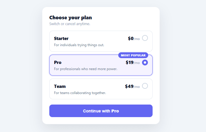
Screenshot of the Radio Card Group snippet rendered live

When you need a user to pick exactly one option from a few — a pricing plan, a shipping speed, a payment method — large clickable cards convert far better than a cramped native dropdown, because each choice can show a title, price, description, and badge. This snippet builds that selectable-card pattern the right way: on top of real <input type="radio"> elements, so it stays keyboard-navigable, screen-reader friendly, and form-submittable with zero JavaScript required for the core behavior.

Real radios under the hood

Each card is a <label> wrapping a visually hidden <input type="radio"> and a styled .rcg-box. Because they're genuine radios sharing one name, the browser gives you single-selection enforcement, arrow-key navigation between options, focus management, and inclusion in form submission — all for free. The selected styling is driven entirely by the CSS :checked sibling selector (input:checked + .rcg-box), which highlights the border, tints the background, and fills the custom radio dot. This is the critical detail: re-implementing radio behavior with <div>s and JavaScript throws away accessibility that the native element provides automatically.

Selected state you can't miss

A chosen card gets a colored border, a soft background tint, a focus-ring-style shadow, and a filled circular indicator in the corner — four redundant signals so the selection is obvious at a glance and never relies on color alone. The :focus-visible selector adds a stronger ring when a card is reached by keyboard, so keyboard users always see where they are, while mouse users don't get a ring they didn't ask for.

A "most popular" flag without breaking layout

One card carries a "Most popular" badge pinned to its top edge — the standard nudge toward a recommended option. A small CSS rule (.rcg-flag ~ .rcg-tick) nudges the selection indicator down on flagged cards so the badge and the tick never collide, the kind of detail that separates a polished component from one that looks broken on the recommended plan.

JavaScript only for the nice-to-haves

The core selection works with no JavaScript at all — that's the point of building on native radios. The small script only powers conveniences: syncing the submit button's label to the chosen plan ("Continue with Pro") and showing a brief confirmation on submit. Strip the script entirely and the cards still select, navigate, and submit correctly, which is exactly the graceful-degradation property you want in a form control.

Keyboard and screen-reader behavior

The group is wrapped in role="radiogroup" with a label, and because the inputs are real radios, arrow keys move the selection, Tab moves into and out of the group as a single stop, and screen readers announce "Pro, radio button, 2 of 3, selected." None of that needs custom key handling — it's the native behavior preserved by not replacing the radios. This is why the radio-card pattern should always be built on inputs, not reconstructed from scratch.

Step by step

How to Use

  1. 1
    Paste HTML, CSS, and JSA three-card plan selector renders with Pro pre-selected and marked "Most popular".
  2. 2
    Click a cardThe whole card is clickable — selecting it highlights the border, tints the background, and fills the corner indicator.
  3. 3
    Use the keyboardTab into the group and use Arrow keys to move between plans — native radio behavior, no custom code.
  4. 4
    Watch the submit labelThe button updates to "Continue with [plan]" reflecting the current choice; submitting confirms it briefly.
  5. 5
    Edit the optionsAdd or change the option cards in the HTML (and the PLANS map) — each is a label-wrapped radio with your content.
  6. 6
    Wire up the choiceOn submit, read the checked radio's value and proceed — start checkout, save the preference, or advance the flow.

Real-world uses

Common Use Cases

Pricing and plan selection
Let users choose a subscription tier as large comparable cards — pair with a pricing toggle for monthly/annual.
Checkout options
Pick a shipping speed or payment method as cards, alongside a promo code input and order summary.
Onboarding preferences
Have new users select a use case, role, or goal from a few descriptive cards.
Survey and quiz answers
Present single-choice questions as cards with more context than a bare radio list.
Configurator and product options
Choose a model, size tier, or service level where each option benefits from a title, price, and description.
Learning accessible custom controls
A reference for styling native radios without losing accessibility — compare with a segmented control for a compact single-choice toggle.

Got questions?

Frequently Asked Questions

Native radios give you single-selection enforcement, arrow-key navigation, focus management, form submission, and correct screen-reader announcements ("2 of 3, selected") automatically. Rebuilding that with divs and JavaScript means re-implementing all of it — and most reimplementations miss keyboard or screen-reader support. Hiding the real radio and styling a sibling keeps every native benefit while giving you full visual control.

Each option is a <label> wrapping an <input type="radio" name="plan" value="..."> and a styled .rcg-box with your title, price, and description. Add or remove these label blocks (and update the PLANS map if you use it for the submit label) — no other code changes, since selection is handled by the shared radio name.

Add the checked attribute to that card's radio input (as the Pro card does here). For no default, leave all unchecked — but a sensible default reduces friction and is recommended for plan pickers where one option is the common choice.

Read form.querySelector('input[name="plan"]:checked').value, either on the submit event (as shown) or on change for live updates. Because they're real radios inside a form, the value also submits automatically with a normal form POST under the radio's name.

In React, hold the selected value in useState and set each radio's checked={value === opt} with an onChange; in Vue, use v-model on the radio group; in Angular, use formControlName or [(ngModel)]. Keep them as real <input type="radio"> elements so you retain native keyboard and accessibility behavior — only the value binding moves into the framework.

Radio Card Group — Export as HTML, React, Vue, Angular & Tailwind

HTML
<!DOCTYPE html>
<html lang="en">
<head>
  <meta charset="UTF-8" />
  <meta name="viewport" content="width=device-width, initial-scale=1.0" />
  <title>Radio Card Group</title>
  <style>
    *{box-sizing:border-box;margin:0;padding:0}
    body{font-family:system-ui,-apple-system,sans-serif;background:#f1f5f9;min-height:100vh;display:flex;align-items:flex-start;justify-content:center;padding:40px 24px}
    
    .rcg-card{background:#fff;border-radius:16px;padding:24px;width:100%;max-width:400px;box-shadow:0 18px 44px rgba(15,23,42,.1)}
    .rcg-card h3{font-size:17px;font-weight:800;color:#0f172a}
    .rcg-sub{font-size:12.5px;color:#94a3b8;margin:3px 0 16px}
    
    .rcg-group{display:flex;flex-direction:column;gap:10px;margin-bottom:18px}
    .rcg-option{display:block;cursor:pointer}
    .rcg-option input{position:absolute;opacity:0;width:0;height:0}
    
    .rcg-box{position:relative;display:block;border:1.5px solid #e2e8f0;border-radius:12px;padding:14px 15px;transition:border-color .15s,box-shadow .15s,background .15s}
    .rcg-option:hover .rcg-box{border-color:#cbd5e1}
    .rcg-option input:checked + .rcg-box{border-color:#6366f1;background:#f5f3ff;box-shadow:0 0 0 3px rgba(99,102,241,.12)}
    .rcg-option input:focus-visible + .rcg-box{box-shadow:0 0 0 3px rgba(99,102,241,.35)}
    
    .rcg-flag{position:absolute;top:-9px;right:14px;background:#6366f1;color:#fff;font-size:10px;font-weight:800;padding:3px 9px;border-radius:999px;text-transform:uppercase;letter-spacing:.03em}
    /* Reserve room on the right of the title row so the price never sits under the tick */
    .rcg-top{display:flex;align-items:baseline;justify-content:space-between;gap:10px;padding-right:28px;margin-bottom:4px}
    .rcg-name{font-size:14.5px;font-weight:800;color:#0f172a}
    .rcg-price{font-size:16px;font-weight:800;color:#0f172a}
    .rcg-price small{font-size:11px;font-weight:600;color:#94a3b8}
    .rcg-desc{font-size:12px;color:#64748b;line-height:1.4;display:block}
    
    .rcg-tick{position:absolute;top:14px;right:15px;width:20px;height:20px;border-radius:50%;border:2px solid #cbd5e1;transition:border-color .15s,background .15s}
    .rcg-option input:checked + .rcg-box .rcg-tick{border-color:#6366f1;background:#6366f1}
    .rcg-option input:checked + .rcg-box .rcg-tick::after{content:'';position:absolute;top:4px;left:4px;width:8px;height:8px;border-radius:50%;background:#fff}
    /* When a plan has the popular flag, nudge the tick down so they don't overlap */
    .rcg-flag ~ .rcg-tick{top:16px}
    
    .rcg-submit{width:100%;background:#6366f1;color:#fff;border:none;border-radius:10px;padding:12px;font-size:14px;font-weight:700;cursor:pointer;transition:background .15s}
    .rcg-submit:hover{background:#4f46e5}
    .rcg-submit b{font-weight:800}
  </style>
</head>
<body>
  <form class="rcg-card" id="rcgForm">
    <h3>Choose your plan</h3>
    <p class="rcg-sub">Switch or cancel anytime.</p>
  
    <div class="rcg-group" id="rcgGroup" role="radiogroup" aria-label="Plan">
      <label class="rcg-option">
        <input type="radio" name="plan" value="starter">
        <span class="rcg-box">
          <span class="rcg-top">
            <span class="rcg-name">Starter</span>
            <span class="rcg-price">$0<small>/mo</small></span>
          </span>
          <span class="rcg-desc">For individuals trying things out.</span>
          <span class="rcg-tick" aria-hidden="true"></span>
        </span>
      </label>
  
      <label class="rcg-option">
        <input type="radio" name="plan" value="pro" checked>
        <span class="rcg-box">
          <span class="rcg-flag">Most popular</span>
          <span class="rcg-top">
            <span class="rcg-name">Pro</span>
            <span class="rcg-price">$19<small>/mo</small></span>
          </span>
          <span class="rcg-desc">For professionals who need more power.</span>
          <span class="rcg-tick" aria-hidden="true"></span>
        </span>
      </label>
  
      <label class="rcg-option">
        <input type="radio" name="plan" value="team">
        <span class="rcg-box">
          <span class="rcg-top">
            <span class="rcg-name">Team</span>
            <span class="rcg-price">$49<small>/mo</small></span>
          </span>
          <span class="rcg-desc">For teams collaborating together.</span>
          <span class="rcg-tick" aria-hidden="true"></span>
        </span>
      </label>
    </div>
  
    <button type="submit" class="rcg-submit">Continue with <b id="rcgChosen">Pro</b></button>
  </form>
  <script>
    var PLANS = {
      starter: 'Starter',
      pro: 'Pro',
      team: 'Team',
    };
    
    var form = document.getElementById('rcgForm');
    var chosen = document.getElementById('rcgChosen');
    
    function sync() {
      var sel = form.querySelector('input[name="plan"]:checked');
      if (sel) chosen.textContent = PLANS[sel.value];
    }
    
    form.addEventListener('change', function (e) {
      if (e.target.name === 'plan') sync();
    });
    
    // Keyboard arrow keys move between options natively because they share a radio name;
    // this just keeps the submit label in sync.
    form.addEventListener('submit', function (e) {
      e.preventDefault();
      var sel = form.querySelector('input[name="plan"]:checked');
      // Proceed with sel.value (e.g. start checkout for that plan).
      var btn = form.querySelector('.rcg-submit');
      btn.textContent = '✓ ' + PLANS[sel.value] + ' selected';
      setTimeout(function () { btn.innerHTML = 'Continue with <b id="rcgChosen">' + PLANS[sel.value] + '</b>'; }, 1600);
    });
    
    sync();
  </script>
</body>
</html>
Tailwind
<!DOCTYPE html>
<html lang="en">
<head>
  <meta charset="UTF-8" />
  <meta name="viewport" content="width=device-width, initial-scale=1.0" />
  <title>Radio Card Group</title>
  <!-- Tailwind CSS v3+ — arbitrary value classes (e.g. bg-[#0f172a]) are valid -->
  <script src="https://cdn.tailwindcss.com"></script>
  <style>
    * {
      box-sizing:border-box;margin:0;padding:0
    }

    body {
      font-family:system-ui,-apple-system,sans-serif;background:#f1f5f9;min-height:100vh;display:flex;align-items:flex-start;justify-content:center;padding:40px 24px
    }

    .rcg-card h3 {
      font-size:17px;font-weight:800;color:#0f172a
    }

    .rcg-option input {
      position:absolute;opacity:0;width:0;height:0
    }

    .rcg-option:hover .rcg-box {
      border-color:#cbd5e1
    }

    .rcg-option input:checked + .rcg-box {
      border-color:#6366f1;background:#f5f3ff;box-shadow:0 0 0 3px rgba(99,102,241,.12)
    }

    .rcg-option input:focus-visible + .rcg-box {
      box-shadow:0 0 0 3px rgba(99,102,241,.35)
    }

    .rcg-price small {
      font-size:11px;font-weight:600;color:#94a3b8
    }

    .rcg-option input:checked + .rcg-box .rcg-tick {
      border-color:#6366f1;background:#6366f1
    }

    .rcg-option input:checked + .rcg-box .rcg-tick::after {
      content:'';position:absolute;top:4px;left:4px;width:8px;height:8px;border-radius:50%;background:#fff
    }

    .rcg-flag ~ .rcg-tick {
      top:16px
    }

    .rcg-submit b {
      font-weight:800
    }
  </style>
</head>
<body>
  <form class="rcg-card bg-[#fff] rounded-2xl p-6 w-full max-w-[400px] shadow-[0_18px_44px_rgba(15,23,42,.1)]" id="rcgForm">
    <h3>Choose your plan</h3>
    <p class="text-[12.5px] text-[#94a3b8] mt-[3px] mx-0 mb-4">Switch or cancel anytime.</p>
  
    <div class="flex flex-col gap-2.5 mb-[18px]" id="rcgGroup" role="radiogroup" aria-label="Plan">
      <label class="rcg-option block cursor-pointer">
        <input type="radio" name="plan" value="starter">
        <span class="rcg-box relative block border rounded-xl py-3.5 px-[15px] [transition:border-color_.15s,box-shadow_.15s,background_.15s]">
          <span class="flex items-baseline justify-between gap-2.5 pr-7 mb-1">
            <span class="text-[14.5px] font-extrabold text-[#0f172a]">Starter</span>
            <span class="rcg-price text-base font-extrabold text-[#0f172a]">$0<small>/mo</small></span>
          </span>
          <span class="text-xs text-[#64748b] leading-[1.4] block">For individuals trying things out.</span>
          <span class="rcg-tick absolute top-3.5 right-[15px] w-5 h-5 rounded-full border-2 border-[#cbd5e1] [transition:border-color_.15s,background_.15s]" aria-hidden="true"></span>
        </span>
      </label>
  
      <label class="rcg-option block cursor-pointer">
        <input type="radio" name="plan" value="pro" checked>
        <span class="rcg-box relative block border rounded-xl py-3.5 px-[15px] [transition:border-color_.15s,box-shadow_.15s,background_.15s]">
          <span class="rcg-flag absolute top-[-9px] right-3.5 bg-[#6366f1] text-[#fff] text-xs font-extrabold py-[3px] px-[9px] rounded-[999px] uppercase tracking-[.03em]">Most popular</span>
          <span class="flex items-baseline justify-between gap-2.5 pr-7 mb-1">
            <span class="text-[14.5px] font-extrabold text-[#0f172a]">Pro</span>
            <span class="rcg-price text-base font-extrabold text-[#0f172a]">$19<small>/mo</small></span>
          </span>
          <span class="text-xs text-[#64748b] leading-[1.4] block">For professionals who need more power.</span>
          <span class="rcg-tick absolute top-3.5 right-[15px] w-5 h-5 rounded-full border-2 border-[#cbd5e1] [transition:border-color_.15s,background_.15s]" aria-hidden="true"></span>
        </span>
      </label>
  
      <label class="rcg-option block cursor-pointer">
        <input type="radio" name="plan" value="team">
        <span class="rcg-box relative block border rounded-xl py-3.5 px-[15px] [transition:border-color_.15s,box-shadow_.15s,background_.15s]">
          <span class="flex items-baseline justify-between gap-2.5 pr-7 mb-1">
            <span class="text-[14.5px] font-extrabold text-[#0f172a]">Team</span>
            <span class="rcg-price text-base font-extrabold text-[#0f172a]">$49<small>/mo</small></span>
          </span>
          <span class="text-xs text-[#64748b] leading-[1.4] block">For teams collaborating together.</span>
          <span class="rcg-tick absolute top-3.5 right-[15px] w-5 h-5 rounded-full border-2 border-[#cbd5e1] [transition:border-color_.15s,background_.15s]" aria-hidden="true"></span>
        </span>
      </label>
    </div>
  
    <button type="submit" class="rcg-submit w-full bg-[#6366f1] text-[#fff] border-0 rounded-[10px] p-3 text-sm font-bold cursor-pointer [transition:background_.15s] hover:bg-[#4f46e5]">Continue with <b id="rcgChosen">Pro</b></button>
  </form>
  <script>
    var PLANS = {
      starter: 'Starter',
      pro: 'Pro',
      team: 'Team',
    };
    
    var form = document.getElementById('rcgForm');
    var chosen = document.getElementById('rcgChosen');
    
    function sync() {
      var sel = form.querySelector('input[name="plan"]:checked');
      if (sel) chosen.textContent = PLANS[sel.value];
    }
    
    form.addEventListener('change', function (e) {
      if (e.target.name === 'plan') sync();
    });
    
    // Keyboard arrow keys move between options natively because they share a radio name;
    // this just keeps the submit label in sync.
    form.addEventListener('submit', function (e) {
      e.preventDefault();
      var sel = form.querySelector('input[name="plan"]:checked');
      // Proceed with sel.value (e.g. start checkout for that plan).
      var btn = form.querySelector('.rcg-submit');
      btn.textContent = '✓ ' + PLANS[sel.value] + ' selected';
      setTimeout(function () { btn.innerHTML = 'Continue with <b id="rcgChosen">' + PLANS[sel.value] + '</b>'; }, 1600);
    });
    
    sync();
  </script>
</body>
</html>
React
import React, { useEffect } from 'react';

// CSS — optionally move to RadioCardGroup.module.css
const css = `
*{box-sizing:border-box;margin:0;padding:0}
body{font-family:system-ui,-apple-system,sans-serif;background:#f1f5f9;min-height:100vh;display:flex;align-items:flex-start;justify-content:center;padding:40px 24px}

.rcg-card{background:#fff;border-radius:16px;padding:24px;width:100%;max-width:400px;box-shadow:0 18px 44px rgba(15,23,42,.1)}
.rcg-card h3{font-size:17px;font-weight:800;color:#0f172a}
.rcg-sub{font-size:12.5px;color:#94a3b8;margin:3px 0 16px}

.rcg-group{display:flex;flex-direction:column;gap:10px;margin-bottom:18px}
.rcg-option{display:block;cursor:pointer}
.rcg-option input{position:absolute;opacity:0;width:0;height:0}

.rcg-box{position:relative;display:block;border:1.5px solid #e2e8f0;border-radius:12px;padding:14px 15px;transition:border-color .15s,box-shadow .15s,background .15s}
.rcg-option:hover .rcg-box{border-color:#cbd5e1}
.rcg-option input:checked + .rcg-box{border-color:#6366f1;background:#f5f3ff;box-shadow:0 0 0 3px rgba(99,102,241,.12)}
.rcg-option input:focus-visible + .rcg-box{box-shadow:0 0 0 3px rgba(99,102,241,.35)}

.rcg-flag{position:absolute;top:-9px;right:14px;background:#6366f1;color:#fff;font-size:10px;font-weight:800;padding:3px 9px;border-radius:999px;text-transform:uppercase;letter-spacing:.03em}
/* Reserve room on the right of the title row so the price never sits under the tick */
.rcg-top{display:flex;align-items:baseline;justify-content:space-between;gap:10px;padding-right:28px;margin-bottom:4px}
.rcg-name{font-size:14.5px;font-weight:800;color:#0f172a}
.rcg-price{font-size:16px;font-weight:800;color:#0f172a}
.rcg-price small{font-size:11px;font-weight:600;color:#94a3b8}
.rcg-desc{font-size:12px;color:#64748b;line-height:1.4;display:block}

.rcg-tick{position:absolute;top:14px;right:15px;width:20px;height:20px;border-radius:50%;border:2px solid #cbd5e1;transition:border-color .15s,background .15s}
.rcg-option input:checked + .rcg-box .rcg-tick{border-color:#6366f1;background:#6366f1}
.rcg-option input:checked + .rcg-box .rcg-tick::after{content:'';position:absolute;top:4px;left:4px;width:8px;height:8px;border-radius:50%;background:#fff}
/* When a plan has the popular flag, nudge the tick down so they don't overlap */
.rcg-flag ~ .rcg-tick{top:16px}

.rcg-submit{width:100%;background:#6366f1;color:#fff;border:none;border-radius:10px;padding:12px;font-size:14px;font-weight:700;cursor:pointer;transition:background .15s}
.rcg-submit:hover{background:#4f46e5}
.rcg-submit b{font-weight:800}
`;

export default function RadioCardGroup() {
  // Auto-generated escape hatch: the original snippet's vanilla JS runs once
  // after mount and queries the rendered DOM. For idiomatic React, lift this
  // into state + handlers.
  useEffect(() => {
    const _listeners = [];
    const _originalAddEventListener = EventTarget.prototype.addEventListener;
    EventTarget.prototype.addEventListener = function(type, listener, options) {
      _listeners.push({ target: this, type, listener, options });
      return _originalAddEventListener.call(this, type, listener, options);
    };
    var PLANS = {
      starter: 'Starter',
      pro: 'Pro',
      team: 'Team',
    };
    
    var form = document.getElementById('rcgForm');
    var chosen = document.getElementById('rcgChosen');
    
    function sync() {
      var sel = form.querySelector('input[name="plan"]:checked');
      if (sel) chosen.textContent = PLANS[sel.value];
    }
    
    form.addEventListener('change', function (e) {
      if (e.target.name === 'plan') sync();
    });
    
    // Keyboard arrow keys move between options natively because they share a radio name;
    // this just keeps the submit label in sync.
    form.addEventListener('submit', function (e) {
      e.preventDefault();
      var sel = form.querySelector('input[name="plan"]:checked');
      // Proceed with sel.value (e.g. start checkout for that plan).
      var btn = form.querySelector('.rcg-submit');
      btn.textContent = '✓ ' + PLANS[sel.value] + ' selected';
      setTimeout(function () { btn.innerHTML = 'Continue with <b id="rcgChosen">' + PLANS[sel.value] + '</b>'; }, 1600);
    });
    
    sync();
    // Cleanup: restore addEventListener and remove all listeners
    return () => {
      EventTarget.prototype.addEventListener = _originalAddEventListener;
      for (const { target, type, listener, options } of _listeners) {
        target.removeEventListener(type, listener, options);
      }
    };
  }, []);

  return (
    <>
      <style>{css}</style>
      <form className="rcg-card" id="rcgForm">
        <h3>Choose your plan</h3>
        <p className="rcg-sub">Switch or cancel anytime.</p>
      
        <div className="rcg-group" id="rcgGroup" role="radiogroup" aria-label="Plan">
          <label className="rcg-option">
            <input type="radio" name="plan" value="starter" />
            <span className="rcg-box">
              <span className="rcg-top">
                <span className="rcg-name">Starter</span>
                <span className="rcg-price">$0<small>/mo</small></span>
              </span>
              <span className="rcg-desc">For individuals trying things out.</span>
              <span className="rcg-tick" aria-hidden="true"></span>
            </span>
          </label>
      
          <label className="rcg-option">
            <input type="radio" name="plan" value="pro" defaultChecked />
            <span className="rcg-box">
              <span className="rcg-flag">Most popular</span>
              <span className="rcg-top">
                <span className="rcg-name">Pro</span>
                <span className="rcg-price">$19<small>/mo</small></span>
              </span>
              <span className="rcg-desc">For professionals who need more power.</span>
              <span className="rcg-tick" aria-hidden="true"></span>
            </span>
          </label>
      
          <label className="rcg-option">
            <input type="radio" name="plan" value="team" />
            <span className="rcg-box">
              <span className="rcg-top">
                <span className="rcg-name">Team</span>
                <span className="rcg-price">$49<small>/mo</small></span>
              </span>
              <span className="rcg-desc">For teams collaborating together.</span>
              <span className="rcg-tick" aria-hidden="true"></span>
            </span>
          </label>
        </div>
      
        <button type="submit" className="rcg-submit">Continue with <b id="rcgChosen">Pro</b></button>
      </form>
    </>
  );
}
React + Tailwind
import React, { useEffect } from 'react';
// Requires Tailwind CSS v3+ — https://tailwindcss.com/docs/installation
// Arbitrary value classes (e.g. bg-[#0f172a]) are valid Tailwind v3+

export default function RadioCardGroup() {
  // Auto-generated escape hatch: the original snippet's vanilla JS runs once
  // after mount and queries the rendered DOM. For idiomatic React, lift this
  // into state + handlers.
  useEffect(() => {
    const _listeners = [];
    const _originalAddEventListener = EventTarget.prototype.addEventListener;
    EventTarget.prototype.addEventListener = function(type, listener, options) {
      _listeners.push({ target: this, type, listener, options });
      return _originalAddEventListener.call(this, type, listener, options);
    };
    var PLANS = {
      starter: 'Starter',
      pro: 'Pro',
      team: 'Team',
    };
    
    var form = document.getElementById('rcgForm');
    var chosen = document.getElementById('rcgChosen');
    
    function sync() {
      var sel = form.querySelector('input[name="plan"]:checked');
      if (sel) chosen.textContent = PLANS[sel.value];
    }
    
    form.addEventListener('change', function (e) {
      if (e.target.name === 'plan') sync();
    });
    
    // Keyboard arrow keys move between options natively because they share a radio name;
    // this just keeps the submit label in sync.
    form.addEventListener('submit', function (e) {
      e.preventDefault();
      var sel = form.querySelector('input[name="plan"]:checked');
      // Proceed with sel.value (e.g. start checkout for that plan).
      var btn = form.querySelector('.rcg-submit');
      btn.textContent = '✓ ' + PLANS[sel.value] + ' selected';
      setTimeout(function () { btn.innerHTML = 'Continue with <b id="rcgChosen">' + PLANS[sel.value] + '</b>'; }, 1600);
    });
    
    sync();
    // Cleanup: restore addEventListener and remove all listeners
    return () => {
      EventTarget.prototype.addEventListener = _originalAddEventListener;
      for (const { target, type, listener, options } of _listeners) {
        target.removeEventListener(type, listener, options);
      }
    };
  }, []);

  return (
    <>
      <style>{`
* {
  box-sizing:border-box;margin:0;padding:0
}

body {
  font-family:system-ui,-apple-system,sans-serif;background:#f1f5f9;min-height:100vh;display:flex;align-items:flex-start;justify-content:center;padding:40px 24px
}

.rcg-card h3 {
  font-size:17px;font-weight:800;color:#0f172a
}

.rcg-option input {
  position:absolute;opacity:0;width:0;height:0
}

.rcg-option:hover .rcg-box {
  border-color:#cbd5e1
}

.rcg-option input:checked + .rcg-box {
  border-color:#6366f1;background:#f5f3ff;box-shadow:0 0 0 3px rgba(99,102,241,.12)
}

.rcg-option input:focus-visible + .rcg-box {
  box-shadow:0 0 0 3px rgba(99,102,241,.35)
}

.rcg-price small {
  font-size:11px;font-weight:600;color:#94a3b8
}

.rcg-option input:checked + .rcg-box .rcg-tick {
  border-color:#6366f1;background:#6366f1
}

.rcg-option input:checked + .rcg-box .rcg-tick::after {
  content:'';position:absolute;top:4px;left:4px;width:8px;height:8px;border-radius:50%;background:#fff
}

.rcg-flag ~ .rcg-tick {
  top:16px
}

.rcg-submit b {
  font-weight:800
}
      `}</style>
      <form className="rcg-card bg-[#fff] rounded-2xl p-6 w-full max-w-[400px] shadow-[0_18px_44px_rgba(15,23,42,.1)]" id="rcgForm">
        <h3>Choose your plan</h3>
        <p className="text-[12.5px] text-[#94a3b8] mt-[3px] mx-0 mb-4">Switch or cancel anytime.</p>
      
        <div className="flex flex-col gap-2.5 mb-[18px]" id="rcgGroup" role="radiogroup" aria-label="Plan">
          <label className="rcg-option block cursor-pointer">
            <input type="radio" name="plan" value="starter" />
            <span className="rcg-box relative block border rounded-xl py-3.5 px-[15px] [transition:border-color_.15s,box-shadow_.15s,background_.15s]">
              <span className="flex items-baseline justify-between gap-2.5 pr-7 mb-1">
                <span className="text-[14.5px] font-extrabold text-[#0f172a]">Starter</span>
                <span className="rcg-price text-base font-extrabold text-[#0f172a]">$0<small>/mo</small></span>
              </span>
              <span className="text-xs text-[#64748b] leading-[1.4] block">For individuals trying things out.</span>
              <span className="rcg-tick absolute top-3.5 right-[15px] w-5 h-5 rounded-full border-2 border-[#cbd5e1] [transition:border-color_.15s,background_.15s]" aria-hidden="true"></span>
            </span>
          </label>
      
          <label className="rcg-option block cursor-pointer">
            <input type="radio" name="plan" value="pro" defaultChecked />
            <span className="rcg-box relative block border rounded-xl py-3.5 px-[15px] [transition:border-color_.15s,box-shadow_.15s,background_.15s]">
              <span className="rcg-flag absolute top-[-9px] right-3.5 bg-[#6366f1] text-[#fff] text-xs font-extrabold py-[3px] px-[9px] rounded-[999px] uppercase tracking-[.03em]">Most popular</span>
              <span className="flex items-baseline justify-between gap-2.5 pr-7 mb-1">
                <span className="text-[14.5px] font-extrabold text-[#0f172a]">Pro</span>
                <span className="rcg-price text-base font-extrabold text-[#0f172a]">$19<small>/mo</small></span>
              </span>
              <span className="text-xs text-[#64748b] leading-[1.4] block">For professionals who need more power.</span>
              <span className="rcg-tick absolute top-3.5 right-[15px] w-5 h-5 rounded-full border-2 border-[#cbd5e1] [transition:border-color_.15s,background_.15s]" aria-hidden="true"></span>
            </span>
          </label>
      
          <label className="rcg-option block cursor-pointer">
            <input type="radio" name="plan" value="team" />
            <span className="rcg-box relative block border rounded-xl py-3.5 px-[15px] [transition:border-color_.15s,box-shadow_.15s,background_.15s]">
              <span className="flex items-baseline justify-between gap-2.5 pr-7 mb-1">
                <span className="text-[14.5px] font-extrabold text-[#0f172a]">Team</span>
                <span className="rcg-price text-base font-extrabold text-[#0f172a]">$49<small>/mo</small></span>
              </span>
              <span className="text-xs text-[#64748b] leading-[1.4] block">For teams collaborating together.</span>
              <span className="rcg-tick absolute top-3.5 right-[15px] w-5 h-5 rounded-full border-2 border-[#cbd5e1] [transition:border-color_.15s,background_.15s]" aria-hidden="true"></span>
            </span>
          </label>
        </div>
      
        <button type="submit" className="rcg-submit w-full bg-[#6366f1] text-[#fff] border-0 rounded-[10px] p-3 text-sm font-bold cursor-pointer [transition:background_.15s] hover:bg-[#4f46e5]">Continue with <b id="rcgChosen">Pro</b></button>
      </form>
    </>
  );
}
Vue
<template>
  <form class="rcg-card" id="rcgForm">
    <h3>Choose your plan</h3>
    <p class="rcg-sub">Switch or cancel anytime.</p>
  
    <div class="rcg-group" id="rcgGroup" role="radiogroup" aria-label="Plan">
      <label class="rcg-option">
        <input type="radio" name="plan" value="starter">
        <span class="rcg-box">
          <span class="rcg-top">
            <span class="rcg-name">Starter</span>
            <span class="rcg-price">$0<small>/mo</small></span>
          </span>
          <span class="rcg-desc">For individuals trying things out.</span>
          <span class="rcg-tick" aria-hidden="true"></span>
        </span>
      </label>
  
      <label class="rcg-option">
        <input type="radio" name="plan" value="pro" checked>
        <span class="rcg-box">
          <span class="rcg-flag">Most popular</span>
          <span class="rcg-top">
            <span class="rcg-name">Pro</span>
            <span class="rcg-price">$19<small>/mo</small></span>
          </span>
          <span class="rcg-desc">For professionals who need more power.</span>
          <span class="rcg-tick" aria-hidden="true"></span>
        </span>
      </label>
  
      <label class="rcg-option">
        <input type="radio" name="plan" value="team">
        <span class="rcg-box">
          <span class="rcg-top">
            <span class="rcg-name">Team</span>
            <span class="rcg-price">$49<small>/mo</small></span>
          </span>
          <span class="rcg-desc">For teams collaborating together.</span>
          <span class="rcg-tick" aria-hidden="true"></span>
        </span>
      </label>
    </div>
  
    <button type="submit" class="rcg-submit">Continue with <b id="rcgChosen">Pro</b></button>
  </form>
</template>

<script setup>
import { onMounted } from 'vue';

var PLANS = {
  starter: 'Starter',
  pro: 'Pro',
  team: 'Team',
};
let form;
let chosen;
function sync() {
  var sel = form.querySelector('input[name="plan"]:checked');
  if (sel) chosen.textContent = PLANS[sel.value];
}

onMounted(() => {
  form = document.getElementById('rcgForm');
  chosen = document.getElementById('rcgChosen');
  form.addEventListener('change', function (e) {
    if (e.target.name === 'plan') sync();
  });
  // Keyboard arrow keys move between options natively because they share a radio name;
  // this just keeps the submit label in sync.
  form.addEventListener('submit', function (e) {
    e.preventDefault();
    var sel = form.querySelector('input[name="plan"]:checked');
    // Proceed with sel.value (e.g. start checkout for that plan).
    var btn = form.querySelector('.rcg-submit');
    btn.textContent = '✓ ' + PLANS[sel.value] + ' selected';
    setTimeout(function () { btn.innerHTML = 'Continue with <b id="rcgChosen">' + PLANS[sel.value] + '</b>'; }, 1600);
  });
  sync();
});
</script>

<style scoped>
*{box-sizing:border-box;margin:0;padding:0}
body{font-family:system-ui,-apple-system,sans-serif;background:#f1f5f9;min-height:100vh;display:flex;align-items:flex-start;justify-content:center;padding:40px 24px}

.rcg-card{background:#fff;border-radius:16px;padding:24px;width:100%;max-width:400px;box-shadow:0 18px 44px rgba(15,23,42,.1)}
.rcg-card h3{font-size:17px;font-weight:800;color:#0f172a}
.rcg-sub{font-size:12.5px;color:#94a3b8;margin:3px 0 16px}

.rcg-group{display:flex;flex-direction:column;gap:10px;margin-bottom:18px}
.rcg-option{display:block;cursor:pointer}
.rcg-option input{position:absolute;opacity:0;width:0;height:0}

.rcg-box{position:relative;display:block;border:1.5px solid #e2e8f0;border-radius:12px;padding:14px 15px;transition:border-color .15s,box-shadow .15s,background .15s}
.rcg-option:hover .rcg-box{border-color:#cbd5e1}
.rcg-option input:checked + .rcg-box{border-color:#6366f1;background:#f5f3ff;box-shadow:0 0 0 3px rgba(99,102,241,.12)}
.rcg-option input:focus-visible + .rcg-box{box-shadow:0 0 0 3px rgba(99,102,241,.35)}

.rcg-flag{position:absolute;top:-9px;right:14px;background:#6366f1;color:#fff;font-size:10px;font-weight:800;padding:3px 9px;border-radius:999px;text-transform:uppercase;letter-spacing:.03em}
/* Reserve room on the right of the title row so the price never sits under the tick */
.rcg-top{display:flex;align-items:baseline;justify-content:space-between;gap:10px;padding-right:28px;margin-bottom:4px}
.rcg-name{font-size:14.5px;font-weight:800;color:#0f172a}
.rcg-price{font-size:16px;font-weight:800;color:#0f172a}
.rcg-price small{font-size:11px;font-weight:600;color:#94a3b8}
.rcg-desc{font-size:12px;color:#64748b;line-height:1.4;display:block}

.rcg-tick{position:absolute;top:14px;right:15px;width:20px;height:20px;border-radius:50%;border:2px solid #cbd5e1;transition:border-color .15s,background .15s}
.rcg-option input:checked + .rcg-box .rcg-tick{border-color:#6366f1;background:#6366f1}
.rcg-option input:checked + .rcg-box .rcg-tick::after{content:'';position:absolute;top:4px;left:4px;width:8px;height:8px;border-radius:50%;background:#fff}
/* When a plan has the popular flag, nudge the tick down so they don't overlap */
.rcg-flag ~ .rcg-tick{top:16px}

.rcg-submit{width:100%;background:#6366f1;color:#fff;border:none;border-radius:10px;padding:12px;font-size:14px;font-weight:700;cursor:pointer;transition:background .15s}
.rcg-submit:hover{background:#4f46e5}
.rcg-submit b{font-weight:800}
</style>
Angular
// @ts-nocheck
// Note: vanilla JS DOM manipulation is preserved as-is inside ngAfterViewInit().
// For idiomatic Angular, replace document.getElementById() with @ViewChild() refs
// and move state into component properties with two-way binding.
import { Component, AfterViewInit, ViewEncapsulation } from '@angular/core';
import { CommonModule } from '@angular/common';

@Component({
  selector: 'app-radio-card-group',
  standalone: true,
  imports: [CommonModule],
  encapsulation: ViewEncapsulation.None,
  template: `
    <form class="rcg-card" id="rcgForm">
      <h3>Choose your plan</h3>
      <p class="rcg-sub">Switch or cancel anytime.</p>
    
      <div class="rcg-group" id="rcgGroup" role="radiogroup" aria-label="Plan">
        <label class="rcg-option">
          <input type="radio" name="plan" value="starter">
          <span class="rcg-box">
            <span class="rcg-top">
              <span class="rcg-name">Starter</span>
              <span class="rcg-price">$0<small>/mo</small></span>
            </span>
            <span class="rcg-desc">For individuals trying things out.</span>
            <span class="rcg-tick" aria-hidden="true"></span>
          </span>
        </label>
    
        <label class="rcg-option">
          <input type="radio" name="plan" value="pro" checked>
          <span class="rcg-box">
            <span class="rcg-flag">Most popular</span>
            <span class="rcg-top">
              <span class="rcg-name">Pro</span>
              <span class="rcg-price">$19<small>/mo</small></span>
            </span>
            <span class="rcg-desc">For professionals who need more power.</span>
            <span class="rcg-tick" aria-hidden="true"></span>
          </span>
        </label>
    
        <label class="rcg-option">
          <input type="radio" name="plan" value="team">
          <span class="rcg-box">
            <span class="rcg-top">
              <span class="rcg-name">Team</span>
              <span class="rcg-price">$49<small>/mo</small></span>
            </span>
            <span class="rcg-desc">For teams collaborating together.</span>
            <span class="rcg-tick" aria-hidden="true"></span>
          </span>
        </label>
      </div>
    
      <button type="submit" class="rcg-submit">Continue with <b id="rcgChosen">Pro</b></button>
    </form>
  `,
  styles: [`
    *{box-sizing:border-box;margin:0;padding:0}
    body{font-family:system-ui,-apple-system,sans-serif;background:#f1f5f9;min-height:100vh;display:flex;align-items:flex-start;justify-content:center;padding:40px 24px}
    
    .rcg-card{background:#fff;border-radius:16px;padding:24px;width:100%;max-width:400px;box-shadow:0 18px 44px rgba(15,23,42,.1)}
    .rcg-card h3{font-size:17px;font-weight:800;color:#0f172a}
    .rcg-sub{font-size:12.5px;color:#94a3b8;margin:3px 0 16px}
    
    .rcg-group{display:flex;flex-direction:column;gap:10px;margin-bottom:18px}
    .rcg-option{display:block;cursor:pointer}
    .rcg-option input{position:absolute;opacity:0;width:0;height:0}
    
    .rcg-box{position:relative;display:block;border:1.5px solid #e2e8f0;border-radius:12px;padding:14px 15px;transition:border-color .15s,box-shadow .15s,background .15s}
    .rcg-option:hover .rcg-box{border-color:#cbd5e1}
    .rcg-option input:checked + .rcg-box{border-color:#6366f1;background:#f5f3ff;box-shadow:0 0 0 3px rgba(99,102,241,.12)}
    .rcg-option input:focus-visible + .rcg-box{box-shadow:0 0 0 3px rgba(99,102,241,.35)}
    
    .rcg-flag{position:absolute;top:-9px;right:14px;background:#6366f1;color:#fff;font-size:10px;font-weight:800;padding:3px 9px;border-radius:999px;text-transform:uppercase;letter-spacing:.03em}
    /* Reserve room on the right of the title row so the price never sits under the tick */
    .rcg-top{display:flex;align-items:baseline;justify-content:space-between;gap:10px;padding-right:28px;margin-bottom:4px}
    .rcg-name{font-size:14.5px;font-weight:800;color:#0f172a}
    .rcg-price{font-size:16px;font-weight:800;color:#0f172a}
    .rcg-price small{font-size:11px;font-weight:600;color:#94a3b8}
    .rcg-desc{font-size:12px;color:#64748b;line-height:1.4;display:block}
    
    .rcg-tick{position:absolute;top:14px;right:15px;width:20px;height:20px;border-radius:50%;border:2px solid #cbd5e1;transition:border-color .15s,background .15s}
    .rcg-option input:checked + .rcg-box .rcg-tick{border-color:#6366f1;background:#6366f1}
    .rcg-option input:checked + .rcg-box .rcg-tick::after{content:'';position:absolute;top:4px;left:4px;width:8px;height:8px;border-radius:50%;background:#fff}
    /* When a plan has the popular flag, nudge the tick down so they don't overlap */
    .rcg-flag ~ .rcg-tick{top:16px}
    
    .rcg-submit{width:100%;background:#6366f1;color:#fff;border:none;border-radius:10px;padding:12px;font-size:14px;font-weight:700;cursor:pointer;transition:background .15s}
    .rcg-submit:hover{background:#4f46e5}
    .rcg-submit b{font-weight:800}
  `]
})
export class RadioCardGroupComponent implements AfterViewInit {
  ngAfterViewInit(): void {
    var PLANS = {
      starter: 'Starter',
      pro: 'Pro',
      team: 'Team',
    };
    
    var form = document.getElementById('rcgForm');
    var chosen = document.getElementById('rcgChosen');
    
    function sync() {
      var sel = form.querySelector('input[name="plan"]:checked');
      if (sel) chosen.textContent = PLANS[sel.value];
    }
    
    form.addEventListener('change', function (e) {
      if (e.target.name === 'plan') sync();
    });
    
    // Keyboard arrow keys move between options natively because they share a radio name;
    // this just keeps the submit label in sync.
    form.addEventListener('submit', function (e) {
      e.preventDefault();
      var sel = form.querySelector('input[name="plan"]:checked');
      // Proceed with sel.value (e.g. start checkout for that plan).
      var btn = form.querySelector('.rcg-submit');
      btn.textContent = '✓ ' + PLANS[sel.value] + ' selected';
      setTimeout(function () { btn.innerHTML = 'Continue with <b id="rcgChosen">' + PLANS[sel.value] + '</b>'; }, 1600);
    });
    
    sync();

    // Bind inline-handler functions to the component so the template can call them
    Object.assign(this, { sync });
  }
}