You Might Also Like
Learn Coding Visually
Learn to code with interactive, live-preview playgrounds — HTML, CSS, JavaScript, React & more.
 HTML Playground42 lessons · Click-based · Live preview
 CSS PlaygroundLearn CSS with a live editor
 JavaScript Playground60 lessons · DOM · Async · Canvas
 React PlaygroundLearn React with a live code editor
 GSAP PlaygroundLearn GSAP animation interactively
 SVG Playground44 lessons · shapes · paths · animation
 SCSS Playground45 lessons · Sass modules · tokens
 Tailwind PlaygroundLearn Tailwind CSS with a live editor
 Bootstrap 5 Playground50 lessons · live preview
Focus Mode / Do Not Disturb Status Toggle — HTML CSS JS
Focus Mode / Do Not Disturb Status Toggle · Forms · Plain HTML, CSS & JS · Live preview
What's included
Features
About this UI Snippet
Focus Mode Status Toggle — Presence Picker, Duration Selector & Live Countdown Badge
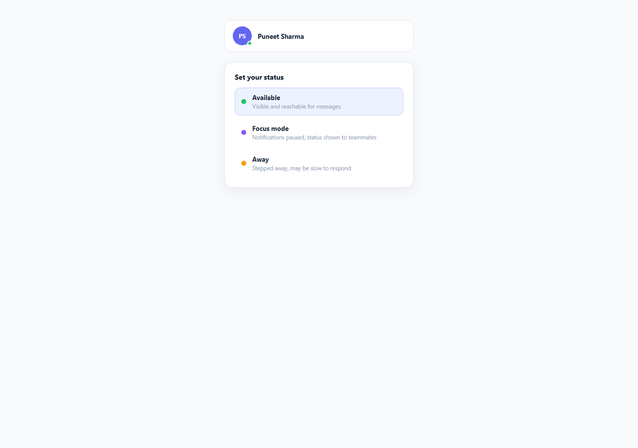
Presence status — Available, Focus mode, Away — has quietly become one of the most-used controls in modern collaboration software. Slack, Discord, Microsoft Teams, and Linear all ship a status picker prominently in their top-level UI, and for good reason: visible status serves two audiences at once. It tells the *user themselves* that they've deliberately entered a protected work state, and it tells *teammates* not to expect an immediate response — without either party needing to send or read an explanatory message. This snippet implements that full pattern: a three-way status picker, a focus-mode duration selector, and a persistent, live-counting badge that reflects the active state anywhere else in the interface.
Why explicit focus status beats silent notification muting
Muting notifications silently (turning off sound with no visible signal) solves half the problem — the user is undisturbed, but teammates have no idea why messages are going unanswered and may escalate through another channel, assume the user is ignoring them, or simply lose trust in the async communication norms of the team. Visible focus status resolves this asymmetry: a small purple dot and "Focus mode active" label next to the user's avatar communicates *why* they're unreachable without the user having to type a single word. This is a specific instance of a broader 2026 "attention design" trend — interfaces increasingly treat a user's attention as a resource worth explicitly protecting and signaling, rather than treating every notification as equally deserving of interruption.
Three status states, one shared component
The .status-options group uses role="radiogroup" with each option as role="radio" and aria-checked, correctly modeling mutually-exclusive selection for assistive technology — only one of Available, Focus mode, or Away can be active at a time, exactly like a native radio button group, even though the markup uses styled <button> elements rather than <input type="radio"> for full visual control. setStatus() is the single function responsible for updating the ARIA state, the color-coded .status-dot (green for available, purple for focus, amber for away), and conditionally revealing the duration picker — keeping presentation and state perfectly in sync from one code path.
Duration selection and the countdown badge
Selecting "Focus mode" doesn't immediately activate anything — it reveals an inline .duration-panel with three duration chips: 30 minutes, 1 hour, or "Until tomorrow" (calculated via msUntilTomorrow9am(), which targets the next day at 9am rather than a fixed offset, matching how most real focus-mode features define an "overnight" duration). Choosing a duration calls startFocus(), which records focusEndsAt as an absolute timestamp (not a countdown value) — a small but important detail, because deriving remaining time as focusEndsAt - Date.now() on every tick keeps the countdown accurate even if the tab is backgrounded and setInterval timing drifts, whereas decrementing a counter every second would drift under exactly those conditions. The countdown renders in two places simultaneously — the compact .focus-badge next to the mock avatar and the fuller .active-focus panel below the status picker — both fed by the same tickCountdown() function, demonstrating how a single piece of state (focusEndsAt) can drive multiple UI surfaces without duplicating logic.
One-click exit, always available
Because focus mode is meant to be a deliberate, temporary state rather than a trap, an "End focus mode" action is available from both the compact badge (a small × button) and the full status card, and selecting a different status (Available or Away) also implicitly ends focus mode via the same endFocus() cleanup path. This reflects a core usability rule for any interruption-blocking feature: exiting must always be at least as easy as entering, or users will distrust the feature and stop using it — the opposite of the intended calm-UI benefit.
Build with AI
Build, Understand, Optimize, and Extend It With AI
Paste this snippet's HTML, CSS, and JS into an AI coding assistant like Claude and ask it to explain why focusEndsAt is stored as an absolute timestamp rather than a countdown integer, and how that choice avoids timer drift — it's a genuinely reusable technique worth understanding before you build any other countdown UI. Good extensions to ask the assistant for: syncing status across a WebSocket presence channel so teammates see the same live countdown, persisting the active focus session to localStorage or a backend so it survives a page reload, and adding a "custom duration" option with a numeric input alongside the three preset chips. You could also ask it to review the radiogroup keyboard handling against the WAI-ARIA Authoring Practices Guide to confirm Home/End key support would be a worthwhile addition.
Prompt to recreate it
Copy this into your AI assistant of choice to build the effect from scratch, or as a jumping-off point for your own variant:
Build a three-state presence/status toggle (Available, Focus mode, Away) in plain HTML, CSS, and JavaScript with a focus-mode duration picker and a live countdown.

Requirements:
- A radiogroup-style status picker with exactly three mutually exclusive options, using correct ARIA semantics (role="radiogroup", role="radio", aria-checked) even though the options are styled buttons rather than native radio inputs, with ArrowUp/ArrowDown keyboard navigation between them.
- Selecting "Focus mode" reveals an inline duration picker with three preset options (e.g. 30 minutes, 1 hour, and an "until tomorrow" option that targets the next day at a fixed morning hour rather than a flat 24-hour offset) before the mode actually activates.
- Once a duration is chosen, show a persistent live countdown in two places at once — a compact badge near a mock user avatar and a fuller status panel — both driven by one shared piece of state so they never disagree, and derive the remaining time each tick from an absolute end timestamp (not a manually decremented counter) so the countdown cannot drift.
- Provide a one-click "End focus mode" action reachable from both the compact badge and the full panel, and also automatically end focus mode if the user switches to a different status option while it's active.
- Color-code the presence dot consistently between the status picker options and the mock avatar indicator.
- Handle the countdown reaching zero by automatically ending focus mode and reverting the status to Available.
Want to tighten it up first? Run this prompt through the AI Prompt Studio to score it across 8 quality dimensions, catch anti-patterns, and tune the wording for Claude, ChatGPT, or Gemini before you paste it in.
Step by step
How to Use
- 1Pick a statusClick Available, Focus mode, or Away in the .status-options radiogroup — setStatus() updates aria-checked on each option and recolors the .status-dot next to the mock avatar to match.
- 2Choose a focus durationSelecting "Focus mode" reveals the .duration-panel with three chips: 30 min, 1 hour, or Until tomorrow. Clicking a chip calls startFocus(mins), which sets focusEndsAt as an absolute timestamp and starts the countdown interval.
- 3Watch the live countdown badgeOnce focus mode is active, the compact .focus-badge next to the avatar and the fuller .active-focus panel both show a live MM:SS countdown, updated every second by tickCountdown() reading Date.now() against the stored focusEndsAt.
- 4End focus mode earlyClick the × on the compact badge or the "End focus mode" button in the active-focus panel — both call endFocus(), which clears the interval, hides both countdown displays, and resets the selected duration chip.
- 5Navigate the status picker by keyboardWith focus inside .status-options, press ArrowUp/ArrowDown to move between the three status buttons, matching standard radiogroup keyboard behavior.
- 6Wire real presence dataReplace setStatus() and startFocus() with calls to your backend presence API (e.g. a WebSocket presence channel), keeping focusEndsAt as the source of truth so the countdown logic continues to work against a server-provided expiry timestamp.
Real-world uses
Common Use Cases
Got questions?
Frequently Asked Questions
Deriving remaining time as focusEndsAt - Date.now() on every tick keeps the countdown accurate regardless of setInterval timing drift, browser tab throttling in background tabs, or the system clock momentarily lagging — all of which can cause a manually decremented counter to drift out of sync with real elapsed time. An absolute end timestamp is also trivially resumable: if the page reloads mid-focus-session, restoring focusEndsAt from storage and re-running tickCountdown() picks up exactly where it left off with no accumulated error.
Replace the local setStatus()/startFocus() state mutations with calls to a backend presence API — typically a WebSocket or Server-Sent Events channel that broadcasts { status, focusEndsAt } to all of a user's connected sessions and to teammates viewing their profile. Keep the client-side countdown logic (deriving remaining time from the timestamp) unchanged; only the source of focusEndsAt changes, from a locally computed value to one pushed from the server.
msUntilTomorrow9am() targets the next day at 9:00 AM local time rather than a flat 24-hour offset, mirroring how most real do-not-disturb "until tomorrow" features work — the intent is "pause until the start of my next work day," not "pause for exactly 24 hours," which would end at an inconvenient time like 11:47 PM. Adjust the target hour to match your product's typical work-day start time.
setStatus() calls endFocus() whenever the newly selected status is not "focus", clearing the countdown interval and hiding both badge displays immediately — so switching status is itself a valid way to end focus mode, in addition to the explicit "End focus mode" button and the inline × on the compact badge. This ensures there is no state where the picker shows a non-focus status while a focus countdown is still silently running.
The three options are marked up as role="radiogroup" containing role="radio" buttons with aria-checked reflecting the current selection, which screen readers announce as a standard mutually-exclusive radio group. ArrowUp and ArrowDown move focus between the three options, matching the expected keyboard behavior for a radiogroup per the WAI-ARIA Authoring Practices Guide, and each option remains a real <button> so Enter and Space activation work natively without extra key handling.