You Might Also Like
Learn Coding Visually
Learn to code with interactive, live-preview playgrounds — HTML, CSS, JavaScript, React & more.
 HTML Playground42 lessons · Click-based · Live preview
 CSS PlaygroundLearn CSS with a live editor
 JavaScript Playground60 lessons · DOM · Async · Canvas
 React PlaygroundLearn React with a live code editor
 GSAP PlaygroundLearn GSAP animation interactively
 SVG Playground44 lessons · shapes · paths · animation
 SCSS Playground45 lessons · Sass modules · tokens
 Tailwind PlaygroundLearn Tailwind CSS with a live editor
 Bootstrap 5 Playground50 lessons · live preview
Text Size Adjuster (A− / A+ Control) — HTML CSS JS Snippet
Text Size Adjuster (A- / A+ Control) · Forms · Plain HTML, CSS & JS · Live preview
What's included
Features
About this UI Snippet
Text Size Adjuster — CSS Custom Property Font Scaling with A−/A+ Controls and localStorage Persistence
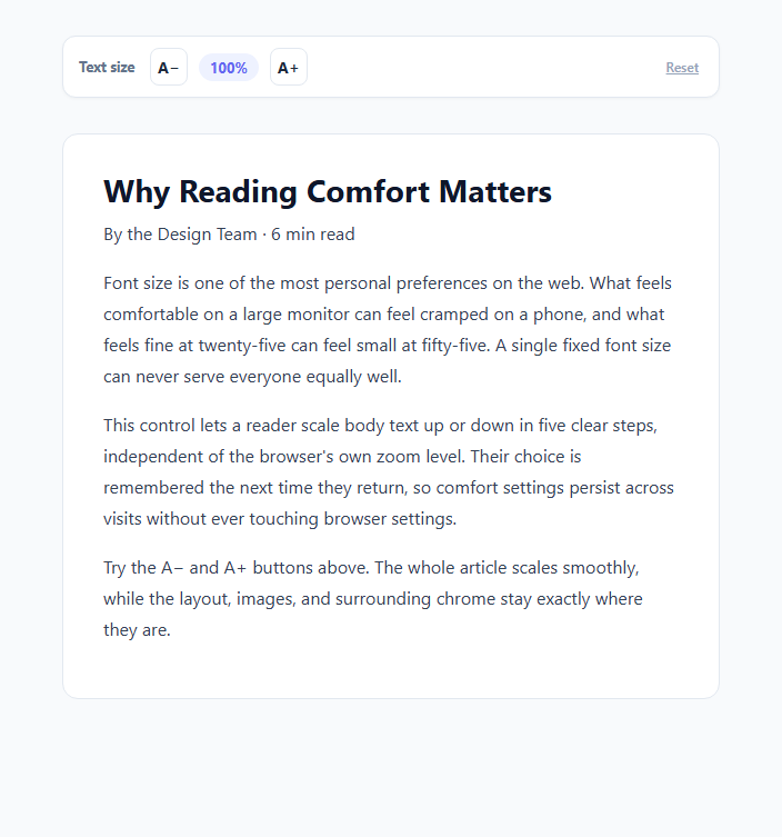
Browsers already give every user a way to zoom a page in and out, so it is fair to ask why a site would build its own font-size control at all. The answer is that browser zoom and an in-page text size adjuster solve different problems. Browser zoom scales the entire viewport — layout chrome, images, buttons, and text all together — and it resets or behaves inconsistently across sessions, devices, and embedded contexts like iframes or in-app browsers where users often cannot reach the browser's zoom controls at all. A dedicated text size adjuster scales only the reading content, remembers the user's preference per site rather than per browser session, and works identically whether the page is opened standalone or embedded inside another app's webview.
How the scaling actually works: a CSS custom property multiplied through calc()
Every scalable font size in this snippet is expressed as a fixed rem value multiplied by a single CSS custom property: font-size: calc(1rem * var(--user-font-scale)). The custom property is declared once on :root with a default of 1 (100%), and every heading, byline, and paragraph in the sample article references it through its own calc() expression. This means resizing text is a single JavaScript operation — root.style.setProperty('--user-font-scale', scale) — that cascades instantly to every element referencing the variable, rather than requiring the script to walk the DOM and rewrite dozens of individual font-size declarations. A transition: font-size 0.2s ease on each scalable element makes the change animate smoothly rather than snapping instantly, which reduces the jarring effect of a sudden layout shift.
Five clamped steps, not a free-form range
Rather than a continuous slider that could produce awkward in-between values, the control offers five fixed steps — 87.5%, 100%, 112.5%, 125%, 137.5%, and 150% — stored as an array and referenced by index. This mirrors how most production-grade accessible text scalers work: continuous scaling invites line-height and spacing to fall out of visual rhythm at odd percentages, while discrete steps can each be verified to look correct at design time. The A− and A+ buttons decrement and increment the step index, and both buttons disable themselves automatically (btnDecrease.disabled = stepIndex === 0) at the extremes so users get clear, unambiguous feedback that they have reached the minimum or maximum size rather than clicking into a dead zone.
Why persistence to localStorage matters more than it seems
Without persistence, a user who prefers larger text has to re-apply their preference on every single page load, which is a real and recurring cognitive tax for anyone with low vision, presbyopia, or simply a preference for a more comfortable reading size. This snippet writes the current step index to localStorage under the key text-size-scale on every change and reads it back on load via loadScale(), so the very first paint after a return visit already reflects the saved preference — no flash of default-size text that then jumps to the preferred size. Because the value is a small integer index rather than a raw pixel value, it stays valid even if the step array is later extended, and it is trivial to migrate or reset by clearing a single localStorage key.
Why this matters for 2026 accessibility-first design
Calm, accessibility-first design in 2026 treats reading comfort as a per-user, per-site setting rather than a one-size-fits-all default baked into the design system. A text size adjuster gives readers direct, visible control over one of the most consequential variables in reading comfort without requiring them to dig into browser or OS accessibility settings most people never discover. Building it on a single CSS custom property keeps the implementation both trivially simple to maintain and instantly extensible — adding a sixth step, changing the default, or wiring the same variable into a mobile app's WebView all require touching only the STEPS array and the property name, not dozens of scattered font-size rules.
Build with AI
Build, Understand, Optimize, and Extend It With AI
Paste this snippet's HTML, CSS, and JS into an AI coding assistant like Claude and ask it to walk through exactly how a single --user-font-scale custom property cascades through every calc() expression in the CSS to keep the heading, byline, and paragraphs scaling in sync from one setProperty() call. It's also a good exercise to ask the assistant to extend the pattern — for example, adding a "remember per-device" fallback using matchMedia('(prefers-reduced-motion)') to skip the transition for users who want instant size changes, or wiring the same custom property into a second content block so two independent reading areas can share one control. You could also ask it to compare this approach against relying purely on rem units and browser zoom, and to explain concretely when each is the better tool for a given product surface.
Prompt to recreate it
Copy this into your AI assistant of choice to build the effect from scratch, or as a jumping-off point for your own variant:
Build an A−/A+ text size control in plain HTML, CSS, and JavaScript that scales a block of sample article content independently of the browser's own zoom.

Requirements:
- Express every scalable font-size in the sample content as a fixed rem value multiplied through calc() by a single CSS custom property (for example --user-font-scale), declared once with a default value of 1 on a shared ancestor.
- Provide exactly five discrete steps (for example 87.5%, 100%, 112.5%, 125%, 137.5%, 150%) referenced by an array and an index, rather than a continuous range input, and update the custom property with a single JavaScript call whenever the step changes.
- An A− button decrements the step and an A+ button increments it; both must automatically disable themselves when the step index reaches the minimum or maximum so users get clear feedback instead of a dead click.
- Display the current size as a readable percentage next to the buttons, and mark it aria-live="polite" so screen reader users hear the new value announced after each change.
- Persist the chosen step index to localStorage on every change, and read it back on page load before the first paint completes so returning users see their preferred size immediately rather than a flash of the default size.
- Animate font-size changes with a short CSS transition so resizing feels smooth rather than an instant jump-cut.
- Include a reset control that returns the size to the default 100% step in one action.
Want to tighten it up first? Run this prompt through the AI Prompt Studio to score it across 8 quality dimensions, catch anti-patterns, and tune the wording for Claude, ChatGPT, or Gemini before you paste it in.
Step by step
How to Use
- 1Increase or decrease the text sizeClick A+ to step up through 112.5%, 125%, 137.5%, and 150%, or A− to step down to 87.5%. The sample article's heading, byline, and paragraphs all scale together smoothly, and the percentage readout in the pill between the buttons updates immediately.
- 2Notice the buttons disable at the limitsAt 150% the A+ button becomes disabled and greyed out; at 87.5% the A− button does the same. This is driven by btnIncrease.disabled = stepIndex === STEPS.length - 1 in the JS panel, giving clear feedback instead of letting users click into a size that does not exist.
- 3Reload the preview to confirm persistencePick a non-default size, then reload the demo (or revisit the page). loadScale() reads the saved step index from localStorage under the key text-size-scale and calls applyScale() immediately, so the article renders at your chosen size on the very first paint.
- 4Inspect the CSS custom property in DevToolsOpen DevTools and watch the --user-font-scale value on the <html> element change as you click A+/A−. Every calc(1rem * var(--user-font-scale)) rule in the CSS panel recalculates automatically the instant the property updates — no JavaScript has to touch individual elements.
- 5Adjust the step values or add more stepsEdit the STEPS array in the JS panel — for example, add 1.625 for a 162.5% step, or change the minimum from 0.875 to 0.75 for a denser option. Each value is a raw multiplier applied through the CSS custom property, so no other code needs to change.
- 6Export and scope it to a specific content areaClick HTML or JSX to export. In your app, set the --user-font-scale property on a wrapper around your article or reading content specifically (rather than the whole <html>) if you want navigation, buttons, and other UI chrome to stay a fixed size while only prose scales.
Real-world uses
Common Use Cases
Got questions?
Frequently Asked Questions
Browser zoom scales the whole page uniformly — navigation, buttons, and images included — which can break carefully tuned layouts at extreme zoom levels, and its setting typically resets per session or per device rather than persisting per site. A dedicated control scales only the content you choose, remembers the preference in localStorage specifically for your site, and keeps working inside embedded webviews (in-app browsers, newsletter clients) where users often cannot access native browser zoom at all.
A single custom property lets the CSS cascade do the work: every rule written as calc(1rem * var(--user-font-scale)) recalculates automatically the moment the property changes on a shared ancestor, so one setProperty() call updates the heading, byline, and every paragraph simultaneously. Setting font-size directly on each element in JavaScript would require walking the DOM, tracking every scalable node, and re-running that logic on every size change — more code, more places to introduce bugs, and no automatic cascade to newly added elements.
Discrete steps let you design-verify each resulting size looks correct — line-height, letter-spacing, and vertical rhythm can all be checked at 87.5%, 100%, 112.5%, 125%, 137.5%, and 150% specifically. A continuous slider can land on awkward in-between percentages that were never visually reviewed and may look slightly off, and discrete buttons are also easier to operate precisely via keyboard or switch-access devices than dragging a slider thumb.
No, by design — the --user-font-scale property in this snippet is only referenced by the sample article's heading, byline, and paragraph font-size rules. Non-text chrome such as buttons, the size-control bar itself, and layout containers use fixed sizes, so scaling reading text up or down does not reflow or resize the surrounding interface. In your own app, scope the property to a wrapper around your reading content specifically to preserve the same isolation.
This demo calls loadScale() at the bottom of the JS panel, which runs as soon as the script executes and sets the CSS custom property before the user perceives the page. For a production site with server-rendered HTML, you can go further by inlining a small blocking script in the document head that reads localStorage and sets the custom property on the root element before the main stylesheet paints, exactly the same technique used to avoid flash-of-wrong-theme in dark mode implementations.