You Might Also Like
Learn Coding Visually
Learn to code with interactive, live-preview playgrounds — HTML, CSS, JavaScript, React & more.
 HTML Playground42 lessons · Click-based · Live preview
 CSS PlaygroundLearn CSS with a live editor
 JavaScript Playground60 lessons · DOM · Async · Canvas
 React PlaygroundLearn React with a live code editor
 GSAP PlaygroundLearn GSAP animation interactively
 SVG Playground44 lessons · shapes · paths · animation
 SCSS Playground45 lessons · Sass modules · tokens
 Tailwind PlaygroundLearn Tailwind CSS with a live editor
 Bootstrap 5 Playground50 lessons · live preview
Sort Dropdown — Free HTML CSS JS Custom Sort By Menu Snippet
Sort Dropdown · Forms · Plain HTML, CSS & JS · Live preview
What's included
Features
About this UI Snippet
Sort Dropdown — HTML, CSS & JavaScript Custom Sort Menu
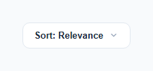
A native <select> is accessible and simple, but it can't be styled beyond its trigger — the dropdown list itself renders using the operating system's own styles, which breaks visual consistency on a polished product page. This snippet replaces it with a fully custom "Sort by" dropdown: a styled trigger button and an absolutely-positioned menu of radio-style options, each showing a checkmark next to the currently active choice.
How the open/close state works
The trigger button toggles an .open class on the .sort-menu and mirrors that state in aria-expanded on the button itself. The menu is always present in the DOM (not conditionally rendered) but hidden via opacity: 0, a slight translateY(-6px) offset, and pointer-events: none when closed — this lets the open/close transition animate smoothly, since a menu that's actually removed from the DOM (display: none) can't transition.
How the active option and checkmark stay in sync
Each <li> carries role="option" and aria-selected. Clicking an option calls selectSort(item), which first resets every option's aria-selected to "false" and clears its checkmark span, then sets the clicked item's aria-selected to "true" and fills in its checkmark character. The trigger's own label text is updated from item.dataset.value, so the visible button always reflects the true selected state stored on the DOM.
How click-outside and Escape-to-close work
A single click listener on document checks whether the click target is inside .sort-wrap using e.target.closest('.sort-wrap'). If not, the menu closes — this is the standard way to implement "click anywhere else closes the dropdown" without attaching a listener to every possible outside element. A parallel keydown listener closes the menu on Escape, which is expected behavior for any custom popup menu and is not something a native <select> needs since the browser already handles it.
Why not just use `<select>`
The native element remains the more accessible *default* choice for simple use cases. This custom version is for when a design system needs the dropdown menu itself — its spacing, checkmarks, hover states, and animation — to be fully brand-consistent, at the cost of reimplementing keyboard and outside-click handling yourself.
Build with AI
Build, Understand, Optimize, and Extend It With AI
Give this snippet to an AI assistant and ask it to explain why the menu is hidden with opacity/transform/pointer-events rather than display:none, and what breaks about the open/close animation if you swap to display:none. It's also a good prompt for adding full keyboard arrow-key navigation between options (moving a highlighted state up/down with ArrowUp/ArrowDown and selecting with Enter) to bring this closer to full native <select> keyboard parity, since the current version only supports mouse/touch selection plus Escape-to-close.
Prompt to recreate it
Copy this into your AI assistant of choice to build the effect from scratch, or as a jumping-off point for your own variant:
Build a custom "Sort by" dropdown in plain HTML, CSS, and vanilla JavaScript that replaces a native <select> element with fully custom-styled markup — no framework, no library.

Requirements:
- A trigger button showing the current sort label and a chevron icon that rotates when the menu is open, with aria-haspopup and aria-expanded attributes reflecting the open state.
- A menu of options (role="listbox" on the container, role="option" and aria-selected on each item) styled as a floating card below the trigger, hidden when closed using opacity, a small transform offset, and pointer-events:none (not display:none), so opening and closing can animate smoothly.
- Exactly one option must be selected at a time. Clicking an option must move a checkmark indicator to that option, clear it from all others, update aria-selected on all options accordingly, and update the trigger's visible label text to match the selected option.
- The menu must close when the user clicks anywhere outside the dropdown's wrapping element, implemented with a single document-level click listener using Element.closest(), not one listener per possible outside target.
- The menu must also close when the user presses the Escape key while it is open.
Want to tighten it up first? Run this prompt through the AI Prompt Studio to score it across 8 quality dimensions, catch anti-patterns, and tune the wording for Claude, ChatGPT, or Gemini before you paste it in.
Step by step
How to Use
- 1Load the snippetClick "Sort Dropdown" in the sidebar Library tab to load the custom sort menu.
- 2Open and selectClick the trigger in the preview, then click a sort option — notice the checkmark moves and the trigger label updates.
- 3Test click-outside and EscapeOpen the menu, then click elsewhere on the page or press Escape to confirm it closes both ways.
- 4Add or rename optionsAdd a new <li role="option"> with a data-value attribute in the HTML panel — selectSort works for any number of options automatically.
- 5Wire to real sorting logicInside selectSort, add a call to your actual list-sorting function using item.dataset.value to know which sort order was chosen.
- 6Export and saveExport as HTML/JSX/Tailwind or click "Save as" to reuse this component in your product listing UI.
Real-world uses
Common Use Cases
Got questions?
Frequently Asked Questions
A native select cannot be styled beyond its closed trigger — the open option list uses the operating system's own rendering. A custom dropdown gives full control over spacing, hover states, checkmarks, and animation to match a design system exactly.
selectSort first clears the checkmark text and aria-selected on every option, then sets aria-selected to true and writes a checkmark character into only the clicked option's check span.
A single click listener on the whole document checks whether the click target is inside the .sort-wrap container using e.target.closest('.sort-wrap'). If the click landed outside that container, the menu's open class is removed.
Keeping the element in the DOM and toggling opacity/transform lets the open and close transitions animate smoothly. An element removed from the DOM (or set to display:none) cannot transition, so it would just appear and disappear instantly.
The trigger has aria-haspopup and aria-expanded, the menu has role="listbox", and each option has role="option" and aria-selected, which mirrors native select semantics closely enough for most screen readers to announce state changes correctly. Escape closes the menu as expected.
Add a new <li role="option" aria-selected="false" data-value="Your Label"> with a .check span inside the sort-menu <ul>. selectSort works for any number of options without changes.
Add your own function call inside selectSort, using item.dataset.value to identify which sort order was picked, and call it after updating the label — e.g. applySortOrder(item.dataset.value).