You Might Also Like
Learn Coding Visually
Learn to code with interactive, live-preview playgrounds — HTML, CSS, JavaScript, React & more.
 HTML Playground42 lessons · Click-based · Live preview
 CSS PlaygroundLearn CSS with a live editor
 JavaScript Playground60 lessons · DOM · Async · Canvas
 React PlaygroundLearn React with a live code editor
 GSAP PlaygroundLearn GSAP animation interactively
 SVG Playground44 lessons · shapes · paths · animation
 SCSS Playground45 lessons · Sass modules · tokens
 Tailwind PlaygroundLearn Tailwind CSS with a live editor
 Bootstrap 5 Playground50 lessons · live preview
Price Range Slider — Free HTML CSS JS Dual Handle Range Slider Snippet
Price Range Slider · Forms · Plain HTML, CSS & JS · Live preview
What's included
Features
About this UI Snippet
Price Range Slider — HTML, CSS & JavaScript Dual-Thumb Range Filter
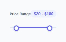
Filtering products by a min/max price range is a staple of e-commerce filter sidebars. Building it usually means reaching for a slider plugin — but a convincing dual-handle range slider can be built with two overlapping native `<input type="range">` elements and a small amount of JavaScript to keep them from crossing.
How two range inputs simulate one dual-handle slider
Both #minRange and #maxRange are absolutely positioned on top of each other, spanning the same track. Each is styled with a transparent background and pointer-events: none on the input track itself, but the ::-webkit-slider-thumb/::-moz-range-thumb pseudo-elements get pointer-events: auto. This means clicking anywhere on the invisible track does nothing, but clicking and dragging either visible circular thumb works normally — the two inputs never fight over the same click because only their thumbs are interactive, and the thumbs sit at different positions.
How the colored fill bar is calculated
A separate .range-fill div (not part of either input) is positioned absolutely between the two thumbs. updateSlider() converts both values to percentages of the slider's max ((value / MAX) * 100) and sets the fill's left to the min percentage and width to the difference between max and min percentages. This is recalculated on every input event from either slider, so the fill visually tracks both thumbs in real time.
How the handles are prevented from crossing
Nothing stops a native range input from having its value larger than a sibling's on its own — the two inputs know nothing about each other. updateSlider checks whether maxVal - minVal has dropped below a minimum GAP, and if so, it forces the *other* slider's value back to maintain that gap, using this (the slider that just fired the event) to determine which one to leave alone and which one to push. This keeps a small buffer between the handles so they never visually overlap or invert.
Why two separate inputs instead of a single custom-built slider
Reusing native <input type="range"> elements means keyboard support (arrow keys, Page Up/Down, Home/End), touch dragging, and screen reader value announcements all come for free from the browser — a fully custom-built slider would need to reimplement all of that manually.
Build with AI
Build, Understand, Optimize, and Extend It With AI
Ask an AI assistant to walk through exactly why pointer-events: none on the range input itself combined with pointer-events: auto on just its thumb pseudo-element is what makes two overlapping sliders usable instead of one permanently blocking clicks to the other. It's also worth asking the assistant to add a debounced onChange callback (versus the live oninput updates) for scenarios where you only want to trigger an actual product filter API call once the user releases the handle, to avoid firing a network request on every pixel of drag.
Prompt to recreate it
Copy this into your AI assistant of choice to build the effect from scratch, or as a jumping-off point for your own variant:
Build a "price range slider" with two draggable handles in plain HTML, CSS, and vanilla JavaScript, using two native <input type="range"> elements — no slider plugin or library.

Requirements:
- Two range inputs sharing the same min/max bounds, absolutely positioned directly on top of each other over a single visual track, where only the circular thumb of each input is clickable/draggable (the invisible track itself must not intercept clicks meant for the other slider).
- A separate fill bar element, positioned independently of the inputs, whose left offset and width are recalculated on every input event to visually span exactly between the two current handle positions, expressed as percentages of the slider's range.
- Logic that prevents the two handles from crossing: if a drag would bring the max value within a small configurable gap of the min value (or vice versa), the other handle must be pushed just enough to maintain that minimum gap rather than allowing an inverted or overlapping range.
- A live text label showing the current selected range formatted as a price string (e.g. "$20 - $180") that updates on every drag frame, not just on release.
- The sliders must retain full native keyboard operability (arrow keys, Home/End) and visible focus indicators on the thumbs.
Want to tighten it up first? Run this prompt through the AI Prompt Studio to score it across 8 quality dimensions, catch anti-patterns, and tune the wording for Claude, ChatGPT, or Gemini before you paste it in.
Step by step
How to Use
- 1Load the snippetClick "Price Range Slider" in the sidebar Library tab to load the dual-handle slider.
- 2Drag both handlesDrag the left and right thumbs in the preview and watch the fill bar and "$X - $Y" label update live.
- 3Test the minimum gapTry dragging one handle into the other — notice it stops before crossing, maintaining a small gap.
- 4Change the price rangeUpdate the min/max attributes on both range inputs and the MAX constant in JS to match your real price bounds.
- 5Adjust the minimum gapChange the GAP constant in the JS panel to allow the handles to get closer or further apart.
- 6Export and saveExport as HTML/JSX/Tailwind or click "Save as" to reuse this filter in a real product listing page.
Real-world uses
Common Use Cases
Got questions?
Frequently Asked Questions
Both inputs are absolutely positioned on top of the same track with transparent backgrounds. Only their thumb pseudo-elements have pointer-events enabled, so users can drag either thumb independently while the invisible track underneath ignores clicks.
The updateSlider function checks the gap between the current min and max values after every input event. If the gap falls below a configured minimum, it pushes the slider that did not just move back to restore that minimum gap, preventing the handles from passing through each other.
Both slider values are converted to percentages of the maximum range value. The fill's left offset is set to the minimum percentage and its width is set to the difference between the max and min percentages, so it always spans exactly between the two visible thumbs.
Native range inputs come with built-in keyboard support, touch dragging, and screen reader value announcements for free. A fully custom slider built from plain divs would need to reimplement all of that accessibility and interaction behavior manually.
Update the min and max attributes on both #minRange and #maxRange inputs in the HTML, and update the matching MAX constant in the JavaScript panel so the fill-bar percentage math stays correct.
Yes — change the string concatenation in updateSlider's valueDisplay.textContent line to use your currency symbol or a proper Intl.NumberFormat currency formatter.
Yes — native range inputs have built-in touch drag support in all modern mobile browsers, so the thumbs can be dragged with a finger exactly as they are with a mouse.