Learn Coding Visually
Learn to code with interactive, live-preview playgrounds — HTML, CSS, JavaScript, React & more.
 HTML Playground42 lessons · Click-based · Live preview
 CSS PlaygroundLearn CSS with a live editor
 JavaScript Playground60 lessons · DOM · Async · Canvas
 React PlaygroundLearn React with a live code editor
 GSAP PlaygroundLearn GSAP animation interactively
 SVG Playground44 lessons · shapes · paths · animation
 SCSS Playground45 lessons · Sass modules · tokens
 Tailwind PlaygroundLearn Tailwind CSS with a live editor
 Bootstrap 5 Playground50 lessons · live preview
Variant Swatch Picker — Free HTML CSS JS Color & Size Selector Snippet
Variant Swatch Picker · Forms · Plain HTML, CSS & JS · Live preview
What's included
Features
About this UI Snippet
Variant Swatch Picker — HTML, CSS & JavaScript Product Variant Selector
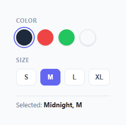
Almost every product with color or size options needs a variant picker, and the standard pattern is two independent single-select groups: circular color swatches and pill-shaped size buttons, each behaving as its own radio group. This snippet builds both, keyed off two plain JavaScript variables, with a live summary label showing the current combination.
How each group behaves like a radio group without radio inputs
Rather than native <input type="radio"> elements (which are harder to style into custom shapes like circular swatches), each swatch and size pill is a plain <button> with role="radio" and aria-checked. selectSwatch(btn) and selectSize(btn) each reset every button in their own group to aria-checked="false", then set the clicked button to "true" — the same "clear all, then set one" pattern used for tabs and filter chips elsewhere in this library, just applied per-group. The two groups are entirely independent — clicking a size never touches the color swatches and vice versa, since each function only ever queries its own .swatch or .size-pill class.
How the active swatch is highlighted
Rather than a checkmark icon (which would need to render legibly against any swatch color, including near-white ones), the active swatch gets a colored outline with outline-offset, forming a visible ring *around* the swatch rather than altering its fill. This works cleanly against every swatch color, including the light "Cloud" swatch, without needing per-color contrast logic.
How the live selection label works
Two module-level variables, selectedColor and selectedSize, hold the current choice from each group. Every time either selectSwatch or selectSize runs, it updates its own variable and calls a shared updateSelectionText() function, which writes both current values into the <strong id="selectionText"> element. Keeping the two variables outside any single click handler is what lets both groups update the same shared label independently, without needing to read the DOM back to reconstruct the current state.
Extending toward a real product page
In production, you'd typically use the selectedColor/selectedSize combination to look up a specific SKU's price, image, and stock status — for instance, swapping the product's main photo when a different color swatch is clicked, or disabling out-of-stock size pills for the currently selected color.
Build with AI
Build, Understand, Optimize, and Extend It With AI
Ask an AI assistant to explain why an outline ring around the swatch, rather than a checkmark drawn on top of it, is the more robust way to indicate the active color selection across an unpredictable range of swatch colors including near-white ones. It's also a good prompt for extending the picker to disable out-of-stock size options based on the currently selected color, or for swapping the product's main image automatically whenever a different color swatch is chosen, both common real-world requirements for a variant picker.
Prompt to recreate it
Copy this into your AI assistant of choice to build the effect from scratch, or as a jumping-off point for your own variant:
Build a "variant swatch picker" in plain HTML, CSS, and vanilla JavaScript for a product page, with two independent single-select option groups — no native radio inputs, no framework.

Requirements:
- A color group of circular swatch buttons, each with role="radio", aria-checked, a descriptive aria-label, and its own distinct background color, where exactly one is selected at a time and the active one is indicated with an outline ring drawn outside the swatch rather than any change to its fill color (so it remains clearly visible even against a near-white swatch).
- A size group of pill-shaped buttons (S, M, L, XL) using the identical role="radio"/aria-checked single-select pattern, completely independent from the color group's state.
- Two separate variables tracking the currently selected color and size, updated by two separate functions (one per group), with a shared function that writes both current values into a single live "Selected: X, Y" text label whenever either group's selection changes.
- Adding a new color swatch or size pill must require no JavaScript changes — only new markup with the correct attributes.
- All buttons must remain fully operable via mouse click and keyboard, with clear visual hover and active states.
Want to tighten it up first? Run this prompt through the AI Prompt Studio to score it across 8 quality dimensions, catch anti-patterns, and tune the wording for Claude, ChatGPT, or Gemini before you paste it in.
Step by step
How to Use
- 1Load the snippetClick "Variant Swatch Picker" in the sidebar Library tab to load the color and size selectors.
- 2Click swatches and sizesClick different colors and sizes in the preview and watch the "Selected: X, Y" label update live.
- 3Add more colorsAdd a new .swatch button with its own background color and data-value in the HTML panel — selectSwatch handles any number automatically.
- 4Add more sizesAdd a new .size-pill button with a data-value in the sizes group; no JS changes needed.
- 5Wire to real product dataInside selectSwatch/selectSize, add a lookup against your product variants to update price, image, or stock state.
- 6Export and saveExport as HTML/JSX/Tailwind or click "Save as" to reuse this picker on a real product detail page.
Real-world uses
Common Use Cases
Got questions?
Frequently Asked Questions
Native radio inputs are difficult to style into custom shapes like solid-color circular swatches while keeping consistent cross-browser appearance. Using button elements with role="radio" and aria-checked recreates the same accessible single-selection semantics while allowing full custom styling.
Instead of relying on the swatch's own fill color to indicate selection, the active swatch gets a colored outline drawn outside its edge with outline-offset. This ring is visible regardless of how light or dark the underlying swatch color is.
selectSwatch and selectSize each only query their own class (.swatch or .size-pill) when resetting and setting aria-checked, so clicking in one group never affects the state of the other group.
Two variables, selectedColor and selectedSize, are declared outside either click handler and updated independently by their respective functions. A shared updateSelectionText function reads both variables whenever either one changes and writes the combined string into the label.
Add a new button with class="swatch", a background color via inline style or a CSS class, a data-value attribute, and the standard role/aria-checked/aria-label attributes, inside the .swatches container.
Yes — inside selectSwatch, after updating selectedColor, look up which sizes are unavailable for that color in your product data and toggle a disabled attribute (plus a visually muted class) on the corresponding .size-pill buttons.
Yes — each option group uses role="radiogroup" on its container and role="radio" with aria-checked on each button, which is the standard ARIA pattern for a custom single-select control, and every swatch has a descriptive aria-label naming its color.