Source Code
<div class="ocw-card" id="ocwCard">
  <button type="button" class="ocw-head" id="ocwToggle">
    <div class="ocw-ring-wrap">
      <svg class="ocw-ring" width="36" height="36" viewBox="0 0 36 36">
        <circle cx="18" cy="18" r="15" fill="none" stroke="#e2e8f0" stroke-width="3.5"/>
        <circle cx="18" cy="18" r="15" fill="none" stroke="#22c55e" stroke-width="3.5" stroke-linecap="round" id="ocwRingFill" stroke-dasharray="94.2" stroke-dashoffset="94.2" transform="rotate(-90 18 18)"/>
      </svg>
      <span class="ocw-ring-pct" id="ocwPct">0%</span>
    </div>
    <div class="ocw-head-text">
      <h3>Getting started</h3>
      <p id="ocwSub">0 of 4 complete</p>
    </div>
    <svg class="ocw-chevron" id="ocwChevron" width="16" height="16" viewBox="0 0 24 24" fill="none" stroke="currentColor" stroke-width="2.4" stroke-linecap="round" stroke-linejoin="round"><polyline points="6 9 12 15 18 9"/></svg>
  </button>

  <div class="ocw-body" id="ocwBody">
    <div class="ocw-task" data-task="profile">
      <button type="button" class="ocw-check" aria-label="Mark complete"></button>
      <div class="ocw-task-text">
        <strong>Complete your profile</strong>
        <span>Add a photo and a short bio</span>
      </div>
    </div>
    <div class="ocw-task" data-task="invite">
      <button type="button" class="ocw-check" aria-label="Mark complete"></button>
      <div class="ocw-task-text">
        <strong>Invite a teammate</strong>
        <span>Collaboration is better together</span>
      </div>
    </div>
    <div class="ocw-task" data-task="connect">
      <button type="button" class="ocw-check" aria-label="Mark complete"></button>
      <div class="ocw-task-text">
        <strong>Connect an integration</strong>
        <span>Sync your calendar or storage</span>
      </div>
    </div>
    <div class="ocw-task" data-task="first">
      <button type="button" class="ocw-check" aria-label="Mark complete"></button>
      <div class="ocw-task-text">
        <strong>Create your first project</strong>
        <span>Takes less than a minute</span>
      </div>
    </div>
  </div>

  <div class="ocw-done" id="ocwDone" hidden>
    <span>🎉 All set! You've completed onboarding.</span>
    <button type="button" id="ocwDismiss">Dismiss</button>
  </div>
</div>*{box-sizing:border-box;margin:0;padding:0}
body{font-family:system-ui,-apple-system,sans-serif;background:#f1f5f9;min-height:100vh;display:flex;align-items:center;justify-content:center;padding:24px}
.ocw-card{background:#fff;border-radius:16px;width:100%;max-width:360px;box-shadow:0 18px 44px rgba(15,23,42,.12);overflow:hidden}
.ocw-head{width:100%;border:none;background:#fff;display:flex;align-items:center;gap:13px;padding:16px;cursor:pointer;text-align:left}
.ocw-ring-wrap{position:relative;width:36px;height:36px;flex-shrink:0}
.ocw-ring{transform:scaleX(-1)}
#ocwRingFill{transition:stroke-dashoffset .5s cubic-bezier(.4,0,.2,1)}
.ocw-ring-pct{position:absolute;inset:0;display:flex;align-items:center;justify-content:center;font-size:8.5px;font-weight:800;color:#0f172a}
.ocw-head-text{flex:1}
.ocw-head-text h3{font-size:14.5px;font-weight:800;color:#0f172a}
.ocw-head-text p{font-size:11.5px;color:#94a3b8;margin-top:1px}
.ocw-chevron{color:#94a3b8;flex-shrink:0;transition:transform .2s}
.ocw-card.collapsed .ocw-chevron{transform:rotate(-90deg)}
.ocw-body{padding:0 14px 14px;display:flex;flex-direction:column;gap:4px;
max-height:600px;overflow:hidden;transition:opacity .2s;opacity:1}
.ocw-card.collapsed .ocw-body{max-height:0;opacity:0;padding-top:0;padding-bottom:0}
.ocw-task{display:flex;align-items:flex-start;gap:11px;padding:9px;border-radius:10px;transition:background .15s}
.ocw-task:hover{background:#f8fafc}
.ocw-task.complete .ocw-task-text strong,.ocw-task.complete .ocw-task-text span{color:#94a3b8;text-decoration:line-through}
.ocw-check{width:21px;height:21px;border-radius:50%;border:2px solid #cbd5e1;background:#fff;cursor:pointer;flex-shrink:0;margin-top:1px;position:relative;transition:background .15s,border-color .15s}
.ocw-check::after{content:'';position:absolute;inset:0;background:url("data:image/svg+xml,%3Csvg xmlns='http://www.w3.org/2000/svg' viewBox='0 0 24 24' fill='none' stroke='white' stroke-width='3' stroke-linecap='round' stroke-linejoin='round'%3E%3Cpolyline points='20 6 9 17 4 12'/%3E%3C/svg%3E") center/12px no-repeat;opacity:0;transition:opacity .15s}
.ocw-task.complete .ocw-check{background:#22c55e;border-color:#22c55e}
.ocw-task.complete .ocw-check::after{opacity:1}
.ocw-task-text{display:flex;flex-direction:column;gap:1px}
.ocw-task-text strong{font-size:13px;font-weight:700;color:#1e293b}
.ocw-task-text span{font-size:11.5px;color:#94a3b8}
.ocw-done{display:flex;align-items:center;justify-content:space-between;gap:10px;background:#ecfdf5;border-top:1px solid #d1fae5;padding:12px 16px;font-size:12.5px;font-weight:700;color:#047857}
.ocw-done[hidden]{display:none}
.ocw-done button{background:transparent;border:1px solid #a7f3d0;color:#047857;border-radius:7px;padding:5px 11px;font-size:11.5px;font-weight:700;cursor:pointer;flex-shrink:0}
.ocw-done button:hover{background:#d1fae5}var tasks = document.querySelectorAll('.ocw-task');
var total = tasks.length;
var RING_CIRC = 94.2;
function updateProgress() {
var done = document.querySelectorAll('.ocw-task.complete').length;
var pct = Math.round((done / total) * 100);
document.getElementById('ocwPct').textContent = pct + '%';
document.getElementById('ocwSub').textContent = done + ' of ' + total + ' complete';
document.getElementById('ocwRingFill').style.strokeDashoffset = RING_CIRC - (RING_CIRC * pct / 100);
if (done === total) {
document.getElementById('ocwBody').style.display = 'none';
document.getElementById('ocwDone').hidden = false;
}
}
tasks.forEach(function (task) {
task.querySelector('.ocw-check').addEventListener('click', function () {
task.classList.toggle('complete');
updateProgress();
});
});
document.getElementById('ocwToggle').addEventListener('click', function () {
document.getElementById('ocwCard').classList.toggle('collapsed');
});
document.getElementById('ocwDismiss').addEventListener('click', function () {
document.getElementById('ocwCard').style.display = 'none';
});Learn Coding Visually
Learn to code with interactive, live-preview playgrounds — HTML, CSS, JavaScript, React & more.
 HTML Playground42 lessons · Click-based · Live preview
 CSS PlaygroundLearn CSS with a live editor
 JavaScript Playground60 lessons · DOM · Async · Canvas
 React PlaygroundLearn React with a live code editor
 GSAP PlaygroundLearn GSAP animation interactively
 SVG Playground44 lessons · shapes · paths · animation
 SCSS Playground45 lessons · Sass modules · tokens
 Tailwind PlaygroundLearn Tailwind CSS with a live editor
 Bootstrap 5 Playground50 lessons · live preview
Onboarding Checklist Widget — Getting Started Card
Onboarding Checklist Widget · Cards · Plain HTML, CSS & JS · Live preview
What's included
Features
About this UI Snippet
Onboarding Checklist Widget — Progress Ring, Collapsible Body & Completion State
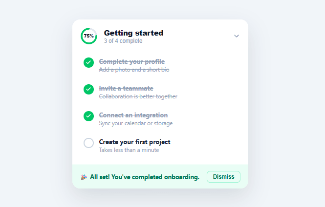
New users abandon software in the first session more than at any other point, and a checklist is the single most effective antidote: it turns "figure out what this app does" into a short, visible list of concrete wins. This snippet builds the dashboard-corner "Getting started" widget pattern seen in Notion, Linear, and Slack — a circular progress ring, a collapsible task list with strikethrough completion, and a celebratory finish state.
A real SVG progress ring, not a fake border
The ring is two stacked SVG <circle> elements: a static gray track and a colored fill circle whose stroke-dasharray is fixed to the circle's circumference (94.2, for radius 15) and whose stroke-dashoffset is set to that same value minus the completed percentage — exactly the technique used by every animated SVG progress ring on the web. The ring is rotated -90° so the fill starts at 12 o'clock instead of 3, and mirrored with scaleX(-1) so it fills clockwise (an SVG circle's natural stroke direction is counter-clockwise from the rotated start point, so the flip corrects it to feel intuitive).
Click-to-complete, click-to-undo
Each task has its own round checkbox button; clicking it toggles a .complete class on the task row, which simultaneously: turns the checkbox green with a checkmark icon (an inline SVG embedded as a CSS background-image data URI, so no extra DOM element is needed for the check glyph), and strikes through the task's title and description text. Clicking a completed task's checkbox again un-completes it — onboarding checklists should never punish an accidental click with no way back.
Collapsible without animating height
Collapsing the widget toggles a .collapsed class on the card, which sets the body's max-height to 0 and fades its opacity to 0, while the head's chevron rotates -90° to point sideways. Using a generous max-height (600px) that's never actually reached by the content, rather than animating to the content's exact measured height, sidesteps the need for JS-measured heights entirely while still collapsing visually — a common, simple trick for collapsible panels whose content size is roughly known in advance.
A real finish state, not just an empty list
Once every task is checked, the task list is hidden entirely and replaced with a green celebration bar and an explicit Dismiss button — the widget doesn't just sit there at "4 of 4 complete" forever; it gets out of the way once its job is done, which is exactly the lifecycle a real onboarding checklist should have.
Build with AI
Build, Understand, Optimize, and Extend It With AI
You don't need to work out the ring math or the rotate-and-mirror trick by hand. Paste this snippet's HTML, CSS, and JS into an AI coding assistant like Claude and ask it to explain exactly why the fill circle needs both a rotate(-90deg) and a scaleX(-1) to start at 12 o'clock and sweep clockwise, or how stroke-dasharray fixed at 94.2 and a shrinking stroke-dashoffset together produce the animated fill. The same assistant can help you optimize it — for instance asking whether the max-height:600px collapse trick could misbehave if a task's description text wraps to several lines, and how you'd measure real content height safely if it did. It's also a quick way to extend the widget: ask it to persist completion state to localStorage so refreshing the page keeps checked tasks, add a per-task due date badge, or animate the celebration bar in with a transition instead of an instant hidden toggle. Treat the code less like a finished artifact and more like a starting point for a conversation.
Prompt to recreate it
Copy this into your AI assistant of choice to build the effect from scratch, or as a jumping-off point for your own variant:
Build a collapsible "onboarding checklist" widget in plain HTML, CSS, and JavaScript using an SVG circular progress ring — no charting library.

Requirements:
- A header button containing a small SVG progress ring built from two stacked circle elements (a static gray track and a colored fill circle), where the fill circle's stroke-dasharray is fixed to its circumference and its stroke-dashoffset is recalculated on every change as circumference minus circumference times the completed percentage, with a CSS transition on stroke-dashoffset for a smooth animated fill. Rotate the fill circle so it starts at the top (12 o'clock) rather than the default 3 o'clock start point, and correct its sweep direction so it fills clockwise as tasks complete.
- A percentage readout centered inside the ring (absolutely positioned over the SVG) and a subtitle showing "X of Y complete", both recomputed from the same task count every time a task is toggled.
- A list of task rows, each with its own round checkbox button (not a native checkbox input) that toggles a complete class on the row when clicked, and can be un-toggled by clicking again — never a one-way action.
- When a row is marked complete, strike through its title and description text and turn its checkbox green with a checkmark glyph (implement the checkmark as a CSS background-image, not an extra DOM element).
- Clicking the header must collapse and expand the task list body using a max-height and opacity transition (not display:none, so it animates), with a chevron icon that rotates to indicate collapsed vs expanded state.
- Once every task is marked complete, hide the task list entirely and replace it with a distinct celebration bar containing a congratulatory message and a Dismiss button that hides the whole widget.
Want to tighten it up first? Run this prompt through the AI Prompt Studio to score it across 8 quality dimensions, catch anti-patterns, and tune the wording for Claude, ChatGPT, or Gemini before you paste it in.
Step by step
How to Use
- 1Paste HTML, CSS, and JSA "Getting started" card renders with a 0% progress ring and four unchecked tasks.
- 2Check off a taskClick any round checkbox — it turns green with a checkmark, the task text strikes through, and the ring fills proportionally.
- 3Uncheck a taskClick a completed checkbox again to undo it — the ring and percentage recompute immediately.
- 4Collapse the widgetClick the header to collapse the task list to just the ring and summary line; click again to expand it.
- 5Complete every taskOnce all four are checked, the list is replaced with a celebration message and a Dismiss button.
- 6Wire up real task stateReplace the click-to-toggle logic with calls that read/write each task's completion from your user's real onboarding progress (database or localStorage).
Real-world uses
Common Use Cases
Got questions?
Frequently Asked Questions
On each checkbox click, write the task's id and completion state to localStorage or your backend; on page load, read that saved state back and add the .complete class to any tasks already done before calling updateProgress() once to sync the ring and counts.
Wrap each task's text in an <a> or make the whole row clickable to navigate to the relevant settings page or modal, while keeping the checkbox as a separate explicit "mark done" control so navigating doesn't accidentally complete the task.
Add or remove a .ocw-task block in the HTML (each needs its own data-task id, a .ocw-check button, and text) — the JS queries .ocw-task generically, so the total and percentage calculations adjust automatically to however many tasks exist.
The ring rotates -90deg so the fill starts at 12 o'clock; change that rotation value to start elsewhere, and remove the scaleX(-1) mirror if you want the fill to run counter-clockwise instead of clockwise.
In React, keep an array or object of task completion states in useState and derive the percentage with useMemo, rendering the ring's strokeDashoffset from that value; in Vue, use a reactive object with a computed percentage; in Angular, use component fields with a getter. The dasharray/dashoffset math is plain CSS/SVG and needs no changes.