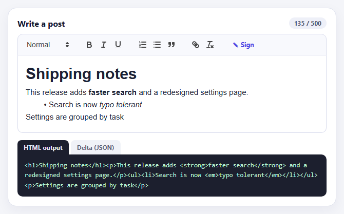
Quill Rich Text Editor with Custom Toolbar and Character Limit
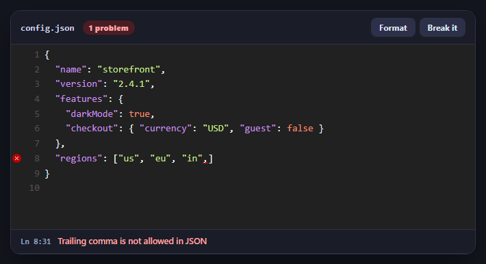
CodeMirror JSON Editor with Validation Gutter
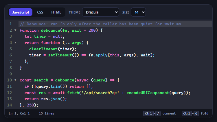
CodeMirror Code Editor with Line Numbers, Folding and Themes
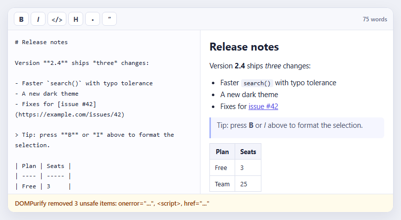
Marked + DOMPurify Live Markdown Preview
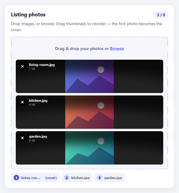
FilePond Image Upload with Preview and Reorder
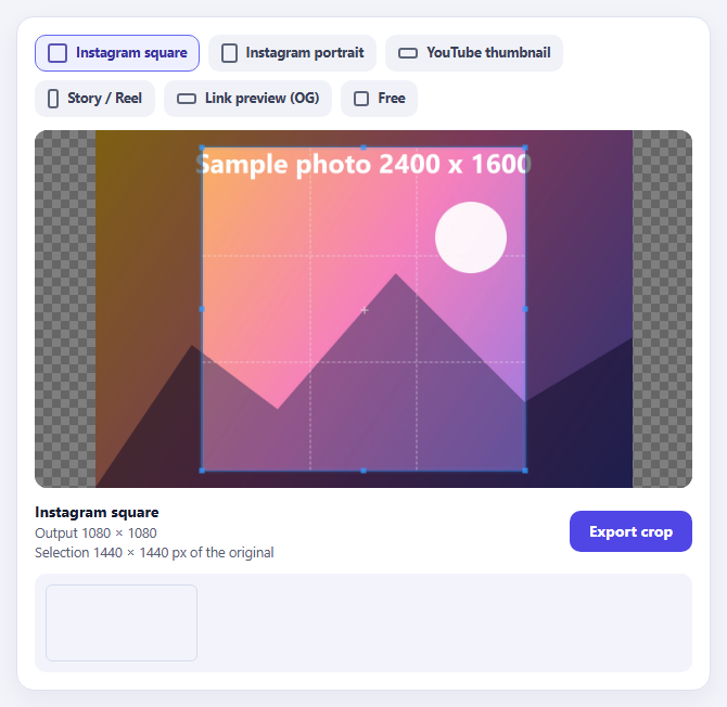
Cropper.js Aspect-Ratio Presets for Social Posts
Learn Coding Visually
Learn to code with interactive, live-preview playgrounds — HTML, CSS, JavaScript, React & more.
 HTML Playground42 lessons · Click-based · Live preview
 CSS PlaygroundLearn CSS with a live editor
 JavaScript Playground60 lessons · DOM · Async · Canvas
 React PlaygroundLearn React with a live code editor
 GSAP PlaygroundLearn GSAP animation interactively
 SVG Playground44 lessons · shapes · paths · animation
 SCSS Playground45 lessons · Sass modules · tokens
 Tailwind PlaygroundLearn Tailwind CSS with a live editor
 Bootstrap 5 Playground50 lessons · live preview
Signup Form with Validation — HTML CSS JS Snippet
Signup Form · Forms · Plain HTML, CSS & JS · Live preview
What's included
Features
About this UI Snippet
Signup Form — Reward-Early/Punish-Late Validation, Password Strength Meter, Loading Button & Success Overlay
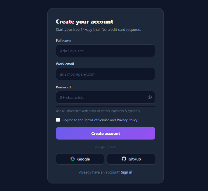
The signup form is the highest-stakes form on any product: every validation annoyance, unclear error, or premature red border costs real conversions. This snippet is a complete registration flow in vanilla HTML, CSS, and JavaScript that implements the patterns conversion research actually supports — blur-triggered validation that turns live only after a field has erred, a five-level password strength meter, show/hide password, a terms checkbox, a loading submit button, social sign-up buttons, and an animated "check your inbox" success overlay.
The validation timing that doesn't fight the user
When to show errors is the defining UX decision of any form, and this snippet implements the researched best practice known as *reward early, punish late*. Each field validates on blur — never while the user is still typing their email for the first time, which is why naive on-input validation feels hostile (you're told "invalid email" after typing one character). But once a field has erred, it flips into live mode: the touched map records that the field has been validated, and subsequent input events re-validate immediately — so the moment the user fixes the mistake, the red border and message vanish, rewarding the correction without waiting for another blur. Valid fields get a subtle green border only when non-empty. On submit, every field is force-touched and validated, and focus moves to the *first* failing input — the accessibility affordance most forms omit.
Validators as data, errors as paired elements
Validation logic is a plain object mapping field names to functions returning an error string or empty — adding a field means one entry and one markup block, no restructuring. Each field's error lives in a .su-error[data-for] paragraph that shows with a small drop-in animation; state classes (invalid/valid) live on the input and drive the border and focus-ring colours. The email regex is deliberately pragmatic (something@something.tld) — exhaustive RFC 5322 regexes reject real addresses and the confirmation email is the true validator anyway, which is exactly what the success screen communicates.
The strength meter: score, don't gatekeep
scorePassword() awards points for length ≥8, length ≥12, mixed case, digits, and symbols, mapping to five meter levels — width, colour (red→orange→yellow→lime→green), and an instructive label ("Weak — add numbers or symbols") that tells users *how* to improve rather than just judging them. Critically, the meter is advisory: only the 8-character minimum blocks submission. Hard composition rules (mandatory symbol + uppercase + digit) are an outdated NIST anti-pattern that produces "Password1!" — length-weighted scoring with guidance produces genuinely stronger passwords. The bar animates via width/background transitions; the show/hide toggle swaps input.type between password and text while updating its aria-label.
Submit, loading, and the success overlay
Submission disables the button, swaps its label to "Creating account…", and reveals a CSS border-spinner — the loading treatment that prevents double-submits without layout shift, since the spinner slots into the existing flex gap. The simulated API resolves into a success overlay: absolutely positioned over the whole card (the form's overflow: hidden keeps its rounded corners), fading in with a spring-popped green ring and echoing the submitted email in "We sent a confirmation link to…" — confirmation-email UX that closes the loop and tells users the next action. Social buttons (Google's official four-colour mark, GitHub's octocat path) sit under an ::before/::after line divider, and autocomplete attributes (name, email, new-password) are set so password managers behave — new-password specifically triggers suggested-password generation in Chrome and Safari.
Build with AI
Build, Understand, Optimize, and Extend It With AI
A signup form is mostly invisible decisions, and an AI assistant is good at making them visible: paste this snippet into Claude and ask it to enumerate every UX decision the code embodies — blur-then-live timing, advisory-not-blocking meter, pragmatic email regex, focus-first-failure — and the research reasoning behind each, so you can defend or adjust them for your product. Then make it yours: ask it to add the fields your funnel needs (company, role, phone with the right autocomplete and inputmode attributes) following the three-map pattern, to write the fetch integration with server-error mapping through showError including the "already exists → sign in with email prefilled" recovery path, and to add the HaveIBeenPwned k-anonymity breach check on password blur. If you're on React or Angular, ask for the conversion and — more valuable — ask it to show how this hand-rolled machine maps onto React Hook Form's onTouched mode or Angular's updateOn: "blur", so you understand exactly what the library abstracts before you adopt it.
Prompt to recreate it
Copy this into your AI assistant of choice to build the effect from scratch, or as a jumping-off point for your own variant:
Build a complete signup form in plain HTML, CSS, and JavaScript with production-grade validation UX — no libraries.

Requirements:
- Fields: full name, work email, password, and a terms-of-service checkbox, each field block containing a label, input with proper autocomplete attributes (name, email, new-password), and a paired error paragraph targeted by a data attribute; plus a gradient submit button, an "or sign up with" divider using ::before/::after lines, Google and GitHub social buttons with inline SVG marks, and a sign-in link.
- Implement reward-early/punish-late validation timing with three plain-object maps (fields, validators returning error-string-or-empty, touched): validate a field on blur; once a field has erred, re-validate it live on every input so fixes clear instantly; on submit, force-touch and validate everything and move focus to the FIRST invalid field.
- State classes on inputs (invalid red border, valid green border only when non-empty) with matching tinted focus rings, and error messages that animate in with a small drop-and-fade.
- A five-level password strength meter under the password field: score length ≥8, length ≥12, mixed case, digits, symbols; animate the bar's width and colour through red→orange→yellow→lime→green with instructive labels ("Weak — add numbers or symbols"); the meter is advisory — only the 8-character minimum blocks submission (comment why composition rules are a NIST anti-pattern).
- A show/hide password eye toggle that swaps input.type and keeps its aria-label in sync.
- On valid submit: disable the button, swap its label to "Creating account…", reveal a CSS border-spinner in the button's flex gap (no layout shift), and after a simulated 1.4s API call show a success overlay covering the card — fading in with a spring-scaled green check ring and "We sent a confirmation link to <the submitted email>".
- Use a pragmatic email regex (local@domain.tld) and comment that the confirmation email is the true validator; comment where server-side errors like "email already exists" would map back through the same error channel.
Want to tighten it up first? Run this prompt through the AI Prompt Studio to score it across 8 quality dimensions, catch anti-patterns, and tune the wording for Claude, ChatGPT, or Gemini before you paste it in.
Source Code
<form class="signup" id="signup" novalidate>
<h2 class="su-title">Create your account</h2>
<p class="su-sub">Start your free 14-day trial. No credit card required.</p>
<div class="field">
<label class="su-label" for="su-name">Full name</label>
<input class="su-input" id="su-name" name="name" type="text" autocomplete="name" placeholder="Ada Lovelace">
<p class="su-error" data-for="name"></p>
</div>
<div class="field">
<label class="su-label" for="su-email">Work email</label>
<input class="su-input" id="su-email" name="email" type="email" autocomplete="email" placeholder="ada@company.com">
<p class="su-error" data-for="email"></p>
</div>
<div class="field">
<label class="su-label" for="su-pass">Password</label>
<div class="pass-wrap">
<input class="su-input" id="su-pass" name="password" type="password" autocomplete="new-password" placeholder="8+ characters">
<button class="pass-toggle" type="button" id="pass-toggle" aria-label="Show password">
<svg width="15" height="15" viewBox="0 0 24 24" fill="none" stroke="currentColor" stroke-width="2"><path d="M1 12s4-8 11-8 11 8 11 8-4 8-11 8-11-8-11-8z"/><circle cx="12" cy="12" r="3"/></svg>
</button>
</div>
<div class="meter"><span class="meter-bar" id="meter-bar"></span></div>
<p class="meter-label" id="meter-label">Use 8+ characters with a mix of letters, numbers & symbols</p>
<p class="su-error" data-for="password"></p>
</div>
<label class="terms">
<input type="checkbox" id="su-terms" name="terms">
<span>I agree to the <a href="#" onclick="return false">Terms of Service</a> and <a href="#" onclick="return false">Privacy Policy</a></span>
</label>
<p class="su-error" data-for="terms"></p>
<button class="su-btn" id="su-btn" type="submit">
<span class="btn-label">Create account</span>
<span class="btn-spinner" hidden></span>
</button>
<div class="divider"><span>or sign up with</span></div>
<div class="social-row">
<button type="button" class="social-btn">
<svg width="16" height="16" viewBox="0 0 24 24"><path fill="#4285F4" d="M22.6 12.3c0-.8-.1-1.5-.2-2.3H12v4.5h6a5 5 0 0 1-2.2 3.3v2.8h3.6c2-1.9 3.2-4.8 3.2-8.3z"/><path fill="#34A853" d="M12 23c3 0 5.5-1 7.3-2.7l-3.6-2.8c-1 .7-2.3 1.1-3.7 1.1-2.9 0-5.3-1.9-6.2-4.6H2.1v2.9A11 11 0 0 0 12 23z"/><path fill="#FBBC05" d="M5.8 14a6.6 6.6 0 0 1 0-4.2V6.9H2.1a11 11 0 0 0 0 10z"/><path fill="#EA4335" d="M12 5.4c1.6 0 3.1.6 4.3 1.7l3.2-3.2A11 11 0 0 0 2.1 6.9l3.7 2.9c.9-2.7 3.3-4.4 6.2-4.4z"/></svg>
Google
</button>
<button type="button" class="social-btn">
<svg width="16" height="16" viewBox="0 0 24 24" fill="currentColor"><path d="M12 .5C5.6.5.5 5.6.5 12c0 5.1 3.3 9.4 7.9 10.9.6.1.8-.2.8-.5v-2c-3.2.7-3.9-1.5-3.9-1.5-.5-1.3-1.3-1.7-1.3-1.7-1-.7.1-.7.1-.7 1.2.1 1.8 1.2 1.8 1.2 1 1.8 2.8 1.3 3.4 1 .1-.8.4-1.3.7-1.6-2.6-.3-5.3-1.3-5.3-5.7 0-1.3.4-2.3 1.2-3.1-.1-.3-.5-1.5.1-3.1 0 0 1-.3 3.2 1.2a11 11 0 0 1 5.8 0C17.3 4.9 18.3 5.2 18.3 5.2c.6 1.6.2 2.8.1 3.1.8.8 1.2 1.8 1.2 3.1 0 4.4-2.7 5.4-5.3 5.7.4.4.8 1.1.8 2.2v3.2c0 .3.2.6.8.5A11.5 11.5 0 0 0 23.5 12C23.5 5.6 18.4.5 12 .5z"/></svg>
GitHub
</button>
</div>
<p class="signin-note">Already have an account? <a href="#" onclick="return false">Sign in</a></p>
<div class="success" id="success" hidden>
<div class="success-ring">
<svg width="26" height="26" viewBox="0 0 24 24" fill="none" stroke="currentColor" stroke-width="2.5"><path d="M20 6L9 17l-5-5"/></svg>
</div>
<h3>Check your inbox</h3>
<p>We sent a confirmation link to <strong id="success-email"></strong></p>
</div>
</form>* { box-sizing: border-box; margin: 0; padding: 0; }
body { font-family: system-ui, sans-serif; background: #0f172a; min-height: 100vh; display: flex; align-items: center; justify-content: center; padding: 24px; }
.signup {
width: 100%; max-width: 400px;
background: #1e293b; border: 1px solid #334155;
border-radius: 18px; padding: 30px 28px;
position: relative; overflow: hidden;
}
.su-title { font-size: 20px; font-weight: 800; color: #f8fafc; }
.su-sub { font-size: 13px; color: #94a3b8; margin: 6px 0 22px; }
.field { margin-bottom: 15px; }
.su-label { display: block; font-size: 12px; font-weight: 600; color: #cbd5e1; margin-bottom: 6px; }
.su-input {
width: 100%; background: #0f172a; border: 1px solid #334155;
border-radius: 10px; padding: 11px 13px;
color: #f1f5f9; font-size: 14px; font-family: inherit; outline: none;
transition: border-color 0.15s, box-shadow 0.15s;
}
.su-input::placeholder { color: #475569; }
.su-input:focus { border-color: #6366f1; box-shadow: 0 0 0 3px rgba(99,102,241,0.2); }
.su-input.invalid { border-color: #f87171; }
.su-input.invalid:focus { box-shadow: 0 0 0 3px rgba(248,113,113,0.18); }
.su-input.valid { border-color: #34d399; }
.su-error {
font-size: 11.5px; color: #f87171; margin-top: 5px;
min-height: 0; display: none;
}
.su-error.show { display: block; animation: err-in 0.18s ease; }
@keyframes err-in { from { opacity: 0; transform: translateY(-3px); } }
/* password */
.pass-wrap { position: relative; }
.pass-wrap .su-input { padding-right: 42px; }
.pass-toggle {
position: absolute; right: 6px; top: 50%; transform: translateY(-50%);
background: none; border: none; color: #64748b; cursor: pointer;
padding: 6px; border-radius: 7px; display: flex;
}
.pass-toggle:hover { color: #e2e8f0; }
/* strength meter */
.meter { height: 4px; background: #0f172a; border-radius: 4px; margin-top: 8px; overflow: hidden; }
.meter-bar {
display: block; height: 100%; width: 0;
border-radius: 4px; background: #f87171;
transition: width 0.3s ease, background 0.3s ease;
}
.meter-label { font-size: 11px; color: #64748b; margin-top: 5px; }
/* terms */
.terms {
display: flex; gap: 9px; align-items: flex-start;
font-size: 12px; color: #94a3b8; line-height: 1.5;
margin: 4px 0 16px; cursor: pointer;
}
.terms input { margin-top: 2px; accent-color: #6366f1; width: 14px; height: 14px; flex-shrink: 0; }
.terms a { color: #a5b4fc; text-decoration: none; }
.terms a:hover { text-decoration: underline; }
/* submit */
.su-btn {
width: 100%; padding: 12px;
background: linear-gradient(135deg, #6366f1, #8b5cf6);
color: #fff; border: none; border-radius: 10px;
font-size: 14px; font-weight: 700; font-family: inherit;
cursor: pointer; display: flex; align-items: center; justify-content: center; gap: 9px;
transition: opacity 0.15s, transform 0.1s;
}
.su-btn:hover { opacity: 0.92; }
.su-btn:active { transform: scale(0.99); }
.su-btn:disabled { opacity: 0.6; cursor: wait; }
.btn-spinner {
width: 15px; height: 15px; border-radius: 50%;
border: 2px solid rgba(255,255,255,0.35); border-top-color: #fff;
animation: spin 0.7s linear infinite;
}
@keyframes spin { to { transform: rotate(360deg); } }
/* divider + social */
.divider {
display: flex; align-items: center; gap: 12px;
margin: 18px 0 14px; color: #475569; font-size: 11px;
}
.divider::before, .divider::after { content: ''; flex: 1; height: 1px; background: #334155; }
.social-row { display: flex; gap: 10px; }
.social-btn {
flex: 1; display: flex; align-items: center; justify-content: center; gap: 8px;
background: #0f172a; border: 1px solid #334155; color: #e2e8f0;
border-radius: 10px; padding: 10px;
font-size: 13px; font-weight: 600; font-family: inherit; cursor: pointer;
transition: border-color 0.15s;
}
.social-btn:hover { border-color: #475569; }
.signin-note { text-align: center; font-size: 12.5px; color: #64748b; margin-top: 18px; }
.signin-note a { color: #a5b4fc; text-decoration: none; font-weight: 600; }
/* success overlay */
.success {
position: absolute; inset: 0; background: #1e293b;
display: flex; flex-direction: column; align-items: center; justify-content: center;
text-align: center; padding: 30px; gap: 6px;
animation: succ-in 0.35s ease;
}
@keyframes succ-in { from { opacity: 0; } }
.success[hidden] { display: none; }
.success-ring {
width: 56px; height: 56px; border-radius: 50%;
background: rgba(52,211,153,0.12); border: 2px solid #34d399;
color: #34d399; display: flex; align-items: center; justify-content: center;
margin-bottom: 10px;
animation: ring-pop 0.4s cubic-bezier(0.34, 1.5, 0.64, 1);
}
@keyframes ring-pop { from { transform: scale(0.5); opacity: 0; } }
.success h3 { color: #f8fafc; font-size: 17px; }
.success p { color: #94a3b8; font-size: 13px; line-height: 1.5; }
.success strong { color: #e2e8f0; }const form = document.getElementById('signup');
const fields = {
name: document.getElementById('su-name'),
email: document.getElementById('su-email'),
password: document.getElementById('su-pass'),
terms: document.getElementById('su-terms'),
};
/* ————— Validators: each returns an error string or '' ————— */
const validators = {
name: v => v.trim().length >= 2 ? '' : 'Please enter your full name',
email: v => /^[^\s@]+@[^\s@]+\.[^\s@]{2,}$/.test(v) ? '' : 'Enter a valid email address',
password: v => v.length >= 8 ? '' : 'Password must be at least 8 characters',
terms: (v, el) => el.checked ? '' : 'You must accept the terms to continue',
};
function showError(key, msg) {
const errEl = form.querySelector('.su-error[data-for="' + key + '"]');
const input = fields[key];
errEl.textContent = msg;
errEl.classList.toggle('show', !!msg);
if (input.type !== 'checkbox') {
input.classList.toggle('invalid', !!msg);
input.classList.toggle('valid', !msg && input.value !== '');
}
}
function validate(key) {
const el = fields[key];
const msg = validators[key](el.type === 'checkbox' ? el.checked : el.value, el);
showError(key, msg);
return !msg;
}
/* Validate on blur; re-validate live only once a field has erred
(the "reward early, punish late" pattern). */
const touched = {};
Object.keys(fields).forEach(key => {
const el = fields[key];
el.addEventListener('blur', () => { touched[key] = true; validate(key); });
el.addEventListener('input', () => { if (touched[key]) validate(key); });
el.addEventListener('change', () => { if (el.type === 'checkbox' && touched[key]) validate(key); });
});
/* ————— Password strength meter ————— */
const meterBar = document.getElementById('meter-bar');
const meterLabel = document.getElementById('meter-label');
const LEVELS = [
{ w: '12%', c: '#f87171', label: 'Too weak — keep going' },
{ w: '35%', c: '#fb923c', label: 'Weak — add numbers or symbols' },
{ w: '60%', c: '#facc15', label: 'Okay — longer is stronger' },
{ w: '80%', c: '#a3e635', label: 'Good password' },
{ w: '100%', c: '#34d399', label: 'Strong password' },
];
function scorePassword(p) {
if (!p) return -1;
let s = 0;
if (p.length >= 8) s++;
if (p.length >= 12) s++;
if (/[A-Z]/.test(p) && /[a-z]/.test(p)) s++;
if (/\d/.test(p)) s++;
if (/[^A-Za-z0-9]/.test(p)) s++;
return Math.min(s, 4);
}
fields.password.addEventListener('input', () => {
const s = scorePassword(fields.password.value);
if (s < 0) {
meterBar.style.width = '0';
meterLabel.textContent = 'Use 8+ characters with a mix of letters, numbers & symbols';
meterLabel.style.color = '';
return;
}
meterBar.style.width = LEVELS[s].w;
meterBar.style.background = LEVELS[s].c;
meterLabel.textContent = LEVELS[s].label;
meterLabel.style.color = LEVELS[s].c;
});
/* ————— Show/hide password ————— */
document.getElementById('pass-toggle').addEventListener('click', function() {
const isPw = fields.password.type === 'password';
fields.password.type = isPw ? 'text' : 'password';
this.setAttribute('aria-label', isPw ? 'Hide password' : 'Show password');
});
/* ————— Submit ————— */
form.addEventListener('submit', e => {
e.preventDefault();
let ok = true;
let firstBad = null;
Object.keys(fields).forEach(key => {
touched[key] = true;
if (!validate(key)) { ok = false; firstBad = firstBad || fields[key]; }
});
if (!ok) { firstBad.focus(); return; }
// Simulate the API call
const btn = document.getElementById('su-btn');
btn.disabled = true;
btn.querySelector('.btn-label').textContent = 'Creating account…';
btn.querySelector('.btn-spinner').hidden = false;
setTimeout(() => {
document.getElementById('success-email').textContent = fields.email.value;
document.getElementById('success').hidden = false;
}, 1400);
});Step by step
How to Use
- 1Test the validation behaviourTab through fields without typing — nothing turns red until you leave a field (blur). Enter a bad email and tab away: the error appears; now fix it and watch the error clear the instant the address becomes valid, without waiting for another blur. Type a password and watch the meter climb through five colour levels with instructive labels. Submit with gaps: every error shows and focus jumps to the first invalid field.
- 2Complete the happy pathFill valid values, tick the terms checkbox, and submit. The button disables, shows "Creating account…" with a spinner for 1.4s (the simulated API), then the success overlay pops in with the green ring and your email echoed in the confirmation message. The show/hide eye toggle reveals the password at any point.
- 3Wire it to your real backendIn the submit handler, replace the setTimeout with: const res = await fetch("/api/signup", { method: "POST", headers: { "Content-Type": "application/json" }, body: JSON.stringify({ name: fields.name.value, email: fields.email.value, password: fields.password.value }) }). On non-OK responses, map server errors back through showError() — e.g. showError("email", "An account with this email already exists") — and re-enable the button. Never validate only client-side; this layer is UX, the server is truth.
- 4Add or remove fieldsEach field is one markup block (label + input + error paragraph with matching data-for) plus one entry in the fields map and one validator function. To add a company field: copy the name block, register fields.company, and add company: v => v.trim() ? "" : "Enter your company name". The blur/live wiring loops over the maps, so new fields inherit the full behaviour automatically.
- 5Tune the password policyThe blocking rule is the validator (8+ chars); the meter is advice. Adjust scorePassword's thresholds and the LEVELS labels/colours to your policy — but resist mandatory-composition rules; length-based scoring with guidance is the modern NIST-aligned approach. For breach checking, call the k-anonymity HaveIBeenPwned range API on blur and surface it as a meter label ("This password appeared in a breach — choose another").
- 6Export and composeClick JSX for React — port the fields/validators maps as-is, hold touched and errors in state, and validate in onBlur/onChange handlers. Pair with the Password Requirements Checklist for explicit rule display, OTP Verification for the post-signup email code, Magic Link Login and Social Login Buttons for alternative auth, and Glassmorphism Login for the sign-in side.
Real-world uses
Common Use Cases
Got questions?
Frequently Asked Questions
The two naive timings both fail users. Pure on-input validation punishes people mid-thought — "invalid email" appears after the first character and screams at them for the next ten keystrokes while they were never wrong, just unfinished. Pure on-submit validation hides all problems until the end, then dumps every error at once, forcing users to re-orient to fields they mentally closed. The blur-then-live hybrid (formalised in UX research as "reward early, punish late") gives errors only when a field is plausibly finished (blur), then switches that field to live mode so fixes are acknowledged instantly — the reward half, which is what makes correction feel responsive rather than nagging. The touched map is the whole mechanism: three booleans' worth of state per field. On submit, force-touching everything ensures untouched-but-required fields still report, and focusing the first invalid field gives keyboard and screen-reader users a direct path to the problem.
Both are deliberate, standards-aligned choices. NIST SP 800-63B explicitly recommends against composition rules (mandatory symbol/uppercase/digit) because they produce predictable patterns ("Password1!") while blocking genuinely strong long passphrases; the guidance is a length minimum, a breach-list check, and user education — which is exactly this form: 8 characters blocks, the meter educates with instructive labels, and the how-to shows where the HaveIBeenPwned k-anonymity check slots in. The email regex (something@something.tld) is similarly pragmatic: fully RFC-compliant regexes are famous for rejecting valid real-world addresses (plus-tags, newer TLDs, quoted locals), and no client regex can confirm deliverability anyway. The confirmation email is the actual validator — the regex's only job is catching obvious typos like a missing @ before the round-trip, and the success screen's "check your inbox" makes that contract explicit.
Reuse the exact same channel as client errors so the user sees one consistent system. After your fetch, branch on the response: a 409 or a validation payload maps field-by-field through showError() — showError("email", "An account with this email already exists — try signing in") — then re-enable the button, restore its label, hide the spinner, and focus the offending field. For non-field errors (rate limits, outages), add one form-level error element above the submit button styled like .su-error. Two details worth copying from production forms: mark the server-erred field as touched so it re-validates live as the user edits (the map already handles this), and make the "already exists" message link to sign-in with the email prefilled — that error is your highest-intent recovery path, not a dead end.
React: the three maps become state — const [touched, setTouched] and const [errors, setErrors] — with validators kept verbatim as a plain object outside the component; bind onBlur={() => touch(name)} and onChange, derive input classes from errors[name], and you have hand-rolled the core of React Hook Form (whose mode: "onTouched" is literally this timing; adopt it when forms multiply). Angular: Reactive Forms encode the same machine natively — updateOn: "blur" on the FormControl gives the first-pass timing, and markAllAsTouched() on submit replaces the force-touch loop; the meter becomes a pipe over the password control's valueChanges. Tailwind: inputs are w-full bg-slate-900 border border-slate-700 rounded-lg px-3 py-2.5 focus:border-indigo-500 focus:ring-4 focus:ring-indigo-500/20 with state variants data-[invalid]:border-red-400 data-[valid]:border-emerald-400; the meter bar is h-1 rounded transition-all with width/colour set inline from the level; the spinner is size-4 rounded-full border-2 border-white/35 border-t-white animate-spin.