Learn Coding Visually
Learn to code with interactive, live-preview playgrounds — HTML, CSS, JavaScript, React & more.
 HTML Playground42 lessons · Click-based · Live preview
 CSS PlaygroundLearn CSS with a live editor
 JavaScript Playground60 lessons · DOM · Async · Canvas
 React PlaygroundLearn React with a live code editor
 GSAP PlaygroundLearn GSAP animation interactively
 SVG Playground44 lessons · shapes · paths · animation
 SCSS Playground45 lessons · Sass modules · tokens
 Tailwind PlaygroundLearn Tailwind CSS with a live editor
 Bootstrap 5 Playground50 lessons · live preview
Choices.js Searchable Multi-Select — Free JS Snippet
Choices.js Searchable Multi-Select with Tags · Forms · Plain HTML, CSS & JS · Live preview
What's included
Features
About this UI Snippet
Choices.js Searchable Multi-Select — HTML, CSS & JavaScript
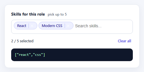
A native <select multiple> is the right data model for a tag picker — it submits with the form, it is what screen readers and password managers already understand — but it is a terrible interface. Nobody wants to hold Ctrl and scroll a list box. Choices.js solves that by hiding the real select and rendering a searchable dropdown with removable chips on top of it, while keeping the original element as the single source of truth.
That "the select stays in sync" detail is what this snippet is built around. Nothing here reads values out of the widget's DOM; the change listener is attached to the original select, and choices.getValue(true) returns a plain array of value strings, ready for JSON or a form post. Because the underlying element is still a real select, the field keeps working in a normal form submission and degrades to the native control if the script fails to load.
The options are grouped with optgroup, so the dropdown shows Frontend, Backend and Tooling headings without any extra configuration. maxItemCount caps the selection at five, and maxItemText supplies the message shown once the cap is hit — without it users just see the list go quiet and assume it is broken. shouldSort is switched off so options keep the order you wrote them in rather than being re-sorted alphabetically, and searchResultLimit keeps the filtered list short enough to scan.
The styling overrides target Choices' own class names (choices__inner, choices__item, choices__list--dropdown) rather than fighting the library with wrappers, so the focus ring, chips and highlighted row all match one accent colour. The counter turns amber at the cap, which gives a second, non-modal cue that the limit has been reached. Clear all calls removeActiveItems(), the supported way to empty a multi-select — setting option.selected on the hidden element would leave the chips out of sync.
Build with AI
Build, Understand, Optimize, and Extend It With AI
Ask an AI assistant like Claude to add a "select all in group" action, persist the selection between visits, or swap the counter for a progress bar that fills as you approach the limit.
Prompt to recreate it
Copy this into your AI assistant of choice to build the effect from scratch, or as a jumping-off point for your own variant:
Build a searchable multi-select tag picker using Choices.js 10 loaded from a CDN.

Requirements:
- Start from a real <select multiple> with optgroup headings; keep it as the source of truth so it still submits in a form.
- Enable removeItemButton, shouldSort: false, a maxItemCount of 5 and a custom maxItemText message.
- Listen for the change event on the original select and render the current values with choices.getValue(true).
- Show a "n / 5 selected" counter that changes colour at the limit, and a Clear all button that calls removeActiveItems().
- Override Choices' own CSS classes to give the chips, focus ring and highlighted option one accent colour.
Want to tighten it up first? Run this prompt through the AI Prompt Studio to score it across 8 quality dimensions, catch anti-patterns, and tune the wording for Claude, ChatGPT, or Gemini before you paste it in.
Source Code
<div class="cs-card">
  <label class="cs-label" for="csSkills">Skills for this role <span class="cs-hint">pick up to 5</span></label>
  <select id="csSkills" multiple>
    <optgroup label="Frontend">
      <option value="react" selected>React</option>
      <option value="vue">Vue</option>
      <option value="svelte">Svelte</option>
      <option value="css" selected>Modern CSS</option>
      <option value="a11y">Accessibility</option>
    </optgroup>
    <optgroup label="Backend">
      <option value="node">Node.js</option>
      <option value="go">Go</option>
      <option value="python">Python</option>
      <option value="sql">SQL</option>
      <option value="graphql">GraphQL</option>
    </optgroup>
    <optgroup label="Tooling">
      <option value="docker">Docker</option>
      <option value="ci">CI / CD</option>
      <option value="testing">Testing</option>
      <option value="figma">Figma</option>
    </optgroup>
  </select>
  <div class="cs-foot">
    <span class="cs-count" id="csCount">2 / 5 selected</span>
    <button type="button" class="cs-clear" id="csClear">Clear all</button>
  </div>
  <div class="cs-out" id="csOut" aria-live="polite"></div>
</div>
body { background: #f4f6fb; padding: 24px; font-family: system-ui, sans-serif; }
.cs-card { max-width: 460px; margin: 0 auto; background: #fff; border: 1px solid #e3e7ef; border-radius: 14px; padding: 22px; box-shadow: 0 8px 24px rgba(20,30,60,.06); }
.cs-label { display: block; font-weight: 700; font-size: 14px; color: #1b2233; margin-bottom: 10px; }
.cs-hint { font-weight: 500; color: #6b7488; font-size: 12px; margin-left: 6px; }
.cs-card .choices { margin-bottom: 0; }
.cs-card .choices__inner { border-radius: 10px; border-color: #cfd6e4; min-height: 48px; padding: 6px 8px; background: #fff; }
.cs-card .is-focused .choices__inner, .cs-card .is-open .choices__inner { border-color: #4f46e5; box-shadow: 0 0 0 3px rgba(79,70,229,.15); }
.cs-card .choices__list--multiple .choices__item { background: #eef0ff; border: 1px solid #c7ccf7; color: #3730a3; border-radius: 999px; font-size: 12.5px; font-weight: 600; padding: 4px 10px; }
.cs-card .choices__list--multiple .choices__item.is-highlighted { background: #e0e4ff; border-color: #a5adf2; }
.cs-card .choices__input { background: transparent; }
.cs-card .choices__button { border-left: 1px solid #a5adf2 !important; opacity: .7; }
.cs-card .choices__list--dropdown .choices__item--selectable.is-highlighted { background: #eef0ff; color: #3730a3; }
.cs-card .choices__list--dropdown { border-radius: 0 0 10px 10px; border-color: #cfd6e4; z-index: 5; }
.cs-foot { display: flex; justify-content: space-between; align-items: center; margin-top: 12px; }
.cs-count { font-size: 12.5px; color: #4b5468; font-weight: 600; }
.cs-count.is-full { color: #b45309; }
.cs-clear { font: inherit; font-size: 12.5px; font-weight: 600; color: #4f46e5; background: none; border: 0; cursor: pointer; padding: 4px 6px; border-radius: 6px; }
.cs-clear:hover { background: #eef0ff; }
.cs-out { margin-top: 14px; padding: 12px; border-radius: 10px; background: #0f172a; color: #a5f3c4; font: 12.5px/1.5 ui-monospace, Menlo, monospace; word-break: break-word; }const el = document.getElementById('csSkills');
const MAX = 5;
const choices = new Choices(el, {
removeItemButton: true,
maxItemCount: MAX,
maxItemText: function (n) { return 'Only ' + n + ' skills can be added'; },
searchResultLimit: 8,
shouldSort: false,
placeholderValue: 'Search skills...',
searchPlaceholderValue: 'Type to filter',
itemSelectText: '',
noResultsText: 'No skills match that search',
noChoicesText: 'Every skill is already selected',
});
const countEl = document.getElementById('csCount');
const outEl = document.getElementById('csOut');
function render() {
const values = choices.getValue(true);
countEl.textContent = values.length + ' / ' + MAX + ' selected';
countEl.classList.toggle('is-full', values.length >= MAX);
outEl.textContent = JSON.stringify(values);
}
// Choices keeps the original <select> in sync, so a plain 'change' listener works.
el.addEventListener('change', render);
document.getElementById('csClear').addEventListener('click', function () {
choices.removeActiveItems();
render();
});
render();Step by step
How to Use
- 1Open the fieldClick into the input. The dropdown lists every skill grouped under Frontend, Backend and Tooling.
- 2Type to filterStart typing "sq" or "css" — the list narrows live and a no-results message appears if nothing matches.
- 3Add and remove chipsSelect options to add chips. Click the small × on a chip, or press Backspace in an empty field, to remove one.
- 4Hit the limitAdd five skills. The counter turns amber and the dropdown explains that no more can be added.
- 5Read the valueThe dark panel shows the array a form handler would receive. Use Clear all to reset it.
Real-world uses
Common Use Cases
Got questions?
Frequently Asked Questions
Yes. Choices keeps the original select in sync, so the selected values post under the select's name exactly like a native multi-select.
Call choices.getValue(true) for an array of value strings, or omit true to get objects with value and label.
Set maxItemCount and provide maxItemText. Choices stops accepting items at the cap and shows your message.
shouldSort is disabled here on purpose so the authored order is kept. Remove that option if you want Choices to sort them.
Use choices.removeActiveItems(). Editing the hidden select's options directly would desynchronise the visible chips.
Yes — create the instance in an effect or mounted hook on a ref'd select, and call choices.destroy() in the cleanup.
Yes. Use the JSX, Vue, Angular or Tailwind export buttons on this page to convert the markup and styles. The behaviour comes from Choices.js, so in a framework project install it with npm install choices.js instead of the CDN tag, create it in useEffect / onMounted / ngAfterViewInit on the select element, and release it with destroy() when the component unmounts.