Learn Coding Visually
Learn to code with interactive, live-preview playgrounds — HTML, CSS, JavaScript, React & more.
 HTML Playground42 lessons · Click-based · Live preview
 CSS PlaygroundLearn CSS with a live editor
 JavaScript Playground60 lessons · DOM · Async · Canvas
 React PlaygroundLearn React with a live code editor
 GSAP PlaygroundLearn GSAP animation interactively
 SVG Playground44 lessons · shapes · paths · animation
 SCSS Playground45 lessons · Sass modules · tokens
 Tailwind PlaygroundLearn Tailwind CSS with a live editor
 Bootstrap 5 Playground50 lessons · live preview
Pickr Color Picker with Contrast Check — Free JS Snippet
Pickr Inline Color Picker with Swatches and Contrast Check · Forms · Plain HTML, CSS & JS · Live preview
What's included
Features
About this UI Snippet
Pickr Inline Color Picker with Contrast Check — HTML, CSS & JavaScript
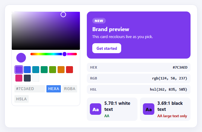
The native <input type="color"> is a poor building block for a designed interface: it opens an operating-system dialog that you cannot style, it offers no swatches, and it gives you a hex string and nothing else. Pickr is a purpose-built colour picker that renders its own panel — saturation square, hue slider, optional alpha, an input row that switches between HEX, RGB and HSL, and a swatch palette — and that panel can be styled or embedded directly in the page.
This snippet uses Pickr in inline mode. Passing inline: true renders the whole picker in place rather than hiding it behind a button, which is the right choice for a theme editor or settings pane where colour is the main task. The nano theme is loaded from its own stylesheet, the swatches option supplies the quick-pick palette, and the components object switches on exactly the parts that are needed — opacity is disabled because a brand colour is opaque, and clear and save are off because every change applies live.
Pickr's change event fires continuously while dragging, and the colour object it passes is more than a string: toHEXA(), toRGBA() and toHSLA() convert on demand, so the readouts for all three formats come from one value. The interesting part is what is done with that value. A brand-colour picker that only shows the colour is missing half the job, so the snippet computes WCAG contrast. It converts the RGB channels to relative luminance, then to a contrast ratio against white and against black, and grades each as AAA, AA, AA for large text only, or fail. The preview card automatically chooses whichever text colour reads better on the chosen background.
That auto-selection is the practical takeaway: instead of hoping a chosen colour works with white text, the UI states plainly which text colour passes and by how much. The recolouring itself is a single CSS custom property, --brand, set on the preview card, so the same approach drops straight into a real theme system that reads CSS variables.
Build with AI
Build, Understand, Optimize, and Extend It With AI
Ask an AI assistant like Claude to generate a full tint-and-shade scale from the chosen colour, add a dark-mode preview, or write the selected colour to a CSS variable used across the whole page.
Prompt to recreate it
Copy this into your AI assistant of choice to build the effect from scratch, or as a jumping-off point for your own variant:
Build an inline colour picker with Pickr 1.9 (nano theme) loaded from a CDN.

Requirements:
- Use Pickr.create with inline: true, a swatches array, and components for preview, hue and an interaction row with hex, rgba, hsla and input enabled (opacity, clear and save off).
- On the init and change events, show the colour as HEX, RGB and HSL using toHEXA(), toRGBA() and toHSLA().
- Recolour a preview card by setting one CSS custom property (--brand), and automatically choose white or black text for the better contrast.
- Compute WCAG relative luminance and show the contrast ratio against white and against black with an AAA / AA / large-text / fail grade for each.
Want to tighten it up first? Run this prompt through the AI Prompt Studio to score it across 8 quality dimensions, catch anti-patterns, and tune the wording for Claude, ChatGPT, or Gemini before you paste it in.
Source Code
<div class="pk-wrap">
  <div class="pk-left">
    <div id="pkHost"></div>
  </div>
  <div class="pk-right">
    <div class="pk-preview" id="pkPreview">
      <span class="pk-badge">New</span>
      <h3>Brand preview</h3>
      <p>This card recolours live as you pick.</p>
      <button type="button">Get started</button>
    </div>
    <dl class="pk-read">
      <div><dt>HEX</dt><dd id="pkHex">-</dd></div>
      <div><dt>RGB</dt><dd id="pkRgb">-</dd></div>
      <div><dt>HSL</dt><dd id="pkHsl">-</dd></div>
    </dl>
    <div class="pk-contrast">
      <div class="pk-c"><span class="pk-sample" id="pkSampleW">Aa</span><div><b id="pkRatioW">-</b><small id="pkGradeW"></small></div></div>
      <div class="pk-c"><span class="pk-sample dark" id="pkSampleB">Aa</span><div><b id="pkRatioB">-</b><small id="pkGradeB"></small></div></div>
    </div>
  </div>
</div>
body { background: #f4f5fa; padding: 22px; font-family: system-ui, sans-serif; }
.pk-wrap { max-width: 640px; margin: 0 auto; display: grid; grid-template-columns: auto 1fr; gap: 22px; background: #fff; border: 1px solid #e1e3f0; border-radius: 16px; padding: 22px; box-shadow: 0 8px 24px rgba(30,30,80,.06); }
@media (max-width: 560px) { .pk-wrap { grid-template-columns: 1fr; } }
.pk-left { min-width: 0; }
.pk-left .pcr-button { display: none; } /* inline mode still renders the trigger button; the panel is always open */
.pk-left .pcr-app { box-shadow: none; border: 1px solid #e1e3f0; border-radius: 12px; }
.pk-right { min-width: 0; }
.pk-preview { --brand: #7c3aed; --on: #fff; border-radius: 14px; padding: 18px; background: var(--brand); color: var(--on); position: relative; transition: background .12s; }
.pk-preview h3 { margin: 6px 0 4px; font-size: 18px; }
.pk-preview p { margin: 0 0 14px; font-size: 13px; opacity: .9; }
.pk-preview button { font: inherit; font-size: 13px; font-weight: 700; color: var(--brand); background: var(--on); border: 0; border-radius: 9px; padding: 8px 14px; }
.pk-badge { display: inline-block; font-size: 11px; font-weight: 800; letter-spacing: .06em; text-transform: uppercase; padding: 2px 8px; border-radius: 999px; background: rgba(255,255,255,.22); }
.pk-read { margin: 14px 0 0; display: grid; gap: 6px; }
.pk-read div { display: flex; justify-content: space-between; gap: 10px; background: #f5f6fb; border-radius: 8px; padding: 7px 11px; }
.pk-read dt { font-size: 11px; font-weight: 700; color: #5c6080; letter-spacing: .04em; }
.pk-read dd { margin: 0; font: 700 12.5px/1.3 ui-monospace, Menlo, monospace; color: #14162b; }
.pk-contrast { display: grid; grid-template-columns: 1fr 1fr; gap: 8px; margin-top: 12px; }
.pk-c { display: flex; align-items: center; gap: 10px; background: #f5f6fb; border-radius: 10px; padding: 8px 10px; }
.pk-sample { width: 38px; height: 38px; border-radius: 8px; display: grid; place-items: center; font-weight: 800; font-size: 16px; color: #fff; flex: none; }
.pk-sample.dark { color: #111; }
.pk-c b { display: block; font-size: 15px; color: #14162b; font-variant-numeric: tabular-nums; }
.pk-c small { font-size: 11.5px; font-weight: 700; }
.pk-c small.pass { color: #15803d; }
.pk-c small.fail { color: #b91c1c; }const preview = document.getElementById('pkPreview');
const $ = function (id) { return document.getElementById(id); };
// WCAG relative luminance and contrast ratio.
function lum(r, g, b) {
const f = function (v) { v /= 255; return v <= 0.03928 ? v / 12.92 : Math.pow((v + 0.055) / 1.055, 2.4); };
return 0.2126 * f(r) + 0.7152 * f(g) + 0.0722 * f(b);
}
function ratio(l1, l2) { const a = Math.max(l1, l2), b = Math.min(l1, l2); return (a + 0.05) / (b + 0.05); }
function grade(r) { return r >= 7 ? 'AAA' : r >= 4.5 ? 'AA' : r >= 3 ? 'AA large text only' : 'Fails'; }
function show(color) {
const hex = color.toHEXA().toString();
const rgba = color.toRGBA();
const hsla = color.toHSLA();
const r = Math.round(rgba[0]), g = Math.round(rgba[1]), b = Math.round(rgba[2]);
$('pkHex').textContent = hex;
$('pkRgb').textContent = 'rgb(' + r + ', ' + g + ', ' + b + ')';
$('pkHsl').textContent = 'hsl(' + Math.round(hsla[0]) + ', ' + Math.round(hsla[1]) + '%, ' + Math.round(hsla[2]) + '%)';
const L = lum(r, g, b);
const cw = ratio(L, 1), cb = ratio(L, 0);
// Pick whichever text colour reads better on the chosen background.
preview.style.setProperty('--brand', hex);
preview.style.setProperty('--on', cw >= cb ? '#ffffff' : '#111111');
$('pkSampleW').style.background = hex; $('pkSampleB').style.background = hex;
$('pkRatioW').textContent = cw.toFixed(2) + ':1 white text';
$('pkRatioB').textContent = cb.toFixed(2) + ':1 black text';
const gw = $('pkGradeW'), gb = $('pkGradeB');
gw.textContent = grade(cw); gw.className = cw >= 4.5 ? 'pass' : 'fail';
gb.textContent = grade(cb); gb.className = cb >= 4.5 ? 'pass' : 'fail';
}
const pickr = Pickr.create({
el: '#pkHost',
theme: 'nano',
inline: true, // render the panel in place instead of behind a button
showAlways: true, // and keep it open (inline mode does not open it by itself)
default: '#7c3aed',
swatches: ['#7c3aed', '#2563eb', '#0891b2', '#059669', '#65a30d', '#d97706', '#dc2626', '#db2777', '#334155', '#f8fafc'],
components: {
preview: true,
opacity: false, // brand colours are opaque; enable for overlays
hue: true,
interaction: { hex: true, rgba: true, hsla: true, input: true, clear: false, save: false },
},
});
// 'change' fires continuously while dragging; 'init' gives the first colour.
pickr.on('init', function (instance) { show(instance.getColor()); });
pickr.on('change', function (color) { show(color); });Step by step
How to Use
- 1Drag in the colour squareMove the handle in the saturation square and the hue slider. The preview card recolours as you drag.
- 2Use the swatchesClick a swatch to jump to a preset brand colour.
- 3Switch formatsUse the format buttons under the picker and type an exact HEX, RGB or HSL value.
- 4Read the contrastCheck the white and black contrast ratios and their WCAG grades beside the preview.
- 5Find an accessible colourPick a very light yellow and watch white text fail while black text passes AAA.
Real-world uses
Common Use Cases
Got questions?
Frequently Asked Questions
It renders the picker panel directly in the element you provide instead of showing it as a popup from a button.
Each RGB channel is converted to linear light, weighted into a relative luminance, and the ratio is (lighter + 0.05) / (darker + 0.05).
WCAG AA needs 4.5:1 for normal text and 3:1 for large text; AAA needs 7:1 for normal text.
The colour object from the change event has toHEXA(), toRGBA(), toHSLA(), toHSVA() and toCMYK() methods.
Set components.opacity to true and read the alpha channel from toRGBA() or toHEXA().
Yes. The CDN script exposes a global Pickr, and the theme CSS is loaded separately.
Yes. Use the JSX, Vue, Angular or Tailwind export buttons on this page to convert the markup and styles. The behaviour comes from Pickr, so in a framework project install it with npm install @simonwep/pickr instead of the CDN tag, create it in useEffect / onMounted / ngAfterViewInit, and release it with destroyAndRemove() when the component unmounts.