Source Code
<div class="scene">
  <div class="card">
    <div class="img-wrap">
      <div class="img-placeholder">
        <svg width="48" height="48" viewBox="0 0 24 24" fill="none" stroke="#cbd5e1" stroke-width="1.5"><rect x="3" y="3" width="18" height="18" rx="2"/><circle cx="8.5" cy="8.5" r="1.5"/><polyline points="21 15 16 10 5 21"/></svg>
      </div>
      <button class="wishlist" id="wish" onclick="this.classList.toggle('liked')">
        <svg width="16" height="16" viewBox="0 0 24 24" fill="none" stroke="currentColor" stroke-width="2"><path d="M20.84 4.61a5.5 5.5 0 0 0-7.78 0L12 5.67l-1.06-1.06a5.5 5.5 0 0 0-7.78 7.78l1.06 1.06L12 21.23l7.78-7.78 1.06-1.06a5.5 5.5 0 0 0 0-7.78z"/></svg>
      </button>
      <span class="badge">-20%</span>
    </div>
    <div class="body">
      <p class="brand">Acme Studio</p>
      <h3>Premium Wireless Headphones</h3>
      <div class="rating">
        <span class="stars">★★★★★</span>
        <span class="count">(2,841)</span>
      </div>
      <div class="price-row">
        <span class="price">$79.99</span>
        <span class="old-price">$99.99</span>
      </div>
      <div class="colors">
        <span class="swatch" style="background:#1e293b" data-name="Midnight"></span>
        <span class="swatch active" style="background:#6366f1" data-name="Indigo"></span>
        <span class="swatch" style="background:#f1f5f9;border:1px solid #e2e8f0" data-name="White"></span>
      </div>
      <button class="add-btn" onclick="addToCart(this)">Add to cart</button>
    </div>
  </div>
</div>
* { box-sizing: border-box; margin: 0; padding: 0; }
body { font-family: system-ui, sans-serif; background: #f1f5f9; display: flex; align-items: center; justify-content: center; min-height: 100vh; padding: 20px; }
.card { background: #fff; border-radius: 18px; overflow: hidden; width: 280px; box-shadow: 0 4px 24px rgba(0,0,0,0.07); }
.img-wrap { position: relative; background: #f8fafc; height: 220px; display: flex; align-items: center; justify-content: center; overflow: hidden; }
.img-placeholder { display: flex; align-items: center; justify-content: center; width: 100%; height: 100%; }
.wishlist { position: absolute; top: 12px; right: 12px; width: 34px; height: 34px; border-radius: 50%; background: #fff; border: none; cursor: pointer; display: flex; align-items: center; justify-content: center; box-shadow: 0 2px 8px rgba(0,0,0,0.1); transition: transform 0.15s; color: #94a3b8; }
.wishlist:hover { transform: scale(1.1); }
.wishlist.liked { color: #ef4444; }
.wishlist.liked svg { fill: #ef4444; }
.badge { position: absolute; top: 12px; left: 12px; background: #ef4444; color: #fff; font-size: 11px; font-weight: 700; padding: 3px 8px; border-radius: 6px; }
.body { padding: 16px; display: flex; flex-direction: column; gap: 8px; }
.brand { font-size: 11px; font-weight: 600; text-transform: uppercase; letter-spacing: 0.5px; color: #6366f1; }
h3 { font-size: 14px; font-weight: 700; color: #1e293b; line-height: 1.4; }
.rating { display: flex; align-items: center; gap: 6px; }
.stars { color: #f59e0b; font-size: 13px; }
.count { font-size: 12px; color: #94a3b8; }
.price-row { display: flex; align-items: baseline; gap: 8px; }
.price { font-size: 20px; font-weight: 800; color: #1e293b; }
.old-price { font-size: 13px; color: #94a3b8; text-decoration: line-through; }
.colors { display: flex; gap: 8px; align-items: center; }
.swatch { width: 20px; height: 20px; border-radius: 50%; cursor: pointer; transition: box-shadow 0.15s; }
.swatch.active { box-shadow: 0 0 0 3px #fff, 0 0 0 5px #6366f1; }
.add-btn { padding: 11px; background: #1e293b; color: #fff; border: none; border-radius: 10px; font-size: 13px; font-weight: 700; cursor: pointer; font-family: inherit; transition: background 0.15s; margin-top: 2px; }
.add-btn:hover { background: #0f172a; }
.add-btn.added { background: #16a34a; }document.querySelectorAll('.swatch').forEach(s => {
s.addEventListener('click', () => {
document.querySelectorAll('.swatch').forEach(x => x.classList.remove('active'));
s.classList.add('active');
});
});
function addToCart(btn) {
btn.textContent = '✓ Added!'; btn.classList.add('added');
setTimeout(() => { btn.textContent = 'Add to cart'; btn.classList.remove('added'); }, 2000);
}Learn Coding Visually
Learn to code with interactive, live-preview playgrounds — HTML, CSS, JavaScript, React & more.
 HTML Playground42 lessons · Click-based · Live preview
 CSS PlaygroundLearn CSS with a live editor
 JavaScript Playground60 lessons · DOM · Async · Canvas
 React PlaygroundLearn React with a live code editor
 GSAP PlaygroundLearn GSAP animation interactively
 SVG Playground44 lessons · shapes · paths · animation
 SCSS Playground45 lessons · Sass modules · tokens
 Tailwind PlaygroundLearn Tailwind CSS with a live editor
 Bootstrap 5 Playground50 lessons · live preview
Product Card — Free HTML CSS JS E-commerce Snippet
Product Card · Cards · Plain HTML, CSS & JS · Live preview
What's included
Features
About this UI Snippet
Product Card — Colour Swatches, Wishlist Toggle & Add to Cart Feedback
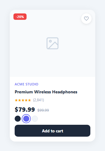
A product card displays a product image, name, price, colour variants, rating, and an add-to-cart CTA in a compact format. It is the core unit of any e-commerce listing, marketplace, or product catalogue, and feeds the mini cart on add.
Colour swatches
Swatch divs have a data-colour attribute and a click listener that removes .active from all swatches then adds it to the clicked one. The CSS .swatch.active applies a ring via outline: 2px solid offset from the swatch border.
Wishlist toggle
The heart button calls toggleWish() which toggles .liked on the button — the same interaction as the standalone favorite button. CSS .wish.liked svg { fill: #ef4444; stroke: #ef4444 } makes the heart fill red when active. The state is purely visual — wire to an API or localStorage for persistence.
Add to Cart feedback
addToCart(btn) changes btn.textContent to "✓ Added!" and adds .added (green background). A setTimeout after 1.5s resets both. This prevents duplicate submissions and confirms the action without a modal.
Badge positioning
The .badge div uses position: absolute; top: 12px; left: 12px on the .img-wrap parent to overlay a "Sale" or "New" label on the product image.
The colour swatch selector
Each swatch button has a data-colour attribute. When clicked, updateSwatch(btn) reads btn.dataset.colour and applies it as the product image background colour: productImg.style.background = colour. The active swatch gets .active class which adds a ring indicator. This pattern demonstrates how to build a colour selector that updates visual state without navigating to a new page — the same interaction used on Apple, Nike, and most e-commerce product pages.
The wishlist toggle
The heart button toggles .liked class. In the liked state, the heart SVG switches from outline (fill="none") to filled (fill="currentColor"). The button colour changes from grey to red. This is the standard heart/save pattern. In a real product, the toggle triggers a PATCH request to your API to add or remove the product from the user's saved items.
Add to cart feedback state
Clicking "Add to Cart" shows a brief "Added!" text and green background for 1.5 seconds, then resets. This immediate visual confirmation is important for cart interactions — without it, users often click multiple times believing the first click failed.
Build with AI
Build, Understand, Optimize, and Extend It With AI
You don't have to trace every click handler by hand. Paste this snippet's HTML, CSS, and JS into an AI coding assistant like Claude and ask it to explain exactly how the swatch click handler's remove-then-add active class pattern works across a querySelectorAll loop, and why addToCart uses a setTimeout to revert the button's text and class instead of leaving it permanently changed. The same assistant can help optimize it, for example checking whether attaching a separate click listener to every individual swatch is the best approach versus a single delegated listener on the swatch container, or whether the wishlist heart's visual state should persist across a page reload. It's also useful for extending the effect: ask it to add a size selector alongside the color swatches using the same active-toggle pattern, persist the wishlist state to localStorage, or wire the swatch selection to actually swap the product image instead of just the ring indicator. Treat the code less like a finished artifact and more like a starting point for a conversation.
Prompt to recreate it
Copy this into your AI assistant of choice to build the effect from scratch, or as a jumping-off point for your own variant:
Build an e-commerce product card in plain HTML, CSS, and vanilla JavaScript with color swatches, a wishlist toggle, and add-to-cart feedback — no frameworks.

Requirements:
- A card showing a product image area (with a placeholder icon acceptable as the image), a floating wishlist heart button in one corner, a floating sale-percentage badge in another corner, a brand name, a product title, a star rating with a review count, a current price next to a struck-through original price, a row of color swatch circles, and an add-to-cart button.
- Clicking the wishlist heart button must toggle a "liked" visual state on that button — an outlined heart becomes a filled, colored heart (achieved through a CSS class toggle affecting fill and stroke), with no page reload.
- Clicking any color swatch must remove the active-state ring indicator from every other swatch and apply it only to the clicked one, so exactly one swatch is marked active at any time.
- Clicking the add-to-cart button must change its label text to a confirmation message (like a checkmark plus "Added!"), switch its background color to a distinct success color, and automatically revert both the label and the color back to their original state after roughly two seconds, without requiring another click.
- Style the active swatch's ring so it clearly stands out from unselected swatches, and make sure the sale badge and wishlist button are positioned as overlays on top of the image area using absolute positioning, not affecting the image's own layout.
- Keep every piece of behavior — swatch selection, wishlist toggle, and cart feedback — working independently, so clicking one does not interfere with or reset the state of the others.
Want to tighten it up first? Run this prompt through the AI Prompt Studio to score it across 8 quality dimensions, catch anti-patterns, and tune the wording for Claude, ChatGPT, or Gemini before you paste it in.
Step by step
How to Use
- 1Interact with the cardClick the colour swatches, heart wishlist button, and Add to Cart button in the preview to see each interaction.
- 2Update product infoIn the HTML panel, change the product name, price, original price, and rating text.
- 3Change swatch coloursUpdate the background colour on each .swatch div inline style in the HTML panel.
- 4Replace the image placeholderReplace the .img-placeholder div with an <img> tag with object-fit: cover; width: 100%; height: 100%;.
- 5Change the badge textUpdate the .badge text in the HTML and its background colour in the CSS.
- 6Export in your formatClick "HTML" for a standalone file, "JSX" for a React component, or "Tailwind" for a React + Tailwind version.
Real-world uses
Common Use Cases
Got questions?
Frequently Asked Questions
Each .swatch div has a click listener. On click, all swatches get .active removed via querySelectorAll, then .active is added to the clicked swatch. CSS .swatch.active applies a ring via outline: 2px solid at 2px offset.
In toggleWish(), save the state to localStorage: localStorage.setItem("wish-productId", btn.classList.contains("liked")). On page load, read the value and apply .liked if true.
In addToCart(btn), add your cart logic before the visual feedback: cart.push(productId) or fetch("/cart/add", { method: "POST", body: ... }). The visual feedback (textContent change, timeout reset) runs regardless.
Copy the swatch row structure and replace swatches with size buttons (XS, S, M, L, XL). Add .size-btn CSS for the button style and use the same querySelectorAll active pattern.
Replace <div class="img-placeholder">...</div> with <img src="url" alt="Product name" style="width:100%;height:100%;object-fit:cover;" />.
Yes. Click "JSX" for a React component. In React, manage selectedSwatch and isWished in useState. Pass product data as props. Wire the cart action to your cart context or Redux dispatch.