Learn Coding Visually
Learn to code with interactive, live-preview playgrounds — HTML, CSS, JavaScript, React & more.
 HTML Playground42 lessons · Click-based · Live preview
 CSS PlaygroundLearn CSS with a live editor
 JavaScript Playground60 lessons · DOM · Async · Canvas
 React PlaygroundLearn React with a live code editor
 GSAP PlaygroundLearn GSAP animation interactively
 SVG Playground44 lessons · shapes · paths · animation
 SCSS Playground45 lessons · Sass modules · tokens
 Tailwind PlaygroundLearn Tailwind CSS with a live editor
 Bootstrap 5 Playground50 lessons · live preview
Like / Favorite Button — HTML CSS JS Snippet
Like / Favorite Button · Buttons · Plain HTML, CSS & JS · Live preview
What's included
Features
cubic-bezier(.2,1.6,.4,1) keyframe overshoots scale to 1.35 then settles — the bounce that makes the tap feel rewarding instead of mechanical.--tx/--ty custom properties; one keyframe translates, fades, and shrinks each one.animationend, so unlimited taps never leak nodes — critical for long feeds.bump class and reading offsetWidth forces a reflow so the count animation replays on every rapid tap.toggleFav handler drives the primary and all compact buttons; each tracks its own liked class and count, including a pre-liked example.aria-pressed between "true" and "false" so screen readers announce the like state, not just a colour change.About this UI Snippet
Like / Favorite Button — Particle Burst, Spring Heart-Pop & Animated Count
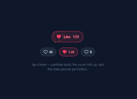
The like button is the most-tapped micro-interaction on the web. Social feeds, product galleries, comment threads, and bookmark lists all live or die on how satisfying that single tap feels. A flat heart that simply changes colour feels cheap; a heart that pops with a spring, fires a radial particle burst, and rolls its count upward feels rewarding — and that reward drives engagement. This snippet implements the full delightful version in plain HTML, CSS, and vanilla JavaScript, with no library and no SVG sprite sheet.
The effect is built from four independent layers that fire together on a single toggleFav call: the heart fill, the spring scale, the particle burst, and the count roll. Keeping them independent means you can drop any one of them without touching the others.
Spring heart-pop
When the .liked class is added, the heart's fill transitions from transparent to red and a heart-pop keyframe runs. The keyframe overshoots — scale(0.2) → 1.35 → 0.9 → 1 — using a cubic-bezier(.2,1.6,.4,1) spring curve. That overshoot is what reads as "bouncy" rather than mechanical. The animation only plays in the liked state, so un-liking is an instant, calm reset.
Radial particle burst
The burst function appends twelve .particle spans to the icon. Each particle gets a target offset from polar coordinates: the angle is evenly spaced around a circle (2π × i / 12) with a small random jitter, and the distance is randomised between 26 and 44 pixels. Those offsets are written as --tx and --ty custom properties, and the burst keyframe translates each particle to calc(-50% + var(--tx)) while fading and shrinking it. Colours cycle through a small palette. Crucially, every particle removes itself on animationend, so the DOM never accumulates dead nodes no matter how many times the user taps.
Expanding ring
A single .ring element expands from 8px to 54px while fading — the shock-wave that anchors the burst. It is the same self-cleaning animationend pattern.
Rolling, formatted count
The count is stored as text and may already be abbreviated ("1.2k"). toggleFav parses it back to a number (multiplying by 1000 when it ends in "k"), adjusts by ±1 depending on the new state, then re-formats: anything ≥ 1000 becomes (n/1000).toFixed(1) with a trailing ".0" stripped. A bump class re-triggers a short translate animation; the class is removed and a forced reflow (void offsetWidth) restarts it so rapid taps always animate.
Reusable and stateful per button
Because all state lives in classes and the count text on each button, the same toggleFav handler powers the large primary button and every compact button in the row independently — including one that starts pre-liked. Pair it with a confetti button for bigger celebrations, a product card wishlist toggle, or a social post card feed.
Build with AI
Build, Understand, Optimize, and Extend It With AI
You don't have to work out the polar-coordinate math for the particle burst yourself. Paste this snippet's HTML, CSS, and JS into an AI coding assistant like Claude and ask it to explain exactly how the burst function computes each particle's angle and distance and turns them into the negative tx and ty custom properties consumed by the keyframe, and why every particle removes itself on animationend rather than being cleaned up some other way. The same assistant can help optimize it — ask whether spawning twelve fresh DOM elements on every single tap is fast enough for a feed where many like buttons could be tapped in quick succession, and whether the count-parsing logic (handling the "1.2k" abbreviated format) covers every value the button might realistically display. It's also useful for extending it: ask it to add a double-tap-to-like gesture matching Instagram's pattern, a reduced-motion fallback that keeps the count and aria-pressed working without any animation, or a small popover showing avatars of other people who liked the same item. Treat the code less like a finished artifact and more like a starting point for a conversation.
Prompt to recreate it
Copy this into your AI assistant of choice to build the effect from scratch, or as a jumping-off point for your own variant:
Build a like/favorite button with a particle burst and animated count in plain HTML, CSS, and JavaScript — no library.

Requirements:
- A toggle button containing a heart icon (built from an inline SVG path, not an icon font), a label, and a count, using aria-pressed to reflect its liked/unliked state.
- When toggled to liked, the heart must fill with color and play a spring-style scale animation that overshoots past its final size before settling (an easing curve with a control point greater than 1), while toggling back to unliked must reset instantly with no animation.
- On liking (not un-liking), programmatically create roughly a dozen small particle elements positioned at the icon's center, each assigned a target x and y offset computed from evenly-spaced polar coordinates around a full circle with some random jitter in both angle and distance, written as CSS custom properties consumed by a single shared keyframe animation that translates, fades, and shrinks each particle outward.
- Also spawn a single expanding ring element on like that grows from a small circle to a larger one while fading and thinning its border, layered behind or alongside the particles as a shockwave.
- Every particle and the ring must remove themselves from the DOM automatically when their animation finishes (via an animationend listener), so tapping the button many times in a row never leaves stray elements behind.
- Parse the displayed count text back into a number even when it's in an abbreviated form like "1.2k", increment or decrement it by exactly one based on the new liked state, then re-format it back into the same abbreviated style when it crosses 1000, and play a small upward bump animation on the count element every time it changes — restarting that animation reliably even on rapid repeated taps by forcing a reflow before re-adding the animation class.
- The same click handler and CSS must work identically for multiple independent buttons on the page, each tracking its own liked state and count without any shared global state.
Want to tighten it up first? Run this prompt through the AI Prompt Studio to score it across 8 quality dimensions, catch anti-patterns, and tune the wording for Claude, ChatGPT, or Gemini before you paste it in.
Step by step
How to Use
- 1Paste HTML, CSS, and JSA large "Like 128" pill button appears above a row of three compact heart buttons (one already liked) on a dark background.
- 2Tap the big heartThe heart fills red and springs with an overshoot pop, twelve coloured particles fan out, a ring expands, and the count rolls to 129.
- 3Tap it again to un-likeThe heart instantly resets to its outline state and the count rolls back down — no burst on un-like, keeping the reverse action calm.
- 4Try the compact buttonsEach mini button keeps its own count and liked state. The "1.2k" button demonstrates the thousands formatting as it ticks up.
- 5Tap rapidlySpam-tap any button — the count animation restarts every time via a forced reflow, and particles self-clean so nothing piles up in the DOM.
- 6Adjust the burstChange the particle loop count, the distance range, or the
COLORSpalette in the JS to tune the burst to your brand.
Real-world uses
Common Use Cases
Got questions?
Frequently Asked Questions
In toggleFav, write the state to localStorage keyed by an item id (localStorage.setItem('fav-' + id, liked)). On load, read each key and add the .liked class plus the correct aria-pressed value before the user interacts. For logged-in users, sync to your API instead so favourites follow the account across devices.
Call your API inside toggleFav with the new state, and update optimistically: change the UI immediately, then if the request fails, revert the class and count. This optimistic pattern keeps the interaction instant; the network round-trip happens invisibly in the background.
Wrap the burst and pop keyframes in @media (prefers-reduced-motion: no-preference) and provide a simple colour change as the fallback. The count still updates and aria-pressed still toggles, so the button stays fully functional without animation.
Setting --tx/--ty per element lets one shared @keyframes burst rule compute the final translate with calc(). That keeps all the timing and easing in CSS (GPU-friendly and consistent) while JavaScript only supplies the per-particle direction — cleaner than scripting each frame.
In React, hold liked and count in useState, render the heart fill from liked, and spawn particles in a small effect or a ref-based helper on click. In Vue, use refs and :class bindings with a method for the burst. In Angular, track state on the component and toggle classes with [class.liked]. The keyframes and custom-property burst CSS port unchanged.