Source Code
<div class="scene">
  <button class="btn" id="btn" onclick="fire()">
    🎉 Celebrate!
  </button>
  <p class="hint">Click to launch confetti</p>
</div>
* { box-sizing: border-box; margin: 0; padding: 0; }
body { font-family: system-ui, sans-serif; background: #0f172a; display: flex; align-items: center; justify-content: center; min-height: 100vh; overflow: hidden; }
.scene { display: flex; flex-direction: column; align-items: center; gap: 16px; }
.btn {
padding: 14px 36px; font-size: 16px; font-weight: 700;
border: none; border-radius: 50px;
background: linear-gradient(135deg, #f97316, #ec4899);
color: #fff; cursor: pointer; font-family: inherit;
box-shadow: 0 4px 24px rgba(249,115,22,0.4);
transition: transform 0.1s, box-shadow 0.15s;
}
.btn:active { transform: scale(0.95); }
.btn:hover { box-shadow: 0 8px 32px rgba(249,115,22,0.6); }
.hint { font-size: 12px; color: #475569; }
.confetti-piece {
position: fixed;
width: 8px; height: 12px;
border-radius: 2px;
pointer-events: none;
animation: fall var(--dur) var(--delay) ease-in forwards;
z-index: 999;
}
@keyframes fall {
0% { transform: translate(0,0) rotate(0deg) scale(1); opacity: 1; }
80% { opacity: 1; }
100% { transform: translate(var(--dx), var(--dy)) rotate(var(--rot)) scale(0.5); opacity: 0; }
}function fire() {
const btn = document.getElementById('btn');
const rect = btn.getBoundingClientRect();
const cx = rect.left + rect.width / 2;
const cy = rect.top + rect.height / 2;
const colors = ['#f97316','#ec4899','#6366f1','#22c55e','#fbbf24','#06b6d4','#a78bfa'];
for (let i = 0; i < 80; i++) {
const el = document.createElement('div');
el.className = 'confetti-piece';
const angle = (Math.random() * 360) * Math.PI / 180;
const dist = 120 + Math.random() * 240;
el.style.cssText = [
`left:${cx}px`, `top:${cy}px`,
`background:${colors[i % colors.length]}`,
`--dx:${Math.cos(angle) * dist}px`,
`--dy:${Math.sin(angle) * dist + 200}px`,
`--rot:${Math.random() * 720 - 360}deg`,
`--dur:${0.8 + Math.random() * 0.8}s`,
`--delay:${Math.random() * 0.2}s`,
`border-radius:${Math.random() > 0.5 ? '50%' : '2px'}`,
].join(';');
document.body.appendChild(el);
el.addEventListener('animationend', () => el.remove());
}
}Learn Coding Visually
Learn to code with interactive, live-preview playgrounds — HTML, CSS, JavaScript, React & more.
 HTML Playground42 lessons · Click-based · Live preview
 CSS PlaygroundLearn CSS with a live editor
 JavaScript Playground60 lessons · DOM · Async · Canvas
 React PlaygroundLearn React with a live code editor
 GSAP PlaygroundLearn GSAP animation interactively
 SVG Playground44 lessons · shapes · paths · animation
 SCSS Playground45 lessons · Sass modules · tokens
 Tailwind PlaygroundLearn Tailwind CSS with a live editor
 Bootstrap 5 Playground50 lessons · live preview
Confetti Button — Free HTML CSS JS Snippet
Confetti Button · Buttons · Plain HTML, CSS & JS · Live preview
What's included
Features
About this UI Snippet
Confetti Button — CSS Custom Property Particles with Polar Coordinate Physics
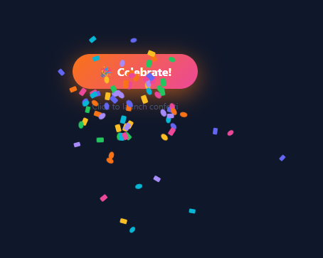
A confetti burst on click is one of the most satisfying micro-interactions — like the ripple button, 80 coloured particles explode from the button and fall with simulated gravity. Used on purchase confirmations (pair with an animated success checkmark), achievements, and any celebratory moment worth rewarding — see also the full-card confetti celebration.
How particles are created
fire() uses getBoundingClientRect() to find the button centre. It creates 80 div.confetti-piece elements appended to document.body, all starting at the button centre.
CSS custom properties drive physics
Each particle has five inline CSS custom properties: --dx (horizontal offset), --dy (vertical offset + 200px gravity), --rot (random rotation), --dur (duration 0.8–1.6s), --delay (0–0.2s). The @keyframes confetti reads them: transform: translate(var(--dx), var(--dy)) rotate(var(--rot)). Each of 80 identical divs follows a unique trajectory purely from CSS.
Polar coordinate direction
Random angle in radians × distance gives Math.cos(angle)*dist for --dx and Math.sin(angle)*dist + 200 for --dy. The +200 shifts the burst centroid downward, simulating gravity.
Auto cleanup
animationend listener calls el.remove() — no DOM accumulation even with rapid clicking.
The physics simulation
Each confetti particle is created at the click position with random polar coordinates: vx = speed * Math.cos(angle), vy = speed * Math.sin(angle). A gravity constant (gy = 0.15) adds to vy every frame, causing particles to arc downward naturally. Each particle has an alpha value that decrements each frame until it reaches 0, at which point the particle is removed from the array. The result is 80 particles that burst outward, arc downward with gravity, and fade as they travel.
CSS custom properties for trajectories
Each particle div has CSS custom properties (--tx, --ty, --r) set as inline styles at creation time. A CSS @keyframes animation uses these properties for the movement: transform: translate(var(--tx), var(--ty)) rotate(var(--r)). This delegates the heavy per-frame position calculation to CSS instead of JavaScript DOM manipulation, keeping the main thread free during the animation burst.
Preventing multiple bursts
A simple isAnimating boolean prevents overlapping burst cycles. When the button is clicked and isAnimating is true, the click handler returns immediately. The flag resets after all particles have faded — typically 1.2–1.5 seconds after the burst.
Customising the burst
Change PARTICLE_COUNT from 80 to adjust density. Increase gravity (gy) for a quicker arc; decrease for a flatter trajectory. Change the colour generator from random hsl to specific colours: const colours = ["#6366f1","#ec4899","#f59e0b"]; const colour = colours[Math.floor(Math.random()*colours.length)]. For a brand-specific confetti palette, this keeps the burst on-brand while still feeling celebratory.
Build with AI
Build, Understand, Optimize, and Extend It With AI
You don't have to work out the polar-coordinate math by hand to see why the burst looks radial rather than mechanical. Paste this snippet's HTML, CSS, and JS into an AI coding assistant like Claude and ask it to explain exactly how the random angle and distance become the --dx and --dy custom properties, and why offsetting --dy by a fixed 200px is enough to fake gravity without any per-frame physics loop. The same assistant can help optimize it — for instance asking whether creating and appending 80 real DOM elements per click scales fine or whether a canvas-based burst would handle rapid repeated clicks better. It's also useful for extending the effect: ask it to make fire() accept any element (not just the one button) so it can be reused across a page, add a confetti shape variety beyond circles and rounded rectangles, or trigger a burst automatically on a specific event like a completed purchase. Treat the code less like a finished artifact and more like a starting point for a conversation.
Prompt to recreate it
Copy this into your AI assistant of choice to build the effect from scratch, or as a jumping-off point for your own variant:
Build a click-triggered confetti burst button in plain HTML, CSS, and JavaScript, driving the actual particle motion entirely through CSS custom properties and a keyframe animation — no animation library, no canvas.

Requirements:
- A single button that, on click, reads its own position with getBoundingClientRect to find its center point as the burst origin.
- Create roughly 80 small div elements per click, each appended to the document body (not confined to the button's own box), assigned a class that has a CSS keyframe transition and animation already defined.
- For each particle, compute a random angle (0 to 360 degrees converted to radians) and a random distance, then derive horizontal and vertical offset custom properties from cosine and sine of that angle and distance — this is the only source of each particle's direction, there must be no separate direction/velocity object in JS.
- Add a fixed downward offset to the vertical custom property (simulating gravity) so every particle's end position is lower than its start position regardless of which direction it launched in.
- Also assign random custom properties for rotation amount, animation duration, and animation delay per particle so the burst doesn't look uniform or mechanical, and randomly alternate each particle's border-radius between fully round and slightly rounded square.
- Cycle particle colors through a small fixed palette array using the particle's index modulo the palette length.
- Remove each particle element from the DOM automatically when its own CSS animation finishes (via the animationend event), so rapid repeated clicks never leave stale elements accumulating in the page.
Want to tighten it up first? Run this prompt through the AI Prompt Studio to score it across 8 quality dimensions, catch anti-patterns, and tune the wording for Claude, ChatGPT, or Gemini before you paste it in.
Step by step
How to Use
- 1Click the buttonClick "Celebrate!" in the preview to see 80 particles burst from the button centre in all directions with random colours, sizes, and timings.
- 2Change particle coloursIn the JS panel, update the colors array. The 7 colours cycle via i % colors.length — more colours give a richer burst.
- 3Change particle countUpdate the 80 in the for loop to more or fewer particles.
- 4Adjust the spread radiusUpdate the 120 + Math.random() * 240 expression to change the minimum and range of particle distances.
- 5Change the button styleUpdate the gradient, border-radius, and padding in the CSS panel.
- 6Export in your formatClick "HTML" for a standalone file, "JSX" for a React component, or "Tailwind" for a React + Tailwind version.
Real-world uses
Common Use Cases
Got questions?
Frequently Asked Questions
Each particle div has inline style properties --dx, --dy, --rot, --dur, --delay set by JS with random values. The CSS @keyframes rule reads these variables: transform: translate(var(--dx), var(--dy)) rotate(var(--rot)). All 80 particles share the same CSS class but follow unique paths.
Adding 200 to --dy shifts the vertical endpoint of every particle downward by 200px. Since all particles end lower than they start regardless of direction, the burst appears to fall with gravity.
Each particle has el.addEventListener("animationend", () => el.remove()). After the keyframe animation completes (0.8-1.6s), the event fires and removes the element from the DOM.
Refactor fire() to accept a button element parameter: fire(btn). Use btn.getBoundingClientRect() inside. Add onclick="fire(this)" to each button.
Yes. Click "JSX" for a React component. Call fire() from the onClick handler. Since particles append to document.body, they work identically in React. For a state-based approach, manage particles as an array and render positioned divs.
Update the for loop condition: for (let i = 0; i < 80; i++). Fewer particles (30-40) are more subtle; more (120-150) are more dramatic but slightly more expensive to animate.