Source Code
<div class="demo">
  <button class="btn" onclick="ripple(event, this)">Click me</button>
  <button class="btn outline" onclick="ripple(event, this)">Outlined</button>
</div>
* { box-sizing: border-box; margin: 0; padding: 0; }
body { font-family: system-ui, sans-serif; background: #f8fafc; display: flex; align-items: center; justify-content: center; min-height: 100vh; gap: 12px; }
.demo { display: flex; gap: 12px; }
.btn {
position: relative;
overflow: hidden;
padding: 11px 28px;
font-size: 14px;
font-weight: 600;
border-radius: 8px;
border: none;
cursor: pointer;
font-family: inherit;
background: #6366f1;
color: #fff;
transition: background 0.15s;
}
.btn:hover { background: #4f46e5; }
.btn.outline { background: #fff; color: #6366f1; border: 1.5px solid #6366f1; }
.btn.outline:hover { background: #eef2ff; }
.ripple-el {
position: absolute;
border-radius: 50%;
background: rgba(255,255,255,0.4);
transform: scale(0);
animation: ripple-anim 0.55s ease-out forwards;
pointer-events: none;
}
.outline .ripple-el { background: rgba(99,102,241,0.18); }
@keyframes ripple-anim {
to { transform: scale(4); opacity: 0; }
}function ripple(e, btn) {
const r = document.createElement('span');
const rect = btn.getBoundingClientRect();
const size = Math.max(rect.width, rect.height);
r.className = 'ripple-el';
r.style.cssText = `width:${size}px;height:${size}px;left:${e.clientX-rect.left-size/2}px;top:${e.clientY-rect.top-size/2}px`;
btn.appendChild(r);
r.addEventListener('animationend', () => r.remove());
}Learn Coding Visually
Learn to code with interactive, live-preview playgrounds — HTML, CSS, JavaScript, React & more.
 HTML Playground42 lessons · Click-based · Live preview
 CSS PlaygroundLearn CSS with a live editor
 JavaScript Playground60 lessons · DOM · Async · Canvas
 React PlaygroundLearn React with a live code editor
 GSAP PlaygroundLearn GSAP animation interactively
 SVG Playground44 lessons · shapes · paths · animation
 SCSS Playground45 lessons · Sass modules · tokens
 Tailwind PlaygroundLearn Tailwind CSS with a live editor
 Bootstrap 5 Playground50 lessons · live preview
Ripple Button — Free HTML CSS JS Material Ripple Snippet
Ripple Button · Buttons · Plain HTML, CSS & JS · Live preview
What's included
Features
About this UI Snippet
Ripple Button — Material-Style Click Ripple Origin from Mouse Coordinates
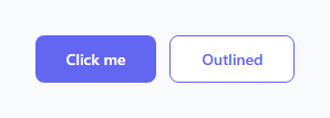
The ripple effect is the defining interaction of Google's Material Design — a circular wave that expands from the exact point where the user clicked, fading out as it reaches the button edge. It communicates "I received your click" with spatial precision that a generic fade or colour change cannot match. This snippet implements the full effect with 10 lines of JavaScript and a single CSS keyframe.
How the ripple calculates its origin
The ripple(e, btn) function uses btn.getBoundingClientRect() to get the button's position and size in the viewport. It then calculates the click position relative to the button: e.clientX - rect.left gives the horizontal offset from the button's left edge, and e.clientY - rect.top gives the vertical offset from the top. The ripple element is centred on this point by subtracting size/2 from both coordinates.
The size of the ripple is Math.max(rect.width, rect.height) — the largest dimension of the button. This ensures the circle is large enough to fill the entire button from any click point, even from a corner.
How the CSS animation works
The ripple element starts at transform: scale(0) and animates to scale(4) while opacity fades from default to 0, using ease-out forwards. The forwards fill mode keeps the element at opacity: 0 at the end so it stays invisible before being removed from the DOM. overflow: hidden on the button clips the ripple circle at the button boundary.
The outline variant
The solid button uses rgba(255,255,255,0.4) for a white semi-transparent ripple. The outline button uses rgba(99,102,241,0.18) — a faint indigo tint that matches the button colour without overpowering the light background.
Automatic cleanup
The span element is appended to the button, plays its animation, then removes itself via r.addEventListener('animationend', () => r.remove()). This prevents DOM accumulation when the button is clicked many times rapidly.
Adding ripple to any button
To add the ripple effect to any existing button: add position: relative; overflow: hidden to the button CSS, copy the .ripple-el CSS and @keyframes ripple-anim, and add onclick="ripple(event, this)" to the button HTML. The effect works on any button shape, size, or colour variant — layer it onto a gradient button, a 3D push button, or any item in a button group.
The getBoundingClientRect offset calculation
The ripple origin must be the exact click position relative to the button, not the viewport. rect = button.getBoundingClientRect() gives the button's position in the viewport. Subtracting rect.left and rect.top from e.clientX and e.clientY gives coordinates relative to the button's top-left corner. The ripple element is positioned at this point minus half its width and height — centering the ripple on the click position.
The scale keyframe
The ripple starts at scale(0) and expands to scale(4) (four times the ripple element size). The ripple element is typically 50×50px — at scale(4) it covers 200×200px. For large buttons, increase the scale factor so the ripple covers the full button width. opacity fades from 0.4 to 0 simultaneously, creating the fade-out as the ripple expands.
Cleanup after animation
The animationend event on the ripple span removes it from the DOM: span.addEventListener('animationend', span.remove). Without this, every click adds a permanent invisible span to the button's DOM. Using { once: true } on the event listener ensures the callback fires exactly once and removes itself, preventing any potential memory leak from the callback reference.
Build with AI
Build, Understand, Optimize, and Extend It With AI
You do not have to work out the coordinate math by hand. Paste this snippet's HTML, CSS, and JS into an AI coding assistant like Claude and ask it to explain exactly why getBoundingClientRect's left and top are subtracted from clientX and clientY before also subtracting half the ripple's own size, and why Math.max of the button's width and height (rather than just one dimension) is what guarantees the scaled-up circle covers every corner regardless of click position. The same assistant can help you optimize it — ask whether appending and removing a fresh span element on every click could be replaced with a pooled/reused element for buttons that get clicked very rapidly, and whether that would meaningfully help given the automatic animationend cleanup already in place. It's also useful for extending the effect: ask it to support keyboard-triggered ripples (originating from the button's center when activated via Enter or Space instead of a mouse event), add a second slower outer ripple layer for a richer effect, or make the ripple color themeable via a CSS custom property instead of hardcoded rgba values. Treat the code less like a finished artifact and more like a starting point for a conversation.
Prompt to recreate it
Copy this into your AI assistant of choice to build the effect from scratch, or as a jumping-off point for your own variant:
Build a Material Design style ripple click effect for buttons in plain HTML, CSS, and JavaScript with no library.

Requirements:
- The button element must have position relative and overflow hidden so any ripple element created inside it visually clips to the button's own boundary.
- On click, compute the click position relative to the button (not the viewport) by subtracting the button's own bounding rectangle's left and top from the click event's clientX and clientY.
- Size the ripple element using the larger of the button's width or height (not a fixed pixel size), so that when the ripple scales up it is guaranteed to cover the entire button surface even when the click originates from a corner.
- Position the newly created ripple element so it is centered exactly on the calculated click point, by offsetting its left and top by negative half of its own computed size.
- Animate the ripple purely with a CSS keyframe that scales it from 0 to a multiple of its own size (large enough to reach the button's edges) while fading its opacity to 0, using the forwards fill mode so it stays invisible at the end of the animation rather than snapping back to its start state.
- Automatically remove the ripple element from the DOM when its animationend event fires, so that many rapid clicks never leave behind extra invisible elements in the button.
- Support at least two visual variants (for example a solid-background button and an outlined button) where the ripple's color is a semi-transparent color appropriate to each variant's background, proving the same JavaScript function works unmodified across different button styles.
Want to tighten it up first? Run this prompt through the AI Prompt Studio to score it across 8 quality dimensions, catch anti-patterns, and tune the wording for Claude, ChatGPT, or Gemini before you paste it in.
Step by step
How to Use
- 1Click both buttons in the previewClick at different positions on both the solid and outline buttons to see the ripple expand from the exact click point.
- 2Change the ripple colourIn the CSS panel, update rgba(255,255,255,0.4) on .ripple-el for the solid variant, and rgba(99,102,241,0.18) on .outline .ripple-el for the outline variant.
- 3Adjust the animation speedChange 0.55s in animation: ripple-anim 0.55s ease-out forwards to make the ripple faster or slower.
- 4Add to any existing buttonAdd position: relative; overflow: hidden to your button CSS, copy the .ripple-el CSS and keyframe, and add onclick="ripple(event, this)" to the HTML element.
- 5Change the scale multiplierIn @keyframes ripple-anim, change scale(4) to scale(3) for a tighter ripple or scale(6) for one that expands further beyond the button.
- 6Export in your formatClick "HTML" for a standalone file, "JSX" for a React component, or "Tailwind" for a React + Tailwind version.
Real-world uses
Common Use Cases
Got questions?
Frequently Asked Questions
The ripple() function uses e.clientX and e.clientY (the mouse coordinates relative to the viewport) and btn.getBoundingClientRect() (the button position and size). Subtracting the button left/top from the click coordinates gives the position relative to the button. Subtracting size/2 centres the ripple circle on that point.
The ripple must be large enough to fill the entire button from any click point, including the corners. Using the larger of the two dimensions ensures the scaled-up circle (scale(4)) always covers the full button area regardless of where the user clicked.
Add position: relative; overflow: hidden to your button CSS. Copy the .ripple-el styles and @keyframes ripple-anim. Add onclick="ripple(event, this)" to the button element. The effect works on any button regardless of shape, size, or existing styles.
The function adds r.addEventListener("animationend", () => r.remove()) before appending the span. When the animation completes, the event fires and removes the element. Rapid clicking creates multiple spans but each is automatically cleaned up after its animation.
Yes. The solid button uses background: rgba(255,255,255,0.4) — a white semi-transparent ripple. The outline button overrides this with rgba(99,102,241,0.18) — a tinted version matching the button colour. Update these rgba values in the CSS panel.
Yes. Click "JSX" to download a React component. In React, attach an onClick handler that creates and appends the span programmatically, or use a ref to call the ripple logic. Alternatively, use the useRipple custom hook pattern where a ref is attached to the button and the click handler is wired via useEffect.