3D Push Button — CSS Press Effect Snippet

3D Push Button · Buttons · Plain HTML, CSS & JS · Live preview

Share & Support

What's included

Features

Two-layer structure: outer button is the shadow face, inner span is the top face
translateY moves the top face down on: active to shrink visible depth
Springy cubic-bezier transition mimics a real physical key
Hover raises the face, active presses it,: hover:active keeps it pressed
Three ready-made colors with a dark-base + light-face pairing
Pure CSS — JavaScript optional, only logs clicks
GPU-friendly: animates only transform at 60fps
Native <button> — keyboard activatable with matching press feedback
outline-offset keeps the focus ring clear of the raised face
Export as HTML file, React JSX, or React + Tailwind CSS

About this UI Snippet

3D Push Button — Tactile CSS Press Effect with a Two-Layer Face
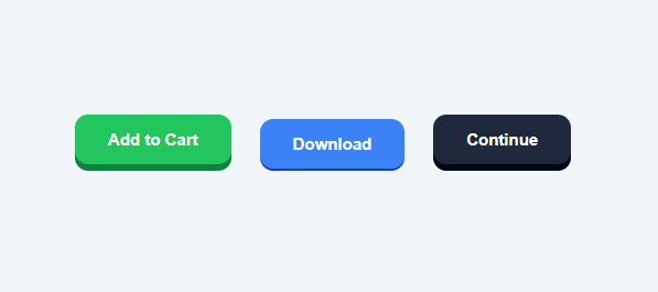
Screenshot of the 3D Push Button snippet rendered live

A 3D push button is a high-demand CSS snippet because it makes a call-to-action feel physical: the button has visible depth and "presses down" when clicked, exactly like a real keyboard key or arcade button. This version is pure CSS — no JavaScript, no images — and ships in three colors (green, blue, dark). The whole effect comes from a clever two-layer structure that any developer can learn and reuse.

The two-face structure

A real 3D button has two visible parts: the top face (the colored surface you press) and the shadow face (a darker base it sits on). This snippet maps those to two elements. The outer <button class="btn-3d"> is the darker shadow face, and the inner <span> is the brighter top face. The button itself has background: transparent; padding: 0, and a colored background on the .green/.blue/.dark modifier — that colored button is the base. The span is filled with a lighter shade of the same hue and lifted up with transform: translateY(-6px), so it floats 6px above the base. That 6px gap is the visible "thickness" of the button.

The press animation

By default the top face is at translateY(-6px) — fully raised. On hover, translateY(-8px) raises it slightly more for a subtle "ready" cue. On :active (mouse or finger down), translateY(-2px) drops the top face most of the way onto the base, shrinking the visible thickness from 6px to 2px. The transition transform 0.12s cubic-bezier(0.3, 0.7, 0.4, 1) makes the motion fast and slightly springy — quick enough to feel responsive, with an easing curve that mimics a real key snapping down. Because only transform animates, the effect runs on the GPU at 60fps with zero layout cost.

Why two layers instead of box-shadow

You could fake depth with a single box-shadow, but the two-layer approach is far more convincing because the dark base is a real element with the button's exact rounded shape. When the top face drops, the base stays put, so the colored "side wall" of the button visibly compresses — the depth shrinks before your eyes. A box-shadow cannot do that; it would just move. The two-layer technique also keeps the corners perfectly rounded at any radius because both the base and the face use the same border-radius: 12px.

The color system

Each variant pairs a dark base with a lighter face of the same hue: green uses #15803d base + #22c55e face, blue uses #1e40af + #3b82f6, dark uses #020617 + #1e293b. The base must be noticeably darker than the face so the "wall" reads as a shadow in the gap. To create a new color, pick a base that is roughly 25–35% darker than the face. The white label sits on the face and stays legible on all three because each face color clears AA contrast for bold text.

Hover, active, and the combined state

The snippet handles three pointer states cleanly. :hover span lifts to -8px (the button "rises" toward the cursor). :active span drops to -2px (pressed). The combined :hover:active rule also drops to -2px so the button does not get stuck at the raised hover height while being held down. This ordering matters: because :hover:active is more specific and comes last, it wins when both states are true, which is exactly what happens during a click.

Accessibility and focus

These are native <button> elements, so they are keyboard-focusable and activate on Enter/Space — and crucially, the :active press animation also fires on keyboard activation in most browsers, so keyboard users get the same tactile feedback. The button uses outline-offset: 4px so a focus ring sits clear of the raised face rather than clipping into it. Keep the default focus outline (or add a :focus-visible style) so keyboard users can see which button is selected. For users who prefer less motion, wrap the press transition in @media (prefers-reduced-motion: reduce) to make the state change instant.

Customizing thickness and feel

The button's depth is the default translateY(-6px) — increase it to -10px for a chunkier, more arcade-like button or reduce it to -3px for a subtle press. The pressed depth (-2px on :active) sets how far it travels; keep a 1–2px gap so the button never looks fully flattened. Speed up or slow down the snap by changing the 0.12s duration, and adjust the cubic-bezier to make it bouncier or stiffer. Because every measurement is a single translateY value, the whole feel is tunable from a few lines of CSS.

Step by step

How to Use

  1. 1
    Copy a buttonEach button is an outer <button> (the dark base) wrapping an inner <span> (the colored top face). Keep both layers.
  2. 2
    Change the labelEdit the text inside the <span>. The label rides on the top face and stays above the press animation.
  3. 3
    Add your own colorSet a dark background on the .btn-3d (base) and a lighter shade of the same hue on its span (face). Aim for the base ~30% darker.
  4. 4
    Tune the thicknessChange the span translateY(-6px) for resting depth and the :active translateY(-2px) for how far it presses.
  5. 5
    Adjust the snapEdit the 0.12s duration and cubic-bezier on the span transition to make the press faster, slower, or bouncier.
  6. 6
    Export in your formatClick "HTML" for a standalone file, "JSX" for a React component, or "Tailwind" for a React + Tailwind version.

Real-world uses

Common Use Cases

Add to cart & checkout buttons
E-commerce CTAs like the add to cart button feel more tactile and clickable with real press depth, nudging users toward the primary action.
Game and app UI controls
Arcade-style buttons suit games, kiosks, and playful product UIs where a satisfying press improves the feel.
Skeuomorphic / playful designs
Brands going for a chunky, friendly look use 3D buttons — alongside soft neumorphism cards — as a signature element across their landing pages.
Learn two-layer depth in CSS
Understand why a real dark base element beats a box-shadow for depth, and how translateY shrinks the visible side wall on press.
Design-system button styles
Add primary, success, and dark 3D variants to your component library — combine with a button group and gradient buttons, all sharing one base-plus-face structure.
Keyboard-friendly feedback
Built on native buttons, the press animation also fires on Enter/Space, so keyboard users get the same tactile confirmation.

Got questions?

Frequently Asked Questions

The outer <button> is a dark base and the inner <span> is a lighter top face lifted with transform: translateY(-6px). On :active the face drops to translateY(-2px), shrinking the visible gap so the button appears to press down. A fast cubic-bezier transition animates the move — all in CSS.

A real base element keeps the button's exact rounded shape, so when the top face drops the colored side wall visibly compresses. A box-shadow would just move, not compress, and is harder to keep crisp on rounded corners.

Change the resting depth on the span (translateY(-6px)) — increase to -10px for chunkier, decrease to -3px for subtle. Keep the :active value around -2px so it never looks fully flattened.

Give the .btn-3d a dark background (the base) and its span a lighter shade of the same hue (the face). Make the base roughly 30% darker than the face so the gap reads as a shadow.

Yes. These are native <button> elements, focusable and activatable with Enter/Space, and the press animation fires on keyboard activation too. outline-offset keeps the focus ring clear of the raised face; add prefers-reduced-motion to disable the animation for those who prefer less motion.

Yes. Click "JSX" for a React component or "Tailwind" for a React + Tailwind version. Render a <button> wrapping a <span> label with the same classes; the CSS works identically, and you can pass the label and onClick as props.

3D Push Button — Export as HTML, React, Vue, Angular & Tailwind

HTML
<!DOCTYPE html>
<html lang="en">
<head>
  <meta charset="UTF-8" />
  <meta name="viewport" content="width=device-width, initial-scale=1.0" />
  <title>3D Push Button</title>
  <style>
    * { box-sizing: border-box; margin: 0; padding: 0; }
    body {
      font-family: system-ui, sans-serif;
      background: #f1f5f9;
      min-height: 100vh;
      display: flex; align-items: center; justify-content: center;
    }
    
    .wrap { display: flex; flex-wrap: wrap; gap: 26px; padding: 24px; }
    
    /* 3D push button: the outer button is the "shadow" face,
       the inner span is the top face that moves down on press. */
    .btn-3d {
      border: none;
      background: transparent;
      padding: 0;
      cursor: pointer;
      border-radius: 12px;
      outline-offset: 4px;
    }
    
    .btn-3d span {
      display: block;
      padding: 14px 30px;
      border-radius: 12px;
      font-size: 15px;
      font-weight: 700;
      color: #fff;
      transform: translateY(-6px);
      transition: transform 0.12s cubic-bezier(0.3, 0.7, 0.4, 1);
    }
    
    /* Press: top face drops onto the shadow face */
    .btn-3d:active span { transform: translateY(-2px); }
    .btn-3d:hover span  { transform: translateY(-8px); }
    .btn-3d:hover:active span { transform: translateY(-2px); }
    
    /* Green */
    .btn-3d.green { background: #15803d; }
    .btn-3d.green span { background: #22c55e; box-shadow: 0 0 0 1px rgba(0,0,0,0.05); }
    
    /* Blue */
    .btn-3d.blue { background: #1e40af; }
    .btn-3d.blue span { background: #3b82f6; }
    
    /* Dark */
    .btn-3d.dark { background: #020617; }
    .btn-3d.dark span { background: #1e293b; }
  </style>
</head>
<body>
  <div class="wrap">
    <button class="btn-3d green"><span>Add to Cart</span></button>
    <button class="btn-3d blue"><span>Download</span></button>
    <button class="btn-3d dark"><span>Continue</span></button>
  </div>
  <script>
    // Pure CSS 3D button — no JavaScript required.
    // Press any button to see the top face drop onto its shadow.
    document.querySelectorAll('.btn-3d').forEach(b => {
      b.addEventListener('click', () => console.log('Pressed:', b.textContent.trim()));
    });
  </script>
</body>
</html>
Tailwind
<!DOCTYPE html>
<html lang="en">
<head>
  <meta charset="UTF-8" />
  <meta name="viewport" content="width=device-width, initial-scale=1.0" />
  <title>3D Push Button</title>
  <!-- Tailwind CSS v3+ — arbitrary value classes (e.g. bg-[#0f172a]) are valid -->
  <script src="https://cdn.tailwindcss.com"></script>
  <style>
    * {
      box-sizing: border-box; margin: 0; padding: 0;
    }

    body {
      font-family: system-ui, sans-serif;
      background: #f1f5f9;
      min-height: 100vh;
      display: flex; align-items: center; justify-content: center;
    }

    .btn-3d span {
      display: block;
      padding: 14px 30px;
      border-radius: 12px;
      font-size: 15px;
      font-weight: 700;
      color: #fff;
      transform: translateY(-6px);
      transition: transform 0.12s cubic-bezier(0.3, 0.7, 0.4, 1);
    }

    .btn-3d:active span {
      transform: translateY(-2px);
    }

    .btn-3d:hover span {
      transform: translateY(-8px);
    }

    .btn-3d:hover:active span {
      transform: translateY(-2px);
    }

    .btn-3d.green {
      background: #15803d;
    }

    .btn-3d.green span {
      background: #22c55e; box-shadow: 0 0 0 1px rgba(0,0,0,0.05);
    }

    .btn-3d.blue {
      background: #1e40af;
    }

    .btn-3d.blue span {
      background: #3b82f6;
    }

    .btn-3d.dark {
      background: #020617;
    }

    .btn-3d.dark span {
      background: #1e293b;
    }
  </style>
</head>
<body>
  <div class="flex flex-wrap gap-[26px] p-6">
    <button class="btn-3d border-0 bg-transparent p-0 cursor-pointer rounded-xl outline-offset-4 green"><span>Add to Cart</span></button>
    <button class="btn-3d border-0 bg-transparent p-0 cursor-pointer rounded-xl outline-offset-4 blue"><span>Download</span></button>
    <button class="btn-3d border-0 bg-transparent p-0 cursor-pointer rounded-xl outline-offset-4 dark"><span>Continue</span></button>
  </div>
  <script>
    // Pure CSS 3D button — no JavaScript required.
    // Press any button to see the top face drop onto its shadow.
    document.querySelectorAll('.btn-3d').forEach(b => {
      b.addEventListener('click', () => console.log('Pressed:', b.textContent.trim()));
    });
  </script>
</body>
</html>
React
import React, { useEffect } from 'react';

// CSS — optionally move to Snippet3DPushButton.module.css
const css = `
* { box-sizing: border-box; margin: 0; padding: 0; }
body {
  font-family: system-ui, sans-serif;
  background: #f1f5f9;
  min-height: 100vh;
  display: flex; align-items: center; justify-content: center;
}

.wrap { display: flex; flex-wrap: wrap; gap: 26px; padding: 24px; }

/* 3D push button: the outer button is the "shadow" face,
   the inner span is the top face that moves down on press. */
.btn-3d {
  border: none;
  background: transparent;
  padding: 0;
  cursor: pointer;
  border-radius: 12px;
  outline-offset: 4px;
}

.btn-3d span {
  display: block;
  padding: 14px 30px;
  border-radius: 12px;
  font-size: 15px;
  font-weight: 700;
  color: #fff;
  transform: translateY(-6px);
  transition: transform 0.12s cubic-bezier(0.3, 0.7, 0.4, 1);
}

/* Press: top face drops onto the shadow face */
.btn-3d:active span { transform: translateY(-2px); }
.btn-3d:hover span  { transform: translateY(-8px); }
.btn-3d:hover:active span { transform: translateY(-2px); }

/* Green */
.btn-3d.green { background: #15803d; }
.btn-3d.green span { background: #22c55e; box-shadow: 0 0 0 1px rgba(0,0,0,0.05); }

/* Blue */
.btn-3d.blue { background: #1e40af; }
.btn-3d.blue span { background: #3b82f6; }

/* Dark */
.btn-3d.dark { background: #020617; }
.btn-3d.dark span { background: #1e293b; }
`;

export default function Snippet3DPushButton() {
  // Auto-generated escape hatch: the original snippet's vanilla JS runs once
  // after mount and queries the rendered DOM. For idiomatic React, lift this
  // into state + handlers.
  useEffect(() => {
    const _listeners = [];
    const _originalAddEventListener = EventTarget.prototype.addEventListener;
    EventTarget.prototype.addEventListener = function(type, listener, options) {
      _listeners.push({ target: this, type, listener, options });
      return _originalAddEventListener.call(this, type, listener, options);
    };
    // Pure CSS 3D button — no JavaScript required.
    // Press any button to see the top face drop onto its shadow.
    document.querySelectorAll('.btn-3d').forEach(b => {
      b.addEventListener('click', () => console.log('Pressed:', b.textContent.trim()));
    });
    // Cleanup: restore addEventListener and remove all listeners
    return () => {
      EventTarget.prototype.addEventListener = _originalAddEventListener;
      for (const { target, type, listener, options } of _listeners) {
        target.removeEventListener(type, listener, options);
      }
    };
  }, []);

  return (
    <>
      <style>{css}</style>
      <div className="wrap">
        <button className="btn-3d green"><span>Add to Cart</span></button>
        <button className="btn-3d blue"><span>Download</span></button>
        <button className="btn-3d dark"><span>Continue</span></button>
      </div>
    </>
  );
}
React + Tailwind
import React, { useEffect } from 'react';
// Requires Tailwind CSS v3+ — https://tailwindcss.com/docs/installation
// Arbitrary value classes (e.g. bg-[#0f172a]) are valid Tailwind v3+

export default function Snippet3DPushButton() {
  // Auto-generated escape hatch: the original snippet's vanilla JS runs once
  // after mount and queries the rendered DOM. For idiomatic React, lift this
  // into state + handlers.
  useEffect(() => {
    const _listeners = [];
    const _originalAddEventListener = EventTarget.prototype.addEventListener;
    EventTarget.prototype.addEventListener = function(type, listener, options) {
      _listeners.push({ target: this, type, listener, options });
      return _originalAddEventListener.call(this, type, listener, options);
    };
    // Pure CSS 3D button — no JavaScript required.
    // Press any button to see the top face drop onto its shadow.
    document.querySelectorAll('.btn-3d').forEach(b => {
      b.addEventListener('click', () => console.log('Pressed:', b.textContent.trim()));
    });
    // Cleanup: restore addEventListener and remove all listeners
    return () => {
      EventTarget.prototype.addEventListener = _originalAddEventListener;
      for (const { target, type, listener, options } of _listeners) {
        target.removeEventListener(type, listener, options);
      }
    };
  }, []);

  return (
    <>
      <style>{`
* {
  box-sizing: border-box; margin: 0; padding: 0;
}

body {
  font-family: system-ui, sans-serif;
  background: #f1f5f9;
  min-height: 100vh;
  display: flex; align-items: center; justify-content: center;
}

.btn-3d span {
  display: block;
  padding: 14px 30px;
  border-radius: 12px;
  font-size: 15px;
  font-weight: 700;
  color: #fff;
  transform: translateY(-6px);
  transition: transform 0.12s cubic-bezier(0.3, 0.7, 0.4, 1);
}

.btn-3d:active span {
  transform: translateY(-2px);
}

.btn-3d:hover span {
  transform: translateY(-8px);
}

.btn-3d:hover:active span {
  transform: translateY(-2px);
}

.btn-3d.green {
  background: #15803d;
}

.btn-3d.green span {
  background: #22c55e; box-shadow: 0 0 0 1px rgba(0,0,0,0.05);
}

.btn-3d.blue {
  background: #1e40af;
}

.btn-3d.blue span {
  background: #3b82f6;
}

.btn-3d.dark {
  background: #020617;
}

.btn-3d.dark span {
  background: #1e293b;
}
      `}</style>
      <div className="flex flex-wrap gap-[26px] p-6">
        <button className="btn-3d border-0 bg-transparent p-0 cursor-pointer rounded-xl outline-offset-4 green"><span>Add to Cart</span></button>
        <button className="btn-3d border-0 bg-transparent p-0 cursor-pointer rounded-xl outline-offset-4 blue"><span>Download</span></button>
        <button className="btn-3d border-0 bg-transparent p-0 cursor-pointer rounded-xl outline-offset-4 dark"><span>Continue</span></button>
      </div>
    </>
  );
}
Vue
<template>
  <div class="wrap">
    <button class="btn-3d green"><span>Add to Cart</span></button>
    <button class="btn-3d blue"><span>Download</span></button>
    <button class="btn-3d dark"><span>Continue</span></button>
  </div>
</template>

<script setup>
import { onMounted } from 'vue';

onMounted(() => {
  // Pure CSS 3D button — no JavaScript required.
  // Press any button to see the top face drop onto its shadow.
  document.querySelectorAll('.btn-3d').forEach(b => {
    b.addEventListener('click', () => console.log('Pressed:', b.textContent.trim()));
  });
});
</script>

<style scoped>
* { box-sizing: border-box; margin: 0; padding: 0; }
body {
  font-family: system-ui, sans-serif;
  background: #f1f5f9;
  min-height: 100vh;
  display: flex; align-items: center; justify-content: center;
}

.wrap { display: flex; flex-wrap: wrap; gap: 26px; padding: 24px; }

/* 3D push button: the outer button is the "shadow" face,
   the inner span is the top face that moves down on press. */
.btn-3d {
  border: none;
  background: transparent;
  padding: 0;
  cursor: pointer;
  border-radius: 12px;
  outline-offset: 4px;
}

.btn-3d span {
  display: block;
  padding: 14px 30px;
  border-radius: 12px;
  font-size: 15px;
  font-weight: 700;
  color: #fff;
  transform: translateY(-6px);
  transition: transform 0.12s cubic-bezier(0.3, 0.7, 0.4, 1);
}

/* Press: top face drops onto the shadow face */
.btn-3d:active span { transform: translateY(-2px); }
.btn-3d:hover span  { transform: translateY(-8px); }
.btn-3d:hover:active span { transform: translateY(-2px); }

/* Green */
.btn-3d.green { background: #15803d; }
.btn-3d.green span { background: #22c55e; box-shadow: 0 0 0 1px rgba(0,0,0,0.05); }

/* Blue */
.btn-3d.blue { background: #1e40af; }
.btn-3d.blue span { background: #3b82f6; }

/* Dark */
.btn-3d.dark { background: #020617; }
.btn-3d.dark span { background: #1e293b; }
</style>
Angular
// @ts-nocheck
// Note: vanilla JS DOM manipulation is preserved as-is inside ngAfterViewInit().
// For idiomatic Angular, replace document.getElementById() with @ViewChild() refs
// and move state into component properties with two-way binding.
import { Component, AfterViewInit, ViewEncapsulation } from '@angular/core';
import { CommonModule } from '@angular/common';

@Component({
  selector: 'app-snippet3-d-push-button',
  standalone: true,
  imports: [CommonModule],
  encapsulation: ViewEncapsulation.None,
  template: `
    <div class="wrap">
      <button class="btn-3d green"><span>Add to Cart</span></button>
      <button class="btn-3d blue"><span>Download</span></button>
      <button class="btn-3d dark"><span>Continue</span></button>
    </div>
  `,
  styles: [`
    * { box-sizing: border-box; margin: 0; padding: 0; }
    body {
      font-family: system-ui, sans-serif;
      background: #f1f5f9;
      min-height: 100vh;
      display: flex; align-items: center; justify-content: center;
    }
    
    .wrap { display: flex; flex-wrap: wrap; gap: 26px; padding: 24px; }
    
    /* 3D push button: the outer button is the "shadow" face,
       the inner span is the top face that moves down on press. */
    .btn-3d {
      border: none;
      background: transparent;
      padding: 0;
      cursor: pointer;
      border-radius: 12px;
      outline-offset: 4px;
    }
    
    .btn-3d span {
      display: block;
      padding: 14px 30px;
      border-radius: 12px;
      font-size: 15px;
      font-weight: 700;
      color: #fff;
      transform: translateY(-6px);
      transition: transform 0.12s cubic-bezier(0.3, 0.7, 0.4, 1);
    }
    
    /* Press: top face drops onto the shadow face */
    .btn-3d:active span { transform: translateY(-2px); }
    .btn-3d:hover span  { transform: translateY(-8px); }
    .btn-3d:hover:active span { transform: translateY(-2px); }
    
    /* Green */
    .btn-3d.green { background: #15803d; }
    .btn-3d.green span { background: #22c55e; box-shadow: 0 0 0 1px rgba(0,0,0,0.05); }
    
    /* Blue */
    .btn-3d.blue { background: #1e40af; }
    .btn-3d.blue span { background: #3b82f6; }
    
    /* Dark */
    .btn-3d.dark { background: #020617; }
    .btn-3d.dark span { background: #1e293b; }
  `]
})
export class Snippet3DPushButtonComponent implements AfterViewInit {
  ngAfterViewInit(): void {
    // Pure CSS 3D button — no JavaScript required.
    // Press any button to see the top face drop onto its shadow.
    document.querySelectorAll('.btn-3d').forEach(b => {
      b.addEventListener('click', () => console.log('Pressed:', b.textContent.trim()));
    });
  }
}