You Might Also Like
Learn Coding Visually
Learn to code with interactive, live-preview playgrounds — HTML, CSS, JavaScript, React & more.
 HTML Playground42 lessons · Click-based · Live preview
 CSS PlaygroundLearn CSS with a live editor
 JavaScript Playground60 lessons · DOM · Async · Canvas
 React PlaygroundLearn React with a live code editor
 GSAP PlaygroundLearn GSAP animation interactively
 SVG Playground44 lessons · shapes · paths · animation
 SCSS Playground45 lessons · Sass modules · tokens
 Tailwind PlaygroundLearn Tailwind CSS with a live editor
 Bootstrap 5 Playground50 lessons · live preview
Floating Action Button Radial Menu — HTML CSS JS
Floating Action Button Radial Menu · Buttons · Plain HTML, CSS & JS · Live preview
What's included
Features
About this UI Snippet
Floating Action Button — Radial Arc Menu, Spring-Staggered Animation & Backdrop Blur
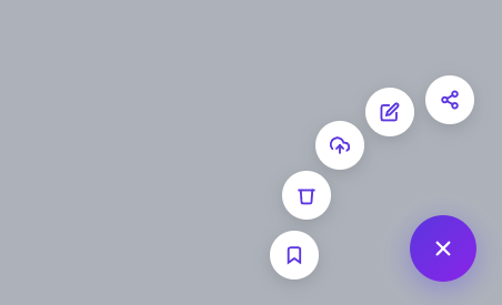
The Floating Action Button (FAB) is the centerpiece of Material Design — a persistent, elevated button that represents the primary action of a screen. This snippet extends the classic single FAB (see the simpler expanding FAB) into a radial menu: clicking the main button fans out five secondary action buttons in an arc pattern, each with a spring-animated entrance and a hover tooltip, overlaid on a blurred backdrop.
Radial arc positioning with CSS transform translate
The five action items all start at position: absolute; bottom: 0; right: 0 — stacked directly under the main FAB button. In their closed state, transform: scale(0) translate(6px,6px); opacity:0 makes them invisible. When the .open class is added to the container, each item gets a specific translate target that positions it along a 90° arc swept into the upper-left quadrant only:
- Item 1: translate(0,-140px) — straight up
- Item 2: translate(-54px,-129px) — 22.5° toward left
- Item 3: translate(-99px,-99px) — upper-left diagonal (cos 45° × 140 ≈ 99)
- Item 4: translate(-129px,-54px) — 67.5° toward left
- Item 5: translate(-140px,0) — straight left
The 140px radius and 22.5° angle increments create a quarter-circle arc that only ever moves up and left — never down. That matters because the FAB is anchored to the bottom-right corner of the viewport: any item with a positive (downward) y-offset would be pushed toward or past the bottom edge of the screen and get clipped or hidden behind other fixed UI. Keeping every item's y-offset zero or negative guarantees all five stay fully visible regardless of how close to the bottom of the page the button sits. The radius is deliberately larger than the 44px item diameter would strictly require, so adjacent items clear each other with a visible gap instead of their circular hit areas overlapping. The positions are pure CSS — no JavaScript trigonometry needed because the arc positions are calculated once and hardcoded.
Spring stagger animation
Each item's transition uses cubic-bezier(.34,1.56,.64,1) — the spring easing — for both transform and opacity. The stagger is achieved with transition-delay values: item 1 at 40ms, item 2 at 80ms, item 3 at 120ms, item 4 at 160ms, item 5 at 200ms. This creates a wave of items appearing in sequence rather than all at once, making the radial expansion feel organic. The 40ms increment is just long enough to perceive as sequential but short enough to feel snappy overall.
Icon crossfade on open/close
The main FAB contains two SVG icons: a plus sign and an X. Both are position: absolute inside the button. The plus starts visible; the X starts with opacity:0; transform:rotate(-90deg) scale(.6). When open, the plus fades and rotates out (opacity:0; rotate(90deg)) while the X fades in and un-rotates to its normal position. This 90° rotation crossfade communicates the dual state of the button without requiring a text label.
Backdrop blur overlay
The backdrop is a position:fixed; inset:0 div with background:rgba(15,23,42,.3); backdrop-filter:blur(2px). When visible it dims and blurs the page content, visually isolating the FAB menu — the same backdrop technique used by the modal snippet. The backdrop also acts as a click target — clicking it closes the menu. The pointer-events:none on the hidden state prevents it from blocking interaction with the page when the FAB is closed.
Dynamic tooltip positioning
Rather than CSS-only tooltips, the tooltip element is repositioned in JavaScript using getBoundingClientRect() to get the hovered item's screen position, then setting the tooltip's right and bottom based on window.innerWidth - rect.right and window.innerHeight - rect.top. This ensures the tooltip always appears to the right of the arc item regardless of which item is hovered, without needing individual tooltip elements per item.
Keyboard and accessibility
The main button has aria-expanded toggled and aria-label="Open actions". Pressing Escape closes the menu. A production implementation would also add aria-label to each action item and manage focus trap behavior so keyboard users can navigate the arc items with Tab/arrow keys.
React export pattern
In React: const [open, setOpen] = useState(false). Each item is a mapped array of { id, icon, label, onClick } objects. The container div gets className={fab-container ${open ? 'open' : ''}}. The backdrop onClick handler calls setOpen(false). Since the arc positions are pure CSS classes (.fab-item-1 through .fab-item-5), the React component simply passes the index to generate the class name: className={fab-item fab-item-${i+1}}.
Build with AI
Build, Understand, Optimize, and Extend It With AI
You don't have to work out the trigonometry behind the arc positions by hand. Paste this snippet's HTML, CSS, and JS into an AI coding assistant like Claude and ask it to explain exactly why every fab-item's translate keeps its y-offset at zero or negative, and how the 140px radius with 22.5-degree increments was used to derive each of the five hardcoded translate pairs. The same assistant can help optimize it — ask whether repositioning the tooltip with getBoundingClientRect on every mouseenter is necessary versus precomputing fixed offsets per item, or whether the five hardcoded transition-delay values should be generated from item count instead of hand-written. It's also useful for extending the menu: have it support a configurable number of items with a generated arc, add a hide-on-scroll behavior, or turn the hardcoded actions array into data-driven items with keyboard arrow navigation between them. Treat the code less like a finished artifact and more like a starting point for a conversation.
Prompt to recreate it
Copy this into your AI assistant of choice to build the effect from scratch, or as a jumping-off point for your own variant:
Build a floating action button (FAB) that expands into a five-item radial arc menu, in plain HTML, CSS, and JavaScript — no libraries.

Requirements:
- A main circular button fixed to the bottom-right corner of the viewport, containing two absolutely-positioned SVG icons (a plus and an X) that crossfade and rotate into each other based on an open/closed state class on a parent container.
- Five secondary circular action buttons, each starting stacked exactly under the main button at scale(0) and opacity 0. When the container's open class is applied, each must translate to a distinct position along a quarter-circle arc that sweeps only upward and to the left (never downward or further right), computed from a fixed radius and even angle increments across 90 degrees, so that no item can ever be pushed toward or past the bottom or right edge of the viewport.
- Each of the five items' transform and opacity transitions must use a springy overshoot easing curve (an appropriate cubic-bezier), and each item must have a slightly increasing transition-delay in arc order, so the items fan out as a visible sequential wave rather than all at once.
- A semi-transparent, blurred backdrop element that fades in behind the menu when open, is clickable to close the menu, and has pointer-events disabled while hidden so it never blocks clicks to the page underneath.
- A tooltip element (not a native title attribute) that is repositioned in JavaScript using getBoundingClientRect on mouseenter to sit next to whichever action item is currently hovered, showing that item's label from a data attribute.
- Clicking any action item must show a brief confirmation toast at the bottom of the screen naming the action, then close the menu. Pressing Escape while the menu is open must also close it. The main button must reflect its open/closed state via aria-expanded.
Want to tighten it up first? Run this prompt through the AI Prompt Studio to score it across 8 quality dimensions, catch anti-patterns, and tune the wording for Claude, ChatGPT, or Gemini before you paste it in.
Step by step
How to Use
- 1Paste HTML, CSS, and JSA purple FAB button appears in the bottom-right corner. The page background shows a hint text.
- 2Click the FABFive white icon buttons fan out in an arc pattern from the main button, each with a spring animation. A blurred backdrop appears.
- 3Hover over an action itemA tooltip appears near the item showing its label (Share, Edit, Upload, Delete, or Bookmark).
- 4Click an actionA confirmation message appears at the bottom of the screen. The menu collapses back.
- 5Dismiss with backdrop or EscapeClick the blurred backdrop or press Escape to close the menu without taking an action.
- 6Customize actionsReplace the SVG icons and
data-labelattributes. Update theonclick="fabAction('...')"calls with your own handlers.
Real-world uses
Common Use Cases
Got questions?
Frequently Asked Questions
Adjust the translate values in the CSS. Keep the y-offset zero or negative for a bottom-right anchored FAB, otherwise items get pushed off the bottom of the screen. Divide your arc (e.g. 90°) by the number of items minus one, then calculate each offset using x = -radius * sin(angle) and y = -radius * cos(angle). For 4 items across a 90° upward-left arc with radius 140: (0,-140), (-99,-99), (-140,0) plus one more at the 30°/60° increment. Keep the radius comfortably larger than the item diameter so neighboring buttons don't overlap.
Remove the tooltip div. Add a <span class="fab-label"> inside each .fab-item. Style with position:absolute; right:52px; white-space:nowrap; font-size:12px; background:#1e293b; color:#fff; padding:4px 8px; border-radius:4px. The labels appear to the left of each icon in the arc.
Create <RadialFAB actions={[{ icon, label, onClick }]} />. Use useState(false) for open state. Map actions to <div className={fab-item fab-item-${i+1}} onClick={() => { onAction(i); setOpen(false); }}>. Pass className={fab-container ${open ? 'open' : ''}} to the container.
Track scroll direction with let lastY = 0 in a scroll event listener. When window.scrollY > lastY (scrolling down), add a hidden class with transform:translateY(100px); opacity:0 to .fab-container. When scrolling up, remove it. Update lastY each event.
Open the Export menu (or the Test Exports preview) in the snippet toolbar. It generates a plain React component, a React + Tailwind version where the button, radial-item, and scrim styles become utility classes, a Vue 3 single-file component, and an Angular standalone component. Each converter preserves the markup, the spring-staggered open animation, and the backdrop and keyboard-dismiss behaviour, so the speed-dial works identically across React, Vue, and Angular. Keep the open state in component state and render the action items from an array passed in as a prop or input rather than hardcoding the five buttons.