Source Code
<div class="demo">
  <button class="burger" aria-label="Toggle menu" aria-expanded="false" aria-controls="menu" onclick="toggleBurger(this)">
    <span class="lines"></span>
  </button>

  <nav class="menu" id="menu">
    <a href="#">Home</a>
    <a href="#">Products</a>
    <a href="#">About</a>
    <a href="#">Contact</a>
  </nav>
</div>
* { box-sizing: border-box; margin: 0; padding: 0; }
body {
font-family: system-ui, sans-serif;
background: #0f172a;
min-height: 100vh;
display: flex; align-items: flex-start; justify-content: center;
padding-top: 70px;
}
.demo { display: flex; flex-direction: column; align-items: center; gap: 22px; }
/* The button */
.burger {
width: 52px; height: 52px;
display: grid; place-items: center;
background: #1e293b;
border: 1px solid #334155;
border-radius: 14px;
cursor: pointer;
}
/* The middle bar; ::before and ::after are the top and bottom bars */
.lines, .lines::before, .lines::after {
display: block;
width: 26px; height: 3px;
background: #fff;
border-radius: 3px;
transition: transform 0.3s cubic-bezier(0.4,0,0.2,1), opacity 0.2s, top 0.3s, bottom 0.3s;
}
.lines { position: relative; }
.lines::before, .lines::after { content: ""; position: absolute; left: 0; }
.lines::before { top: -8px; }
.lines::after { bottom: -8px; }
/* Open state → morph into an X */
.burger.open .lines { background: transparent; } /* hide middle bar */
.burger.open .lines::before { top: 0; transform: rotate(45deg); }
.burger.open .lines::after { bottom: 0; transform: rotate(-45deg); }
/* The menu it controls */
.menu {
display: flex; flex-direction: column; gap: 2px;
width: 220px;
background: #1e293b;
border: 1px solid #334155;
border-radius: 14px;
padding: 8px;
opacity: 0; transform: translateY(-8px);
pointer-events: none;
transition: opacity 0.25s, transform 0.25s;
}
.menu.show { opacity: 1; transform: translateY(0); pointer-events: auto; }
.menu a {
padding: 11px 14px; border-radius: 9px;
color: #cbd5e1; text-decoration: none; font-size: 14px; font-weight: 500;
transition: background 0.15s, color 0.15s;
}
.menu a:hover { background: #334155; color: #fff; }function toggleBurger(btn) {
const open = btn.classList.toggle('open');
btn.setAttribute('aria-expanded', String(open));
document.getElementById('menu').classList.toggle('show', open);
}Learn Coding Visually
Learn to code with interactive, live-preview playgrounds — HTML, CSS, JavaScript, React & more.
 HTML Playground42 lessons · Click-based · Live preview
 CSS PlaygroundLearn CSS with a live editor
 JavaScript Playground60 lessons · DOM · Async · Canvas
 React PlaygroundLearn React with a live code editor
 GSAP PlaygroundLearn GSAP animation interactively
 SVG Playground44 lessons · shapes · paths · animation
 SCSS Playground45 lessons · Sass modules · tokens
 Tailwind PlaygroundLearn Tailwind CSS with a live editor
 Bootstrap 5 Playground50 lessons · live preview
Animated Hamburger Menu — CSS Icon Morph Snippet
Animated Hamburger Menu · Buttons · Plain HTML, CSS & JS · Live preview
What's included
Features
About this UI Snippet
Animated Hamburger Menu — Three Bars Morphing into an X with CSS Transforms
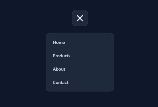
An animated hamburger menu is one of the most-searched UI snippets because the three-line icon that smoothly morphs into an X is the universal mobile-navigation control (see the full hamburger nav), and getting the animation crisp is surprisingly fiddly. This snippet nails it with pure CSS transforms — no icon swap, no SVG library — and pairs it with an accessible toggle and a dropdown menu so it is a complete, drop-in navigation control.
Building three bars from one element
The clever part is that the icon uses a single element with two pseudo-elements instead of three separate divs. The .lines span is the middle bar; its ::before is the top bar (positioned top: -8px) and its ::after is the bottom bar (bottom: -8px). All three share the same width, height, color, and rounded corners. This keeps the markup to one element and makes the morph math clean, because the top and bottom bars are positioned relative to the middle one.
The morph into an X
When the button gets the .open class, three things happen at once, each transitioned smoothly. The middle bar fades out with background: transparent — it does not need to rotate, it just disappears. The top bar moves from top: -8px to top: 0 (sliding into the center) and rotates 45deg. The bottom bar moves from bottom: -8px to bottom: 0 and rotates -45deg. Now the two remaining bars overlap at the center at opposite 45° angles — a perfect X. Reverse the class and they slide back apart and un-rotate into the hamburger. Because the transition animates top, bottom, and transform together with a single easing curve, the morph feels like one fluid motion rather than separate movements.
Why transforms beat swapping icons
A common but inferior approach is to swap a hamburger SVG for an X SVG on click. That gives an instant, jarring change with no animation, and you maintain two icons. Morphing the same three bars with CSS transforms animates the transition for free, uses no images, scales to any size by changing the bar width and the 8px offset together, and inherits color via the bar's background. It is also GPU-friendly: transform and opacity are cheap to animate, so the morph runs at 60fps even on low-end phones.
The accessible toggle
The button is a real <button> with the correct ARIA for a disclosure control: aria-label="Toggle menu" names it, aria-expanded reflects whether the menu is open ("false"/"true", kept in sync by the click handler), and aria-controls="menu" points at the menu it opens. The tiny toggleBurger function toggles the .open class on the button (driving the X morph), updates aria-expanded, and toggles the .show class on the menu. Using a native button means it is keyboard-focusable and activates on Enter/Space, and screen readers announce it as an expandable menu button.
The menu it controls
The dropdown menu animates in with the standard opacity + transform: translateY fade-and-slide, and is hidden with pointer-events: none while closed so it cannot be clicked when invisible. This is the same robust show/hide pattern used for accessible dropdowns — it animates (unlike display: none) and stays out of the way when closed. The menu links have hover states and comfortable tap targets. In a real navbar you would position the menu absolutely or as a full-screen overlay or side drawer on mobile; here it sits below the button to demonstrate the wiring.
Customizing the icon
Change the bar color via the background on .lines (and its pseudo-elements share it). Resize by adjusting the bar width (26px) and the 8px vertical offset of the top/bottom bars together — keep the offset roughly a third of the bar width for balanced spacing. Speed up or slow the morph with the transition 0.3s duration, or swap the cubic-bezier for a bouncier feel. For a thinner, more minimal icon, reduce the bar height to 2px. The button's own size, background, and radius are independent of the icon, so you can drop the bars into any button shape.
Accessibility and behaviour notes
Keep aria-expanded in sync with the open state (the handler does this) so assistive tech announces the correct state. Add aria-hidden toggling or focus management if the menu is a modal overlay. For a production mobile nav, also close the menu on outside click and on Escape, and trap focus inside it when it is a full-screen overlay — small additions to the toggle handler. Respect motion preferences by wrapping the morph transition in @media (prefers-reduced-motion: reduce) so users who prefer less animation get an instant icon change. Because the control is a native button driving an aria-controls menu, the core accessibility is correct out of the box.
Build with AI
Build, Understand, Optimize, and Extend It With AI
You don't have to work out the pseudo-element geometry by hand — paste this snippet's HTML, CSS, and JS into an AI coding assistant like Claude and ask it to explain exactly why the top and bottom bars are positioned as ::before/::after offsets from the middle bar rather than three separate elements, and why the middle bar fades out instead of rotating like the other two. The same assistant is useful for optimizing it — asking whether the transition list (transform, opacity, top, bottom) could be trimmed to only the properties that actually change, and whether animating top/bottom instead of a single transform: translateY has any performance cost worth avoiding. It's just as good for extending the button: ask it to add outside-click and Escape-key closing for a real navigation use, wrap the morph in a prefers-reduced-motion media query that swaps it for an instant state change, or turn the two-bar X into a three-state icon (menu, back arrow, close) for a multi-step mobile flow. Treat the code less like a finished artifact and more like a starting point for a conversation.
Prompt to recreate it
Copy this into your AI assistant of choice to build the effect from scratch, or as a jumping-off point for your own variant:
Build an animated "hamburger to X" menu button in plain HTML and CSS, with a single small JavaScript toggle function — no icon library, no SVG swapping, no separate icon elements for the open and closed states.

Requirements:
- Construct all three bars of the icon from exactly one HTML element: a middle bar as the base element, with its ::before pseudo-element acting as the top bar and its ::after pseudo-element acting as the bottom bar, each positioned with a fixed vertical offset from the middle bar (not as independent siblings).
- All three bars must share identical width, height, background color, and border-radius by inheriting from the shared base styles.
- Define a single "open" class that, when applied to the button, does three things simultaneously via CSS transitions: makes the middle bar's background transparent (it disappears, it does not rotate), moves the top bar's vertical offset to zero and rotates it 45 degrees, and moves the bottom bar's vertical offset to zero and rotates it -45 degrees in the opposite direction — so the two remaining bars slide to the center and cross into a visual X.
- Transition transform, opacity, and the position offsets together with one shared duration and easing so the morph reads as one continuous motion, not three separate movements.
- The button must be a real button element with aria-label, aria-expanded (toggled true/false to match the open state), and aria-controls pointing at the id of the menu it opens, updated entirely inside one small toggle function bound to a click event.
- The controlled menu must fade and slide into view using opacity and transform only (never display or height), with pointer-events disabled while hidden so it cannot be clicked when invisible.
Want to tighten it up first? Run this prompt through the AI Prompt Studio to score it across 8 quality dimensions, catch anti-patterns, and tune the wording for Claude, ChatGPT, or Gemini before you paste it in.
Step by step
How to Use
- 1Copy the button and menuCopy the <button class="burger"> with its single .lines span, and the .menu it controls. Keep the aria-expanded and aria-controls attributes.
- 2Keep the three-bar structureThe .lines span is the middle bar; its ::before and ::after are the top and bottom bars. Do not split them into separate elements — the morph relies on this.
- 3Wire the toggletoggleBurger flips the .open class (driving the X morph), updates aria-expanded, and shows/hides the menu. Reuse it on your real menu.
- 4Resize the iconAdjust the bar width (26px) and the top/bottom offset (8px) together — keep the offset about a third of the width for even spacing.
- 5Add production behaviourFor a real nav, also close on outside click and Escape, and position the menu as an overlay on mobile.
- 6Export in your formatClick "HTML" for a standalone file, "JSX" for a React component, or "Tailwind" for a React + Tailwind version.
Real-world uses
Common Use Cases
Got questions?
Frequently Asked Questions
The icon is one .lines span (the middle bar) with ::before and ::after as the top and bottom bars. On the .open class the middle bar fades to transparent, the top bar slides to center and rotates 45deg, and the bottom bar slides to center and rotates -45deg. The two crossed bars form an X, and the transition animates the change smoothly.
Using one span plus its ::before and ::after keeps the markup minimal and makes the morph math clean, because the top and bottom bars are positioned relative to the middle one. It also means a single color and size definition cascades to all three bars.
Yes. Swapping icons is instant and jarring and requires maintaining two icons. Morphing the same bars with CSS transforms animates for free, uses no images, scales to any size, inherits color, and runs on the GPU at 60fps.
Change the bar width (26px) and the top/bottom offset (8px) together, keeping the offset about a third of the width. For a thinner look, reduce the bar height (e.g. to 2px). The button size is independent of the icon.
Add a document click listener that closes the menu when the click is outside the button and menu, and a keydown listener for Escape that removes the .open and .show classes and resets aria-expanded. These are small additions to the toggle handler.
Yes. Click "JSX" for a React component or "Tailwind" for a React + Tailwind version. In React, hold an open boolean in useState, toggle it on click, and drive the .open/.show classes and aria-expanded from it; the CSS morph works unchanged.